7 Best Thematic Mapping Techniques
Why it matters: Traditional thematic mapping techniques like choropleth maps and dot density visualizations dominate most geographic data presentations, but they’re not always the most effective way to tell your story.
The big picture: You can transform how audiences understand spatial relationships and data patterns by exploring unconventional approaches that challenge standard cartographic conventions and offer fresh perspectives on complex information.
What’s next: These innovative mapping strategies will help you break through the noise of typical visualizations and create more engaging, memorable experiences that resonate with your audience while maintaining analytical precision.
Disclosure: As an Amazon Associate, this site earns from qualifying purchases. Thank you!
P.S. check out Udemy’s GIS, Mapping & Remote Sensing courses on sale here…
Sound Mapping: Visualizing Audio Landscapes Through Geographic Data
Sound mapping transforms auditory data into visual geographic representations, offering cartographers new ways to analyze environmental noise patterns and acoustic environments. This approach captures the spatial distribution of sound phenomena that traditional visual mapping techniques can’t adequately represent.
Explore and map the wilderness for the Queen in Cartographers! Draw unique terrain shapes and score points based on randomly selected goals each game, but beware of monster ambushes.

Creating Acoustic Territory Maps
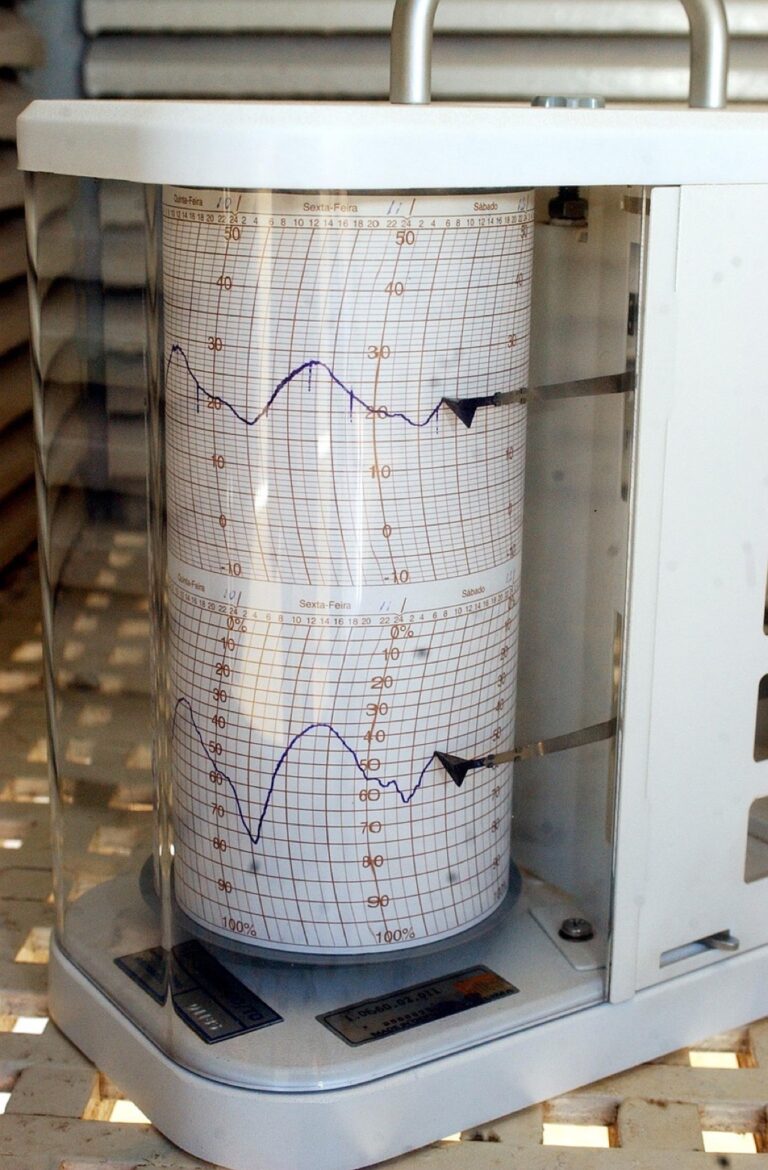
Acoustic territory mapping defines spatial boundaries based on sound characteristics rather than administrative borders. You’ll collect decibel readings at regular intervals using calibrated sound meters, then create interpolated surfaces showing noise levels across your study area. Software like ArcGIS Pro or QGIS handles the kriging interpolation needed to generate smooth acoustic contours. Consider mapping urban soundscapes during different time periods – rush hour traffic creates distinct acoustic territories compared to late-night ambient conditions.
Measure sound levels accurately with the TopTes TS-501B decibel meter. Featuring a backlit LCD screen for easy reading and A/C weighting from 30-130dB, it also offers MAX/MIN data hold functionality.

Implementing Sound Pollution Visualization Techniques
Sound pollution visualization employs color-coded intensity maps to highlight areas exceeding safe noise thresholds. You’ll use graduated color schemes where darker reds indicate dangerous noise levels above 85 decibels, while cooler blues represent quieter zones below 55 decibels. Combine point data from noise monitoring stations with land use polygons to identify pollution sources like airports, highways, and industrial facilities. Heat map techniques work particularly well for showing noise concentration around transportation corridors and manufacturing districts.
Developing Musical Geography Representations
Musical geography mapping visualizes cultural soundscapes by plotting music venues, instrument shops, and performance spaces across urban areas. You’ll create thematic symbols representing different musical genres – jazz clubs, classical concert halls, and electronic music venues each receive distinct iconography. Choropleth mapping can show music education density by census tract, while flow maps illustrate touring artist movement patterns between cities. Consider incorporating Spotify listening data or concert attendance figures to quantify musical activity intensity across your mapped region.
Smell Mapping: Charting Olfactory Experiences Across Geographic Spaces
You can expand beyond visual and auditory mapping by incorporating olfactory data to create multisensory geographic representations. Smell mapping transforms invisible aromatic landscapes into tangible spatial information that reveals environmental patterns and human experiences across different locations.
Designing Scent Distribution Networks
Distribution networks map how odors travel through urban environments using wind pattern data and emission sources. You’ll create vector networks showing scent pathways from industrial facilities, restaurants, and natural sources like flowering trees. GPS-enabled scent sensors provide concentration measurements at specific coordinates, allowing you to generate interpolated surfaces that show smell intensity gradients. Use ArcGIS Network Analyst to model how prevailing winds carry fragrances through street corridors and around building obstacles.
Mapping Air Quality Through Aromatic Data
Air quality visualization combines olfactory sensors with pollution monitoring to create comprehensive environmental health maps. You can deploy electronic nose devices that detect specific chemical compounds and correlate them with traditional air quality indices. Color-coded heat maps show where pleasant garden scents transition to industrial odors or vehicle emissions. Temporal analysis reveals how smell patterns change throughout the day, highlighting rush hour pollution spikes and evening floral blooms in residential areas.
Creating Fragrance Tourism Routes
Tourism routes leverage scent mapping to guide visitors through aromatic experiences within cities and natural areas. You’ll identify signature smells like bakery districts, spice markets, or lavender fields to create themed walking paths. Mobile apps can trigger location-based scent descriptions when tourists reach specific GPS coordinates. Interactive maps highlight seasonal fragrance variations, directing visitors to cherry blossom neighborhoods in spring or pine forests releasing resin in summer heat.
Emotion Mapping: Capturing Human Feelings in Geographic Context
Emotion mapping transforms subjective human experiences into quantifiable geographic data, creating visual narratives that traditional demographic maps can’t capture. You’ll discover how psychological states correlate with specific locations and environmental factors.
Building Mood-Based Location Analytics
Mood-based location analytics combine social media sentiment data with GPS coordinates to reveal emotional patterns across urban spaces. You’ll collect geotagged posts from platforms like Twitter and Instagram, then apply natural language processing algorithms to classify emotional content. Tools like VADER sentiment analysis and TextBlob help you categorize feelings into positive, negative, and neutral classifications. Heat maps display mood concentrations using color gradients, while temporal analysis reveals how emotions shift throughout daily cycles. Shopping districts typically show elevated happiness scores during weekends, whereas business districts exhibit stress peaks during rush hours.
Developing Stress Level Geographic Indicators
Stress level geographic indicators utilize biometric data from wearable devices and smartphone sensors to map psychological pressure across territories. You’ll aggregate anonymous heart rate variability and cortisol level measurements from fitness trackers to identify high-stress zones. Urban planning departments use this data to locate areas needing green space interventions or noise reduction measures. Traffic congestion corridors consistently show elevated stress readings, while parks and waterfront areas display relaxation patterns. Integration with crime statistics and economic data strengthens correlation analysis, helping you identify environmental stressors that impact community well-being.
Experience vivid content on the Galaxy A16 5G's 6.7" display and capture stunning photos with its triple-lens camera. Enjoy peace of mind with a durable design, six years of updates, and Super Fast Charging.

Creating Happiness Index Territorial Displays
Happiness index territorial displays synthesize multiple well-being metrics into comprehensive geographic visualizations using established psychological frameworks. You’ll combine survey data from tools like the Oxford Well-Being Index with location-specific factors including income levels, social services access, and environmental quality. Choropleth maps use graduated color schemes to represent happiness scores across neighborhoods or census tracts. Interactive dashboards allow users to explore contributing factors by clicking specific areas, revealing detailed breakdowns of life satisfaction components. University campuses and cultural districts frequently rank highest, while industrial zones and high-crime areas show consistently lower happiness indices.
Time-Lapse Mapping: Showing Geographic Changes Through Temporal Layers
Time-lapse mapping captures geographic transformations across multiple time periods, revealing spatial patterns invisible in static visualizations. This temporal approach transforms traditional cartographic methods into dynamic storytelling tools that showcase environmental changes, urban development, and demographic shifts through sequential data layers.
Constructing Historical Evolution Visualizations
Historical evolution visualizations layer archival datasets to reveal long-term geographic transformations across decades or centuries. You’ll combine historical maps, aerial photography, and census data to create compelling before-and-after comparisons that highlight urban sprawl, deforestation, or coastline changes.
Start by georeferencing historical maps using control points and contemporary satellite imagery. QGIS temporal controller allows you to animate these layers chronologically, while ArcGIS Pro time slider provides advanced temporal analysis capabilities. Include population density overlays from historical census data to show demographic shifts alongside physical changes.
Get precise timing control with this reliable timer relay. Set custom on/off schedules and enjoy long-lasting performance with a durable design.

Implementing Real-Time Change Detection Systems
Real-time change detection systems monitor geographic phenomena as they occur, utilizing streaming data feeds and automated analysis algorithms. You’ll integrate satellite imagery, sensor networks, and IoT devices to create responsive mapping systems that update continuously.
Configure Google Earth Engine to process Landsat and Sentinel satellite imagery automatically, detecting changes in vegetation, water bodies, or urban development. Combine this with Python-based change detection algorithms like the Continuous Change Detection algorithm for forest monitoring. Stream social media geotagged data through APIs to capture real-time human activity patterns and emergency response situations.
Creating Future Projection Geographic Models
Future projection geographic models combine historical trends with predictive algorithms to visualize potential spatial scenarios decades ahead. You’ll utilize climate data, population models, and urban planning datasets to create evidence-based projections of future geographic conditions.
Apply machine learning regression models to historical land use data for predicting urban expansion patterns. Integrate IPCC climate scenarios with elevation data to model sea-level rise impacts on coastal communities. Use agent-based modeling tools like NetLogo to simulate human migration patterns and their geographic consequences, creating multiple scenario visualizations that help planners prepare for various future conditions.
Touch Mapping: Representing Tactile Experiences Through Spatial Data
Touch mapping transforms physical sensations into measurable geographic data, creating visualizations that capture texture, temperature, and accessibility patterns across spatial environments. You’ll discover how tactile mapping techniques reveal hidden environmental characteristics that traditional visual approaches can’t effectively communicate.
Developing Texture-Based Geographic Classifications
Texture-based classifications categorize surfaces using standardized roughness scales and material properties to create comprehensive tactile terrain maps. You can utilize laser scanning technology combined with ground-penetrating radar to measure surface variations down to millimeter-level precision. Digital texture analysis algorithms process this data through specialized software like CloudCompare and MeshLab to generate quantifiable roughness indices. Classification systems typically employ five-point scales ranging from smooth concrete surfaces to coarse natural stone textures, enabling consistent data collection across different geographic regions.
Creating Temperature Variation Mapping Systems
Temperature variation systems integrate thermal imaging data with environmental sensors to visualize heat distribution patterns across urban and natural landscapes. You’ll need to deploy infrared thermometers and thermal cameras at strategic monitoring points to capture surface temperature fluctuations throughout daily cycles. FLIR thermal imaging software processes this data alongside meteorological records to create heat maps showing temperature gradients. Advanced systems incorporate microclimate factors like building shadows, vegetation cover, and pavement materials to predict thermal comfort zones for pedestrian planning and outdoor activity scheduling.
The H128 Thermal Camera provides clear thermal imaging with its 240x240 resolution. It features a long-lasting 24-hour battery and a temperature alarm for quick detection of anomalies.

Building Accessibility-Focused Tactile Maps
Accessibility-focused maps prioritize navigation aids for visually impaired users through raised surface techniques and standardized tactile symbols following ADA compliance guidelines. You can create these specialized maps using thermoform plastic molding or 3D printing technologies that produce consistent raised elements. Braille translation software converts geographic labels into tactile text while maintaining proper spacing requirements. Essential features include raised lines for pathways, textured areas for different terrain types, and standardized symbols for landmarks, ensuring users can independently navigate complex environments through touch-based wayfinding systems.
Create 3D art with the SCRIB3D P1 3D Pen! This easy-to-use pen features adjustable speed control and includes PLA filament, a stencil book, and project guide to get you started.

Memory Mapping: Documenting Personal and Collective Geographic Memories
Memory mapping transforms intangible recollections into tangible geographic data, capturing the emotional and cultural significance of places beyond traditional demographic boundaries. This approach reveals how communities and individuals connect with their environments through shared experiences and personal narratives.
Constructing Community Story-Based Maps
Community story-based maps compile collective narratives using crowdsourced data collection platforms like StoryMapJS and Esri Story Maps. You’ll gather oral histories through structured interviews and digital submissions, then geocode these narratives to specific locations using GPS coordinates. These maps layer multiple perspectives on single locations, revealing how different community members experience the same geographic space. Interactive storytelling elements allow users to explore overlapping memories, creating rich cultural documentation that preserves community identity and highlights significant local events.
Developing Personal Journey Documentation Systems
Personal journey documentation systems track individual geographic experiences through automated location logging and manual memory annotation. You’ll use mobile applications like Journey or Day One combined with GPS tracking to create detailed movement records. These systems integrate photographs, audio recordings, and written reflections with precise geographic coordinates, building comprehensive personal geographic archives. Time-stamped emotional markers help you identify meaningful locations and recurring patterns in your spatial behavior, transforming routine movements into insightful personal geography narratives.
Creating Historical Memory Geographic Archives
Historical memory geographic archives preserve collective recollections through digitized oral history collections and archival material integration. You’ll employ digital asset management systems like Omeka S and Dublin Core metadata standards to organize historical narratives by geographic location and time period. These archives connect historical events to specific coordinates using georeferenced historical maps and survey data. Cross-referenced documentation allows researchers to explore how historical events shaped community memory across different neighborhoods, creating searchable databases that preserve cultural heritage for future generations.
Dream Mapping: Visualizing Imaginary and Aspirational Geographic Spaces
Dream mapping captures the geography of possibility by transforming conceptual visions into spatial representations. This technique bridges the gap between current reality and future aspirations through carefully structured cartographic frameworks.
Building Fantasy Location Mapping Systems
Fantasy location mapping systems create detailed geographic representations of imaginary worlds using established cartographic principles. You’ll construct these maps by applying real-world topographic rules to fictional territories, ensuring consistent elevation patterns, drainage networks, and climate zones. Advanced GIS software like World Machine generates realistic terrain models, while Campaign Cartographer provides specialized tools for fantasy mapping. This approach maintains geographic authenticity within imaginary contexts, creating believable spatial relationships that support narrative development and world-building projects.
Creating Vision-Based Community Planning Maps
Vision-based community planning maps visualize future development scenarios by combining citizen aspirations with spatial analysis techniques. You’ll gather community input through participatory mapping workshops, then integrate resident feedback with zoning regulations and infrastructure capacity data. Tools like SketchUp and CityScope help translate community visions into three-dimensional spatial models. These maps display proposed green spaces, mixed-use developments, and transportation networks according to community priorities. This collaborative approach ensures planning decisions reflect actual resident needs while maintaining technical feasibility standards.
Developing Speculative Geographic Design Tools
Speculative geographic design tools explore alternative spatial futures through experimental mapping methodologies. You’ll prototype interactive interfaces that allow users to manipulate geographic variables and observe resulting spatial patterns. Processing and D3.js enable custom visualization development, while Unity creates immersive 3D geographic experiences. These tools simulate climate adaptation scenarios, urban morphology experiments, and resource distribution alternatives. By combining parametric design principles with geographic data, you’ll generate multiple spatial possibilities that challenge conventional planning assumptions and inspire innovative geographic solutions.
Conclusion
These unconventional thematic mapping approaches transform how you visualize and understand geographic data. By incorporating sensory elements like sound and smell alongside emotional and temporal dimensions you create more engaging and memorable spatial narratives.
The beauty of these techniques lies in their ability to reveal hidden patterns that traditional mapping methods miss. Whether you’re tracking community memories or visualizing future possibilities each approach offers unique insights into the complex relationships between people and places.
Start experimenting with one technique that resonates with your project goals. You’ll discover that combining multiple approaches often yields the most compelling results allowing you to tell richer more nuanced geographic stories that truly connect with your audience.
Frequently Asked Questions
What is sound mapping and how does it work?
Sound mapping is a cartographic technique that visualizes audio landscapes by plotting sound phenomena across geographic spaces. It captures environmental noise patterns, acoustic environments, and cultural soundscapes that traditional maps cannot represent. The process involves creating acoustic territory maps based on sound characteristics and using color-coded intensity visualizations to show areas exceeding safe noise thresholds.
How can smell mapping help with urban planning?
Smell mapping charts olfactory experiences across geographic areas, transforming invisible aromatic landscapes into spatial data. It reveals environmental patterns by tracking how odors travel through urban environments using wind patterns and emission sources. This technique helps urban planners identify pollution sources, create environmental health maps, and develop fragrance tourism routes for enhanced sensory city experiences.
What data sources are used for emotion mapping?
Emotion mapping utilizes social media sentiment data combined with GPS coordinates to reveal emotional patterns across urban spaces. It employs tools like VADER sentiment analysis and TextBlob to classify emotional content. Additionally, it incorporates biometric data from wearable devices to map stress levels and synthesizes multiple well-being metrics to create happiness index displays for different neighborhoods.
How does time-lapse mapping differ from static maps?
Time-lapse mapping captures geographic transformations across multiple time periods, revealing spatial patterns invisible in static visualizations. It transforms traditional cartography into dynamic storytelling by showcasing environmental changes, urban development, and demographic shifts through sequential data layers. This approach uses tools like QGIS and ArcGIS Pro to create animated visualizations of historical evolution and real-time changes.
What makes touch mapping beneficial for accessibility?
Touch mapping transforms physical sensations into geographic data, capturing texture, temperature, and accessibility patterns. It creates tactile terrain maps using standardized roughness scales and material properties through laser scanning technology. For visually impaired users, it provides accessibility-focused maps with raised surfaces and standardized symbols, making navigation more inclusive and informative through physical interaction.
How can memory mapping preserve community heritage?
Memory mapping transforms intangible recollections into tangible geographic data by capturing emotional and cultural significance of places. It compiles collective narratives through crowdsourced community stories, allowing exploration of overlapping memories. The technique preserves community identity by creating historical memory archives that connect oral histories and archival materials to specific geographic coordinates.
What are the applications of dream mapping in urban planning?
Dream mapping captures the geography of possibility by transforming conceptual visions into spatial representations. It creates vision-based community planning maps that visualize future development scenarios by integrating citizen aspirations with spatial analysis. This approach uses speculative geographic design tools to explore alternative spatial futures, inspiring new solutions and enhancing community engagement in planning processes.