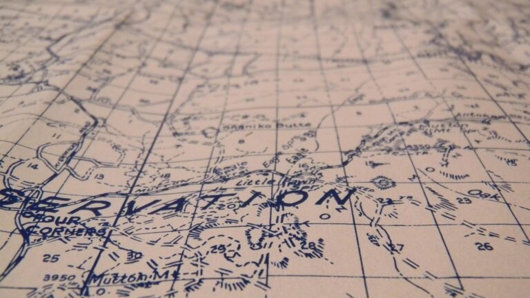
6 Best Map Design Tips for Accuracy and Appeal
Why it matters: Map design sits at the crossroads of artistic expression and scientific precision, where every creative choice must serve both visual appeal and data integrity.
The challenge: You’re constantly navigating the tension between making maps that capture attention and ensuring they communicate geographic information accurately without misleading viewers.
What’s ahead: These six proven strategies will help you create compelling map designs that maintain cartographic standards while engaging your audience effectively.
Disclosure: As an Amazon Associate, this site earns from qualifying purchases. Thank you!
P.S. check out Udemy’s GIS, Mapping & Remote Sensing courses on sale here…
Embrace Color Psychology While Maintaining Geographic Accuracy
Color choices in cartography influence reader interpretation while conveying spatial relationships accurately. You’ll need to balance psychological impact with standardized geographic conventions.
Choose Colors That Reflect Natural Terrain Features
Select earth tones for elevation gradients that mirror real-world landscapes. Use brown-to-white transitions for mountain peaks, green-to-yellow for lowlands, and blue gradients for water depth. Your color palette should match users’ expectations – desert regions appear in sandy yellows and browns, while forests display various green intensities. This approach maintains visual logic while supporting quick terrain recognition across different map scales and projection types.
Use Consistent Color Schemes Across Related Map Elements
Establish unified color families for similar geographic features throughout your entire map series. Apply identical blue hues for all water bodies, consistent green ranges for vegetation types, and matching brown palettes for elevation zones. Your color consistency helps users navigate between different map sheets or zoom levels without confusion. Create a standardized color library that includes specific RGB or CMYK values for each feature category to ensure reproducibility across digital and print formats.
Balance Aesthetic Appeal With Functional Color Coding
Design color combinations that satisfy both visual harmony and information hierarchy requirements. Implement high-contrast pairings for critical boundary lines while using subtle variations for background elements. Your color decisions should enhance readability without overwhelming geographic accuracy – bright colors draw attention to important features while muted tones support secondary information. Test your color schemes with colorblind accessibility tools and ensure sufficient contrast ratios meet WCAG standards for inclusive map design.
Incorporate Creative Typography Without Compromising Readability
Typography serves as your map’s voice, guiding readers through geographic information while maintaining visual appeal. Effective typographic choices enhance your map’s storytelling capacity without sacrificing the precision required for accurate spatial communication.
Select Fonts That Match Your Map’s Purpose and Audience
Choose serif fonts for formal reference maps where authority and tradition matter most. Times New Roman and Minion Pro work well for atlas production and academic publications. Opt for sans-serif typefaces like Helvetica or Frutiger when designing digital maps requiring screen readability. Modern geometric fonts such as Montserrat add contemporary appeal to tourism maps while maintaining clarity. Match font weight to information hierarchy – use bold weights for major cities and regular weights for smaller settlements. Your audience’s technical expertise should guide complexity levels.
Ensure Text Hierarchy Supports Geographic Understanding
Establish clear size relationships between administrative levels using a consistent scaling system. Capital cities should appear 2-3 points larger than regional centers, which should exceed local towns by similar margins. Apply consistent styling to feature categories – all water bodies use italic formatting while transportation networks maintain regular text. Position labels strategically to follow natural reading patterns from upper-left to lower-right when possible. Color coding reinforces hierarchy when size alone proves insufficient, with darker tones indicating higher administrative importance.
Balance Decorative Elements With Essential Label Information
Limit decorative typography to non-critical map elements like titles, legends, and compass roses where artistic expression won’t compromise navigation. Maintain standard fonts for all location names and essential geographic features to ensure universal readability. Reserve creative treatments for thematic elements such as historical callouts or cultural annotations that enhance rather than replace core geographic information. Script fonts work effectively for historical maps’ decorative titles but should never label modern transportation networks or boundary lines. Test decorative choices at intended viewing distances to verify legibility remains intact.
Use Artistic Cartographic Symbols While Preserving Data Integrity
Cartographic symbols serve as your map’s visual vocabulary, translating complex geographic data into instantly recognizable elements. You’ll need to balance creative expression with standardized symbolization to maintain both visual appeal and data accuracy.
Design Custom Icons That Accurately Represent Geographic Features
Create distinctive symbols that reflect actual landscape characteristics while maintaining cartographic conventions. You should base mountain icons on topographic profiles and forest symbols on vegetation density patterns. Use simplified geometric forms that scale effectively across different map sizes and resolutions.
Start with established cartographic standards from organizations like the International Cartographic Association, then adapt these foundations to match your map’s aesthetic needs. Your custom symbols must preserve essential feature attributes – elevation for terrain, canopy coverage for forests, and flow direction for rivers.
Achieve a flawless, even complexion with e.l.f. Flawless Satin Foundation. This lightweight, vegan formula provides medium coverage and a semi-matte finish for all-day wear, while hydrating your skin with glycerin.

Maintain Symbol Consistency Across Different Map Scales
Establish a symbol hierarchy that adapts gracefully from overview to detail scales without losing geographic meaning. You’ll need to create multiple versions of each symbol – simplified forms for small scales and detailed versions for large-scale presentations.
Test your symbols at various zoom levels to ensure they remain legible and proportionally accurate. Major highways should maintain visual prominence over local roads regardless of scale, while settlement symbols must reflect actual population relationships consistently across your entire map series.
Balance Visual Interest With Universal Symbol Recognition
Incorporate creative elements that enhance your map’s visual appeal without compromising international symbol standards. You can add artistic flair through color variations, texture patterns, and stylized edges while preserving core symbol shapes that users recognize instantly.
Focus your creative energy on non-critical decorative elements like borders, legends, and background patterns. Essential navigation symbols – airports, hospitals, schools – should follow established conventions to ensure accessibility for diverse user groups including international audiences and those with visual impairments.
Apply Creative Layout Techniques Without Sacrificing Spatial Relationships
Creative map layouts can transform geographic presentation while maintaining essential spatial accuracy. Strategic design choices allow you to enhance visual appeal without compromising the fundamental relationships between geographic features.
Experiment With Non-Traditional Map Orientations When Appropriate
Rotate your map orientation to better fit your data distribution or publication format. You can orient coastlines diagonally to maximize space utilization or align mountain ranges with your page dimensions. Consider portrait orientations for north-south trending features like river systems or political boundaries. Always include a clear north arrow when deviating from standard north-up orientation, and ensure your rotation enhances rather than confuses spatial understanding for your target audience.
Use White Space Strategically to Enhance Geographic Focus
Leverage white space as a design element to direct attention to critical geographic areas. You can create breathing room around dense urban areas or highlight isolated features like islands or mountain peaks. Position empty space to balance complex data clusters and prevent visual overcrowding. Strategic white space placement helps readers process geographic information more effectively while maintaining accurate scale relationships. Use ocean areas or unpopulated regions as natural white space opportunities.
Balance Artistic Composition With Accurate Spatial Representation
Apply composition principles like the rule of thirds while preserving geographic accuracy. You can position key features at compositional focal points without distorting their actual locations or relationships. Create visual hierarchy through strategic placement of inset maps or detail callouts. Maintain proportional accuracy when adjusting map extents for aesthetic purposes. Use artistic framing techniques that complement rather than compete with your geographic data, ensuring decorative elements never obscure critical spatial information.
Integrate Storytelling Elements While Maintaining Factual Precision
Maps tell stories about places, people, and time while presenting accurate geographic data. You can weave narrative elements into your cartographic design without compromising the precision that makes maps trustworthy reference tools.
Add Historical Context Through Visual Design Choices
Historical context enhances your map’s narrative power through period-appropriate design elements that reflect the mapped era. Choose vintage color palettes from historical atlases when depicting past events, such as sepia tones for 19th-century exploration routes or muted earth colors for medieval trade maps. Select typography that matches your temporal focus—serif fonts like Times Roman for colonial-era maps or Art Deco styles for 1920s urban planning documents. Incorporate decorative borders and cartouches that reference historical cartographic traditions while maintaining modern readability standards and accurate coordinate systems.
Include Narrative Elements That Support Geographic Accuracy
Narrative elements strengthen geographic understanding by providing context that explains spatial relationships and patterns. Add inset maps showing regional context for detailed area studies, helping readers understand scale and location within broader geographic frameworks. Include elevation profiles along hiking trails or cross-sections through geological formations that support topographic accuracy with storytelling depth. Design legend entries that explain not just what symbols represent but why features exist in specific locations, such as noting how river confluences influenced settlement patterns or how elevation gradients affect climate zones.
Balance Creative Storytelling With Objective Data Presentation
Creative storytelling complements objective data when visual elements enhance rather than obscure geographic information. Use artistic illustrations for map corners or margins that relate to your theme without interfering with data layers or coordinate grids. Apply gradient effects and artistic shading that follow actual topographic relief patterns, ensuring creative treatments support rather than contradict elevation data. Incorporate thematic icons and symbols that tell your story while maintaining standardized cartographic conventions for universal recognition. Test your creative elements at multiple scales to verify they don’t compromise data accuracy or readability across different viewing contexts.
Leverage Modern Design Tools While Respecting Cartographic Standards
Modern mapping software provides unprecedented creative freedom while maintaining the precision that geographic visualization demands. You’ll discover how contemporary design capabilities can enhance traditional cartographic principles without compromising spatial accuracy.
Use Digital Software to Enhance Traditional Mapping Techniques
Digital platforms like ArcGIS Pro and QGIS let you apply classical cartographic principles with enhanced precision and visual appeal. You can implement traditional techniques such as hillshading and relief representation using advanced algorithms that calculate terrain more accurately than manual methods. These tools enable you to maintain established cartographic workflows while leveraging computational power for complex geometric calculations. Modern software also supports traditional color theory applications through precise color management systems, ensuring your digital maps maintain the visual harmony that manual cartographers achieved through careful pigment selection.
Explore and map the wilderness for the Queen in Cartographers! Draw unique terrain shapes and score points based on randomly selected goals each game, but beware of monster ambushes.

Apply Contemporary Design Trends Within Cartographic Guidelines
Contemporary design elements like minimalist aesthetics and flat design principles can enhance map readability when applied within cartographic standards. You can incorporate modern typography trends such as clean sans-serif fonts while maintaining the hierarchical text relationships that guide geographic understanding. Current design approaches emphasize visual clarity through strategic use of white space and simplified color palettes, which align perfectly with cartographic principles of reducing visual clutter. However, you must ensure that trendy design choices don’t override essential cartographic conventions like standardized symbol recognition and proper scale representation.
Balance Innovation With Established Geographic Conventions
Innovation in map design should complement rather than replace fundamental geographic conventions that ensure universal map comprehension. You can experiment with interactive elements and dynamic visualizations while maintaining core standards like consistent north orientation and accurate scale relationships. Modern techniques such as 3D visualization and animated temporal data can enhance geographic storytelling when they preserve spatial accuracy and maintain recognizable cartographic symbols. The key lies in testing innovative approaches against established usability standards, ensuring that creative elements support rather than hinder the map’s primary function of conveying accurate geographic information.
Conclusion
Mastering the balance between creativity and accuracy transforms your maps from simple data displays into compelling visual narratives. You’ll find that thoughtful color choices support both aesthetic appeal and geographic clarity while strategic typography guides readers without overwhelming them.
Your success lies in treating cartographic conventions as creative foundations rather than limitations. When you blend artistic elements with scientific precision you create maps that engage viewers and communicate spatial relationships effectively.
Remember that the most impactful maps serve both form and function. By implementing these strategies you’ll develop a design approach that respects traditional cartographic principles while expressing your unique creative vision through every element on the page.
Frequently Asked Questions
What is the main challenge in map design?
The primary challenge in map design is balancing artistic expression with scientific accuracy. Designers must create visually appealing maps that engage users while ensuring all geographic information is conveyed correctly and adheres to established cartographic standards.
How important is color psychology in cartography?
Color psychology is crucial in cartography as it affects how users interpret geographic information. Colors should reflect natural terrain features using earth tones for elevation and landscape-specific palettes, while maintaining consistency across map elements for better navigation and understanding.
What role does typography play in effective map design?
Typography acts as the map’s voice, guiding readers through geographic information while enhancing visual appeal. It involves selecting appropriate fonts for the map’s purpose, establishing clear text hierarchy, and balancing decorative elements with essential information for optimal readability.
How should cartographic symbols be designed?
Cartographic symbols should balance creative expression with standardized conventions. Custom icons must accurately represent geographic features while maintaining consistency across different scales, reflecting actual landscape characteristics, and adhering to universal symbol recognition standards for clarity.
What are effective layout techniques for maps?
Effective layout techniques include experimenting with non-traditional orientations (with clear north arrows), using strategic white space to prevent overcrowding, and applying composition principles like the rule of thirds while ensuring accurate spatial relationships and geographic feature placement.
How can storytelling elements enhance map design?
Storytelling elements enhance maps through historical context using period-appropriate design choices, narrative components like inset maps and elevation profiles, and thematic icons. These elements must support rather than obscure geographic accuracy while maintaining objective data presentation.
What modern tools can improve traditional cartographic design?
Modern digital mapping software like ArcGIS Pro and QGIS enhance traditional cartographic principles with improved precision. Contemporary design trends such as minimalist aesthetics and interactive elements can be incorporated while preserving spatial accuracy and established geographic conventions.
Create accurate digital maps effortlessly with the Plott Carta digital measuring wheel. Measure any surface and instantly calculate area, perimeter, and material costs using the Lets Plott app for streamlined project estimation and easy data sharing.