6 Best Art Ethics in Cartography
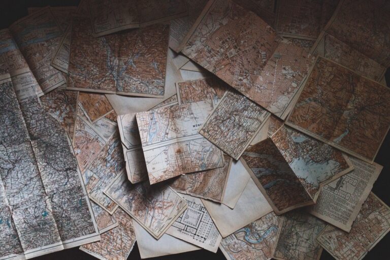
Maps aren’t just practical tools — they’re powerful storytelling devices that shape how you see the world. Every line drawn and color chosen reflects the mapmaker’s choices about what to include what to exclude and whose perspective matters most.
The intersection of art and ethics in cartography reveals fascinating tensions between aesthetic appeal and responsible representation. When cartographers blend creative expression with moral considerations they create maps that both inform and inspire while respecting the communities they represent.
Modern mapping faces unprecedented challenges as digital tools democratize cartography but also amplify the potential for both beautiful innovations and harmful misrepresentations.
Disclosure: As an Amazon Associate, this site earns from qualifying purchases. Thank you!
P.S. check out Udemy’s GIS, Mapping & Remote Sensing courses on sale here…
Decolonizing Map Projections Through Artistic Representation
Traditional map projections perpetuate colonial perspectives by centering European viewpoints and minimizing the Global South. Artists and cartographers are collaborating to create ethically-conscious alternatives that challenge these embedded biases.
Challenging Eurocentric World Views
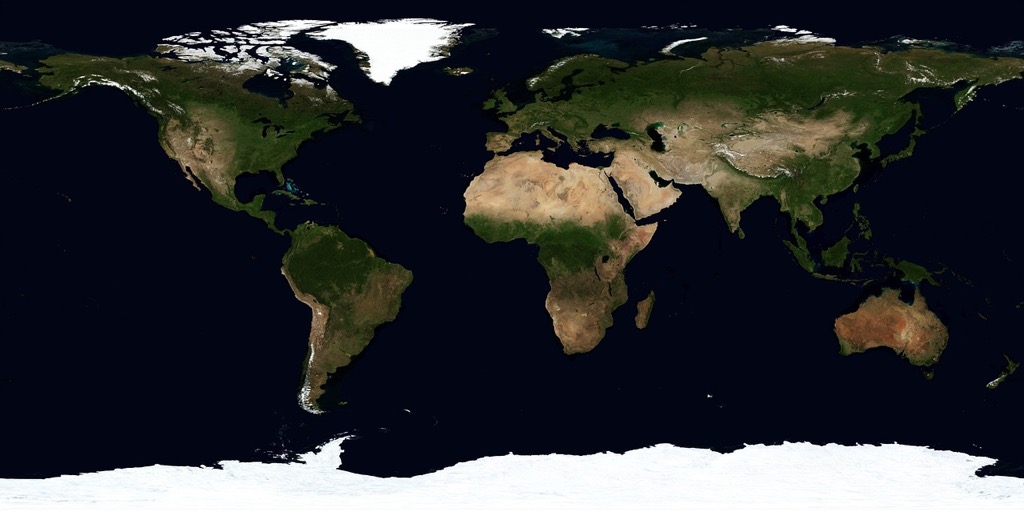
Replace the Mercator projection with equal-area alternatives like the Gall-Peters or AuthaGraph projections in your artistic maps. These projections accurately represent landmass sizes, showing Africa and South America at their true proportions rather than diminished versions. Experiment with non-Western centering points by placing the Pacific Ocean or Africa at your map’s center instead of the Greenwich Meridian. Incorporate indigenous mapping traditions and cosmologies into your visual narratives to showcase alternative spatial understandings.
Creating Inclusive Visual Narratives
Design maps that highlight underrepresented regions through color hierarchies, typography choices, and detail levels that don’t privilege Western nations. Collaborate with local communities to ensure accurate representation of place names, boundaries, and cultural significance in your cartographic artwork. Integrate multiple projection systems within single compositions to demonstrate how different mathematical approaches reveal varying truths about our world. Use artistic techniques like layering, transparency, and mixed media to question the authority of any single cartographic perspective.
Incorporating Indigenous Mapping Traditions Into Contemporary Cartography
Indigenous mapping traditions offer profound insights that can transform how you approach contemporary cartography. These knowledge systems provide alternative frameworks for understanding spatial relationships and representing cultural connections to place.
Honoring Traditional Knowledge Systems
Traditional indigenous mapping methods emphasize relationships between people, land, and spiritual elements rather than purely geometric representations. You can integrate these approaches by incorporating oral histories, seasonal migration patterns, and sacred site locations into your cartographic work. Songlines from Aboriginal Australian cultures and Inuit sea ice knowledge demonstrate how indigenous communities encode complex spatial information through storytelling and environmental observation. These systems often prioritize dynamic, time-based relationships over static boundaries, offering you valuable perspectives on representing change and movement within landscapes.
Blending Ancient Techniques With Modern Technology
Modern GIS platforms allow you to overlay traditional mapping elements with contemporary data visualization techniques. You can combine indigenous place names, traditional travel routes, and ecological knowledge with satellite imagery and digital elevation models to create multilayered representations. Participatory mapping projects using tablets and GPS devices enable indigenous communities to digitally record traditional knowledge while maintaining cultural protocols. StoryMaps and interactive web platforms provide frameworks for integrating audio recordings, traditional artwork, and contemporary mapping data into cohesive digital narratives that respect both ancient wisdom and modern technological capabilities.
Stay connected anywhere with this compact satellite communicator. Enjoy two-way messaging, interactive SOS, and TracBack routing for confident navigation. Battery lasts up to 14 days in tracking mode.

Addressing Historical Cartographic Colonialism Through Corrective Art
You can transform problematic colonial-era cartography into powerful educational tools through strategic artistic intervention. Corrective mapping projects expose systematic biases while creating visually compelling alternatives that challenge traditional geographic narratives.
Exposing Deliberate Territorial Distortions
Overlay techniques reveal how colonial maps systematically minimized indigenous territories while inflating European settlements. You’ll create powerful visual comparisons by layering pre-colonial territorial boundaries over colonial administrative maps using transparency effects. Digital annotation tools allow you to highlight specific distortions like compressed tribal lands or exaggerated colonial outposts. These artistic interventions make invisible biases visible through color-coding, scale comparisons, and side-by-side presentations that demonstrate how cartographic choices served imperial agendas rather than geographic accuracy.
Reimagining Borders and Boundaries
Fluid boundary visualization challenges rigid colonial line-drawing by representing territories as dynamic, permeable spaces. You’ll replace harsh border lines with gradient zones, seasonal migration patterns, and cultural influence areas that reflect pre-colonial spatial understanding. Mixed media approaches combine watercolor techniques with digital mapping to show overlapping jurisdictions and shared territories. This artistic method acknowledges that many indigenous societies viewed land as interconnected rather than divided, creating maps that honor traditional spatial concepts while correcting colonial oversimplifications.
Create vibrant watercolor art with this portable set. It includes 40 colors (metallic & fluorescent), a brush pen, watercolor paper, and more, all in a stylish tin box.

Promoting Environmental Justice Through Aesthetic Mapping Choices
Environmental justice mapping becomes a powerful advocacy tool when you combine accurate data with thoughtful visual design. Your aesthetic choices can amplify marginalized voices while exposing systemic inequalities.
Visualizing Climate Change Impacts on Vulnerable Communities
Climate vulnerability maps require careful visual hierarchy to highlight disproportionate impacts on marginalized populations. You’ll want to layer flood zone data with demographic information using graduated symbols rather than uniform shading. Consider time-series animations showing sea level rise progression alongside community income levels. Heat island mapping works particularly well when you contrast urban temperature data with green space availability. Use choropleth maps with carefully selected break points to avoid masking extreme vulnerability in smaller communities.
Using Color Theory to Highlight Environmental Inequalities
Color temperature psychology can effectively communicate environmental injustice patterns without overwhelming viewers. Warm colors (reds, oranges) naturally draw attention to pollution hotspots while cool blues and greens represent healthier areas. You’ll achieve stronger impact by using high contrast palettes that emphasize the disparity between affluent and disadvantaged neighborhoods. Sequential color schemes work best for pollution concentration data, while diverging palettes effectively show above/below average environmental conditions. Avoid color combinations that might exclude colorblind users—approximately 8% of men experience color vision deficiency.
Ensuring Accessibility and Inclusion in Map Design
Accessible cartographic design requires intentional choices that prioritize universal usability alongside accurate spatial representation. You’ll create more inclusive maps by addressing diverse user needs from the initial design phase rather than retrofitting accessibility features later.
Creating Maps for Diverse Abilities
Universal design principles transform your cartographic work into tools that serve users across the ability spectrum. You’ll need to implement high contrast color schemes with luminance ratios exceeding 4.5:1 for text elements while providing alternative text descriptions for all visual components. Screen reader compatibility becomes essential when you embed alternative data formats like CSV exports or tabular summaries alongside your visual maps. Consider tactile mapping elements for print versions and ensure your digital maps support keyboard navigation without requiring mouse interaction. Font sizes should remain scalable to 200% without losing functionality, and you’ll want to test your maps with assistive technologies before publication.
Representing Marginalized Communities Accurately
Accurate representation of marginalized communities demands collaborative data collection and community-verified information sources. You’ll need to move beyond census tract generalizations by incorporating community-defined boundaries and locally significant landmarks that reflect actual lived experiences. Engage directly with community organizations to verify place names, cultural sites, and demographic representations rather than relying solely on government databases. Your symbol choices should avoid stereotypical imagery while incorporating community-preferred visual elements and terminology. Consider multilingual labeling where appropriate and ensure your data sources include recent community input rather than outdated administrative records that may misrepresent current conditions.
Balancing Artistic Expression With Geographic Accuracy
You face a fundamental tension between creative vision and scientific precision when creating maps that serve both aesthetic and informational purposes. This balance requires careful consideration of how artistic choices impact data integrity and user understanding.
Maintaining Scientific Integrity While Embracing Creativity
Scientific rigor doesn’t eliminate artistic potential in your cartographic work. You can employ creative color palettes and innovative typography while maintaining accurate coordinate systems and scale relationships. Use artistic elements like textural overlays or stylized symbols that enhance rather than obscure geographic data. Implement rigorous quality control procedures to verify that creative embellishments don’t compromise spatial accuracy or mislead users about actual geographic relationships.
Establishing Ethical Guidelines for Artistic Cartographers
Explore and map the wilderness for the Queen in Cartographers! Draw unique terrain shapes and score points based on randomly selected goals each game, but beware of monster ambushes.

Clear ethical frameworks guide your creative cartographic decisions responsibly. Establish protocols that prioritize accuracy over aesthetic appeal when conflicts arise between visual impact and data integrity. Document your artistic choices and their potential impacts on user interpretation through detailed metadata. Create review processes involving both cartographic experts and community stakeholders to identify potential misrepresentations. Maintain transparency about artistic liberties taken and provide alternative views when creative interpretations might influence geographic understanding.
Conclusion
The future of ethical cartography lies in your hands as you embrace these innovative approaches that challenge traditional mapping conventions. By integrating indigenous wisdom with modern technology and prioritizing community voices you’re creating maps that serve as powerful tools for social justice and environmental advocacy.
Your commitment to accessibility and inclusion ensures that cartographic work reaches diverse audiences while maintaining scientific integrity. The artistic choices you make—from color theory to visual hierarchy—can amplify marginalized voices and expose systemic inequalities that traditional maps often overlook.
As you continue exploring the intersection of art and ethics in mapping remember that every design decision carries weight. Your maps have the potential to reshape how people understand their world while honoring the communities and landscapes they represent.
Frequently Asked Questions
What is the dual role of maps discussed in the article?
Maps serve both as practical navigation tools and powerful storytelling devices that shape how we perceive the world. They influence our understanding of geography, politics, and cultural relationships through the choices mapmakers make about what to include, exclude, or emphasize in their representations.
Why is decolonizing map projections important?
Traditional map projections often perpetuate colonial perspectives by centering European viewpoints and minimizing the Global South. Decolonizing projections involves using equal-area maps like Gall-Peters or AuthaGraph, experimenting with non-Western centering points, and incorporating indigenous mapping traditions to create more equitable world representations.
How can Indigenous mapping traditions be incorporated into modern cartography?
Indigenous traditions can be integrated through GIS platforms that blend ancient techniques with contemporary data visualization. This includes incorporating oral histories, seasonal migration patterns, sacred site locations, and traditional spatial relationships while respecting cultural protocols through participatory mapping projects.
What are corrective mapping projects?
Corrective mapping projects transform problematic colonial-era maps into educational tools through artistic interventions. They expose systematic biases by overlaying pre-colonial boundaries on colonial maps, using fluid boundary visualizations, and challenging traditional geographic narratives to reveal deliberate historical distortions.
How can maps promote environmental justice?
Maps can amplify marginalized voices by visualizing climate change impacts on vulnerable communities, using thoughtful visual hierarchy and layered data to highlight disproportionate effects. Color theory and careful design choices help communicate patterns of environmental injustice while maintaining accessibility for all users.
What makes map design accessible and inclusive?
Accessible map design requires high contrast color schemes, alternative text descriptions, screen reader compatibility, and universal design principles. It also involves collaborating with communities for accurate representation, using community-verified information sources, and avoiding stereotypical imagery while incorporating preferred visual elements.
How do you balance artistic expression with geographic accuracy in maps?
Maintain scientific integrity by ensuring artistic elements enhance rather than obscure geographic data. Establish clear ethical guidelines, prioritize accuracy over aesthetics when conflicts arise, maintain transparency in creative choices, and involve both cartographic experts and community stakeholders in the review process.