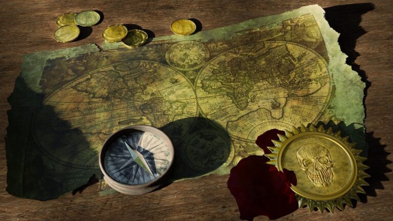
6 Best Generative Art Ideas for Digital Mapping
The big picture: You’re witnessing a revolution in mapmaking as generative art transforms traditional cartography into dynamic visual storytelling.
Why it matters: Digital artists and cartographers are now combining algorithmic creativity with geographic data to produce maps that aren’t just functional—they’re mesmerizing works of art that reveal hidden patterns in our world.
Explore and map the wilderness for the Queen in Cartographers! Draw unique terrain shapes and score points based on randomly selected goals each game, but beware of monster ambushes.

What’s next: These six innovative approaches will show you how generative art can breathe new life into everything from urban planning visualizations to abstract representations of complex spatial relationships.
Disclosure: As an Amazon Associate, this site earns from qualifying purchases. Thank you!
P.S. check out Udemy’s GIS, Mapping & Remote Sensing courses on sale here…
Create Dynamic Weather Pattern Visualizations
Generative art transforms weather data into compelling visual narratives that reveal atmospheric patterns invisible in traditional static maps. You’ll discover how algorithmic approaches can animate meteorological phenomena with unprecedented clarity and artistic appeal.
Real-Time Storm System Representations
Generate live storm visualizations using particle systems that respond to wind velocity and pressure data from weather APIs. You can create swirling animations where thousands of particles follow actual wind vectors, producing mesmerizing cyclonic patterns that update every 15 minutes. Tools like Processing or p5.js excel at rendering these dynamic systems, while NOAA’s real-time data feeds provide the atmospheric inputs your algorithms need for accurate storm tracking and intensity visualization.
Seasonal Climate Change Animations
Animate temperature gradients across geographic regions using color-shifting algorithms that morph through seasonal transitions over multi-year datasets. Your generative systems can interpolate between monthly temperature averages, creating flowing color fields that reveal warming trends and seasonal anomalies. Combine NASA’s MODIS temperature data with gradient mapping techniques to produce time-lapse visualizations spanning decades, where subtle climate shifts become dramatically apparent through algorithmic color progression and temporal smoothing functions.
Historical Weather Data Interpretations
Transform decades of weather records into abstract pattern compositions using recursive algorithms that encode precipitation, temperature, and pressure variations. You can convert historical NCEI datasets into spiral patterns where each revolution represents a year, with line thickness indicating rainfall intensity and color representing temperature fluctuations. These generative interpretations reveal cyclical weather patterns and long-term climate trends through mathematical visualization techniques that make complex meteorological data immediately comprehensible to diverse audiences.
Generate Procedural Terrain and Topographical Features
Moving beyond atmospheric phenomena, generative algorithms excel at creating realistic terrain features that form the foundation of compelling cartographic work. You’ll discover how computational methods can generate complex topographical elements that would take hours to manually design.
Achieve a flawless, even complexion with e.l.f. Flawless Satin Foundation. This lightweight, vegan formula provides medium coverage and a semi-matte finish for all-day wear, while hydrating your skin with glycerin.

Algorithmic Mountain Range Creation
Perlin noise algorithms generate realistic mountain elevations by layering multiple frequency patterns to simulate natural terrain variation. You can use tools like World Machine or Terragen to create elevation datasets with mathematically-driven peak distributions and ridge formations. These algorithms apply fractal mathematics to produce believable mountain chains with proper geological flow patterns. Diamond-square algorithms offer another approach, subdividing terrain grids recursively to build elevation maps with natural-looking ridgelines and valley systems that mirror real-world topographical relationships.
Automated River System Generation
Hydrological modeling algorithms trace water flow paths through generated elevation data to create natural river networks. You’ll find that drainage basin algorithms calculate optimal flow routes by analyzing slope gradients and accumulation patterns across your terrain mesh. Tools like GRASS GIS and ArcGIS Pro implement these watershed calculations to generate tributary systems that follow realistic branching patterns. Erosion simulation enhances river authenticity by carving valleys and adjusting elevation data based on simulated water flow over geological time periods.
Fractal-Based Coastline Development
Fractal coastline generators use recursive subdivision methods to create irregular shorelines that match natural coastal complexity at multiple scales. You can apply Lindenmayer systems (L-systems) to generate intricate bay and peninsula formations with self-similar patterns found in real coastlines. Brownian motion algorithms add realistic roughness to shoreline edges, creating the jagged detail that characterizes natural coastal boundaries. These mathematical approaches ensure your generated coastlines maintain proper fractal dimensions between 1.2 and 1.5, matching observed coastal complexity measurements.
Get reliable backup power with the Westinghouse 12500-Watt Dual Fuel Generator. It offers remote electric start and runs on either gasoline or propane, with multiple outlets including transfer switch and RV-ready options.

Design Abstract Population Density Representations
Transform demographic data into compelling visual narratives that reveal hidden patterns within urban populations. These generative approaches help you create maps that communicate complex social geography through artistic interpretation.
Particle-Based Urban Growth Simulations
Create dynamic visualizations where individual particles represent population units moving through urban spaces over time. Configure particle systems to spawn from historical settlement points and spread according to actual growth data. Adjust particle density, speed, and clustering behavior to mirror real demographic expansion patterns. Use OpenFrameworks or Processing to implement these systems, allowing particles to interact with geographic constraints like rivers or mountain ranges. The resulting animations reveal how cities develop organically while maintaining scientific accuracy in their underlying population models.
Color-Coded Demographic Flow Patterns
Develop gradient-based representations that show population movement as flowing streams of color across your map surface. Map different demographic groups to distinct color channels, creating layered visualizations where migration patterns emerge as shifting hues. Implement algorithms that blend colors based on population mixing ratios in specific geographic areas. Tools like D3.js excel at creating these smooth transitions between demographic zones. The technique transforms static census data into fluid, artistic representations that highlight social boundaries and integration patterns within urban environments.
Generative Heat Maps for City Planning
Generate temperature-style visualizations where population intensity creates organic, cloud-like patterns across urban landscapes. Use Gaussian blur algorithms to smooth demographic data points into continuous density fields that reveal neighborhood character. Implement custom color palettes that emphasize planning concerns – housing density, service accessibility, or economic activity levels. QGIS plugins like HeatMap can automate initial processing, while custom Python scripts allow fine-tuning of visual parameters. These abstract representations help planners identify underserved areas and optimal locations for new infrastructure development.
Develop Interactive Transit Network Visualizations
Transit networks present unique challenges for cartographers seeking to balance data density with visual clarity. Generative art transforms static route maps into dynamic visualizations that reveal transportation patterns invisible in traditional mapping approaches.
Animated Route Optimization Displays
You’ll create compelling route optimization displays using particle systems that visualize transit efficiency in real-time. These animations show optimal paths as flowing streams of color that adapt based on current traffic conditions and service delays.
Your generative algorithms can highlight bottlenecks using heat-mapping techniques where congested routes pulse with warmer colors. Machine learning models predict future route performance and generate alternative pathway visualizations that help transit planners identify infrastructure improvements.
Real-Time Transportation Flow Graphics
Real-time transportation flow graphics transform live GPS tracking data into mesmerizing visual streams that follow actual vehicle movements. You’ll use bezier curve generators to create smooth path animations between transit stops that respond to current passenger loads and service frequency.
Track vehicles and assets with the LandAirSea 54 GPS Tracker. Get real-time location alerts and historical playback using the SilverCloud app, with a long-lasting battery and discreet magnetic mount.

Your visualization system processes API feeds from transit agencies to generate flowing particle effects representing buses trains and light rail systems. Color-coded intensity algorithms automatically adjust brightness based on ridership density creating organic patterns that reveal peak usage corridors.
Algorithmic Public Transit Mapping
Algorithmic public transit mapping employs force-directed graph layouts to automatically position stations and routes for optimal readability. Your generative system calculates ideal spacing between transit lines using Dijkstra’s algorithm while maintaining geographic accuracy within acceptable tolerance levels.
You’ll implement automated label placement algorithms that prevent text overlap while preserving route clarity especially in dense urban transit networks. Voronoi diagrams help generate service area boundaries showing catchment zones for each station creating comprehensive coverage maps for transit planning purposes.
Produce Artistic Interpretations of Geographic Data
Geographic data contains layers of visual potential waiting to be unlocked through generative art techniques. You can transform standard cartographic elements into compelling artistic statements while maintaining their informational value.
Stylized Elevation Contour Artworks
Elevation contours become artistic masterpieces when you apply generative algorithms to their traditional linear representations. You’ll create flowing, organic patterns by using sine wave distortions that follow natural terrain rhythms while preserving elevation accuracy. Advanced noise functions like Simplex noise add subtle variations to contour thickness, creating hand-drawn aesthetics that rival traditional artistic techniques. Color gradient algorithms can transform simple brown elevation lines into rainbow spectrums or monochromatic gradients that emphasize topographic drama.
Abstract Boundary Line Compositions
Political and administrative boundaries offer rich opportunities for artistic reinterpretation through generative line art techniques. You can apply particle trail algorithms that trace boundary paths with organic, flowing movements rather than rigid geometric lines. Bezier curve generators smooth sharp political boundaries into graceful arcs while maintaining geographic accuracy within acceptable tolerances. Multi-layered boundary compositions use transparency blending and stroke weight variations to create depth, transforming flat administrative maps into dynamic visual hierarchies that communicate jurisdictional relationships through artistic expression.
Generative Color Palette Applications
Color palette generation transforms mundane geographic datasets into visually striking cartographic art through algorithmic color theory applications. You’ll use HSV color space manipulation to create harmonious palettes that respond to data values while maintaining aesthetic coherence across your entire map composition. Perceptually uniform color spaces like LAB ensure your generated palettes remain accessible to colorblind users while achieving artistic impact. Machine learning algorithms can analyze successful color combinations from master painters and apply those principles to your geographic data visualization.
Build Responsive Environmental Impact Maps
You’ll create compelling environmental narratives by transforming raw ecological data into dynamic visual stories that reveal the urgency of environmental challenges.
Pollution Distribution Visualizations
Transform air quality sensor networks into flowing particle systems that animate pollution plumes across urban landscapes. Generate color-coded contamination clouds using real-time EPA data streams, where particle density reflects pollutant concentration levels. Implement temporal layering techniques to show pollution buildup throughout daily cycles, revealing industrial emission patterns and traffic-related air quality degradation. Use gradient mapping algorithms to create smooth transitions between clean and contaminated zones, making invisible environmental threats visually comprehensible for policy makers and citizens.
Deforestation Progress Tracking
Create animated forest loss visualizations using satellite imagery time-series data from NASA’s Global Forest Change dataset. Generate algorithmic tree canopy representations that dissolve progressively as deforestation advances, using particle decay systems to simulate vegetation loss. Implement color-shifting gradients that transition from vibrant greens to barren browns, emphasizing ecological transformation over time. Apply edge detection algorithms to highlight clear-cut boundaries and illegal logging patterns, transforming complex satellite data into emotionally impactful visual narratives that communicate environmental destruction effectively.
Ocean Current Pattern Displays
Generate flowing current visualizations using NOAA’s oceanographic datasets, creating particle trail systems that follow actual water movement patterns. Implement velocity-based color coding where warm colors represent faster currents and cool tones indicate slower flows. Use sine wave distortions to animate surface currents while maintaining scientific accuracy of directional flow data. Apply temporal cycling algorithms to show seasonal current variations, revealing how climate patterns affect global ocean circulation and marine ecosystem health through captivating generative animations.
Conclusion
These six generative art approaches offer you powerful tools to revolutionize your cartographic work. You’ll discover that combining algorithmic creativity with geographic data creates maps that aren’t just functional—they’re compelling visual narratives that engage viewers on multiple levels.
Your maps can now communicate complex information through dynamic visualizations that traditional static approaches simply can’t match. Whether you’re tracking environmental changes or optimizing urban transit systems you’ll find these techniques transform raw data into meaningful insights.
The future of cartography lies in this intersection of art and science. By embracing generative techniques you’re not just creating better maps—you’re participating in a fundamental shift toward more intuitive and impactful geographic communication.
Frequently Asked Questions
What is generative art in mapmaking?
Generative art in mapmaking is a revolutionary approach that combines digital art techniques with traditional cartography. It uses algorithms and computational methods to create visually stunning maps that go beyond basic functionality. This collaboration between digital artists and cartographers produces dynamic visualizations that reveal hidden geographic patterns and transform static data into compelling visual narratives.
How does generative art enhance weather visualization on maps?
Generative art creates dynamic weather pattern visualizations using particle systems and real-time meteorological data. It can animate storm systems, show seasonal climate changes through color-shifting algorithms, and transform historical weather data into abstract patterns. These techniques make complex atmospheric phenomena visible and accessible, revealing weather dynamics that static maps cannot capture.
What are procedural terrain generation techniques?
Procedural terrain generation uses algorithms like Perlin noise to create realistic landscapes and topographical features. These techniques include automated mountain range creation, river system generation through hydrological modeling, and fractal-based coastline development. These computational methods ensure maps accurately reflect real-world geography while enhancing visual appeal through mathematically-generated natural features.
How can generative art visualize population density?
Generative art transforms demographic data into visual narratives using particle-based urban growth simulations and color-coded flow patterns. It creates generative heat maps using Gaussian blur algorithms for city planning, helping identify underserved areas and optimal infrastructure locations. These techniques reveal hidden patterns in urban populations and enhance urban planning efforts.
What makes transit network visualization more effective with generative art?
Generative art transforms static route maps into dynamic visualizations using animated route optimization displays and real-time transportation flow graphics. It employs particle systems, heat-mapping techniques, and machine learning models to show transit efficiency. Force-directed graph layouts and automated label placement algorithms improve readability in dense urban transit networks.
How does generative art interpret geographic data artistically?
Generative art transforms elevation contours into organic patterns using sine wave distortions while preserving accuracy. It reinterprets political boundaries through particle trail algorithms and Bezier curves, creating dynamic visual hierarchies. Algorithmic color theory generates harmonious palettes that enhance aesthetic impact while ensuring accessibility for colorblind users.
Can generative art help visualize environmental impact?
Yes, generative art creates responsive environmental impact maps that transform ecological data into dynamic visual stories. It animates pollution distribution using real-time EPA data, tracks deforestation progress through satellite imagery, and displays ocean current patterns using NOAA datasets. These visualizations highlight urgent environmental challenges and reveal contamination patterns effectively.