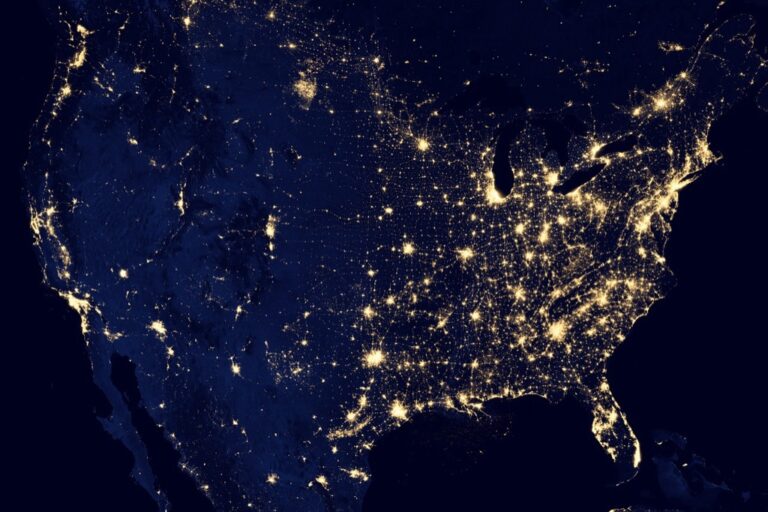
6 Map Generalization Techniques That Transform Digital Maps
Why it matters: When you’re working with complex geographic datasets, too much detail can overwhelm your maps and slow down performance. Map generalization techniques help you strike the perfect balance between visual clarity and data accuracy.
The big picture: These six proven methods let you reduce data complexity without losing the essential information your audience needs. You’ll discover how to transform cluttered, hard-to-read maps into clean visualizations that communicate effectively across different scales and platforms.
What’s ahead: From simplifying coastlines to aggregating point clusters, these techniques will transform how you approach cartographic design and data management.
Disclosure: As an Amazon Associate, this site earns from qualifying purchases. Thank you!
P.S. check out Udemy’s GIS, Mapping & Remote Sensing courses on sale here…
Simplification: Removing Unnecessary Detail While Preserving Essential Features
Simplification forms the backbone of effective map generalization by strategically removing extraneous detail while maintaining the geographic integrity of your data. You’ll find this technique essential when working with high-resolution datasets that contain more points than necessary for your intended map scale.
Point Reduction Algorithms
Douglas-Peucker algorithm remains the gold standard for simplifying linear features by removing redundant vertices based on distance thresholds. You can implement this through QGIS’s “Simplify” tool or ArcGIS’s “Simplify Line” function, typically reducing point counts by 60-80% while preserving critical shape characteristics. Visvalingam-Whyatt algorithm offers superior results for curved features by considering triangle areas rather than perpendicular distances, making it ideal for coastlines and natural boundaries.
Line Smoothing Methods
Gaussian smoothing eliminates angular artifacts in your linear features by applying weighted averaging algorithms that preserve overall geometry while reducing jagged edges. You’ll achieve optimal results using GRASS GIS’s v.generalize command with smoothing parameters between 10-50 meters depending on your data scale. Spline interpolation creates flowing curves from segmented lines, particularly effective for transportation networks and hydrographic features where natural flow patterns matter more than precise geometric accuracy.
Polygon Boundary Refinement
Boundary simplification reduces polygon complexity by removing unnecessary vertices while maintaining area relationships and topological integrity through tools like PostGIS’s ST_Simplify function. You should apply shape-preserving algorithms that consider polygon area-to-perimeter ratios, ensuring small but significant features aren’t eliminated during generalization. Multi-resolution hierarchies allow you to maintain detailed boundaries at multiple scales simultaneously, enabling dynamic simplification based on zoom levels in web mapping applications.
Aggregation: Combining Similar Features Into Unified Elements
Aggregation transforms cluttered geographic datasets by merging nearby features with shared characteristics. This technique reduces visual complexity while maintaining spatial relationships essential for effective cartographic communication.
Spatial Clustering Techniques
Density-based clustering algorithms like DBSCAN identify natural groupings within your point datasets. You’ll find k-means clustering particularly effective for creating uniform distribution patterns across administrative regions. Buffer-based aggregation works well when you’re combining facilities within specific distance thresholds, such as merging hospitals within 5-kilometer zones. Voronoi tessellation helps you create service area boundaries when aggregating retail locations or emergency services into coherent coverage zones.
Attribute-Based Grouping
Statistical classification methods enable you to merge features sharing similar attribute values or ranges. You can group census tracts by income brackets using natural breaks or equal interval classification schemes. Land use categories often benefit from reclassification where you combine residential subcategories into broader housing zones. Population density aggregation works effectively when you merge administrative units with similar demographic characteristics, creating meaningful regional patterns for analysis and visualization.
Administrative Boundary Consolidation
Hierarchical boundary merging streamlines complex administrative datasets by combining lower-level units into higher administrative tiers. You’ll achieve cleaner visualizations by dissolving county boundaries into state-level representations for national-scale maps. School district consolidation reduces overlapping jurisdictions while preserving essential service delivery information. Municipal boundary aggregation proves valuable when creating regional planning maps where individual city limits create unnecessary visual fragmentation across metropolitan areas.
Displacement: Repositioning Features to Avoid Visual Conflicts
Displacement resolves overlapping map elements by strategically repositioning features while maintaining their spatial relationships. You’ll apply this technique when symbols crowd together or linear features create visual confusion that obscures critical geographic information.
Symbol Displacement Strategies
Symbol displacement prevents overlapping labels and icons through systematic repositioning algorithms. You can implement radial displacement patterns that move symbols outward from congested areas while preserving relative positions. Priority-based displacement ranks features by importance, ensuring critical elements like hospitals or fire stations remain prominently visible. Advanced GIS software like ArcGIS Pro offers automated displacement tools that calculate optimal positions using conflict detection algorithms, maintaining symbol legibility across different map scales.
Linear Feature Adjustment
Linear Feature Adjustment repositions roads, rivers, and boundaries to eliminate visual conflicts without distorting geographic accuracy. You’ll apply perpendicular offset techniques that shift parallel features like highways and railways apart by predetermined distances. Curve smoothing algorithms can adjust meandering features to create visual separation while preserving essential directional flow. QGIS and MapInfo provide displacement tools that automatically detect line conflicts and suggest repositioning solutions based on feature hierarchy and cartographic standards.
Point Feature Relocation
Point Feature Relocation moves clustered symbols to nearby positions while maintaining spatial context and reference accuracy. You can establish displacement zones around high-density areas, relocating less critical points to secondary positions within acceptable proximity thresholds. Automated tools like FME’s PointCloudDisplacer calculate optimal relocation distances based on symbol size and map scale requirements. Manual displacement techniques allow precise control over feature positioning, ensuring relocated points don’t interfere with other map elements or cross administrative boundaries.
Selection: Choosing Only the Most Important Features for Display
Selection determines which geographic features remain visible on your map based on their significance to your cartographic purpose. This technique reduces visual clutter by eliminating less critical elements while preserving essential spatial information.
Importance-Based Filtering
Hierarchy-based selection ranks features by their functional importance to your map’s purpose. You’ll prioritize major highways over residential streets, primary cities over small towns, and significant landmarks over minor points of interest. Commercial GIS software like ArcGIS Pro provides attribute-based selection tools that automatically filter features using predefined importance rankings. This approach ensures your most critical geographic elements remain visible while secondary features disappear at broader scales.
Scale-Dependent Feature Selection
Scale thresholds control feature visibility based on zoom levels to maintain map readability across different viewing distances. You’ll establish minimum scale denominators where specific feature classes become visible – displaying individual buildings only below 1:5,000 scale while showing city boundaries at 1:100,000 scale. Modern web mapping libraries like Leaflet and Mapbox GL JS implement scale-dependent styling through zoom-based layer controls, automatically hiding detailed features as users zoom out.
Thematic Relevance Criteria
Purpose-driven selection filters features based on their relevance to your map’s specific theme or analytical objective. You’ll include only transportation networks for transit maps, hydrographic features for watershed analysis, or demographic boundaries for population studies. QGIS expression filters and ArcGIS definition queries enable automated feature selection using attribute values that match your thematic criteria. This targeted approach eliminates irrelevant geographic data that might distract from your map’s primary message.
Symbolization: Adapting Visual Representation for Scale and Purpose
Symbolization transforms how geographic features appear on your map by adjusting visual elements to match viewing scale and analytical objectives. This technique ensures your map remains readable and purposeful across different zoom levels.
Symbol Size Optimization
Optimize symbol sizes by establishing hierarchical scaling relationships that maintain visual balance across zoom levels. You’ll create size categories based on feature importance, using proportional scaling algorithms that prevent symbol overcrowding. Size optimization tools in ArcGIS Pro and QGIS automatically adjust point symbols based on map scale, ensuring critical features remain visible while secondary elements scale appropriately without overwhelming your visualization.
Color Scheme Adjustment
Adjust color schemes by reducing palette complexity and enhancing contrast ratios for improved readability at smaller scales. You’ll consolidate similar hues into broader color categories while maintaining semantic meaning through strategic color mapping. Modern cartographic standards recommend limiting color palettes to 5-7 distinct hues for optimal visual hierarchy, with tools like ColorBrewer providing scientifically-tested combinations that work across different viewing conditions and accessibility requirements.
Pattern Simplification
Simplify fill patterns by reducing texture complexity and increasing pattern spacing to prevent visual noise at reduced scales. You’ll replace intricate hatching with broader geometric patterns while maintaining categorical distinctions through strategic pattern selection. Pattern libraries in professional GIS software offer scale-dependent rendering options that automatically adjust line weights and spacing intervals, ensuring your map symbols remain distinguishable without creating visual clutter across different zoom levels.
Classification: Grouping Data Into Meaningful Categories
Classification organizes geographic features into logical groups that reduce visual complexity while preserving analytical value. You’ll create meaningful data categories that support your map’s primary objectives.
Hierarchical Classification Systems
Hierarchical systems organize geographic features into nested categories based on administrative or functional relationships. You can structure municipal boundaries from county to state level, creating clear visual hierarchies that display appropriately at different zoom levels. Administrative classification trees work effectively for government datasets, while functional hierarchies suit infrastructure mapping projects like transportation networks where highways, arterials, and local roads form distinct classification levels.
Statistical Grouping Methods
Statistical methods group features using quantitative attributes through techniques like natural breaks, quantiles, and standard deviations. You’ll apply Jenks natural breaks optimization to identify logical breakpoints in population density data, while equal interval classification works well for temperature or elevation datasets. K-means clustering algorithms automatically group point features based on spatial proximity and attribute similarity, reducing dataset complexity while maintaining statistical relationships between geographic elements.
Semantic Category Organization
Semantic organization groups features by thematic meaning and functional purpose rather than statistical properties. You can classify land use categories into residential, commercial, and industrial zones that align with planning objectives, or organize points of interest into tourism, services, and emergency facilities. Ontological frameworks help maintain consistent classification schemes across multiple datasets, ensuring your categorical groupings support clear visual communication and analytical workflows.
Conclusion
Mastering these six map generalization techniques will transform your ability to create compelling and functional geographic visualizations. You’ll find that combining simplification with aggregation produces the cleanest results while displacement and selection techniques ensure your most important features remain prominent.
Remember that effective map generalization isn’t about applying every technique simultaneously. Instead focus on selecting the right combination based on your specific dataset and visualization goals. Start with simplification for basic data reduction then layer in symbolization and classification adjustments as needed.
Your mapping projects will benefit significantly from implementing these proven strategies. With practice you’ll develop an intuitive sense for which techniques work best together creating maps that communicate clearly without sacrificing essential geographic information.
Frequently Asked Questions
What is map generalization and why is it important?
Map generalization is the process of reducing data complexity in geographic datasets while maintaining essential information and visual clarity. It’s crucial for creating effective maps that don’t overwhelm viewers with unnecessary detail and ensure optimal performance. This technique helps balance data accuracy with readability, making maps more useful for analysis and decision-making.
What are the main techniques used in map generalization?
The six main map generalization techniques are simplification, aggregation, displacement, selection, symbolization, and classification. Each method serves a specific purpose: simplification removes unnecessary detail, aggregation merges similar features, displacement resolves overlapping elements, selection determines feature visibility, symbolization adjusts visual appearance, and classification organizes features into meaningful categories.
How does the Douglas-Peucker algorithm work for line simplification?
The Douglas-Peucker algorithm simplifies linear features by identifying and removing points that don’t significantly contribute to the overall shape. It works by finding the point with the greatest distance from a straight line between endpoints, then recursively applying this process to segments. This method is considered the gold standard for simplifying coastlines, roads, and other linear geographic features.
What is spatial clustering and how does it help with map visualization?
Spatial clustering groups nearby geographic features with similar characteristics to reduce visual complexity. Techniques like DBSCAN and k-means clustering identify natural groupings in data, allowing mapmakers to represent multiple features as single symbols or merged areas. This approach maintains essential spatial relationships while creating cleaner, more readable visualizations.
When should displacement techniques be used in cartography?
Displacement techniques should be used when map elements overlap and create visual conflicts that hinder readability. These methods strategically reposition features like labels, symbols, and linear elements while maintaining their spatial relationships. Displacement is particularly useful at smaller scales where maintaining exact geographic positions would result in cluttered, unreadable maps.
How do selection techniques improve map effectiveness?
Selection techniques improve map effectiveness by determining which features remain visible based on their importance, scale appropriateness, and thematic relevance. This process ensures that critical elements are prioritized while less important features are filtered out at inappropriate zoom levels. The result is a more focused, readable map that serves its intended analytical purpose.
What role does symbolization play in map generalization?
Symbolization transforms how geographic features appear by adjusting visual elements like size, color, and patterns to match viewing scale and objectives. It establishes hierarchical scaling relationships, optimizes color schemes for better contrast, and simplifies patterns to prevent visual noise. Proper symbolization ensures features remain distinguishable and meaningful across different zoom levels.
How does classification help organize geographic data on maps?
Classification organizes geographic features into meaningful categories that reduce visual complexity while preserving analytical value. It uses hierarchical systems, statistical grouping methods, and semantic organization to structure data logically. This approach helps viewers understand spatial patterns and relationships more easily while maintaining the map’s analytical integrity.