7 Best Temporal Data Visualization Techniques
The big picture: You’re sitting on mountains of temporal data but struggling to make it tell compelling visual stories that actually drive decisions.
Why it matters: Creative overlay techniques can transform confusing time-based datasets into clear actionable insights that reveal patterns trends and anomalies your stakeholders need to see.
What’s next: These seven innovative overlay approaches will help you unlock your temporal data’s potential and create visualizations that don’t just look impressiveâthey deliver real business value.
Disclosure: As an Amazon Associate, this site earns from qualifying purchases. Thank you!
P.S. check out Udemy’s GIS, Mapping & Remote Sensing courses on sale here…
Use Animated Heat Maps to Show Seasonal Patterns
Animated heat maps transform static temporal data into dynamic visual narratives that reveal seasonal patterns with remarkable clarity. You’ll discover how motion-based overlays can expose cyclical trends that traditional static visualizations often miss.
Track Temperature Changes Throughout the Year
Temperature heat maps reveal geographic climate patterns through animated color gradients that shift across months. You can overlay temperature data on regional maps to show how seasonal changes affect different areas at varying intensities. Weather stations provide hourly data that creates smooth transitions between hot and cold periods. Agricultural researchers use these animations to identify frost zones and growing seasons. Urban planners leverage temperature overlays to understand heat island effects and plan cooling strategies for metropolitan areas.
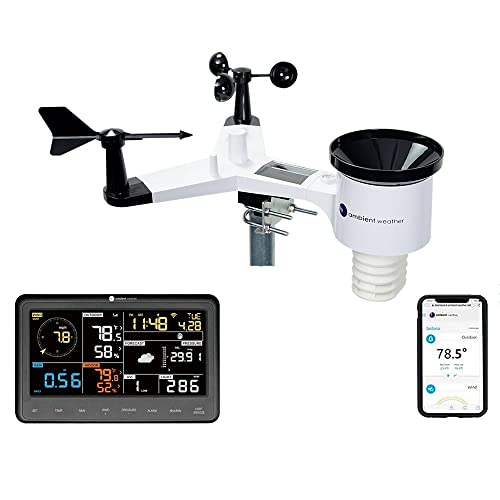
Get real-time weather data with the Ambient Weather WS-2902. This WiFi-enabled station measures wind, temperature, humidity, rainfall, UV, and solar radiation, plus it connects to smart home devices and the Ambient Weather Network.
Visualize Website Traffic Fluctuations
Traffic heat maps display user engagement patterns through animated overlays that highlight peak activity periods. You can track visitor behavior across different time zones and seasonal shopping cycles using color-coded intensity maps. E-commerce sites benefit from animated overlays showing holiday spikes and weekend lulls in real-time data streams. Marketing teams use these visualizations to optimize campaign timing and resource allocation. Server load animations help IT departments anticipate infrastructure needs during high-traffic seasons like Black Friday or back-to-school periods.
Monitor Disease Outbreak Spreads Over Time
Epidemiological heat maps track pathogen transmission through animated geographic overlays that show infection density changes. You can visualize how diseases spread across regions using time-stamped health data and population density matrices. Public health officials use animated outbreak maps to identify transmission corridors and implement targeted containment strategies. Hospital systems leverage these overlays to predict resource demands and staff allocation during epidemic seasons. Vaccination campaign planners use animated disease maps to prioritize high-risk geographic areas and track immunization effectiveness over time.
Create Interactive Timeline Overlays for Historical Events
Building on the temporal visualization techniques we’ve explored, interactive timeline overlays transform static historical maps into dynamic storytelling tools. You’ll create layered experiences that allow users to navigate through centuries of change with precision controls.
Explore history's most significant maps with *Great Maps*. This book delves into cartographic masterpieces and their historical context.
Layer Multiple Historical Periods on Single Maps
You can overlay distinct historical eras using semi-transparent polygon layers with time-slider controls. Configure your GIS software to display Roman territories alongside medieval kingdoms and modern borders simultaneously. Use color-coded transparency settings between 30-60% opacity to maintain visual hierarchy while preventing data occlusion. This technique works exceptionally well for archaeological sites where you’re comparing settlement patterns across Bronze Age, Iron Age, and Roman periods on identical geographic foundations.
Achieve a flawless, even complexion with e.l.f. Flawless Satin Foundation. This lightweight, vegan formula provides medium coverage and a semi-matte finish for all-day wear, while hydrating your skin with glycerin.
Show Political Boundary Changes Over Decades
You’ll implement temporal boundary datasets using vector time series that capture administrative changes at 5-10 year intervals. Load historical boundary shapefiles into your mapping platform and configure timeline controls to animate border shifts during major political events. Focus on specific regions like Eastern Europe (1900-2000) or the Middle East (1920-present) where frequent boundary changes create compelling visual narratives. Use distinct stroke weights and colors to differentiate between disputed territories, occupied zones, and internationally recognized borders.
Demonstrate Urban Development Through Time
You can visualize city growth patterns by layering building footprint data, transportation networks, and population density grids across temporal intervals. Import historical aerial imagery or satellite data as base layers, then overlay vector datasets showing infrastructure development at 10-20 year intervals. Configure your timeline interface to display urban sprawl metrics, green space changes, and transportation corridor evolution simultaneously. This approach proves invaluable for urban planners analyzing development patterns in rapidly growing metropolitan areas like Phoenix or Austin.
Implement Sliding Time Controls for Real-Time Data
Real-time temporal data requires dynamic controls that allow users to scrub through time intervals seamlessly. You’ll create more engaging experiences by implementing sliding time controls that update overlays instantly as users navigate through different time periods.
Display Stock Market Movements Hour by Hour
Stock market overlays benefit from hour-by-hour time controls that reveal intraday trading patterns across different market sectors. You can layer price movements, volume indicators, and volatility measures using semi-transparent color gradients that respond to slider adjustments. Financial analysts use these controls to identify support and resistance levels during specific trading hours, particularly around market open and close periods when volatility typically peaks.
Monitor Social Media Activity During Events
Social media monitoring overlays capture engagement spikes and sentiment shifts throughout major events using real-time sliding controls. You’ll implement location-based data points that change color intensity based on posting frequency, retweet rates, and hashtag usage during specific time windows. Event organizers and marketers rely on these temporal controls to track audience response patterns, identifying peak engagement moments and geographic hotspots of social activity.
Track Weather Pattern Progressions
Weather pattern overlays utilize sliding time controls to display atmospheric changes across multiple forecast models and observation periods. You can layer precipitation intensity, wind direction vectors, and temperature gradients that update smoothly as users navigate through hourly or daily intervals. Meteorologists and emergency planners use these controls to compare predicted versus actual weather progression, particularly for tracking storm systems and identifying areas requiring weather warnings.
Design Comparative Before-and-After Visualizations
Comparative overlays transform temporal data into powerful storytelling tools that highlight dramatic changes across time periods. You’ll create compelling narratives by strategically layering past and present datasets to reveal transformation patterns.
Showcase Environmental Changes Over Years
You’ll capture deforestation impacts by overlaying satellite imagery from different decades using semi-transparent layers set to 60% opacity. Forest cover datasets from USGS Earth Explorer provide accurate temporal comparisons for Amazon rainforest monitoring projects. Layer glacial retreat data from NASA’s Global Climate Change program to visualize Arctic ice loss patterns. You can implement dual-timeline controls that allow viewers to slide between 1990 and 2020 imagery, revealing stark environmental transformations that drive conservation efforts.
Compare Population Demographics Across Decades
You’ll visualize demographic shifts by creating choropleth overlays using Census Bureau data from multiple decades with diverging color schemes. Layer population density maps from 1980, 2000, and 2020 to reveal urban migration patterns in metropolitan areas like Phoenix and Austin. Implement graduated symbol overlays for age distribution changes, using circle sizes to represent population groups. You can add interactive hover tooltips displaying percentage changes between time periods, helping urban planners identify gentrification trends and housing demand patterns.
Illustrate Infrastructure Development Projects
You’ll document construction progress by overlaying building footprint data from municipal GIS databases at quarterly intervals throughout project timelines. Transportation network datasets from OpenStreetMap reveal highway expansion impacts on surrounding communities over 5-10 year periods. Layer utility infrastructure data including power lines, water systems, and telecommunications networks to show comprehensive development patterns. You can create time-stamped polygon overlays with construction milestone markers, enabling stakeholders to track billion-dollar infrastructure investments and their community impacts.
Build Multi-Layer Temporal Dashboards
Multi-layer temporal dashboards transform complex time-series data into comprehensive visual narratives that reveal interconnected patterns across multiple datasets. You’ll create powerful analytical tools by combining various temporal overlays into unified dashboard environments.
Stack Economic Indicators by Time Periods
Stack unemployment rates, GDP growth, and inflation data using synchronized time axes to reveal economic correlations. You’ll layer these indicators with transparent overlays, allowing pattern recognition across different economic cycles. Configure your dashboard with quarterly data views, enabling analysts to identify leading indicators that predict market downturns or recovery periods through visual correlation analysis.
Improve reading focus and comfort with these colored overlays. This pack includes 20 sheets in 7 colors to reduce visual stress and aid readers of all ages.
Combine Multiple Data Sources in Single View
Combine weather data, agricultural yields, and commodity prices within single dashboard views to create comprehensive analytical environments. You’ll integrate APIs from NOAA, USDA, and financial markets using consistent temporal formatting. This approach reveals causation patterns between climate events and market fluctuations, particularly valuable for agricultural commodity traders and supply chain managers tracking seasonal impacts.
Create Customizable Time Range Filters
Create dynamic time range selectors that allow users to focus on specific periods while maintaining context from broader temporal patterns. You’ll implement slider controls with preset options like “last 30 days,” “quarterly,” and “year-over-year” comparisons. These filters enable stakeholders to drill down from decade-long trends to daily fluctuations, supporting both strategic planning and operational decision-making across different organizational levels.
Develop Story-Driven Data Narratives
Transform your temporal data overlays into compelling visual stories that guide stakeholders through complex information patterns. Story-driven narratives turn abstract data points into meaningful insights that drive decision-making.
Guide Users Through Sequential Data Points
Structure your temporal overlays with logical progression markers that highlight key moments in your dataset. Create breadcrumb navigation systems that show users their current position within the temporal sequence while maintaining context from previous data points.
Implement annotation callouts that appear automatically as users navigate through time periods. These contextual explanations help viewers understand significant changes or anomalies without overwhelming the visual display with permanent text overlays.
Design progressive disclosure controls that reveal additional data layers as users advance through the timeline. This approach prevents cognitive overload while ensuring comprehensive coverage of your temporal dataset’s most important elements.
Create Guided Tours of Temporal Changes
Develop automated playback sequences that highlight dramatic transformations in your data over specific time intervals. Set optimal viewing speeds that allow users to absorb changes without losing important transitional details between data points.
Configure pause points at critical moments where significant events occurred in your temporal dataset. These strategic stops give users time to examine specific changes before continuing through the automated sequence.
Include voice-over explanations or text overlays that provide context during automated tours. This narration helps users understand the significance of what they’re observing while maintaining focus on the visual elements.
Build Interactive Data Storytelling Experiences
Incorporate decision points where users choose which temporal path to explore next based on their specific interests or research questions. This branching approach creates personalized experiences that increase engagement and comprehension.
Add interactive hotspots that reveal detailed information when users hover over or click specific areas of your temporal visualization. These elements provide depth without cluttering the main display.
Enable comparison modes where users can select multiple time periods simultaneously to examine side-by-side changes. This functionality supports analytical thinking and helps users identify patterns that might be missed in sequential viewing.
Incorporate Predictive Overlay Elements
Predictive overlays bridge the gap between historical patterns and future possibilities, transforming your temporal visualizations into forward-looking analytical tools.
Show Forecasted Trends Alongside Historical Data
Overlay forecasted data using distinct visual styling that clearly separates predictions from historical facts. Apply dashed lines or transparent fills to distinguish future projections while maintaining consistent color schemes. Layer regression models, seasonal decomposition forecasts, and machine learning predictions directly onto your existing temporal displays. Include confidence bands that gradually widen as projections extend further into the future, helping users understand prediction reliability across different time horizons.
Display Confidence Intervals for Future Projections
Visualize uncertainty levels through graduated transparency bands or error bars that expand with temporal distance. Implement color-coded confidence zones using green for high confidence, yellow for moderate, and red for low-confidence predictions. Stack multiple forecast scenarios as semi-transparent overlays, allowing users to compare optimistic, pessimistic, and most-likely outcomes simultaneously. Include statistical confidence percentages in hover tooltips or legend elements to provide quantitative context for decision-makers evaluating risk levels.
Compare Actual Results with Predicted Outcomes
Layer actual outcomes over previous predictions using contrasting visual elements that highlight accuracy patterns. Implement side-by-side timeline views showing predicted versus actual values with difference calculations displayed as percentage variances. Create dynamic overlays that automatically update as new data arrives, maintaining historical prediction accuracy records for model validation. Include interactive controls allowing users to toggle between different forecasting models and their respective performance metrics across various time periods.
Conclusion
These seven overlay techniques give you the power to transform your temporal data from static displays into dynamic storytelling tools. You’ll find that each approach serves different analytical needs while maintaining the flexibility to combine multiple methods for comprehensive insights.
Your organization’s temporal data holds incredible value when visualized effectively. By implementing these creative overlay strategies you’ll help stakeholders identify patterns trends and opportunities that traditional charts simply can’t reveal.
Start with one technique that aligns with your current data visualization needs then gradually expand your toolkit. You’ll discover that these overlay methods not only improve data comprehension but also drive more informed decision-making across your entire organization.
Frequently Asked Questions
What are temporal data overlays and why are they important?
Temporal data overlays are visualization techniques that layer time-based information to reveal patterns, trends, and changes over time. They’re crucial because they transform complex datasets into clear visual stories that help stakeholders make informed decisions. These overlays unlock hidden insights in temporal data that static visualizations often miss, providing significant business value beyond basic aesthetics.
How do animated heat maps improve data visualization?
Animated heat maps reveal seasonal patterns and cyclical trends that static visualizations typically miss. They show changes over time through dynamic color coding, making it easier to spot temperature variations, website traffic peaks, disease outbreak patterns, and other time-sensitive data. This animation helps users quickly identify critical periods and understand temporal relationships in complex datasets.
What are interactive timeline overlays and how do they work?
Interactive timeline overlays transform static maps into dynamic storytelling tools by allowing users to navigate through different time periods. They use semi-transparent layers and time-slider controls to show historical changes, political boundary shifts, urban development, and archaeological patterns. Users can seamlessly move through centuries of data to compare different periods and understand evolution over time.
How do sliding time controls enhance real-time data visualization?
Sliding time controls provide seamless navigation through time intervals, making real-time data more engaging and accessible. They’re particularly effective for stock market analysis, social media monitoring, and weather tracking. These controls allow users to explore hour-by-hour changes, identify patterns during specific events, and track atmospheric changes, helping professionals make timely decisions.
What are comparative overlays and when should they be used?
Comparative overlays layer past and present datasets to reveal dramatic transformations over time. They’re ideal for showing environmental changes like deforestation, demographic shifts in urban areas, and infrastructure development impacts. By using dual-timeline controls, viewers can easily slide between different time periods to understand the magnitude and nature of changes.
How do multi-layer temporal dashboards provide comprehensive insights?
Multi-layer temporal dashboards combine multiple time-series datasets into unified visual narratives, revealing interconnected patterns across different data sources. They stack related indicators like economic data, weather patterns, and agricultural yields using synchronized time axes. This approach helps users discover correlations and create comprehensive analytical environments for better decision-making.
What makes story-driven data narratives effective for temporal visualization?
Story-driven data narratives guide stakeholders through complex temporal information using logical progression markers, annotation callouts, and automated playback sequences. They incorporate interactive elements like decision points and comparison modes to create personalized viewing experiences. This approach transforms raw data into compelling visual stories that enhance understanding without overwhelming users.
How do predictive overlay elements enhance temporal visualizations?
Predictive overlays bridge historical patterns with future possibilities by layering forecasted trends alongside actual data using distinct visual styles. They incorporate uncertainty levels through confidence intervals and transparency bands, allowing users to compare multiple scenarios. These elements transform temporal visualizations into forward-looking analytical tools that support strategic planning and decision-making.


