7 Best Map Design Techniques for Impact
Why it matters: Traditional map hierarchies follow predictable patterns that can make your visualizations blend into the background noise of conventional design.
The big picture: Breaking away from standard cartographic conventions opens up powerful opportunities to guide viewer attention exactly where you need it most.
What’s next: These seven unconventional approaches will transform how you think about organizing visual elements and creating compelling map narratives that actually get noticed.
Disclosure: As an Amazon Associate, this site earns from qualifying purchases. Thank you!
P.S. check out Udemy’s GIS, Mapping & Remote Sensing courses on sale here…
Use Color Temperature to Guide Attention Instead of Traditional Color Coding
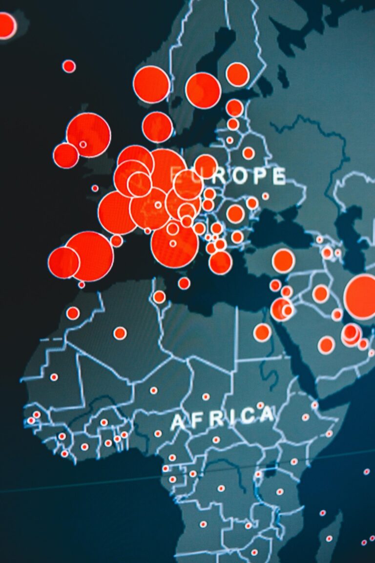
Color temperature creates intuitive visual pathways that guide viewers through your map without relying on conventional categorical colors. This approach leverages psychological responses to warm and cool tones, establishing clear information hierarchies that feel natural to interpret.
Implement Warm Colors for Primary Focus Areas
Apply reds, oranges, and yellows to highlight your map’s most critical features. Warm colors naturally advance toward viewers, making primary roads, key landmarks, or main geographic features immediately stand out. Set your primary data layers to temperatures between 2700K-3500K using RGB values that emphasize red and yellow channels. This technique works especially well for navigation routes, population centers, or emergency response zones where immediate attention is essential.
Apply Cool Colors for Secondary Information Layers
Use blues, greens, and purples for supporting elements that provide context without competing for attention. Cool colors recede visually, making them perfect for background terrain, water bodies, or supplementary data overlays. Configure secondary layers with temperatures between 5000K-7000K, emphasizing blue and cyan channels in your color palette. This creates depth while maintaining readability of less critical information like administrative boundaries, elevation contours, or reference grids.
Employ Typography Weight Variations as Navigation Cues
Typography weight creates natural reading patterns that guide your viewers through map information systematically. Strategic font weight variations establish clear information hierarchies without relying on color differences alone.
Create Bold Headers for Major Geographic Features
Bold typefaces draw immediate attention to primary geographic elements like mountain ranges, rivers, and city names. Use weights between 600-800 for state names, major highways, and prominent landmarks to ensure they dominate the visual hierarchy. This approach works particularly well when you’re mapping large-scale features that serve as primary navigation anchors. Reserve your heaviest weights (800-900) for critical wayfinding elements like interstate numbers or major metropolitan areas that viewers need to locate quickly.
Use Light Text Weights for Supporting Details
Light typography weights (200-400) effectively communicate secondary information without overwhelming your primary navigation elements. Apply these lighter weights to street names, elevation markers, and supplementary geographic details that provide context rather than primary wayfinding. This creates visual breathing room while maintaining readability at appropriate zoom levels. You’ll find that 300-weight fonts work best for labels that need to remain legible but shouldn’t compete with your bold primary features.
Leverage Negative Space to Establish Information Priority
Negative space transforms cluttered maps into clean, professional visualizations that guide viewers naturally to essential information. Strategic whitespace placement creates visual hierarchies that traditional cartographic methods can’t achieve.
Design Breathing Room Around Critical Map Elements
Isolate your primary features with generous white margins to create instant focal points. Leave 20-30% more space around major cities, landmarks, or route markers than standard conventions suggest. Buffer critical elements like highway interchanges with clean zones that prevent visual competition from nearby labels or symbols. Position key navigation points at least 0.25 inches from secondary data layers to establish clear importance rankings that viewers process automatically.
Balance Dense Data Areas with Strategic Empty Zones
Create intentional voids between high-density information clusters to prevent visual overwhelm in complex geographic regions. Distribute empty space proportionally—for every dense urban area showing multiple data layers, include equivalent negative space in adjacent zones. Separate overlapping information categories with calculated gaps that maintain data accuracy while improving readability. Design buffer zones around congested areas like downtown districts to ensure critical wayfinding elements remain distinguishable from background detail layers.
Implement Layered Transparency Effects for Data Depth
Transparency layers transform flat map designs into dimensional visualizations that reveal multiple data relationships simultaneously. Strategic opacity control creates visual depth while maintaining the clarity of individual information layers.
Stack Semi-Transparent Overlays for Complex Information
Improve reading focus and comfort with these colored overlays. This pack includes 20 sheets in 7 colors to reduce visual stress and aid readers of all ages.

Combine multiple data layers using 40-70% opacity to maintain visibility across all information levels. Set base layers like terrain at 100% opacity while keeping demographic overlays at 60% and transportation networks at 45%. This technique prevents visual competition between data sets while preserving individual layer readability. Position critical wayfinding elements on separate transparency levels to ensure they remain distinguishable from background statistical information during complex data visualization tasks.
Use Opacity Gradients to Show Relationship Hierarchies
Create graduated transparency scales from 20% to 85% opacity to establish clear information priorities across connected data elements. Apply highest opacity values to primary features like major highways and lowest transparency to supporting details such as property boundaries. Implement smooth gradient transitions between related geographic features to demonstrate spatial relationships and data flow patterns. This approach guides viewers through complex information networks while maintaining visual connections between hierarchical map elements.
Apply Unconventional Scale Relationships for Emphasis
Break away from proportional scaling conventions to create powerful visual hierarchies that direct attention where it’s needed most. Strategic size manipulation transforms ordinary map elements into commanding focal points.
Enlarge Important Features Beyond Geographic Accuracy
Expand critical landmarks 150-200% beyond their true proportional size to establish immediate visual dominance. You’ll create instant recognition for essential wayfinding elements like airports, hospitals, and transit hubs by deliberately oversizing their symbols. This technique works particularly well for navigation apps where users need to locate specific destinations quickly. Consider enlarging major road intersections and key building footprints to help viewers orient themselves within complex urban environments while maintaining overall geographic relationships.
Minimize Less Critical Elements While Maintaining Context
Reduce secondary features to 60-75% of standard sizing to create visual breathing room around primary information. You’ll maintain contextual awareness by keeping supporting elements visible but subdued through intentional downsizing. Scale back minor street labels, utility markers, and decorative geographic features while preserving their informational value. This approach allows dense urban maps to remain readable by creating clear hierarchical distinctions between essential navigation elements and background context without completely eliminating supporting details.
Utilize Motion and Animation to Direct User Focus
Strategic animation transforms static maps into dynamic visual experiences that naturally guide viewer attention through complex geographic information. Motion elements create clear visual hierarchies without overwhelming users with excessive movement.
Create Subtle Pulsing Effects for Priority Locations
Pulsing animations establish immediate visual prominence for critical map features like emergency services or points of interest. You’ll want to implement gentle opacity transitions between 60-100% at 2-3 second intervals to maintain professional appearance while ensuring visibility. Apply pulsing selectively to 3-5 high-priority locations maximum to prevent visual chaos. Consider using slightly larger pulse radii for mobile interfaces where touch targets need enhanced visibility for usability.
See your shots instantly with these 12x12" splatter targets. The bright fluorescent yellow impact mark is easily visible, making them ideal for all firearms, indoors or outdoors.

Implement Progressive Reveal Animations for Data Layers
Progressive reveal animations allow you to control information flow by displaying map layers sequentially rather than simultaneously. Start with base geography at full opacity then introduce data layers with 0.5-1 second fade-in delays to establish clear viewing order. This technique works particularly well for complex datasets like demographic overlays or transportation networks. Use staggered timing between related layer groups to help users process information systematically while maintaining spatial relationships between connected geographic elements.
Integrate Interactive Elements as Hierarchy Indicators
Interactive elements transform static visual hierarchies into dynamic systems that respond to user engagement. You’ll create more intuitive map experiences when interactive features guide viewers through information layers systematically.
Design Hover States That Reveal Information Levels
Hover states establish information priorities through progressive disclosure techniques. You should configure primary features to display essential details on initial hover, such as location names and basic attributes. Secondary data layers can reveal themselves through extended hover duration of 1.5-2 seconds, preventing accidental triggers while maintaining accessibility.
Design subtle visual feedback using border highlights or gentle glow effects at 20-30% opacity to indicate interactive elements without overwhelming base map features. Configure hover zones 15-20% larger than visible elements to improve user targeting accuracy, especially for mobile touch interfaces where precision varies.
Create Click-Through Pathways for Detailed Data Access
Click interactions should establish clear information hierarchies through structured data access. You’ll guide users from general overview information to specific details using single-click actions for primary data and double-click sequences for comprehensive datasets. This approach prevents accidental deep-diving while maintaining quick access to essential information.
Implement breadcrumb navigation within popup windows to show information hierarchy levels, allowing users to understand their current position within complex datasets. Configure popup sizing to display 3-5 key attributes initially, with expansion options for complete data access through clearly marked “View Details” triggers.
Conclusion
These seven unconventional hierarchy techniques give you the tools to create maps that truly connect with your audience. By experimenting with color temperature gradients typography variations negative space transparency effects and scale relationships you’ll develop a unique visual language that sets your work apart.
Remember that effective map design isn’t about following every rule—it’s about knowing when to break them strategically. The interactive elements and animation techniques we’ve explored help transform static visualizations into engaging experiences that guide users naturally through complex information.
Start implementing one or two of these approaches in your next project and observe how they change user engagement. Your maps will become more than navigation tools—they’ll tell compelling stories that viewers actually want to explore.
Frequently Asked Questions
What are the main limitations of traditional map hierarchies?
Traditional map hierarchies often create visualizations that lack visual distinction and fail to capture viewer attention effectively. They rely on standard cartographic conventions that can result in cluttered, overwhelming designs where important information gets lost among less critical details, making navigation and comprehension difficult for users.
How does color temperature help improve map design?
Color temperature creates clear visual hierarchies by using warm colors (reds, oranges, yellows) for primary focus areas like roads and landmarks, while cool colors (blues, greens, purples) handle secondary information layers. This approach ensures critical features stand out immediately while providing necessary context without visual competition.
What role does typography weight play in map navigation?
Typography weight variations create natural reading patterns that guide viewers systematically through map information. Bold fonts (600-800 weight) highlight major features like cities and mountains, while heavier weights (800-900) mark critical wayfinding elements. Lighter weights (200-400) handle supporting details without overwhelming primary navigation elements.
How does negative space improve map readability?
Strategic negative space transforms cluttered maps into clean visualizations by providing generous white margins (20-30% more than standard) around primary features. Balancing dense data areas with intentional empty zones prevents visual overwhelm while ensuring critical wayfinding elements remain distinguishable from background details.
What are layered transparency effects in map design?
Layered transparency effects add depth by stacking semi-transparent overlays with varying opacities. Base layers remain at 100% while overlays use 40-70% transparency, preventing visual competition between datasets. Opacity gradients establish relationship hierarchies, with higher opacity for primary features and lower transparency for supporting details.
How do unconventional scale relationships enhance map emphasis?
Breaking proportional scaling conventions creates powerful visual hierarchies by enlarging important features like airports and hospitals by 150-200% beyond true size for immediate recognition. Less critical elements are minimized to 60-75% of standard size, creating visual breathing room while maintaining contextual awareness in dense urban maps.
What benefits do interactive elements bring to map hierarchies?
Interactive elements transform static hierarchies into dynamic, responsive systems. Hover states enable progressive disclosure with primary features showing essential details immediately, while secondary data appears after brief delays. Click-through pathways guide users from general overviews to specific details, with breadcrumb navigation clarifying information hierarchy levels.