5 Ways to Combine Data Sets That Transform Digital Maps
You’re sitting on a goldmine of geographic data but your maps still look flat and uninspiring. The secret sauce? Combining multiple data sets to create visualizations that tell compelling stories and reveal hidden patterns your audience never saw coming.
Smart mapmakers know that layering different data sources transforms basic location plots into powerful analytical tools that drive real decisions. Whether you’re tracking demographic shifts combining census data with economic indicators or analyzing environmental patterns by merging satellite imagery with ground sensor readings the magic happens when datasets work together.
The bottom line: Five proven techniques can turn your scattered data into mapping masterpieces that captivate viewers and deliver actionable insights.
Disclosure: As an Amazon Associate, this site earns from qualifying purchases. Thank you!
P.S. check out Udemy’s GIS, Mapping & Remote Sensing courses on sale here…
Join Spatial Data Through Geographic Boundaries
Spatial data joining transforms disconnected datasets into comprehensive mapping resources by aligning information through shared geographic boundaries. You’ll achieve more accurate analysis when administrative boundaries serve as the common thread between disparate data sources.
Census Tract Level Integration
Census tract boundaries provide the finest resolution for demographic data integration. You can merge American Community Survey statistics with business location data using Federal Information Processing Standards (FIPS) codes as your primary key. PostGIS spatial joins execute efficiently at this scale using ST_Within functions. Population density calculations become more precise when you overlay point data like retail locations or crime incidents within tract polygons. This granular approach reveals neighborhood-level patterns that county-wide aggregations often mask.
County and State Boundary Matching
County-level joins handle larger datasets with improved processing speed and data availability. You’ll find TIGER/Line shapefiles from the Census Bureau provide standardized county boundaries for consistent matching across multiple years. State boundaries work best for regional analysis where you’re combining federal datasets like Bureau of Labor Statistics employment figures with state-specific environmental monitoring data. QGIS table joins using county FIPS codes streamline the workflow when processing multi-state datasets with varying data collection methodologies.
ZIP Code Area Harmonization
ZIP Code Tabulation Areas (ZCTAs) bridge the gap between postal geography and statistical analysis. You can join customer databases with demographic profiles using five-digit ZIP codes, though boundary precision varies significantly compared to census geographies. Commercial datasets often use ZIP+4 extensions for enhanced spatial accuracy. Crosswalk tables become essential when converting between ZIP codes and census tracts, as postal boundaries don’t align with statistical boundaries and change frequently based on mail delivery patterns.
Merge Temporal Data Sets for Time-Series Analysis
Time-series mapping reveals patterns that static visualizations miss entirely. You’ll discover seasonal trends, long-term shifts, and cyclical behaviors by combining datasets across multiple time periods.
Historical Weather Data Integration
Connect weather station records with your spatial data to reveal climate-driven patterns over time. NOAA’s Climate Data Online provides standardized temperature, precipitation, and extreme weather records dating back decades. You can merge these datasets using nearest neighbor analysis or inverse distance weighting to interpolate values across your study area. This approach works particularly well for agricultural mapping, where you’ll correlate crop yields with seasonal weather variations, or urban planning projects tracking heat island effects over multiple years.
Get real-time weather data with the Ambient Weather WS-2902. This WiFi-enabled station measures wind, temperature, humidity, rainfall, UV, and solar radiation, plus it connects to smart home devices and the Ambient Weather Network.

Population Change Over Decades
Layer census data from multiple decades to visualize demographic shifts and growth patterns. The American Community Survey and decennial census provide consistent geographic boundaries through TIGER/Line files, making temporal comparisons reliable. You’ll need to account for boundary changes between census years using crosswalk tables or geographic interpolation methods. This technique excels for tracking suburbanization, urban decline, or gentrification patterns. Population density animations become powerful storytelling tools when you combine multiple decades of data with consistent cartographic styling.
Economic Trend Correlation
Overlay employment statistics, housing values, and business data across time periods to identify economic cycles. Bureau of Labor Statistics employment data combines effectively with real estate records and business licensing databases to reveal economic health patterns. You’ll want to normalize values using constant dollars and standardize geographic units for accurate comparison. This approach helps identify recession impacts, recovery patterns, and emerging economic clusters. Consider using animated choropleth maps or small multiples to display these temporal relationships clearly.
Blend Point Data with Area Data for Enhanced Context
Combining point features with area boundaries creates mapping layers that reveal spatial relationships invisible when datasets exist in isolation. This technique transforms scattered locations into contextual stories by anchoring discrete events to their surrounding demographic or geographic characteristics.
Store Locations with Demographic Zones
Store locations gain analytical depth when overlaid with census tract demographics, revealing market penetration patterns and underserved areas. You’ll identify demographic clusters that correlate with successful retail locations by calculating store density per capita within each tract. This overlay exposes gaps in coverage where high-income or high-population areas lack adequate retail access, supporting expansion planning and competitive analysis.
Crime Incidents with Neighborhood Statistics
Crime incidents plotted against neighborhood boundaries reveal safety patterns tied to socioeconomic factors and urban design characteristics. You can calculate crime rates per square mile or per capita by overlaying point data with community areas or police districts. This combination helps identify hotspot correlations with unemployment rates, housing density, or transit accessibility, enabling targeted prevention strategies.
Transportation Hubs with Land Use Patterns
Transportation hubs plotted within land use zones reveal accessibility patterns and development opportunities around transit infrastructure. You’ll discover which zoning categories benefit most from proximity to stations, airports, or major highways by analyzing buffer distances around transit points. This overlay identifies mixed-use development potential and highlights areas where transit access doesn’t align with high-density residential or commercial zones.
Stack Multi-Source Environmental Data Layers
Environmental mapping reaches its full potential when you combine remote sensing data with ground-based measurements to create comprehensive analytical frameworks.
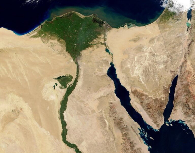
Satellite Imagery with Ground Sensors
Satellite imagery provides the broad perspective while ground sensors deliver precise validation data. You’ll achieve the most accurate environmental assessments by overlaying Landsat thermal bands with weather station temperature readings. This combination reveals urban heat island effects that satellite data alone might misrepresent. ArcGIS Pro’s Image Analyst extension streamlines this process by automatically matching temporal data points from both sources, creating validated temperature maps for urban planning initiatives.
Air Quality Data with Traffic Patterns
Air quality monitoring stations generate point data that gains context when combined with traffic flow patterns. You can correlate PM2.5 readings with vehicle count data to identify pollution hotspots along major corridors. QGIS’s temporal controller allows you to animate both datasets simultaneously, revealing how rush hour traffic directly impacts air quality measurements. This layered approach helps environmental agencies pinpoint the most effective locations for pollution reduction strategies.
Topographic Features with Climate Records
Elevation data transforms climate records from simple measurements into spatial climate models. You’ll discover microclimates by overlaying USGS Digital Elevation Models with historical precipitation data from NOAA stations. The resulting maps reveal how mountain ranges create rain shadows and valley systems trap cold air. Use ArcGIS Spatial Analyst’s regression tools to interpolate climate data across elevation gradients, producing detailed climate zone maps essential for ecological research.
Integrate Real-Time Data Streams with Static Base Maps
Real-time data integration transforms static maps into dynamic analytical tools that update continuously. You’ll create responsive visualizations that adapt to changing conditions and provide immediate insights for decision-making.
GPS Tracking with Route Networks
Track vehicles and assets with the LandAirSea 54 GPS Tracker. Get real-time location alerts and historical playback using the SilverCloud app, with a long-lasting battery and discreet magnetic mount.

GPS tracking data overlaid on static route networks reveals actual travel patterns versus planned infrastructure. You can identify bottlenecks by comparing live vehicle positions with road capacity data, showing where traffic consistently slows despite adequate road width. Fleet management applications benefit from this approach, displaying delivery trucks against optimal routing algorithms to highlight efficiency gaps and rerouting opportunities in real-time.
Social Media Check-ins with Business Locations
Social media check-in data combined with static business location maps creates heat maps of customer activity patterns. You’ll discover peak visitation times by overlaying Instagram and Facebook location tags with restaurant and retail databases, revealing which establishments attract crowds during specific hours. This integration helps identify underperforming locations despite high foot traffic or successful businesses in unexpected areas.
IoT Sensor Data with Infrastructure Maps
IoT sensor networks layered over infrastructure maps provide continuous monitoring capabilities for urban systems. You can track water pressure readings across pipe network maps to detect leaks before they become visible, or overlay air quality sensors with traffic infrastructure to identify pollution correlation points. Smart city applications use this method to monitor bridge stress sensors against structural blueprints for predictive maintenance scheduling.
Understand your indoor air quality with the Amazon Smart Air Quality Monitor. It tracks five key factors and provides an easy-to-understand air quality score in the Alexa app, plus notifications when air is poor.

Conclusion
You now have five powerful techniques to transform your mapping projects from simple visualizations into comprehensive analytical tools. Each method—from spatial boundary joins to real-time data integration—offers unique opportunities to uncover hidden patterns and relationships in your data.
The key to successful data combination lies in understanding how different datasets complement each other. Whether you’re overlaying demographic information with business locations or merging environmental sensors with satellite imagery you’ll create maps that tell compelling stories and drive informed decisions.
Measure temperature, humidity, pressure, and VOC gases with the BME680 environmental sensor. It supports I2C and SPI communication and is compatible with 3.3V/5V systems, including Raspberry Pi, Arduino, and ESP32.

Start with the technique that best matches your current project needs. As you become more comfortable with these approaches you’ll naturally begin combining multiple methods to create even richer more insightful visualizations that truly showcase the power of integrated geographic data.
Frequently Asked Questions
What is the main benefit of combining multiple data sets in map visualizations?
Combining multiple data sets transforms basic maps into powerful analytical tools. By layering different data sources like census data with economic indicators or satellite imagery with ground sensor readings, mapmakers can reveal hidden patterns and relationships that single-source maps miss, leading to more insightful decision-making.
How do census tract boundaries help with demographic data integration?
Census tract boundaries provide precise geographic frameworks for overlaying demographic data with point data like retail locations or crime incidents. This allows for detailed population density calculations and helps identify market penetration patterns, underserved areas, and demographic correlations within specific neighborhoods.
What are TIGER/Line shapefiles and why are they important?
TIGER/Line shapefiles are standardized geographic boundary files provided by the U.S. Census Bureau. They ensure consistent analysis across multiple years by providing uniform county and state boundaries, making it easier to compare data sets over time and maintain accuracy in large-scale mapping projects.
How can temporal data sets reveal patterns in maps?
Merging temporal data sets creates time-series analysis that shows patterns static visualizations miss. By integrating historical weather data, multi-decade census information, or economic trends over time, mapmakers can visualize demographic shifts, climate patterns, and economic cycles through animated maps and trend analysis.
What insights come from blending point data with area data?
Blending point data (like store locations) with area data (like census demographics) reveals spatial relationships that enhance context. This combination helps identify market penetration patterns, correlate crime incidents with neighborhood statistics, and map transportation hubs within land use patterns for development opportunities.
How does environmental mapping benefit from combining different data sources?
Environmental mapping gains accuracy by overlaying satellite imagery with ground sensor data. This combination reveals urban heat island effects, correlates air quality with traffic patterns to identify pollution hotspots, and integrates topographic features with climate records to create detailed ecological zone maps.
What advantages do real-time data streams offer when integrated with static maps?
Real-time data streams transform static maps into dynamic analytical tools providing immediate insights. GPS tracking reveals actual travel patterns, social media check-ins create customer activity heat maps, and IoT sensor data enables continuous monitoring of urban infrastructure for smart city applications and predictive maintenance.
What challenges exist when working with ZIP Code boundaries in mapping?
ZIP codes present boundary precision challenges since they’re designed for postal delivery rather than statistical analysis. Converting between ZIP codes and census tracts requires crosswalk tables, and ZIP code boundaries may not align perfectly with other geographic data sets, potentially affecting analysis accuracy.