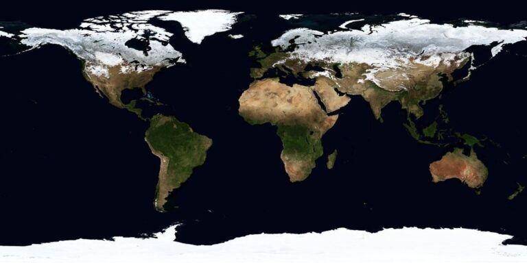
6 Ideas for Mapping Public Health Data Creatively That Transform Analysis
Public health data visualization has evolved far beyond basic bar charts and static maps. You’re now seeing innovative approaches that transform complex health statistics into compelling visual stories that actually drive policy changes and community action.
Creative mapping techniques are revolutionizing how we understand disease patterns, health disparities, and population wellness trends. These fresh approaches make data accessible to everyone from policymakers to community leaders who need actionable insights fast.
Disclosure: As an Amazon Associate, this site earns from qualifying purchases. Thank you!
Interactive Heat Maps for Disease Outbreak Tracking
Interactive heat maps transform complex epidemiological data into intuitive visual tools that enable rapid identification of disease hotspots and transmission patterns. These dynamic visualizations allow public health officials to monitor outbreaks as they unfold and make data-driven decisions for resource allocation.
P.S. check out Udemy’s GIS, Mapping & Remote Sensing courses on sale here…
Real-Time Visualization of Infection Rates
Real-time heat maps display infection rates using live data feeds from health surveillance systems and hospital networks. You can configure automated data updates every 15-30 minutes to track disease progression across geographic regions. Advanced mapping platforms like ArcGIS Online and CARTO integrate with health databases to show infection density through color gradients that update continuously. These systems alert epidemiologists when infection thresholds exceed predetermined levels in specific areas.
Color-Coded Intensity Mapping for Quick Assessment
Color-coded intensity scales provide immediate visual assessment of disease severity across mapped regions. You should implement standardized color schemes where deep reds indicate high infection rates and cool blues represent low-risk areas. Choropleth mapping techniques work best with 5-7 color classes to avoid overwhelming viewers while maintaining clear distinctions. Professional cartographers recommend using ColorBrewer 2.0 palettes that remain accessible to colorblind users while preserving data integrity.
Integration with Geographic Information Systems
GIS integration enables layering of demographic, environmental, and infrastructure data with disease outbreak information. You can combine census data, transportation networks, and healthcare facility locations to identify vulnerable populations and optimal response strategies. QGIS and ArcGIS Pro support real-time data connections through REST services and database queries. This integration allows epidemiologists to perform spatial analysis including buffer zones around outbreak centers and accessibility modeling for vaccine distribution sites.
Story Maps That Connect Health Data to Human Experiences
Understand the structure of a one-hour TV drama pilot. This book provides a guide to story mapping for television.

Story mapping transforms cold statistics into compelling narratives that reveal the human impact behind public health data. You’ll create deeper understanding by connecting quantitative findings to real community experiences.
Narrative-Driven Visualization Techniques
Sequential mapping guides viewers through health data chronologically, showing how conditions evolve over time within specific populations. You’ll layer temporal data with geographic information to create compelling before-and-after visualizations that highlight intervention effectiveness. Multimedia integration combines maps with video testimonials, audio recordings, and photographs to provide context that raw numbers can’t convey. Interactive timelines allow users to explore health outcomes at their own pace while maintaining spatial reference points for better comprehension.
Personal Stories Behind Statistical Data
Individual case mapping plots anonymized patient journeys across healthcare systems, revealing access barriers and treatment delays through geographic visualization. You’ll connect demographic data points to real experiences by mapping healthcare facility distances, transportation challenges, and socioeconomic factors that influence health outcomes. Community portraits showcase how neighborhood characteristics directly impact resident health through visual storytelling that combines census data with resident interviews. These approaches humanize epidemiological findings by showing how zip codes, income levels, and environmental factors translate into lived experiences.
Community-Centered Mapping Approaches
Participatory mapping engages residents as data collectors, creating community-generated health maps that reflect local knowledge and priorities. You’ll facilitate workshops where community members identify health assets, hazards, and needs within their neighborhoods using GPS-enabled devices and mobile mapping applications. Asset-based visualization focuses on community strengths rather than deficits, mapping healthcare resources, social networks, and wellness initiatives that support population health. Collaborative platforms allow residents to contribute ongoing updates about local health conditions, creating dynamic maps that reflect community perspectives alongside official health surveillance data.
Track your valuables in real-time with this mini GPS tracker, using Apple's Find My network without monthly fees. Its compact, magnetic, and waterproof design easily attaches to vehicles and other assets.

3D Topographic Models for Environmental Health Factors
Three-dimensional topographic models transform flat environmental health data into immersive landscapes that reveal spatial relationships between geography and health outcomes. You’ll create powerful visualizations that help stakeholders understand how terrain influences disease patterns and environmental exposures.
Elevation-Based Visualization of Air Quality Data
Elevation-based air quality models use terrain height to display pollution concentration levels across different altitudes. You’ll map particulate matter readings as color-coded peaks and valleys, showing how topography affects pollutant distribution. Mountain areas typically show cleaner air at higher elevations, while urban valleys demonstrate pollution accumulation. ArcGIS Pro’s 3D Analyst extension enables you to extrude air quality data points based on PM2.5 values, creating visual mountains where pollution levels peak.
Articulate! is a fast-talking description game for 4+ players. Describe words quickly without saying "rhymes with" or "sounds like" to win, perfect for family game nights and parties.

Terrain Mapping for Water Contamination Sources
Terrain-based contamination mapping reveals how water flows carry pollutants from source to affected communities through watershed analysis. You’ll visualize contamination plumes as they follow natural drainage patterns using digital elevation models. Upstream industrial sites appear as elevated risk zones, while downstream communities show exposure intensity through depth variations. QGIS terrain analysis tools help you model contaminant flow paths by combining elevation data with hydrological networks to predict contamination spread patterns.
Multi-Layered Environmental Risk Assessment
Multi-layered 3D risk models stack multiple environmental health factors into comprehensive terrain visualizations showing cumulative exposure impacts. You’ll combine air quality, water contamination, soil toxicity, and proximity to hazardous facilities into single topographic displays. High-risk areas emerge as elevated terrain features, while safer zones appear as valleys or plains. Esri CityEngine allows you to build complex environmental risk landscapes by layering datasets with weighted importance values for different health factors.
Time-Lapse Animation Maps for Epidemiological Trends
Time-lapse animation maps transform temporal health data into dynamic visual sequences that reveal epidemiological patterns invisible in static visualizations. These animated cartographic tools enable you to track disease progression, seasonal variations, and historical health events through moving visualizations that compress months or years of data into compelling minutes-long presentations.
Chronological Disease Progression Visualization
Sequential mapping frames display disease spread patterns across geographic regions over specific timeframes. You’ll create frame-by-frame animations using temporal health surveillance data from CDC Wonder or state health departments, setting 7-day or monthly intervals for optimal pattern recognition. Animation software like QGIS TimeManager or ArcGIS Pro’s temporal visualization tools generate smooth transitions between data points. Color gradients shift from light to intense hues as case numbers increase, while pulsing effects highlight outbreak epicenters during peak transmission periods.
Seasonal Health Pattern Analysis
Cyclical health animations reveal recurring seasonal disease patterns through multi-year temporal mapping sequences. You’ll overlay influenza surveillance data, allergy pollen counts, or heat-related illness statistics across 3-5 year periods to identify consistent seasonal trends. Time-series animations display monthly health indicator fluctuations using animated bar charts synchronized with geographic heat maps. Temperature overlays correlate environmental conditions with health outcomes, while animated legends show seasonal progression markers that help viewers understand cyclical health vulnerabilities in specific populations.
Historical Public Health Event Documentation
Documentary-style health mapping chronicles significant epidemiological events through chronological visualization sequences. You’ll compile historical outbreak data from sources like HealthMap or WHO Disease Outbreak News to create educational animations showing pandemic progression or vaccination campaign effectiveness. Multi-decade animations document long-term health improvements, displaying mortality rate reductions or disease elimination efforts across affected regions. Milestone markers highlight key intervention points, policy implementations, or breakthrough discoveries that influenced disease trajectories throughout documented timeframes.
Community-Generated Crowdsourced Health Maps
Community-generated crowdsourced health maps democratize public health data collection by empowering residents to contribute local health intelligence. These participatory approaches capture health information that traditional surveillance systems often miss, creating comprehensive datasets that reflect community experiences and priorities.
Citizen Science Data Collection Methods
Structured data collection protocols enable volunteers to gather standardized health information using smartphone apps like KoBoToolbox and Survey123. Community members document environmental hazards, accessibility barriers, and health resource locations through GPS-enabled forms that automatically geotag submissions. Training workshops teach residents proper data collection techniques, ensuring consistency across multiple contributors. Quality verification systems validate crowdsourced entries through peer review processes, where multiple community members confirm observations before data integration into master health maps.
Experience vivid content on the Galaxy A16 5G's 6.7" display and capture stunning photos with its triple-lens camera. Enjoy peace of mind with a durable design, six years of updates, and Super Fast Charging.

Participatory Mapping for Health Equity
Community mapping sessions bring residents together to identify health disparities and resource gaps using large-format neighborhood maps and colored markers. Participants mark locations of health concerns, safe spaces, and community assets while sharing local knowledge about access barriers. Asset-based mapping approaches highlight existing community strengths rather than focusing solely on deficits, revealing informal health networks and cultural resources. Digital equity considerations ensure mapping processes accommodate varying technology access levels through multilingual interfaces and offline data collection capabilities for underserved populations.
This 40-count set of Crayola Ultra Clean Washable Markers delivers vibrant color for all art projects. Easily washes from skin, clothing, and painted walls, making them perfect for kids ages 3 and up.

Mobile App Integration for Real-Time Reporting
Custom health reporting applications streamline community data submission through user-friendly interfaces that require minimal technical expertise. Apps like Ushahidi and Fulcrum enable residents to photograph health hazards, report food access issues, and document healthcare facility conditions with automatic location stamps. Real-time data synchronization pushes community reports directly to public health dashboards, enabling rapid response to emerging health concerns. Push notification systems alert community members about local health updates, creating feedback loops that encourage continued participation in ongoing health surveillance efforts.
Artistic Data Visualization for Public Health Awareness
Creative design elements transform clinical data into compelling visual stories that resonate with diverse audiences and drive public health action.
Creative Color Schemes and Design Elements
Color psychology principles enhance public health map readability by using intuitive associations like red for danger zones and green for healthy areas. You’ll achieve maximum impact through high-contrast palettes that accommodate color-blind viewers and cultural color meanings. Design consistency across multiple visualizations builds recognition patterns, while typography hierarchies guide viewers through complex health data layers. Strategic use of whitespace prevents visual overwhelm and allows critical health information to stand out effectively.
Infographic-Style Map Presentations
Infographic mapping combines traditional cartographic elements with engaging visual storytelling techniques to simplify complex epidemiological data. You can integrate icons, charts, and statistical callouts directly onto geographic layouts to create comprehensive health dashboards. Template-based designs ensure consistency across multiple health topics while maintaining professional standards. Interactive elements like hover-over statistics and clickable regions transform static presentations into dynamic exploration tools that encourage deeper engagement with public health findings.
Visual Metaphors for Complex Health Concepts
Metaphorical visualization translates abstract health statistics into familiar visual concepts that audiences instantly understand and remember. You can represent disease transmission networks as subway system maps or visualize health disparities through economic inequality metaphors. Population health flows work effectively when depicted as river systems, while vaccination coverage maps benefit from puzzle piece imagery showing community protection gaps. These creative approaches make epidemiological concepts accessible to non-technical audiences and policymakers.
Conclusion
These creative mapping approaches represent the future of public health communication. By moving beyond traditional charts and static displays you’re able to create visualizations that truly resonate with your audience and drive meaningful action.
The key lies in selecting the right technique for your specific data and objectives. Whether you’re tracking disease outbreaks through interactive heat maps or engaging communities through crowdsourced initiatives each method serves a unique purpose in your public health toolkit.
Remember that effective health data visualization isn’t just about making information look appealingâit’s about making complex epidemiological patterns accessible and actionable. When you combine technical precision with creative presentation you empower decision-makers and communities to respond more effectively to health challenges.
Start experimenting with these techniques today and watch how your public health data transforms from mere statistics into powerful stories that inspire change.
Frequently Asked Questions
What are the main advantages of modern public health data visualization over traditional methods?
Modern visualization techniques transform complex epidemiological data into engaging, accessible formats that enhance understanding of disease patterns and health disparities. Unlike static bar charts, interactive visualizations allow real-time monitoring, enable targeted interventions, and make data actionable for policymakers and community leaders through intuitive visual narratives.
How do interactive heat maps help track disease outbreaks?
Interactive heat maps convert complex outbreak data into intuitive visual tools that identify disease hotspots and transmission patterns. Updated frequently through health surveillance systems, these color-coded intensity maps allow public health officials to quickly assess disease severity, monitor infection rates in real-time, and make informed decisions for targeted responses.
What is story mapping in public health visualization?
Story mapping connects health data to human experiences by transforming statistics into compelling narratives. This technique uses sequential mapping and multimedia integration to guide viewers through health data chronologically, incorporating testimonials and visual elements that reveal the human impact behind epidemiological findings and community health outcomes.
How do 3D topographic models enhance environmental health data understanding?
3D topographic models transform flat environmental data into immersive landscapes that reveal spatial relationships between geography and health outcomes. These visualizations display pollution concentration levels across different altitudes, show contamination flow patterns through watersheds, and combine multiple environmental factors into comprehensive risk assessments for better decision-making.
What are time-lapse animation maps and their benefits?
Time-lapse animation maps convert temporal health data into dynamic visual sequences that reveal epidemiological patterns invisible in static visualizations. They display disease spread over time, showcase seasonal health trends, and document historical public health events, creating educational tools that illustrate pandemic progression and intervention effectiveness.
How do crowdsourced health maps work?
Crowdsourced health maps democratize data collection by enabling residents to contribute local health intelligence through smartphone apps and participatory mapping sessions. Community members document environmental hazards, health resources, and local concerns using GPS-enabled forms, creating comprehensive datasets that capture information traditional surveillance systems often miss.
What role does artistic visualization play in public health communication?
Artistic data visualization transforms clinical data into compelling visual stories using creative color schemes, infographic-style presentations, and visual metaphors. These techniques improve map readability, simplify complex epidemiological data for non-technical audiences, and make health statistics more accessible to policymakers and the general public.
How do Geographic Information Systems (GIS) improve public health interventions?
GIS technology layers demographic and environmental data with health information, enabling comprehensive spatial analysis for targeted public health responses. This integration helps identify high-risk areas, analyze disease transmission patterns in relation to geographic features, and support evidence-based decision-making for effective community health interventions.