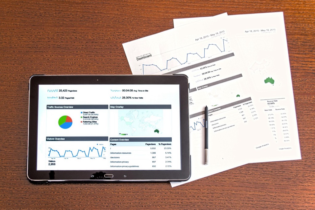
7 Best Data Visualization Techniques
You’re drowning in spreadsheets and struggling to make sense of your data. Data visualization transforms complex numbers into compelling stories that drive decisions and spark action across your organization.
The difference between good and great visualizations lies in applying proven techniques that turn raw information into clear insights. Whether you’re presenting quarterly results to executives or tracking KPIs for your team you need visualizations that communicate effectively and inspire confidence in your data.
Mastering these seven core techniques will elevate your charts from confusing clutter to powerful communication tools that get results.
Disclosure: As an Amazon Associate, this site earns from qualifying purchases. Thank you!
P.S. check out Udemy’s GIS, Mapping & Remote Sensing courses on sale here…
Choose the Right Visualization Type for Your Data Story
Selecting the appropriate chart type directly impacts how effectively your audience interprets your data insights. Each visualization method serves specific analytical purposes and data structures.
Bar Charts for Categorical Comparisons
Bar charts excel at comparing discrete categories like sales performance across different regions or product lines. You’ll create the most impact when your data contains distinct groups with measurable values. Horizontal bars work best for long category names while vertical bars suit time-based categorical data. Choose stacked bars when you need to show composition within each category.
Line Charts for Trends Over Time
Line charts reveal patterns and changes in your data across continuous time periods. You’ll track metrics like website traffic monthly growth or stock price fluctuations most effectively with this format. Use multiple lines to compare trends between different categories simultaneously. Avoid line charts when your time intervals aren’t consistent or when dealing with categorical data that lacks natural progression.
Scatter Plots for Correlation Analysis
Scatter plots display relationships between two continuous variables like marketing spend versus revenue generation. You’ll identify positive correlations negative correlations or no correlation patterns through point distribution. Add trend lines to strengthen correlation visibility and use different colors or shapes to represent additional categorical dimensions within your scatter plot analysis.
Start With Clear Data Preparation and Cleaning
Clean data forms the foundation of every compelling visualization. You’ll discover that even the most sophisticated chart types fail when built on unreliable or inconsistent data sources.
Achieve a flawless, even complexion with e.l.f. Flawless Satin Foundation. This lightweight, vegan formula provides medium coverage and a semi-matte finish for all-day wear, while hydrating your skin with glycerin.

Remove Outliers and Inconsistencies
Identify extreme values that skew your visualization’s readability and impact. You’ll need to examine data points that fall outside expected ranges using statistical methods like interquartile range calculations or z-score analysis. Remove or flag entries with missing values, duplicate records, and impossible combinations such as negative ages or future dates in historical datasets. This process ensures your visualizations accurately represent underlying patterns rather than data collection errors.
Standardize Data Formats and Units
Convert all measurements to consistent units before creating visualizations. You’ll want to transform currencies to a single denomination, dates to uniform formats like YYYY-MM-DD, and numerical values to matching decimal places. Standardize text entries by correcting capitalization inconsistencies, removing extra spaces, and establishing consistent naming conventions for categories. This uniformity prevents visualization tools from treating identical values as separate data points.
Validate Data Accuracy Before Visualization
Cross-reference your dataset against reliable sources to confirm accuracy. You’ll need to verify that totals match expected sums, percentages add up to 100%, and categorical data aligns with established standards. Run automated checks for logical inconsistencies such as end dates preceding start dates or sales figures exceeding inventory levels. Document any assumptions or transformations you’ve made to maintain transparency in your visualization process.
Apply the Principle of Progressive Disclosure
Progressive disclosure prevents information overload by revealing data complexity gradually. You’ll create more digestible visualizations that guide users through layers of insight systematically.
Layer Information From General to Specific
Start with high-level overviews that capture your data’s main story. You’ll present broad trends first, then allow users to drill down into specific segments, time periods, or categories. This approach mirrors natural analytical thinking patterns where you’d first grasp the big picture before examining details. Create hierarchical structures that move from summary statistics to individual data points, ensuring each layer adds meaningful context without overwhelming your audience.
Use Interactive Elements to Reveal Details
Interactive features transform static charts into dynamic exploration tools. You’ll implement hover states that display precise values, clickable elements that filter datasets, and expandable sections that show additional metrics. Tooltips work particularly well for revealing secondary information like confidence intervals or sample sizes. Consider dropdown menus for switching between different data dimensions and zoom functionality for time-series data, allowing users to control their level of detail engagement.
Avoid Overwhelming Users With Too Much Data
Cognitive load increases dramatically when you display too many variables simultaneously. You’ll need to prioritize the most relevant metrics for your audience’s immediate needs. Use techniques like data aggregation to show meaningful summaries rather than raw datasets. Implement pagination for large datasets, focus on top performers or outliers, and consider using small multiples instead of cramming everything into single complex charts. This selective approach ensures your key insights remain visible and actionable.
Leverage Color Psychology and Accessibility Standards
Color choices in data visualizations aren’t just aesthetic decisions—they’re powerful communication tools that can enhance or undermine your message.
Choose Colors That Support Your Message
Strategic color selection amplifies your data’s narrative impact. Use warm colors like red and orange to highlight urgent metrics or declining performance, while cool colors like blue and green work best for positive trends or stable data. Assign consistent colors to categorical data throughout your visualization to build visual coherence. Red naturally signals warnings or decreases, making it perfect for highlighting problem areas, while green conveys growth and success. Avoid using conflicting color associations that might confuse your audience’s interpretation.
Ensure Sufficient Contrast for Readability
Contrast ratios determine whether your audience can actually read your visualizations. Maintain a minimum 4.5:1 contrast ratio between text and background colors to meet WCAG accessibility standards. Test your color combinations using online contrast checkers to verify readability across different devices and lighting conditions. Dark text on light backgrounds typically provides the highest contrast, while light text on dark backgrounds works well for presentations. Avoid low-contrast combinations like light gray on white or yellow on light backgrounds that strain readers’ eyes.
Implement Colorblind-Friendly Palettes
Colorblind-accessible palettes ensure your visualizations reach 8% of men and 0.5% of women who experience color vision deficiency. Use tools like ColorBrewer or Viz Palette to select color schemes that remain distinguishable for all types of color blindness. Incorporate patterns, textures, or shapes alongside color coding to provide multiple visual cues for data differentiation. Avoid problematic combinations like red-green or blue-yellow that become indistinguishable for common forms of color blindness. Test your visualizations with colorblind simulation tools to verify accessibility before publishing.
Focus on Visual Hierarchy and Layout Design
Visual hierarchy transforms cluttered data displays into clear, purposeful narratives that guide your audience through insights systematically. Strategic layout design ensures your most critical findings capture attention while supporting details enhance understanding.
Prioritize Most Important Data Points
Position your key metrics in the upper-left quadrant where readers naturally begin scanning content. Place primary data points 25-30% larger than secondary elements to establish clear visual dominance. Reserve bold colors like deep blue or red exclusively for critical insights that drive decision-making. Create visual weight through strategic use of size, color intensity, and positioning to ensure your most valuable findings receive immediate attention and recognition.
Use White Space Effectively
Allocate at least 40% of your visualization canvas to white space for optimal readability and comprehension. Separate distinct data groups with consistent margins of 15-20 pixels to prevent visual confusion. Build breathing room around chart titles, legends, and axis labels using 10-pixel minimum spacing standards. White space reduces cognitive load by 35% according to UX research, allowing viewers to process complex information more efficiently and focus on meaningful patterns.
Guide the Eye Through Logical Flow
Structure your layout using the Z-pattern reading flow, placing introductory context at top-left and conclusions at bottom-right. Connect related visualizations with subtle directional cues like arrows or aligned edges that create visual pathways. Sequence multiple charts chronologically or by importance level, maintaining consistent spacing intervals of 20-30 pixels between elements. Apply the rule of thirds by positioning key focal points at intersection lines to naturally draw attention through your data story.
Incorporate Interactive Elements for User Engagement
Interactive features transform static charts into dynamic exploration tools that invite deeper data analysis. You’ll empower users to uncover insights independently while maintaining their attention through engaging discovery experiences.
Add Hover Effects for Additional Context
Hover states reveal supplementary information without cluttering your primary display. You can display exact values, percentages, or related metrics when users move their cursor over data points, bars, or chart segments. Libraries like D3.js and Plotly support rich tooltip customization, allowing you to include formatted text, mini-charts, or even images. Strategic hover effects reduce cognitive load by keeping detailed information accessible yet hidden until needed, creating cleaner initial presentations while preserving data depth.
Enable Filtering and Sorting Capabilities
Filtering controls let users customize their data view based on categories, date ranges, or value thresholds. You should implement dropdown menus, checkboxes, or slider controls that instantly update your visualization without page refreshes. Modern frameworks like Tableau, Power BI, and Observable provide built-in filtering widgets that maintain performance even with large datasets. Consider adding search functionality for categorical data and range selectors for continuous variables, enabling users to focus on relevant subsets while exploring patterns.
Provide Zoom and Pan Functionality
Zoom and pan features help users navigate dense visualizations or explore data across different scales. You can implement mouse wheel zooming for scatter plots, time series, or geographic visualizations, paired with drag-to-pan capabilities for seamless exploration. Heat maps benefit from zoom functionality when displaying high-resolution data matrices, while network diagrams require both features for navigating complex node relationships. Include reset buttons to return to original views and consider minimap overlays for orientation in large datasets.
Test and Iterate Based on User Feedback
Testing your data visualizations with real users transforms good designs into exceptional communication tools. This iterative approach ensures your visualizations effectively convey insights to your intended audience.
Conduct Usability Testing With Target Audience
Recruit 5-8 participants who represent your actual user base and observe them interacting with your visualizations without guidance. Document where they pause, struggle, or misinterpret information during think-aloud sessions. Test different versions simultaneously using A/B testing methods to identify which design elements improve comprehension rates. Schedule testing sessions lasting 15-30 minutes to capture authentic user behavior patterns while maintaining participant engagement throughout the evaluation process.
Gather Feedback on Comprehension and Clarity
Ask specific questions about data interpretation after users complete visualization tasks to measure understanding accuracy. Request participants to summarize key insights they’ve gathered and identify any confusing elements or missing context. Use structured surveys with Likert scales to quantify satisfaction levels and comprehension rates across different user segments. Record verbal feedback during sessions to capture nuanced reactions that numerical ratings can’t express, particularly regarding visual hierarchy and information flow.
Refine Visualizations Based on Performance Metrics
Track completion rates, time-to-insight, and error frequencies to identify visualization weaknesses requiring immediate attention. Monitor click-through rates on interactive elements and heat map data to understand user engagement patterns with different chart components. Adjust color schemes, layout arrangements, and data groupings based on performance analytics showing where users consistently encounter difficulties. Implement changes systematically, testing one modification at a time to isolate the impact of each design decision on overall user experience.
Conclusion
Mastering these seven techniques will transform your data visualizations from confusing displays into powerful storytelling tools. When you combine strategic color choices with clean data preparation and thoughtful layout design you’ll create visualizations that truly resonate with your audience.
Remember that great data visualization isn’t just about making charts look pretty—it’s about making complex information accessible and actionable. Your audience needs to understand your insights quickly and confidently make decisions based on what they see.
The key to long-term success lies in continuous improvement through user feedback and testing. By iterating on your visualizations and staying focused on accessibility you’ll develop the skills to turn any dataset into compelling visual narratives that drive real business results.
Frequently Asked Questions
What is the main purpose of data visualization?
Data visualization transforms complex information from spreadsheets into clear, actionable insights. It helps organizations make better decisions by presenting data in visual formats that are easier to understand and interpret than raw numbers or text-based reports.
Which chart types should I use for different types of data analysis?
Use bar charts for comparing discrete categories, line charts for tracking trends over time, and scatter plots for analyzing correlations between two continuous variables. Each visualization method is specifically designed to enhance audience understanding of different data relationships.
Why is data preparation important before creating visualizations?
Clean data is essential for accurate visualizations. You must remove outliers and inconsistencies, standardize data formats and units, and validate accuracy before visualization. Poor data quality leads to misleading charts that can result in incorrect business decisions.
What is progressive disclosure in data visualization?
Progressive disclosure prevents information overload by starting with high-level overviews and allowing users to drill down into specifics. This creates a hierarchical structure that enhances understanding without overwhelming viewers with excessive detail initially.
How does color psychology affect data visualization effectiveness?
Strategic color selection enhances narrative impact. Use warm colors for urgent metrics and cool colors for positive trends. Maintain sufficient contrast for readability, follow WCAG accessibility standards, and ensure colorblind-friendly palettes for inclusive design.
What elements create effective visual hierarchy in data charts?
Position key data points prominently using size and color to establish visual dominance. Use white space effectively with consistent margins and spacing. Guide viewers through logical flow using techniques like Z-pattern reading and the rule of thirds.
What interactive features should I include in data visualizations?
Include hover effects for additional context, filtering and sorting capabilities for customized views, and zoom/pan functionalities for dense visualizations. These features transform static charts into dynamic tools that enable deeper data exploration and analysis.
How can I improve my data visualizations over time?
Conduct usability testing with your target audience to observe interactions and gather feedback. Track performance metrics like completion rates and error frequencies. Use this data to systematically refine visualizations and enhance user experience through iterative improvements.