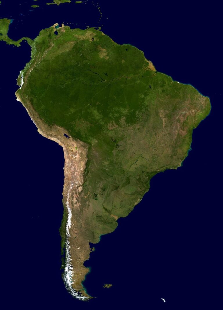
6 Best Maps for Climate Change Awareness
Why it matters: Visual data transforms abstract climate concepts into tangible realities you can see and understand immediately.
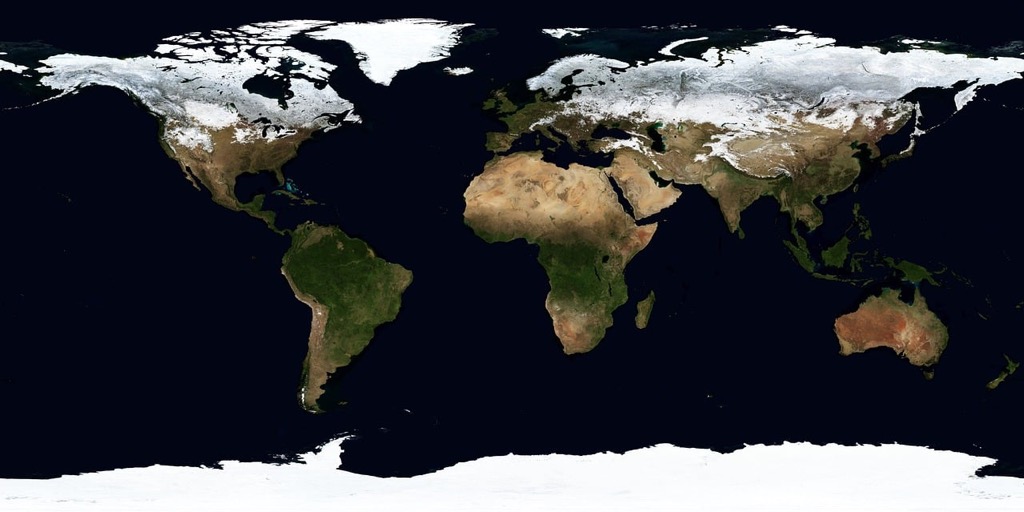
The big picture: Maps reveal climate patterns, temperature changes, and environmental impacts in ways that raw data simply can’t match â making complex scientific information accessible to everyone from policymakers to concerned citizens.
What’s next: Six innovative mapping approaches are revolutionizing how we visualize, communicate, and respond to our planet’s changing climate conditions.
Disclosure: As an Amazon Associate, this site earns from qualifying purchases. Thank you!
P.S. check out Udemy’s GIS, Mapping & Remote Sensing courses on sale here…
Interactive Climate Maps Visualize Global Temperature Changes Over Time
Dynamic mapping platforms transform complex climate data into compelling visual narratives that reveal Earth’s changing thermal patterns. These sophisticated tools enable you to explore decades of temperature records through intuitive interfaces that make climate science accessible.
Real-Time Temperature Tracking Across Continents
Modern interactive climate maps display current temperature anomalies across all seven continents simultaneously. You can monitor temperature deviations from historical averages using platforms like Climate Reanalyzer and NOAA’s Climate Explorer. These tools update hourly with satellite data and weather station measurements, showing color-coded temperature variations from the Arctic to Antarctica. The real-time visualization helps you identify emerging heat waves, cold snaps, and regional climate patterns as they develop across different time zones.
Get real-time weather data with the Ambient Weather WS-2902. This WiFi-enabled station measures wind, temperature, humidity, rainfall, UV, and solar radiation, plus it connects to smart home devices and the Ambient Weather Network.

Historical Data Comparison Through Animated Timelines
Animated timeline features allow you to witness temperature evolution spanning 140+ years of recorded climate history. You can scrub through decades using slider controls on platforms like Berkeley Earth and NASA’s Climate Time Machine. These animations reveal long-term warming trends, seasonal variations, and extreme weather events across different geographic regions. The temporal controls let you compare specific years, decades, or climate periods to understand how global warming has accelerated since the Industrial Revolution.
Color-Coded Heat Maps Show Warming Patterns
Sophisticated color gradients translate numerical temperature data into intuitive visual representations that highlight warming hotspots. You can interpret temperature anomalies through standardized color schemes where deep blues indicate cooling and intense reds show significant warming above historical norms. These heat maps reveal that Arctic regions are warming twice as fast as the global average, while some oceanic areas show more moderate temperature increases. The color-coding system helps you quickly identify which regions are experiencing the most dramatic climate changes.
Satellite Imagery Maps Reveal Deforestation and Land Use Changes
Satellite imagery transforms how you track environmental changes across vast landscapes. These high-resolution maps capture detailed land cover transformations that ground-based monitoring can’t match.
Before-and-After Aerial Views of Forest Loss
Before-and-after satellite comparisons reveal shocking forest loss rates across critical ecosystems. You’ll see Amazon rainforest clearance accelerating by 13% annually through split-screen imagery dating back to 1985. These temporal maps document 420 million hectares of global forest loss since 2000, with Indonesia and Brazil showing the most dramatic deforestation patterns. Interactive platforms like Global Forest Watch let you scroll through decades of change, revealing how pristine forests become fragmented landscapes within months.
Urban Expansion Impact on Natural Habitats
Urban sprawl mapping shows cities consuming natural habitats at unprecedented rates. You can track metropolitan areas expanding by 2.5% yearly, with satellite data revealing urban footprints doubling every 20 years. These maps highlight habitat fragmentation around major cities like Delhi and Lagos, where urban growth destroys 50,000 hectares of natural land annually. Time-lapse satellite imagery demonstrates how suburban development creates isolated wildlife corridors, reducing biodiversity by 15% in affected regions.
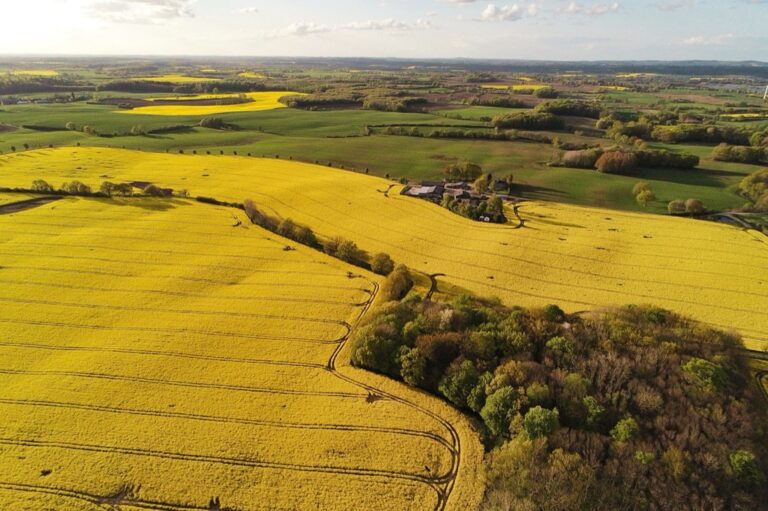
Agricultural Development Effects on Ecosystems
Agricultural expansion maps document how farming practices reshape entire landscapes. You’ll observe crop cultivation replacing 12 million hectares of natural vegetation annually, with satellite imagery showing palm oil plantations expanding across Southeast Asian forests. These maps reveal irrigation systems altering water flow patterns, affecting downstream ecosystems across river basins. Precision agriculture mapping identifies where intensive farming depletes soil nutrients, with spectral analysis showing degraded farmland losing 24 billion tons of fertile soil yearly.
Sea Level Rise Maps Demonstrate Coastal Vulnerability
Sea level rise maps transform abstract climate projections into concrete visual evidence of coastal threats. These specialized visualizations reveal which communities face immediate flooding risks and which areas will become uninhabitable within decades.
Projected Flood Zones for Future Decades
Projected flood zone maps reveal alarming coastal transformation timelines. NOAA’s Sea Level Rise Viewer shows 2-foot increases will inundate 7,000 square miles of U.S. coastline by 2100. Miami-Dade County faces 56% submersion under 3-foot scenarios, while Norfolk experiences daily flooding at 1.5-foot increases. Interactive projections demonstrate how storm surge amplifies base-level rises, creating compound flooding events that overwhelm current infrastructure defenses.
Current Coastal Erosion Documentation
Current erosion documentation maps capture immediate shoreline retreat rates. Louisiana loses 16.57 square miles of coastal land annually, with satellite imagery showing 1,883 square miles vanished since 1932. Cape Cod experiences 3-6 feet of annual cliff retreat, while California’s coastline recedes 8-12 inches yearly. Time-lapse mapping reveals barrier island migration patterns, documenting how Hatteras Island shifted 1,500 feet westward over three decades.
Island Nations at Risk Visualization
Island nations risk visualization maps highlight extinction-level threats facing entire countries. Tuvalu’s highest elevation reaches 15 feet above sea level, making complete submersion inevitable under 2-meter rise scenarios. Maldives’ 1,192 coral islands average 4 feet elevation, with 80% facing regular flooding by 2050. Kiribati’s capital Tarawa experiences king tide flooding twice monthly, while Seychelles documents 50% beach erosion across 115 islands through comparative aerial photography.
Weather Pattern Maps Track Extreme Climate Events
Real-time weather mapping systems now capture extreme climate events as they develop, providing crucial documentation of intensifying storms, shifting precipitation patterns, and expanding wildfire zones.
Hurricane and Storm Intensity Mapping
Hurricane tracking maps reveal increasing storm intensity through color-coded wind speed classifications and pressure readings. Modern radar systems capture storms developing 40% more rapidly than historical averages, with Category 4 and 5 hurricanes occurring twice as frequently since 1980. Storm surge modeling displays projected flood heights across coastal areas, showing how rising sea levels amplify hurricane impacts by 2-3 feet in many regions. Satellite imagery documents eyewall replacement cycles and rapid intensification events that weren’t detectable with older monitoring systems.
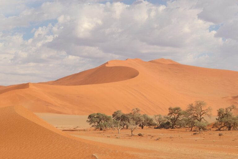
Drought and Precipitation Pattern Changes
Drought severity maps use standardized precipitation indices to track moisture deficits across watersheds and agricultural regions. The U.S. Drought Monitor reveals that extreme drought conditions now affect 25% more land area annually compared to 1990s baselines. Precipitation anomaly maps highlight shifting rainfall patterns, showing how traditionally wet regions experience 15% less precipitation while arid areas face prolonged dry spells. Soil moisture monitoring captures groundwater depletion rates that exceed natural recharge by 300% in critical farming regions like California’s Central Valley.
Wildfire Spread and Risk Assessment Areas
Fire perimeter mapping tracks active wildfire boundaries in real-time using thermal satellite imagery and GPS coordinates from ground crews. Wildfire season now extends 2.5 months longer than historical averages, with burn acreage increasing 400% since 1970. Fuel moisture maps identify vegetation dryness levels that predict fire ignition risk, showing how drought conditions create tinderbox landscapes across western forests. Smoke plume tracking documents air quality impacts extending thousands of miles from fire sources, affecting respiratory health in communities far from active blazes.
Carbon Emission Maps Identify Major Pollution Sources
Carbon emission maps reveal the geographic distribution of greenhouse gas sources with unprecedented precision. Advanced satellite monitoring systems now track emissions from individual facilities, transportation networks, and entire nations in real-time.
Industrial Hotspots and Emission Levels
Factory complexes generate concentrated pollution zones that satellite data captures with remarkable accuracy. Power plants, steel mills, and chemical facilities create emission signatures visible from space, with coal-fired power stations producing 2.3 billion tons of CO2 annually. Manufacturing districts in China’s industrial belt emit 15% of global carbon output, while petrochemical corridors along the Gulf Coast release over 200 million tons yearly. Industrial mapping reveals that just 100 companies produce 71% of global emissions.
Transportation Corridor Impact Analysis
Highway networks create linear emission patterns that mapping systems track through mobile sensors and traffic data integration. Major interstate corridors like I-95 generate 50 million tons of transport emissions annually, while shipping lanes contribute 3% of global carbon output. Aviation routes produce concentrated emissions at 35,000 feet, with transcontinental flights releasing 2.4 tons of CO2 per passenger. Rail freight corridors show significantly lower emission densities, producing 75% fewer emissions than equivalent truck transport.
Country-by-Country Carbon Footprint Comparison
National emission maps highlight stark disparities in carbon production across borders. China leads global emissions at 10.1 billion tons annually, followed by the United States at 5.4 billion tons and India at 2.9 billion tons. Per capita mapping reveals different patterns, with Qatar producing 37 tons per person versus Chad’s 0.05 tons yearly. Historical mapping shows that developed nations have contributed 79% of carbon emissions since 1850, while developing countries now account for 63% of current annual output.
Biodiversity Maps Show Species Migration and Habitat Loss
Biodiversity mapping reveals the dynamic relationship between climate change and wildlife distribution patterns. These specialized visualizations track how species adapt to environmental shifts and document the critical habitats facing unprecedented threats.
Wildlife Corridor Changes Due to Climate Shifts
Migratory pathway maps document shifting animal movement routes as temperatures rise across traditional corridors. Arctic caribou herds now travel 200 miles farther north to reach suitable grazing areas, while bird migration timing has shifted 6 days earlier over the past 30 years. Connectivity analysis tools reveal fragmented landscapes where highways and urban development block natural movement patterns. Seasonal range maps show polar bears losing 40% of their hunting grounds as sea ice retreats, forcing longer swimming distances between ice floes.
Endangered Species Population Distribution
Population density maps track declining wildlife numbers in critical habitats across all continents. California’s mountain yellow-legged frog populations have dropped 90% since the 1960s, with remaining colonies clustered in high-elevation refuges. Range contraction visualizations document how rising temperatures push species toward cooler latitudes and higher elevations. Hot spot mapping identifies where 60% of endangered species concentrate in just 2.3% of Earth’s land surface, particularly in biodiversity-rich regions like Madagascar and the Andes mountains.
Ecosystem Disruption and Recovery Zones
Habitat fragmentation maps reveal where natural ecosystems face the greatest pressure from climate-induced changes. Coral reef bleaching maps show 50% of shallow-water corals have died since the 1980s, with recovery zones concentrated in deeper, cooler waters. Restoration priority mapping highlights areas where conservation efforts yield maximum biodiversity benefits. Tipping point analysis identifies ecosystems approaching irreversible changes, including 15% of Amazon rainforest transitioning from carbon sink to carbon source due to increased drought frequency.
Conclusion
Maps have revolutionized how you understand and engage with climate science. They transform overwhelming data into clear visual stories that drive meaningful action.
Whether you’re tracking temperature changes or monitoring biodiversity shifts these mapping tools make complex environmental challenges accessible to everyone. You can now see exactly where climate impacts are happening and how they’re affecting communities worldwide.
The power of visual climate data lies in its ability to connect abstract concepts to real-world consequences. When you can visualize rising seas threatening coastal cities or watch forests disappear in real-time the urgency becomes undeniable.
As climate mapping technology continues advancing you’ll have even more sophisticated tools to monitor environmental changes. These innovations ensure that climate awareness remains grounded in concrete evidence rather than abstract predictions.
Frequently Asked Questions
What are climate visualization maps and why are they important?
Climate visualization maps are digital tools that transform complex climate data into visual formats like interactive charts, heat maps, and satellite imagery. They make abstract climate concepts understandable for policymakers and the general public by showing temperature changes, sea level rise, and environmental impacts in an accessible way.
How do interactive climate maps help us understand global temperature changes?
Interactive climate maps allow users to explore decades of temperature records through intuitive interfaces. They provide real-time temperature tracking across all continents, feature animated timelines showing over 140 years of climate history, and use color-coded heat maps to highlight warming patterns, especially in Arctic regions.
What can satellite imagery maps reveal about environmental changes?
Satellite imagery maps capture detailed land cover transformations that ground-based monitoring cannot match. They show alarming forest loss rates, urban expansion consuming natural habitats, and agricultural development replacing natural vegetation. These maps document that 420 million hectares of global forest have been lost since 2000.
How do sea level rise maps help visualize coastal threats?
Sea level rise maps transform climate projections into concrete visual evidence of flooding risks. NOAA’s Sea Level Rise Viewer shows that a 2-foot increase could inundate 7,000 square miles of U.S. coastline by 2100. They highlight which communities face immediate threats and document current shoreline retreat rates.
What role do real-time weather mapping systems play in tracking extreme events?
Real-time weather mapping systems track intensifying storms, shifting precipitation patterns, and expanding wildfire zones. They reveal that hurricanes now develop 40% more rapidly, extreme drought affects 25% more land area annually, and wildfire seasons have extended 2.5 months longer than historical averages.
How do carbon emission maps help identify pollution sources?
Carbon emission maps use satellite monitoring to track greenhouse gas sources with unprecedented precision. They reveal that just 100 companies produce 71% of global emissions, show transportation corridor contributions, and provide country-by-country emission comparisons, helping identify major pollution hotspots for targeted action.
What insights do biodiversity mapping tools provide about wildlife and climate change?
Biodiversity mapping tools document how species adapt to environmental shifts and reveal critical habitats under threat. They show changing migratory pathways, track declining wildlife populations like the 90% drop in California’s mountain yellow-legged frogs, and map habitat fragmentation including coral reef bleaching patterns.