9 Data Visualization Techniques for Temporal Mapping That Reveal Hidden Patterns
Time-based data comes alive through powerful visualization techniques that transform complex temporal information into clear actionable insights. Whether you’re tracking market trends analyzing historical patterns or forecasting future outcomes temporal mapping helps you uncover hidden relationships in your time-series data.
From interactive timelines to dynamic heat maps you’ll discover how modern visualization tools can elevate your data storytelling and decision-making capabilities while making temporal patterns more accessible to your audience.
Disclosure: As an Amazon Associate, this site earns from qualifying purchases. Thank you!
Understanding Temporal Data Visualization Fundamentals
Time-based data visualization requires a structured approach to effectively communicate patterns and trends across different temporal scales.
P.S. check out Udemy’s GIS, Mapping & Remote Sensing courses on sale here…
Key Components of Temporal Data
Temporal data consists of four essential elements: timestamps timestamps (exact points in time) time intervals (periods between events) time series (sequential data points) and temporal hierarchies (year month day). Each component requires specific visualization techniques to highlight relationships. Time granularity plays a crucial role in determining the appropriate visualization method whether you’re working with milliseconds decades or cyclical patterns. The data structure must account for temporal resolution gaps missing values and overlapping time periods.
Importance of Time-Based Visualization
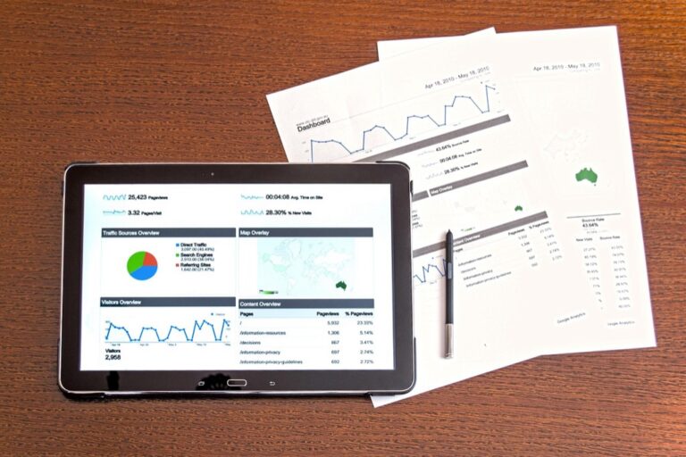
Time-based visualization transforms complex temporal datasets into intuitive visual patterns that reveal trends seasonality and anomalies at a glance. Interactive timelines enable users to zoom between different time scales identifying both macro trends and micro-level details. These visualizations support critical business functions like resource planning performance monitoring and predictive analytics. Modern tools offer features such as brush-and-link interfaces temporal filtering and dynamic aggregation to enhance data exploration and pattern recognition.
Choosing the Right Timeline Visualization Methods
Selecting an appropriate timeline visualization method depends on your data characteristics and analytical goals.
Linear Timeline Charts
Linear timelines offer a straightforward way to display sequential events across a defined period. You’ll find these charts particularly effective for tracking project milestones individual events or discrete occurrences. They work best when your data points are evenly distributed and don’t overlap significantly. Popular tools like Tableau and D3.js provide built-in templates for creating interactive linear timelines with customizable markers tooltips and zoom functionality.
Spiral Timeline Displays
Spiral timelines help you identify cyclical patterns and recurring events in temporal data. You’ll see these displays commonly used for analyzing seasonal trends weather patterns or periodic business cycles. The spiral format compresses long time series into a compact visual space making it easier to spot repetitive patterns. Tools like R’s CircularView package and Python’s Matplotlib enable you to create spiral visualizations with adjustable radii and color-coded segments.
Create publication-quality plots easily with Matplotlib for Python. This guide helps developers build impactful visualizations using Python's popular plotting library.

Calendar Heat Maps
Calendar heat maps transform daily data into color-coded grid patterns that mirror traditional calendar layouts. You’ll benefit from this visualization when analyzing day-specific patterns attendance records or daily performance metrics. Each cell represents a single day with color intensity indicating data values. Github’s contribution graph serves as a prime example while libraries like Cal-Heatmap.js and seaborn’s calendar plot function offer robust implementation options.
Implementing Interactive Time Series Techniques
Dynamic Time Sliders
Dynamic time sliders transform static temporal visualizations into explorable interfaces. Implement range-based sliders to control temporal windows using JavaScript libraries like noUiSlider or jQuery UI Slider. Configure the slider’s granularity to match your data intervals (hours days months) and set up event listeners to trigger data updates. Add visual feedback through tooltips that display the selected time range and enable keyboard controls for precise navigation.
Learn jQuery UI quickly with practical examples. This book provides step-by-step guidance and ready-to-use solutions for building interactive user interfaces.

Temporal Brushing and Linking
Temporal brushing and linking creates coordinated views across multiple temporal visualizations. Use D3.js brushing components to highlight specific time periods while simultaneously updating linked charts. Enable cross-filtering between views by implementing shared data bindings and event handlers. Add smooth transitions for selection changes and maintain consistent color schemes across linked visualizations to reinforce data relationships.
Real-Time Data Updates
Set up WebSocket connections or polling mechanisms to stream live temporal data updates. Configure data buffers to manage incoming information and implement efficient DOM updates using virtual scrolling techniques. Use requestAnimationFrame for smooth animations when new data arrives and implement data windowing to maintain optimal performance. Add visual indicators to show data freshness and loading states.
Mastering Advanced Temporal Mapping Tools
Advanced temporal mapping tools provide sophisticated ways to analyze and visualize spatiotemporal data patterns across multiple dimensions.
Space-Time Cubes
Space-time cubes transform 2D maps into 3D visualizations by adding time as the vertical axis. You’ll see geographic locations plotted on the x-y plane while temporal changes rise along the z-axis. These cubes effectively display movement patterns migration flows or urban development over time. Tools like ArcGIS Pro’s Space Time Pattern Mining toolset and QGIS’s Qgis2threejs plugin let you create interactive space-time cube visualizations with features like temporal slicing dynamic rotation and attribute filtering.
Temporal Flow Maps
Temporal flow maps illustrate the movement of objects entities or information across space and time. You can use line thickness color gradients or animated paths to represent flow volume timing and direction. Modern tools like Flowmap.gl and Kepler.gl enable creation of interactive flow visualizations that support temporal filtering edge bundling and custom styling. These maps excel at showing trade routes traffic patterns and population movements across different time periods.
Time-Series Clustering
Time-series clustering groups similar temporal patterns to reveal underlying trends and relationships in your spatial data. This technique helps identify areas with matching temporal behaviors like regions with similar seasonal tourism patterns or synchronized economic cycles. Tools like Python’s scikit-learn with spatial extensions and R’s spatiotemporal packages provide clustering algorithms including k-means DBSCAN and hierarchical clustering specifically optimized for temporal mapping applications.
Master machine learning by building real-world projects using scikit-learn and TensorFlow. Explore diverse models, from support vector machines to neural nets, and leverage techniques like dimensionality reduction and deep reinforcement learning.

Exploring Multi-Dimensional Time Visualization
Multi-dimensional temporal data requires specialized visualization techniques to reveal complex patterns and relationships across different time scales and variables.
Parallel Time Coordinates
Parallel time coordinates transform multi-dimensional temporal data into a set of parallel vertical axes where each axis represents a different time period or variable. Lines connecting points across axes show relationships between dimensions. Tools like D3.js and Plotly enable interactive parallel coordinates with features such as axis reordering brushing selection and opacity controls. This technique excels at revealing correlations between multiple time-based variables such as temperature rainfall and wind speed across seasons.
Stacked Temporal Views
Stacked temporal views layer multiple time series to show how different variables evolve simultaneously. These visualizations use color-coded layers or streams to represent distinct data dimensions like market segments or demographic groups. Tools such as ThemeRiver and streamgraphs in Observable Plot display the relative contribution of each component over time. This approach works best for showing compositional changes such as market share evolution or population distribution shifts.
Hierarchical Time Trees
Hierarchical time trees organize temporal data into nested structures displaying relationships between different time scales and categories. Using tools like TimeTree.js or R’s dendextend package you can create interactive visualizations that show temporal hierarchies from years down to seconds. These trees excel at revealing patterns in nested temporal data such as corporate organizational changes project timeline dependencies or evolutionary relationships in biological data.
Optimizing Temporal Data Animation
Effective animation of temporal data requires careful consideration of motion design principles and performance optimization to create smooth engaging visualizations.
Motion Techniques
Implement smooth motion paths by using interpolation methods like linear easing or cubic-bezier curves when animating data points. Use velocity-based transitions to maintain consistent movement speeds across different time scales. Apply motion blur effects for fast-moving elements to enhance visual tracking. Consider using requestAnimationFrame() for JavaScript animations to ensure optimal performance with frame rates of 60fps. Tools like GreenSock Animation Platform (GSAP) offer precise control over motion timing and trajectories.
Transition Effects
Design seamless transitions between temporal states using fade effects opacity changes and morphing animations. Apply staggered transitions when updating multiple data points to prevent visual overload. Implement cross-fades for smooth switches between different time periods. Use transition.duration() in D3.js to control animation timing or CSS transitions for simple state changes. Add subtle scaling effects during updates to draw attention to changing values while maintaining context.
Frame Sequencing
Structure animation frames to align with meaningful temporal intervals in your dataset. Calculate optimal frame rates based on data granularity with 24-30fps for smooth human perception. Buffer upcoming frames to prevent stuttering during complex animations. Use RAF (RequestAnimationFrame) scheduling to synchronize with browser rendering cycles. Implement frame skipping logic for performance optimization when rendering large datasets across time periods.
Incorporating Statistical Time Analysis
Statistical analysis adds depth and meaning to temporal visualizations by revealing hidden patterns and relationships in time-based data.
Trend Visualization
Time series trends require clear visual representation through statistical methods like moving averages and regression lines. Use tools like ggplot2 or Plotly to implement trend lines with configurable parameters for smoothing windows. Create dual-axis charts that overlay raw data with computed trend lines using different opacities. Highlight significant trend changes with vertical bands or markers to draw attention to key temporal shifts. R’s forecast package and Python’s statsmodels offer robust trend decomposition capabilities for complex time series.
Seasonal Pattern Detection
Implement seasonal decomposition techniques to identify recurring patterns in temporal data. Apply methods like STL (Seasonal and Trend decomposition using Loess) to separate time series into seasonal trend and residual components. Create polar plots or circular heat maps to visualize daily weekly or annual cycles. Use tools like Python’s seasonal_decompose or R’s decompose function to extract and visualize seasonal patterns. Highlight peak seasons with color intensity variations and annotate significant seasonal events.
Anomaly Highlighting
Deploy statistical methods like Z-scores or IQR analysis to detect temporal anomalies automatically. Implement visual markers such as distinct colors shapes or size variations to highlight data points that deviate from expected patterns. Use tools like Tableau’s built-in outlier analysis or Python’s isolation forest algorithm to identify anomalies. Create interactive tooltips that display statistical significance values and contextual information for identified anomalies. Configure threshold controls to adjust anomaly detection sensitivity based on domain requirements.
Designing Effective Time-Based User Interfaces
Crafting intuitive time-based interfaces requires careful attention to user interaction patterns and temporal data representation needs.
Navigation Controls
Design time-based navigation controls using familiar patterns like play/pause buttons timeline scrubbers and arrow controls. Implement responsive time sliders with clear markers for significant events or data points. Add keyboard shortcuts (← →) for precise temporal navigation and zoom controls to adjust time window sizes. Consider including a mini-map timeline below the main visualization to maintain context during detailed exploration.
Filtering Options
Integrate dynamic temporal filters that allow users to isolate specific time periods ranges or patterns. Include preset filters for common time frames like today last week or custom date ranges. Add multi-level filtering capabilities to combine temporal constraints with other data attributes. Enable quick toggles for temporal granularity switching between hours days months or years based on analysis needs.
Custom Time Scales
Support flexible time scale customization through adaptive temporal units and granularity options. Implement logarithmic time scales for datasets spanning widely different time periods. Add relative time options that adjust scales based on the current viewing window. Include specialized scales like fiscal years academic calendars or business quarters with appropriate labeling and tick marks.
Best Practices for Temporal Data Storytelling
Creating Narrative Flow
Structure your temporal data story with clear beginning middle and end points to guide viewers through time-based insights. Start with broad temporal patterns then zoom into specific time periods that highlight key findings. Use progressive disclosure to reveal data layers sequentially matching your narrative arc. Tools like Flourish and Observable help create guided temporal narratives with step-by-step revelations of insights.
Emphasizing Key Time Points
Highlight critical temporal moments using visual emphasis techniques like color contrast annotations or animated transitions. Create visual hierarchies by sizing data points relative to their importance and using consistent visual markers for recurring events. Implement interactive tooltips that provide detailed context for pivotal timestamps. Tools like Highcharts and Chart.js offer built-in annotation features for emphasizing significant temporal data points.
Building Interactive Experiences
Design temporal interfaces that encourage data exploration through intuitive controls and smooth transitions. Implement linked brushing between multiple views allowing users to select time ranges and see related data update dynamically. Add interactive elements like timeline sliders time period filters and drill-down capabilities that reveal temporal details on demand. Use libraries like D3.js or Plotly to create responsive temporal visualizations that maintain performance with large datasets.
Future Trends in Temporal Visualization
Temporal data visualization continues to evolve with emerging technologies and growing data complexity. You’ll find AI-powered visualization tools becoming more prevalent offering automated pattern detection and smart timeline generation. Real-time visualization capabilities will expand as edge computing and 5G technologies enable faster data processing.
The future brings exciting possibilities for immersive temporal visualizations through AR and VR interfaces letting you literally step inside your time-series data. As organizations collect more temporal data these visualization techniques will become essential tools for making informed decisions.
By mastering these visualization methods and staying current with emerging tools you’ll be well-equipped to transform complex temporal data into compelling visual stories that drive actionable insights.