6 Best Map Color Palettes for Design
Why it matters: Choosing the right color palette can make or break your map’s effectiveness whether you’re designing historical visualizations or cutting-edge digital interfaces.
The big picture: Historical maps relied on natural pigments and printing limitations while modern cartographers have unlimited digital possibilities at their fingertips. Between the lines: The best palette choice depends on your audience’s expectations data complexity and the story you’re trying to tell through your geographic visualization.
Explore and map the wilderness for the Queen in Cartographers! Draw unique terrain shapes and score points based on randomly selected goals each game, but beware of monster ambushes.

Disclosure: As an Amazon Associate, this site earns from qualifying purchases. Thank you!
Understanding the Foundation: Historical Map Color Traditions
Achieve a flawless, even complexion with e.l.f. Flawless Satin Foundation. This lightweight, vegan formula provides medium coverage and a semi-matte finish for all-day wear, while hydrating your skin with glycerin.

Historical mapping traditions established color conventions that remain influential in modern cartographic design. Understanding these foundational principles helps you make informed palette decisions that balance tradition with contemporary visualization needs.
P.S. check out Udemy’s GIS, Mapping & Remote Sensing courses on sale here…
Traditional Cartographic Color Conventions
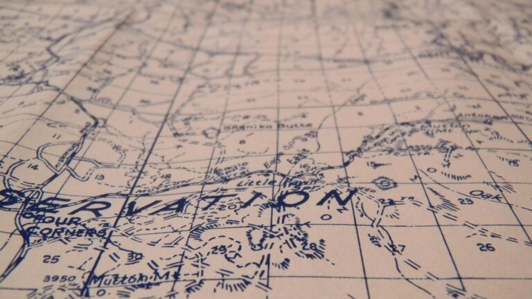
Blue represents water bodies across virtually all historical mapping traditions, from medieval portolan charts to 19th-century topographic surveys. Green indicates vegetation and lowland areas, while brown depicts mountainous terrain and elevated topography. Roads appeared in black or dark red, with political boundaries marked in bold red lines. Settlement symbols used black text on white backgrounds for maximum legibility. These conventions emerged from practical printing limitations and natural pigment availability, creating a universal visual language that cartographers worldwide still reference today.
Age-Appropriate Palette Considerations
Medieval maps employed limited earth tones – ochres, umbers, and iron-based reds – due to available mineral pigments and manuscript illumination techniques. Renaissance cartography introduced richer blues through ultramarine and indigo imports, expanding oceanic representation possibilities. 18th-century copper engraving allowed finer detail gradations using cross-hatching techniques rather than solid colors. 19th-century lithography enabled mass production with consistent color registration across multiple print runs. Each technological advancement shaped palette choices, demonstrating how production methods directly influenced visual communication standards that modern digital cartographers can now recreate or deliberately contrast.
Cultural Context in Historical Mapping
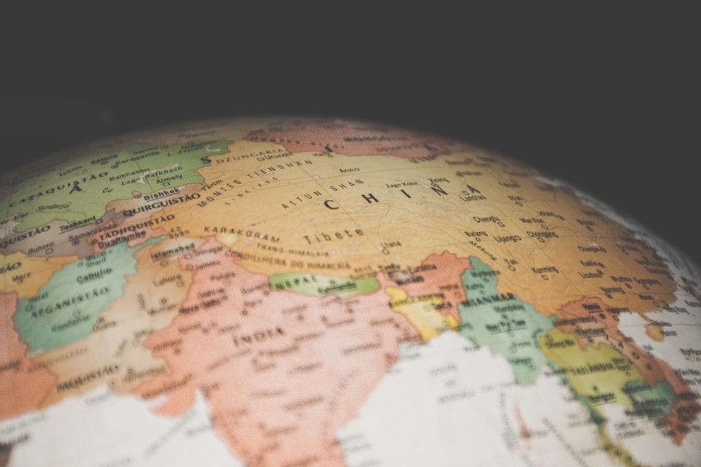
European cartographic traditions emphasized political boundaries through bold red lines and territorial color coding, reflecting colonial administrative needs and sovereignty concepts. Asian mapping traditions favored naturalistic landscape representation using subtle gradations and artistic interpretations of terrain features. Indigenous mapping systems integrated spiritual geography through symbolic color associations – sacred sites, seasonal hunting grounds, and ancestral territories. Arabic cartographic schools developed geometric abstractions using mathematical principles and religious symbolism in their color applications. Understanding these cultural perspectives helps you choose palettes that respect diverse geographic storytelling traditions while serving contemporary analytical purposes.
Embracing Contemporary Design: Modern Map Aesthetics
Modern digital cartography breaks free from historical constraints, offering unlimited color possibilities that serve today’s diverse mapping applications. You’ll find contemporary palette approaches prioritize user experience, accessibility, and brand alignment over traditional printing limitations.
Digital-First Color Approaches
Modern mapping software provides unlimited RGB color spaces that weren’t available in historical cartography. You can leverage gradient transitions, transparency effects, and dynamic color schemes that respond to user interactions. Tools like QGIS, ArcGIS Pro, and web-based platforms support millions of color combinations, allowing precise data differentiation through subtle hue variations. Digital-first palettes often incorporate vibrant accent colors, custom brand colors, and non-traditional combinations that enhance data storytelling while maintaining visual clarity across different screen types and resolutions.
Accessibility and Universal Design Principles
Contemporary map design prioritizes inclusive color choices that serve users with visual impairments and color vision differences. You should implement WCAG 2.1 contrast ratios of at least 4.5:1 between text and background elements. ColorBrewer 2.0 provides scientifically-tested palettes that remain distinguishable for colorblind users, while tools like Stark and Colour Contrast Analyser help validate accessibility compliance. Modern cartographers integrate alternative visual cues like patterns, textures, and varied symbol sizes alongside color coding to ensure comprehensive data communication.
Brand Integration Opportunities
Digital mapping platforms enable seamless brand palette integration that wasn’t possible with historical printing methods. You can incorporate corporate color schemes, marketing campaign themes, and organizational identity elements directly into your cartographic designs. Modern web mapping APIs support custom styling through JSON configurations, allowing dynamic brand application across different map layers. This approach creates cohesive visual experiences between your maps and other digital assets while maintaining cartographic best practices for data readability and geographic accuracy.
Leveraging Sepia and Earth Tones for Vintage Appeal
Sepia and earth tones create an authentic historical aesthetic that connects modern maps with traditional cartographic heritage. These warm color palettes evoke the natural aging process of antique maps while maintaining contemporary functionality.
Classic Brown and Beige Combinations
Brown and beige palettes establish instant vintage credibility through their connection to historical paper aging and natural ink pigments. You’ll achieve optimal results using chocolate brown (#3E2723) for coastlines and borders, complemented by warm beige (#F5F5DC) for land masses. This combination mimics the natural oxidation patterns found in 18th-century maps while ensuring sufficient contrast for modern readability standards.
Adding Depth with Gradient Techniques
Gradient transitions between sepia tones create dimensional depth that historical maps achieved through hand-drawn shading techniques. You can implement subtle gradients from light ochre (#CC9966) to deep umber (#654321) for elevation changes and terrain features. Modern mapping software like ArcGIS Pro and QGIS support these gradient effects while maintaining the authentic appearance of traditional relief shading methods.
Balancing Readability with Authenticity
Readability concerns require careful calibration when using historically-inspired earth tones to ensure accessibility compliance. You’ll need to maintain minimum contrast ratios of 4.5:1 between text and background elements while preserving the vintage aesthetic. Consider using darker sepia values (#8B4513) for text elements and lighter cream tones (#FDF5E6) for backgrounds to achieve both historical authenticity and modern usability standards.
Incorporating Bold, High-Contrast Colors for Modern Impact
Bold, high-contrast palettes break away from traditional cartographic restraint to create maps that demand attention. These dynamic color schemes serve modern audiences who consume geographic information through screens and digital interfaces.
Vibrant Primary Color Schemes
Primary color combinations create immediate visual impact while maintaining cartographic clarity. You’ll achieve maximum contrast using red, blue, and yellow as your foundation colors for categorical data like political boundaries or land use classifications. Electric blue (#0066FF) paired with bright red (#FF0033) establishes clear territorial divisions on administrative maps. Bold primary schemes work particularly well for infographic-style maps where data storytelling takes precedence over traditional cartographic conventions.
Neon and Fluorescent Accent Options
Neon accents highlight critical map features without overwhelming the entire composition. Fluorescent green (#39FF14) effectively marks transportation networks like bike paths or hiking trails on dark basemaps. Hot pink (#FF1493) creates striking point symbols for urban amenities or event locations. Strategic neon placement ensures these electric colors serve as visual anchors rather than distractions, maintaining readability while delivering contemporary appeal that resonates with digital-native audiences.
Technology-Inspired Color Combinations
Tech-inspired palettes mirror the visual language of modern interfaces and digital platforms. Cyberpunk combinations like electric purple (#8A2BE2) with neon cyan (#00FFFF) create futuristic urban mapping aesthetics. Circuit board color schemes using bright green (#00FF00) on dark backgrounds evoke technological infrastructure maps. These combinations work exceptionally well for smart city visualizations, IoT data displays, and tech industry presentations where modern visual language reinforces the innovative nature of your geographic data.
Blending Historical and Contemporary Elements
You’ll create maps that resonate with both traditional cartographic principles and modern design sensibilities when you master the art of blending historical and contemporary elements.
Strategic Color Mixing Techniques
Anchor historical foundations with modern accents to create sophisticated palette combinations. Start with traditional earth tones like sienna browns and sage greens as your base colors, then introduce contemporary highlights through selective digital enhancements. Layer translucent modern blues over classic sepia backgrounds to maintain vintage authenticity while adding depth. Apply the 70-20-10 rule: 70% historical base colors, 20% transitional bridging tones, and 10% modern accent colors for focal points.
Maintaining Visual Hierarchy
Establish clear information priorities by using historical colors for foundational elements and contemporary colors for data overlays. Traditional browns and greens should carry your base geographic features, while modern high-contrast colors highlight critical data points. Create layered transparency effects that allow historical elements to show through modern data visualizations. Position contemporary elements strategically to guide the eye without overwhelming the historical aesthetic foundation.
Creating Cohesive Dual-Purpose Designs
Balance competing design languages through consistent color temperature and saturation levels across both historical and modern elements. Choose warm or cool undertones consistently throughout your palette to unify disparate color periods. Apply modern accessibility standards to historical color combinations by adjusting contrast ratios while preserving authentic appearance. Test your blended palettes across different viewing contexts to ensure they function effectively for both nostalgic appeal and contemporary usability requirements.
Choosing Colors Based on Geographic Context and Purpose
Your color choices must align with both the geographic region you’re mapping and the specific objectives of your visualization. Regional familiarity and functional requirements drive successful palette decisions.
Regional Color Associations
Mediterranean regions traditionally use warm terra cotta and olive tones that reflect local landscapes and architectural heritage. Your European maps benefit from cooler blues and grays that match temperate climate expectations, while tropical areas demand vibrant greens and earth browns. Arctic mapping requires ice blues and stark whites to maintain geographic authenticity. Desert regions call for sandy beiges and rust oranges that users instinctively associate with arid environments.
Functional Color Coding Systems
Elevation mapping demands sequential color schemes from green lowlands through brown highlands to white peaks. Your transportation networks require distinct categorical colors – red for highways, blue for waterways, yellow for local roads. Population density visualizations work best with single-hue progressions from light to dark. Hazard mapping needs high-contrast warning colors like red for danger zones and green for safe areas to ensure immediate recognition.
Target Audience Considerations
Academic audiences expect conservative palettes that prioritize data accuracy over visual appeal. Your business presentations benefit from corporate brand colors integrated thoughtfully into cartographic standards. Public-facing maps require accessible color combinations that accommodate colorblind users – avoid red-green pairings. Tourist maps can embrace vibrant, engaging palettes that create emotional connections, while technical documentation demands neutral, high-contrast schemes that photocopy clearly and maintain legibility across different viewing conditions.
Conclusion
Your palette selection ultimately shapes how effectively your map communicates its intended message. Whether you’re drawn to the authenticity of historical earth tones or the boldness of contemporary digital schemes each approach offers unique advantages for different contexts and audiences.
The most successful modern cartographers understand that color choice isn’t about following strict rules but about making informed decisions. You’ll create more impactful visualizations by considering your geographic context audience expectations and accessibility requirements while drawing inspiration from both traditional and innovative approaches.
Remember that the best maps often blend elements from both worlds. You can honor cartographic heritage while embracing modern technology to create designs that are both visually compelling and functionally effective for today’s diverse users.
Frequently Asked Questions
What factors should I consider when choosing colors for map design?
Consider your audience’s expectations, the complexity of your data, and the narrative you want to convey. Regional context matters too – warm terra cotta works well for Mediterranean areas while cooler blues suit European maps. Academic audiences prefer conservative palettes, while tourist maps can embrace vibrant colors. Always ensure accessibility for colorblind users.
What are the traditional color conventions in cartography?
Historical cartographic traditions established enduring color conventions: blue for water bodies, green for vegetation, and brown for mountainous terrain. These associations emerged from practical printing limitations and natural pigment availability in historical mapping. These foundational principles continue to influence contemporary cartographic design standards.
How has digital technology changed map color possibilities?
Modern digital cartography breaks free from historical printing constraints, offering unlimited color possibilities. Digital-first approaches enable gradient transitions, transparency effects, and dynamic color schemes that enhance data storytelling. This technology prioritizes user experience, accessibility compliance, and brand alignment while maintaining cartographic best practices.
How can I make my maps accessible to colorblind users?
Use tools like ColorBrewer 2.0 and accessibility compliance validators to ensure inclusive color choices. Maintain proper contrast ratios and avoid relying solely on color to convey information. Consider using patterns, textures, or labels alongside colors to accommodate users with visual impairments and meet modern accessibility standards.
What is the 70-20-10 rule for map color distribution?
The 70-20-10 rule suggests using 70% traditional earth tones as your foundation, 20% complementary colors for secondary elements, and 10% modern accent colors for highlights. This creates a balanced composition that blends historical cartographic principles with contemporary design elements while maintaining visual hierarchy and readability.
When should I use vintage earth tones versus bold modern colors?
Use vintage earth tones (browns, beiges, sepia) when creating maps with historical appeal or connecting to traditional cartographic heritage. Choose bold, high-contrast colors for modern audiences, tech presentations, or when you need maximum attention and clarity for categorical data. Consider your audience and purpose when deciding.
How do I balance historical aesthetics with modern usability?
Maintain contrast ratios for accessibility compliance while preserving historical aesthetic appeal. Use gradient techniques to add depth, mimicking traditional shading methods. Ensure readability by balancing color temperature and saturation levels. Apply modern accessibility standards while respecting traditional cartographic principles for cohesive dual-purpose designs.