7 Best Map Design Techniques
Why it matters: Your map’s visual language determines whether users instantly understand your data or abandon it in frustration.
The big picture: Smart designers use seven core visual principles to transform complex geographic information into clear compelling stories that drive action and engagement.
What’s next: These proven techniques will help you create maps that not only look professional but actually communicate your message effectively to any audience.
Disclosure: As an Amazon Associate, this site earns from qualifying purchases. Thank you!
P.S. check out Udemy’s GIS, Mapping & Remote Sensing courses on sale here…
Understanding Visual Language in Map Design Fundamentals
Visual language in cartography functions as the bridge between complex spatial data and user comprehension. You’ll need to master these fundamental principles to create maps that communicate effectively across different audiences and contexts.
Elements That Create Map Communication
Symbols serve as your primary vocabulary for conveying geographic information to users. You’ll use points for locations like cities or landmarks, lines for features like roads or boundaries, and polygons for areas such as countries or forest zones. Color creates immediate visual hierarchy through strategic application of hue, saturation, and brightness values. Typography guides readers through your map’s narrative using font weight, size, and placement to establish information priority. Texture and pattern differentiate between similar features when color alone isn’t sufficient for distinction.
The Psychology of Visual Perception in Maps
Gestalt principles directly influence how users process your cartographic designs. You’ll leverage proximity by grouping related elements together and similarity by using consistent visual treatments for feature categories like highways or water bodies. Pre-attentive processing occurs within 200-500 milliseconds of initial viewing, making your color choices and contrast levels critical for immediate comprehension. Users naturally follow established reading patterns, scanning from top-left to bottom-right in Western cultures, which affects your legend placement and visual flow decisions.
Using Color Theory to Enhance Map Readability
Color selection transforms how quickly users interpret your spatial data. Strategic color choices reduce cognitive load while improving data comprehension across diverse user groups.
Strategic Color Palettes for Different Map Types
Sequential palettes work best for choropleth maps showing data progression like population density or elevation changes. Use single-hue gradients from ColorBrewer or Carto’s color schemes for quantitative data visualization.
Diverging palettes excel when displaying data with meaningful midpoints like temperature anomalies or election results. Choose contrasting hues that meet at a neutral center point to highlight positive and negative values effectively.
Qualitative palettes suit categorical data like land use classifications or political boundaries. Select distinct hues with similar saturation levels to ensure equal visual weight across all categories.
Accessibility Considerations in Color Selection
Colorblind-friendly palettes ensure your maps reach wider audiences since 8% of men and 0.5% of women have color vision deficiencies. Tools like Coblis or Stark help test your color schemes against common colorblind conditions.
High contrast ratios improve readability for users with visual impairments. Maintain minimum 3:1 contrast ratios between map elements and backgrounds, with 4.5:1 ratios for text labels and annotations.
Redundant encoding strengthens accessibility by combining color with patterns, textures, or symbols. This dual-coding approach ensures critical information remains accessible even when color perception varies among users.
Cultural Implications of Color Choices
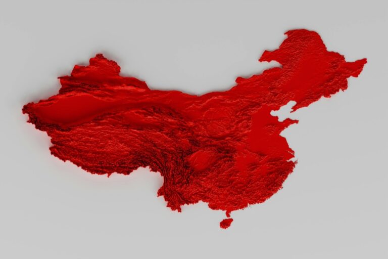
Regional color associations influence user interpretation of your map data. Red signals danger in Western cultures but represents good fortune in Chinese contexts, affecting how users process risk-related information.
Political sensitivities require careful color selection when mapping contested territories or sensitive demographic data. Neutral color schemes help maintain objectivity while avoiding unintended political messaging.
Industry conventions guide color expectations in specific mapping contexts. Topographic maps traditionally use blue for water bodies and green for vegetation, while weather maps employ standardized temperature color ramps that users recognize instinctively.
Plan your next adventure with the 2025 National Geographic Road Atlas, covering the United States, Canada, and Mexico. Its durable, folded format (11 x 15 in) makes it ideal for hiking and camping trips.

Implementing Typography and Text Hierarchy
Typography serves as your map’s voice, guiding users through spatial information with clarity and precision. Strategic text implementation transforms complex geographic data into readable narratives that support your visual design choices.
Font Selection for Maximum Legibility
Choose sans-serif fonts like Arial or Helvetica for labels and data callouts, as they maintain clarity at small sizes and high zoom levels. Reserve serif fonts for title elements where readability isn’t compromised by scale changes. Test your font selections across different output formats – screen displays, print materials, and mobile devices – to ensure consistent performance. Avoid decorative fonts that sacrifice legibility for style, particularly in technical mapping applications where accuracy takes precedence.
Text Placement and Spacing Techniques
Position labels using the point-in-polygon rule for area features and maintain consistent offset distances from linear elements like roads or rivers. Apply adequate white space around text elements to prevent visual crowding and improve scanning efficiency. Use leader lines sparingly, connecting labels to features only when direct placement creates confusion or overlap. Implement automatic label placement algorithms in GIS software like ArcGIS or QGIS, then manually adjust critical labels for optimal positioning and hierarchy.
Creating Visual Hierarchy Through Typography
Establish three distinct text levels: primary titles at 16-18pt, secondary labels at 12-14pt, and tertiary annotations at 8-10pt sizes. Apply font weight variations – bold for major features, regular for standard labels, and light for supplementary information. Control visual importance through color contrast, using darker text for essential elements and lighter shades for supporting details. Maintain consistent spacing between different hierarchy levels to create clear information groupings that guide user attention systematically.
Leveraging Symbols and Icons for Clear Communication
Symbols and icons function as your map’s universal language, transcending linguistic barriers to deliver instant spatial understanding. Strategic symbol implementation reduces cognitive load while maintaining visual clarity across diverse user groups.
Universal Symbol Recognition Standards
Adopt internationally recognized symbols to ensure immediate comprehension across global audiences. The ISO 3864 standard provides tested symbols for public information, while transportation icons follow established conventions like highway shields and airport symbols.
Implement consistent sizing protocols with symbols scaling between 12-24 pixels for digital displays and 3-6mm for print applications. Maintain 2:1 contrast ratios against background colors to meet accessibility requirements.
This 43" Samsung 4K UHD commercial display delivers crisp visuals with a non-glare screen and built-in media player. Designed for 16/7 operation, it offers versatile connectivity and a three-year warranty for reliable performance.

Reference established symbol libraries including Font Awesome, Material Design Icons, and USGS topographic symbols. These collections offer vetted designs that users already recognize from other mapping applications.
Custom Icon Design for Specific Audiences
Design audience-specific symbols when standard icons don’t match your data requirements or user expectations. Local government maps benefit from community-recognizable landmarks, while scientific applications require precise categorical representations.
Test symbol recognition through user studies before finalizing custom designs. Present symbols without labels to 10-15 target users and measure comprehension rates above 80% for critical map elements.
Maintain visual consistency across your custom symbol set using identical stroke weights, corner radii, and style treatments. Create symbol families that share common design elements while remaining functionally distinct.
Balancing Detail and Simplicity in Symbols
Optimize symbol complexity for your intended viewing scale and medium. Digital maps displayed on mobile devices require simplified 16×16 pixel symbols, while large-format prints accommodate intricate 48×48 pixel designs.
This large print edition of the Bhagavad Gita of Vyasa offers an accessible reading experience. Its large format enhances readability for comfortable study.

Eliminate unnecessary details that don’t contribute to symbol recognition at your target resolution. Focus on distinctive shape characteristics rather than decorative elements that disappear during scaling operations.
Establish symbol hierarchies using size, color saturation, and visual weight to guide user attention. Primary symbols should dominate secondary elements by 150-200% scale difference for effective visual ranking.
Mastering Scale and Proportion in Map Elements
Scale and proportion form the mathematical foundation of effective map communication. They create visual relationships that guide users through spatial data with intuitive clarity.
Achieve a flawless, even complexion with e.l.f. Flawless Satin Foundation. This lightweight, vegan formula provides medium coverage and a semi-matte finish for all-day wear, while hydrating your skin with glycerin.

Relative Sizing for Visual Impact
Size your elements proportionally to their real-world importance or data values. Point symbols representing cities should scale with population data using consistent mathematical ratios. Make your primary roads 2-3 times wider than secondary roads to establish clear hierarchy. Apply the square root rule when sizing area symbols – if one region has four times the data value, make its symbol twice the diameter. Test your proportional scaling at different zoom levels to ensure readability across viewing contexts.
Maintaining Consistency Across Map Features
Establish standardized sizing rules that apply uniformly throughout your entire map series. Create style guides specifying exact point sizes, line weights, and polygon stroke widths for each feature type. Use consistent scaling ratios – if highway symbols measure 4pt at 1:100,000 scale, make them 8pt at 1:50,000 scale. Maintain proportional relationships between text sizes and their corresponding map features. Document your sizing standards in templates to ensure team consistency across multiple map products and updates.
Using Scale to Guide User Attention
Control visual emphasis through strategic size manipulation that directs user focus. Make critical features 20-30% larger than secondary elements to establish clear information hierarchy. Use progressive sizing to create visual pathways – largest elements draw initial attention, medium elements provide context, smallest elements supply supporting detail. Implement the 3:5:8 ratio system for primary, secondary, and tertiary feature sizing. Reserve your largest symbols for the most important data points while keeping supporting elements proportionally smaller.
Creating Effective Visual Contrast and Emphasis
Visual contrast serves as your primary tool for guiding user attention across complex spatial data. Strategic emphasis techniques transform overwhelming geographic information into scannable, hierarchical content that users can process efficiently.
Contrast Techniques for Feature Differentiation
Contrast techniques distinguish map features through systematic visual separation methods. You’ll achieve optimal differentiation by varying line weights between 0.5pt for minor roads and 3pt for highways. Color value contrasts should maintain a minimum 3:1 ratio between adjacent features, with high-contrast combinations like dark blue water bodies against light gray land masses. Texture patterns differentiate land use categories effectively—diagonal lines for agricultural areas versus dots for urban zones. Shape contrast separates point features through geometric variety: circles for cities, triangles for airports, squares for landmarks.
Using White Space to Improve Focus
White space eliminates visual clutter and creates breathing room around critical map elements. You’ll need minimum 2mm margins around text labels to prevent overlap with geographic features. Buffer zones around major cities should equal 1.5 times the symbol diameter to maintain readability. Strategic placement of negative space draws attention to data-rich areas while providing visual rest points. Consistent spacing between legend items—typically 4-6pt vertical gaps—improves scanning efficiency. White space ratios of 60% content to 40% empty space optimize information density without overwhelming users.
Highlighting Critical Information Through Emphasis
Emphasis techniques direct user attention to essential spatial relationships and data points. You’ll establish information hierarchy through size scaling: primary features at 100% scale, secondary at 75%, tertiary at 50%. Color temperature contrasts place warm colors (reds, oranges) for urgent information against cool backgrounds (blues, grays). Drop shadows with 2pt offset and 20% opacity elevate important features above base layers. Border treatments—2pt white outlines around critical symbols—ensure visibility across varied background colors. Annotation callouts with leader lines connect detailed information to specific geographic locations without cluttering the main display.
Establishing Consistent Design Patterns and Styles
Creating standardized design patterns transforms your map collection from individual pieces into a unified cartographic system. You’ll establish visual rules that users recognize instantly across different map products.
Developing a Cohesive Visual System
Define clear style guidelines that govern every map element from symbol libraries to color palettes. You should create standardized templates with locked design elements including fonts, spacing rules, and legend formats. Document your visual decisions in a style guide that specifies exact color codes, typography hierarchies, and symbol sizing ratios. Test your system across different map types—topographic, thematic, and reference maps—to ensure universal application and maintain visual consistency throughout your entire mapping portfolio.
Pattern Recognition for User Navigation
Establish predictable visual cues that help users navigate your maps intuitively through repeated design elements. You’ll position legends consistently in the same corner, use identical symbol treatments for similar features, and maintain uniform color coding across map series. Repeat key design patterns like border styles, scale bar formats, and attribution placement to build user familiarity. Create visual anchors through consistent north arrow designs and coordinate grid styling that users recognize immediately.
Maintaining Brand Consistency in Map Design
Integrate your organization’s brand elements seamlessly into cartographic design without compromising map functionality or readability. You should adapt brand colors to cartographic color theory principles, ensuring accessibility while maintaining visual identity. Incorporate brand typography selectively—use brand fonts for titles while keeping sans-serif fonts for labels and technical text. Balance brand requirements with mapping conventions, applying logos and brand elements in designated areas that don’t interfere with spatial data interpretation.
Conclusion
Your maps will transform from simple data displays into powerful communication tools when you master these seven visual language principles. Each technique builds upon the others to create a cohesive system that guides your users naturally through complex spatial information.
Remember that effective map design isn’t about using every visual element available—it’s about choosing the right combination for your specific audience and message. Start with one or two principles that address your biggest design challenges then gradually incorporate others as you build confidence.
The most successful maps balance aesthetic appeal with functional clarity. By applying these proven visual language strategies you’ll create maps that not only look professional but actually help your users understand and act on the geographic data you’re presenting.
Frequently Asked Questions
What are the seven key visual principles for effective map design?
The article mentions that skilled designers use seven key visual principles to transform complex geographic information into clear, engaging narratives. These principles include visual language fundamentals, color theory, typography hierarchy, symbols and icons, scale and proportion, visual contrast and emphasis, and consistent design patterns. These elements work together to create maps that are both visually appealing and functionally effective for diverse audiences.
How does color theory improve map readability?
Strategic color choices reduce cognitive load and improve data comprehension across user groups. Sequential palettes work best for choropleth maps, diverging palettes for data with midpoints, and qualitative palettes for categorical data. Proper color selection also ensures accessibility through colorblind-friendly palettes and high contrast ratios, while considering cultural associations that might influence user interpretation of the data.
What typography guidelines should I follow for map labels?
Use sans-serif fonts like Arial or Helvetica for labels due to their superior legibility, while reserving serif fonts for titles. Apply the point-in-polygon rule for area features and maintain adequate white space for better scanning. Create visual hierarchy through distinct text levels, varying font weights, and color contrast to guide user attention effectively through the spatial information.
How do I choose appropriate symbols and icons for maps?
Adopt internationally recognized symbols following standards like ISO 3864 to ensure global comprehension. Use established symbol libraries for consistency and test custom icons through user studies. Balance detail with simplicity based on viewing scale, maintain proper sizing and contrast ratios for accessibility, and establish symbol hierarchies to guide user attention to the most important information.
What role does scale and proportion play in map design?
Scale and proportion form the mathematical foundation of effective map communication. Size elements relative to their real-world importance, such as scaling city symbols by population. Maintain consistent ratios across features and use standardized sizing rules. Strategic size manipulation can guide attention, with a recommended 3:5:8 ratio system for establishing clear information hierarchies.
How can I create effective visual contrast in my maps?
Use varying line weights and color value contrasts to distinguish different map features. Employ white space strategically to eliminate visual clutter and improve focus. Highlight critical information through size scaling, color temperature contrasts, border treatments, and annotation callouts. Maintain proper margins and spacing guidelines to ensure elements remain visually distinct and easily readable.
Why is consistency important in map design?
Consistent design patterns create a unified cartographic system that helps users navigate information predictably. Develop clear style guidelines governing all map elements, including symbol libraries and color palettes. Maintain brand consistency while ensuring functionality isn’t compromised. Predictable visual cues reduce cognitive load and help users understand and interact with spatial data more effectively.