5 Best Map Design Techniques
Maps don’t have to be cold technical documents — they can tell powerful stories that move people to action. The smartest designers know that emotional mapping transforms dry data into compelling narratives that resonate with audiences and drive real engagement. Whether you’re visualizing climate change impacts or highlighting community stories, these five proven techniques will help you create maps that connect with hearts and minds.
Disclosure: As an Amazon Associate, this site earns from qualifying purchases. Thank you!
Use Color Psychology to Convey Mood and Atmosphere
Color choices directly influence how viewers interpret your map’s emotional message. Strategic color application transforms technical data into compelling visual narratives that resonate with your audience’s psychological responses.
Choose Warm Colors for Comfort and Nostalgia
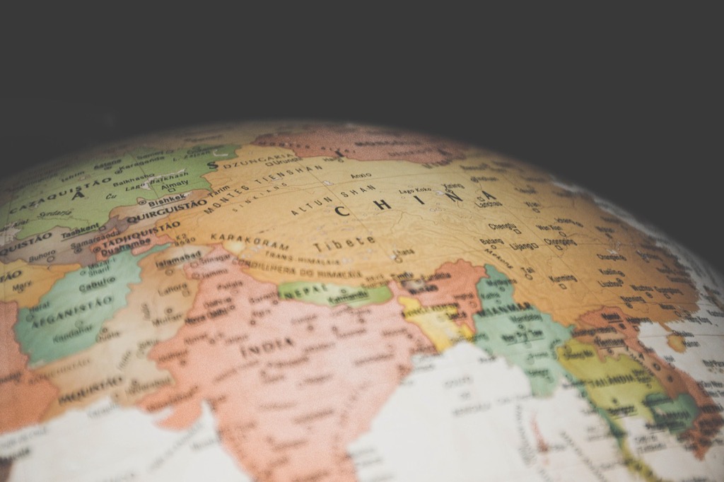
Warm color palettes featuring reds, oranges, and golden yellows create feelings of comfort and familiarity in your maps. You’ll find these hues particularly effective when mapping community spaces, historical districts, or recreational areas where you want viewers to feel welcomed and connected. Use graduated warm tones to represent population density or economic activity, as they naturally draw attention while maintaining a positive emotional association with the data you’re presenting.
P.S. check out Udemy’s GIS, Mapping & Remote Sensing courses on sale here…
Apply Cool Tones for Melancholy and Reflection
Cool colors including blues, purples, and muted greens evoke contemplative moods perfect for environmental or memorial mapping projects. You can leverage these palettes when visualizing climate data, water resources, or areas of historical significance where reflection is appropriate. Layer different shades of blue to show elevation changes or flood zones, creating depth that encourages viewers to pause and consider the map’s deeper implications rather than rushing through the information.
Incorporate High Contrast for Drama and Intensity
High contrast color combinations using opposing hues create visual tension that demands immediate attention from your audience. You’ll achieve maximum impact by pairing bright colors against dark backgrounds or using complementary colors like orange against deep blue for emergency response maps or crisis visualization. Apply this technique sparingly to highlight critical data points or dangerous zones, ensuring the dramatic effect serves your map’s emotional purpose without overwhelming the underlying geographic information.
Incorporate Personal Stories and Memory Markers
Personal narratives transform maps from static representations into living documents that resonate with viewers’ experiences. Memory markers create emotional anchors that help audiences connect with geographic spaces on a deeply personal level.
Add Handwritten Notes and Annotations
Handwritten elements on digital maps create authenticity that resonates with viewers’ emotional memories. You can overlay scanned handwriting using transparency layers in QGIS or ArcGIS Pro to maintain the organic feel while preserving map readability. Consider adding personal observations like “Mom’s favorite overlook” or “Where we saw the eagle” directly onto location points. These annotations work particularly well when you’re mapping family histories, memorial projects, or community storytelling initiatives where personal connection matters more than technical precision.
Include Meaningful Dates and Life Events
Temporal markers anchor emotional experiences to specific geographic locations on your maps. You’ll want to incorporate birth dates, anniversaries, graduations, or other milestone events as pop-up information or timeline elements using tools like StoryMaps or TimeMapper. Consider creating chronological layers that users can toggle to see how personal significance evolved across different time periods. Wedding locations, first homes, or places where major life decisions occurred become powerful emotional touchpoints when properly documented with specific dates and contextual details.
Mark Places of Significant Personal Experiences
Geographic locations gain emotional weight when you highlight their role in personal narratives and transformative moments. Plot childhood homes, first job locations, places where relationships began, or sites of personal challenges using distinctive symbology that reflects the emotional tone of each experience. You can use custom icons or color-coded point symbols to differentiate between joyful memories, difficult periods, and neutral reference points. These experiential markers work best when accompanied by brief descriptions that explain why each location holds special significance in the overall story.
Employ Artistic Techniques and Visual Metaphors
Transforming your technical mapping data into emotional storytelling requires deliberate artistic choices that go beyond traditional cartographic conventions.
Use Watercolor Effects for Dreamlike Quality
Create vibrant watercolor art with this portable set. It includes 40 colors (metallic & fluorescent), a brush pen, watercolor paper, and more, all in a stylish tin box.
Watercolor textures create soft boundaries that mirror how memories and emotions naturally blur together. You’ll achieve this effect using transparency overlays in QGIS or ArcGIS Pro, setting layer opacity between 40-70% for optimal blending. Apply gradient fills with feathered edges to represent emotional intensity zones, letting colors flow organically across geographical boundaries. This technique works particularly well for childhood memory maps or community heritage projects where precise borders matter less than emotional territories.
Apply Sketching and Hand-Drawn Elements
Hand-drawn elements inject authenticity that digital perfection can’t replicate, making viewers feel they’re exploring someone’s personal journal. You can create custom brushes in Adobe Illustrator or import scanned sketches as overlay elements in your GIS software. Draw irregular coastlines, wobbly roads, and imperfect symbols that suggest human experience rather than surveyed precision. Add handwritten labels using fonts like Amatic SC or Bradley Hand, positioning them at slight angles to mimic natural penmanship across your mapped landscapes.
Learn Adobe Illustrator with the 2025 release of this comprehensive guide. Master essential skills through hands-on lessons.
Integrate Symbolic Icons and Imagery
Symbolic representations communicate emotional concepts that traditional map symbols cannot express effectively. You’ll replace standard point markers with meaningful icons like broken hearts for loss, sprouting plants for growth, or intertwined rings for connection. Source custom symbols from icon libraries like Noun Project or create your own using vector graphics software. Scale these symbols proportionally to their emotional significance rather than geographical accuracy, allowing powerful memories to visually dominate smaller but less meaningful locations.
Create scalable vector graphics with XML using SVG Essentials. This book teaches you to produce high-quality images that remain sharp at any size.
Focus on Scale and Perspective to Create Intimacy
Scale manipulation transforms emotional distance into personal connection. When you adjust your map’s scale to focus on intimate spaces, you create opportunities for viewers to see themselves within the mapped environment.
Zoom in on Neighborhood-Level Details
Neighborhood-scale mapping reveals the emotional texture of daily life. Focus your map extent between 1:2,000 and 1:10,000 to capture individual buildings, street corners, and local landmarks. Include details like corner stores, bus stops, and community gardens that residents recognize instantly. Use high-resolution basemaps from sources like Esri World Imagery or Google Earth to maintain visual clarity. Add residential street names and house numbers to help viewers locate their own experiences within your emotional narrative.
Highlight Walking Paths and Personal Routes
Personal pathways create emotional connections through familiar movement patterns. Map pedestrian routes, bike paths, and shortcuts that people actually use rather than official transportation networks. Collect GPS tracks from community members using apps like Strava or AllTrails to identify well-worn paths. Style these routes with hand-drawn line symbology or dotted patterns to distinguish them from formal roads. Weight line thickness based on frequency of use, making the most traveled emotional routes visually prominent on your map.
Emphasize Small Spaces with Big Memories
Intimate spaces often hold disproportionate emotional weight in personal geography. Identify and highlight locations under 100 square meters that carry significant meaning—playgrounds, benches, building stoops, or memorial sites. Use enlarged point symbols or callout boxes to draw attention to these micro-spaces. Apply buffer zones around these locations to show their sphere of emotional influence. Consider using detailed inset maps at scales of 1:500 or larger to showcase the spatial relationships within these meaningful small areas.
Layer Temporal Elements to Show Change Over Time
Temporal mapping transforms static visualizations into powerful narratives that capture the emotional weight of transformation. Time-based elements reveal how landscapes, communities, and environments evolve, creating deeper connections between viewers and the mapped stories.
Compare Past and Present Landscapes
Split-screen cartography creates immediate emotional impact by juxtaposing historical and contemporary views of the same location. You’ll achieve this through side-by-side map panels or overlay techniques that highlight dramatic changes in land use, development patterns, or natural features.
Historical aerial photography paired with current satellite imagery reveals profound transformations—from pristine wetlands to urban sprawl or thriving neighborhoods to abandoned districts. Use consistent symbology and color schemes across both time periods to emphasize continuity while allowing changes to speak for themselves through stark visual contrasts.
Show Seasonal Transformations
Seasonal mapping sequences capture the cyclical nature of environmental and human activity patterns. Create time-lapse visualizations using monthly or quarterly data to show vegetation changes, migration patterns, or tourism flows throughout the year.
Agricultural regions demonstrate this technique effectively—spring planting maps transition to summer growth patterns, then autumn harvest activities, and winter dormancy. Tourist destinations reveal similar rhythms through accommodation occupancy rates, trail usage data, and seasonal business operations. Use graduated symbols and animated transitions to emphasize the temporal flow between seasons.
Document Urban Development and Growth
Growth trajectory mapping chronicles how cities and neighborhoods expand over decades, revealing patterns of prosperity, decline, and renewal. You’ll track building permits, population density changes, and infrastructure development through multi-year datasets.
Gentrification studies benefit from this approach—mapping property values, demographic shifts, and business turnover rates across 10-20 year periods. Use color-coded timelines and progressive symbology to show how development radiates from core areas or follows transportation corridors. Historical zoning maps overlaid with current land use create compelling before-and-after narratives that resonate with community stakeholders.
Conclusion
Creating emotionally resonant maps transforms your data from mere information into compelling visual stories that truly connect with your audience. When you combine strategic color psychology with personal narratives and artistic techniques you’re not just mapping locations—you’re mapping human experiences.
The power lies in your ability to manipulate scale perspective and time to create intimate connections between viewers and the spaces they encounter. Whether you’re documenting climate change or preserving community memories these five approaches ensure your maps speak directly to people’s hearts.
Your maps become living documents that invite exploration and emotional engagement rather than passive consumption. By incorporating these storytelling techniques you’ll create visualizations that linger in viewers’ minds long after they’ve moved on making your geographic narratives both memorable and impactful.
Frequently Asked Questions
What is emotional mapping and why is it important?
Emotional mapping transforms traditional maps from technical documents into powerful storytelling tools that evoke emotional responses. It’s important because it helps create deeper connections between viewers and data by turning statistics into engaging narratives that resonate with audiences on a personal level, making information more memorable and impactful.
How does color psychology affect map design?
Color psychology significantly influences how viewers interpret maps emotionally. Warm colors like reds and oranges evoke comfort and nostalgia, perfect for community stories. Cool tones create melancholy and reflection, ideal for environmental projects. High contrast colors add drama and intensity, drawing immediate attention to critical data points.
What techniques can make maps more personal and relatable?
Maps become more personal through handwritten annotations, meaningful dates, and life event markers that anchor emotional experiences to specific locations. Using distinctive symbols to reflect emotional tones of memories, along with personal pathway highlights like walking routes, helps viewers connect with the mapped environment on an intimate level.
How can artistic elements enhance emotional storytelling in maps?
Artistic techniques like watercolor effects create dreamlike qualities, while transparency overlays blend colors to represent emotional intensity. Hand-drawn elements add authenticity, making maps feel like personal journals. Symbolic icons replacing traditional markers convey deeper emotional concepts, allowing powerful memories to visually dominate the landscape.
What is temporal mapping and how does it work?
Temporal mapping captures the emotional weight of change over time by transforming static maps into dynamic narratives. It uses split-screen cartography to show historical versus contemporary views, seasonal sequences to illustrate cyclical patterns, and growth trajectory mapping to chronicle urban development, making stories more compelling and relevant.
Why is scale and perspective important in emotional mapping?
Scale and perspective create intimacy by focusing on neighborhood-level details like individual buildings and local landmarks. This approach reveals the emotional texture of daily life, helps viewers identify with familiar spaces, and allows maps to highlight small but significant memory locations through enlarged symbols and callout boxes.


