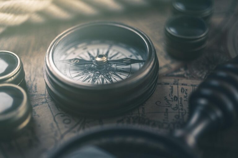
7 Best Projection Techniques for Visual Impact
Why it matters: Traditional map projections like Mercator and Robinson have dominated cartography for centuries, but artists and designers are pushing boundaries with experimental techniques that transform how we visualize our world.
The big picture: These innovative projection methods blend mathematical precision with creative vision, producing maps that challenge conventional geographic representation while revealing new perspectives on spatial relationships.
What’s next: From impossible geometries to data-driven distortions, these seven experimental techniques are reshaping artistic cartography and opening new possibilities for visual storytelling through maps.
Disclosure: As an Amazon Associate, this site earns from qualifying purchases. Thank you!
P.S. check out Udemy’s GIS, Mapping & Remote Sensing courses on sale here…
Anamorphic Projection: Distorting Reality for Emotional Impact
Anamorphic projection deliberately warps geographic features to create powerful visual narratives that prioritize emotional connection over spatial accuracy. This technique transforms familiar landscapes into compelling artistic statements by manipulating scale, perspective, and proportional relationships.
Understanding Anamorphic Transformation Principles
Anamorphic transformation relies on mathematical distortion algorithms that stretch or compress geographic elements based on specific viewpoints or data variables. You’ll manipulate coordinate systems to create intentional visual effects that highlight particular themes or messages. The technique works by applying non-uniform scaling factors across different map regions, creating dramatic perspective shifts that draw attention to key areas. Professional cartographers use polynomial transformations and rubber-sheet algorithms to achieve controlled distortions while maintaining recognizable geographic features.
Explore and map the wilderness for the Queen in Cartographers! Draw unique terrain shapes and score points based on randomly selected goals each game, but beware of monster ambushes.

Creating Perspective-Based Geographic Narratives
Perspective-based narratives emerge when you strategically distort map elements to guide viewer attention toward specific geographic relationships or social phenomena. You can emphasize urban density by expanding metropolitan areas while compressing rural regions, or highlight climate data by stretching affected coastlines. This approach transforms static geographic information into dynamic storytelling tools that communicate complex spatial relationships through visual metaphor. Your narrative choices determine which geographic features receive prominent placement and which elements fade into the background.
Tools and Software for Anamorphic Map Creation
Professional anamorphic mapping requires specialized software that handles complex geometric transformations and maintains data integrity throughout the distortion process. ArcGIS Pro offers advanced projection tools and custom transformation capabilities for professional workflows. QGIS provides open-source alternatives with plugins like QCartography for artistic projections. Adobe Illustrator combines with MAPublisher for vector-based anamorphic designs, while Processing and D3.js enable custom algorithmic approaches. You’ll need vector editing capabilities alongside GIS functionality to achieve precise control over your distortion parameters.
Learn Adobe Illustrator with the 2025 release of this comprehensive guide. Master essential skills through hands-on lessons.

Stereographic Projection: Transforming Spheres Into Infinite Planes
You’ll discover how stereographic projection creates stunning artistic maps by projecting spherical surfaces onto infinite planes. This technique transforms three-dimensional geographic data into compelling two-dimensional visualizations that maintain angular relationships while creating dramatic visual effects.
Mathematical Foundation of Stereographic Mapping
Achieve a flawless, even complexion with e.l.f. Flawless Satin Foundation. This lightweight, vegan formula provides medium coverage and a semi-matte finish for all-day wear, while hydrating your skin with glycerin.

Stereographic projection operates through a simple geometric principle: every point on a sphere projects onto a plane through straight lines passing through a fixed projection point. You’ll find this method preserves angles locally while dramatically distorting areas near the projection center. The mathematical formula involves complex coordinates where each point (x,y,z) on the sphere maps to (X,Y) coordinates on the plane using the relationship X = x/(1-z) and Y = y/(1-z). This creates infinite expansion as you approach the antipodal point.
Artistic Applications in Contemporary Cartography
Contemporary artists leverage stereographic projection to create mesmerizing world maps that challenge traditional geographic perspectives. You can transform polar regions into central focal points while pushing equatorial areas toward infinity, creating dramatic visual narratives about climate change or global connectivity. Digital artists use tools like Blender, Processing, and custom Python scripts to generate these projections with precise control over projection points and visual styling. Popular applications include circular world maps, hemisphere visualizations, and interactive installations where viewers manipulate projection centers in real-time.
Get durable, tear-resistant posters made in the USA. Each 18" x 29" poster features high-quality 3 MIL lamination for lasting protection.

Balancing Scientific Accuracy With Visual Appeal
You’ll need to carefully balance mathematical precision with artistic expression when implementing stereographic projection in your mapping projects. While the technique preserves angular relationships perfectly, area distortions can mislead viewers about geographic scale and proportion. Consider using graduated color schemes or transparency effects to indicate distortion levels across your map surface. Professional cartographers recommend clearly labeling projection parameters and including reference grids to help viewers understand spatial relationships. Documentation of your projection center coordinates and scaling factors ensures reproducibility while maintaining scientific integrity in your artistic interpretations.
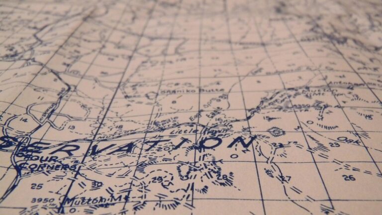
Interrupted Projection: Breaking Boundaries for Creative Expression
Interrupted projections fragment the globe into separate sections, eliminating the compromise between accuracy and continuity. This deliberate breaking allows you to preserve accurate area relationships while creating distinctive visual compositions.
Goode’s Homolosine as Artistic Inspiration
Goode’s homolosine projection splits continents to maintain accurate area measurements across six distinct lobes. You can adapt this foundation by repositioning interruption lines along artistic rather than oceanic boundaries. Modern cartographers often use ArcGIS Pro’s custom projection tools to modify Goode’s parameters, creating asymmetrical interruptions that emphasize specific landmasses. Processing and D3.js offer additional flexibility for generating non-traditional interruption patterns that serve artistic narratives while preserving the projection’s equal-area properties.
Custom Interruption Patterns for Unique Aesthetics
Custom interruption strategies transform traditional map layouts into compelling visual compositions. You’ll achieve striking results by interrupting along cultural boundaries, climate zones, or economic regions rather than standard meridians. QGIS plugins like QuickOSM enable precise control over interruption placement using geographic data layers. Consider interrupting at 30° intervals for tropical focus or asymmetrical breaks that isolate polar regions. Python scripts with CartoPy library provide programmatic control over interruption parameters, allowing you to experiment with unconventional patterns.
Combining Multiple Projection Methods
Hybrid projection approaches blend different mathematical methods within interrupted frameworks for maximum creative impact. You can combine stereographic polar sections with cylindrical tropical zones, creating seamless transitions at interruption boundaries. GDAL’s projection transformation tools enable precise stitching between projection types while maintaining coordinate accuracy. Popular combinations include Mollweide interrupted sections with orthographic polar caps, or azimuthal equidistant regional focuses connected through cylindrical bridges. Blender’s geographic plugins facilitate 3D visualization of these complex hybrid projections for final artistic presentation.
Polyhedral Projection: Unfolding Earth’s Geometric Beauty
Polyhedral projection transforms the Earth’s spherical surface onto geometric solids like icosahedrons and octahedrons, creating stunning three-dimensional visualizations. You’ll discover how these mathematical frameworks produce unique artistic maps that balance spatial accuracy with geometric elegance.
Icosahedral and Octahedral Mapping Approaches
Icosahedral projection divides Earth into 20 triangular faces, minimizing distortion across continental landmasses. You can use Dymaxion projection principles to distribute geographic features evenly, with each triangle maintaining angular relationships. Octahedral mapping creates eight triangular sections that emphasize polar regions while compressing equatorial zones. Tools like WorldWind and custom MATLAB scripts enable precise vertex calculations for both approaches, allowing you to experiment with face orientations and interruption patterns.
Creating Three-Dimensional Paper Map Sculptures
Physical polyhedral maps require careful template design using vector graphics software like Adobe Illustrator or Inkscape. You’ll need to calculate fold lines and tab placements for each geometric face, ensuring proper assembly alignment. Print templates on heavyweight paper (200-300 GSM) for structural integrity, then score fold lines using a bone folder. Assembly techniques involve systematic gluing of adjacent faces, starting from a central point and working outward to maintain geometric accuracy throughout the construction process.
Create scalable vector graphics with XML using SVG Essentials. This book teaches you to produce high-quality images that remain sharp at any size.

Digital Visualization of Polyhedral Projections
3D modeling software like Blender and Cinema 4D provides advanced polyhedral visualization capabilities through UV mapping techniques. You can apply geographic textures to geometric primitives, adjusting vertex positions for accurate continental placement. Interactive web visualizations use Three.js or D3.js libraries to create rotating polyhedral maps with dynamic data overlays. Processing and OpenFrameworks offer real-time manipulation options, enabling you to adjust face rotations and projection parameters while maintaining mathematical precision for professional cartographic applications.
Perspective Projection: Simulating Human Vision in Cartography
Perspective projection replicates natural depth perception in cartographic design, transforming flat geographic data into immersive three-dimensional visualizations. This technique bridges the gap between traditional mapping and human visual experience by incorporating atmospheric effects and vanishing points.
One-Point and Two-Point Perspective Techniques
One-point perspective creates dramatic depth by establishing a single vanishing point on the horizon line, typically used for aerial city views or coastal mappings. Two-point perspective adds complexity with dual vanishing points, enabling corner-view compositions that showcase urban intersections or mountain ranges. Tools like Blender’s camera constraints and SketchUp’s perspective guides help you maintain accurate geometric relationships while preserving recognizable landmarks.
Atmospheric Perspective for Depth Perception
Atmospheric perspective simulates distance through progressive color desaturation and contrast reduction, mimicking how Earth’s atmosphere affects visibility. You’ll achieve this effect by applying graduated opacity masks to background features while maintaining sharp detail in foreground elements. QGIS’s styling tools and Adobe Illustrator‘s gradient meshes enable precise control over atmospheric layering, creating convincing depth illusions that guide viewer attention across your cartographic composition.
Integrating Landscape Art Principles
Landscape art principles enhance perspective projection through compositional techniques like foreground-middleground-background layering and strategic focal point placement. You’ll apply color temperature shifts—warm foreground tones transitioning to cool background hues—to reinforce spatial hierarchy. Traditional plein air painting methods inform digital elevation model visualization, where terrain features follow artistic conventions for shadow casting and highlight placement to create compelling three-dimensional geographic narratives.
Conformal Projection: Preserving Angles for Artistic Precision
Conformal projections maintain local angular relationships while transforming curved surfaces into flat planes, making them essential for artistic maps requiring precise geometric accuracy. These mathematical transformations preserve the shape of small geographic features while allowing creative interpretation of larger spatial relationships.
Mercator Variations for Creative Cartography
Transverse Mercator projections rotate the cylinder 90 degrees, creating vertical meridian lines that emphasize north-south geographic relationships in your artistic compositions. You can adjust the central meridian to highlight specific continents or ocean basins. Oblique Mercator orientations follow great circle routes, producing dynamic diagonal map layouts that challenge traditional horizontal presentations. Space-oblique Mercator accounts for satellite orbital paths, generating curved meridian patterns perfect for movement-based geographic narratives. Software like ArcGIS Pro and PROJ libraries enable precise parameter control for these Mercator adaptations.
Lambert Conformal Conic Adaptations
Lambert conformal conic projections use two standard parallels to minimize distortion across mid-latitude regions, making them ideal for continental artistic representations. You can manipulate the cone’s apex position to create dramatic perspective effects while maintaining angular accuracy. Secant cones intersect Earth at two parallel lines, producing balanced distortion patterns that work well for regional focus maps. Tangent cone variations touch Earth at single parallels, creating concentrated accuracy zones surrounded by artistic distortion gradients. Tools like Geographic Calculator and custom Python scripts help you fine-tune these conic parameters for specific creative objectives.
Maintaining Local Shape Accuracy in Art Maps
Local shape preservation requires careful scale factor monitoring throughout your projection transformations to ensure small geographic features retain their recognizable forms. You’ll need to balance artistic vision with mathematical constraints by selecting appropriate projection parameters that minimize angular distortion in critical map regions. Grid convergence angles help you understand how meridian lines deviate from true north, allowing strategic placement of artistic elements along these natural geometric boundaries. Tissot’s indicatrix circles visualize distortion patterns, guiding your color choices and graphic treatments to complement the projection’s mathematical characteristics while maintaining cartographic integrity.
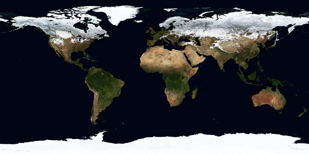
Equal-Area Projection: Balancing Proportion and Visual Harmony
Equal-area projections preserve the relative size relationships between geographic regions, making them essential for artistic maps where accurate proportional representation drives visual storytelling. These projections sacrifice angular accuracy to maintain area relationships, creating opportunities for compelling thematic visualizations.
Mollweide and Sinusoidal Projection Modifications
Mollweide projection creates elliptical world maps that preserve area relationships while producing aesthetically pleasing oval boundaries. You can modify standard Mollweide parameters by adjusting the central meridian to center specific continents or ocean basins for dramatic effect. Sinusoidal projection offers pseudocylindrical characteristics with straight parallels and curved meridians that create distinctive visual rhythms. Modern GIS software like QGIS and ArcGIS Pro allows you to customize these projections by shifting origin points and scaling factors to emphasize particular geographic relationships while maintaining proportional accuracy.
Color Theory Applications in Area-Preserving Maps
Sequential color schemes work exceptionally well with equal-area projections because consistent geographic proportions support reliable data comparison across regions. You should apply monochromatic progressions using tools like ColorBrewer to ensure visual weight corresponds directly to data values without distortion from projection artifacts. Complementary color pairs create striking contrasts when mapping opposing phenomena like temperature variations or economic indicators. Temperature-based color gradients from blue to red maintain intuitive associations while leveraging the projection’s proportional accuracy. Choropleth mapping becomes more reliable with equal-area projections since color intensity directly reflects data density without misleading size distortions.
Creating Thematic Art Maps With Accurate Proportions
Population density visualizations benefit tremendously from equal-area projections because they prevent wealthy nations from appearing disproportionately large compared to developing regions. You can create powerful cartograms by combining equal-area foundations with symbol scaling based on demographic data. Environmental mapping projects like deforestation tracking or carbon emission visualization require proportional accuracy to communicate scientific data effectively. Resource distribution maps showing agricultural output or mineral reserves maintain credibility when built on equal-area frameworks. Tools like D3.js and Mapbox Studio enable you to overlay statistical graphics while preserving the projection’s proportional integrity for compelling data storytelling.
Conclusion
These experimental projection techniques open up endless possibilities for your artistic cartographic work. You’re no longer limited by traditional mapping conventions when you have tools like anamorphic distortion and polyhedral transformation at your disposal.
The key lies in matching your chosen technique to your artistic vision. Whether you’re creating immersive perspective maps or fragmented interrupted projections each method serves a unique storytelling purpose.
Your success with these techniques depends on balancing mathematical precision with creative expression. Start experimenting with one projection method that resonates with your artistic goals and gradually expand your toolkit.
The future of artistic cartography belongs to creators who embrace these innovative approaches while respecting the fundamental principles of geographic accuracy.
Frequently Asked Questions
What is anamorphic projection in cartography?
Anamorphic projection is an experimental cartographic technique that deliberately distorts geographic features to create powerful visual narratives. It prioritizes emotional connection over spatial accuracy by manipulating scale, perspective, and proportional relationships. This method uses mathematical distortion algorithms to stretch or compress geographic elements, transforming familiar landscapes into compelling artistic statements that guide viewer attention toward specific relationships or phenomena.
How does stereographic projection work in artistic mapping?
Stereographic projection transforms spherical surfaces into infinite planes by projecting points from a sphere onto a flat surface through straight lines. This technique maintains angular relationships while creating dramatic visual effects and distorting areas near the projection center. Contemporary artists use stereographic projection to create mesmerizing world maps that challenge traditional geographic perspectives and produce stunning artistic visualizations.
What is interrupted projection and why is it used?
Interrupted projection fragments the globe into separate sections, allowing for accurate area relationships while creating distinctive visual compositions. This technique, exemplified by Goode’s homolosine projection, breaks the Earth’s surface into pieces to minimize distortion. Artists use interrupted projections to create hybrid approaches that blend different mathematical methods within fragmented frameworks, resulting in unique and visually striking map designs.
How does polyhedral projection create three-dimensional maps?
Polyhedral projection transforms the Earth’s spherical surface onto geometric solids like icosahedrons and octahedrons. This technique creates stunning three-dimensional visualizations by projecting geographic data onto multiple flat faces of polyhedra. Icosahedral projection minimizes distortion across continental landmasses and enables the creation of both physical polyhedral maps and digital visualizations that offer unique perspectives on global geography.
What makes conformal projection important for artistic cartography?
Conformal projection preserves local angular relationships while transforming curved surfaces into flat planes, making it essential for artistic maps requiring geometric accuracy. Variations like Transverse and Oblique Mercator projections emphasize specific geographic relationships and create dynamic layouts. This technique maintains local shape accuracy while allowing artists to balance their creative vision with mathematical constraints for precise cartographic representation.
Why is equal-area projection crucial for data visualization?
Equal-area projection preserves the relative size relationships between geographic regions, making it essential for artistic maps where accurate proportional representation drives visual storytelling. Techniques like Mollweide and sinusoidal projections can be customized using modern GIS software to emphasize specific geographic relationships. This approach is particularly effective for thematic art maps displaying population density, environmental data, and other complex information while maintaining credibility.
How do perspective projection techniques enhance map visualization?
Perspective projection simulates human vision in cartography by transforming flat geographic data into immersive three-dimensional visualizations. Using one-point and two-point perspective techniques, along with atmospheric perspective effects, this method enhances depth perception in maps. It creates more engaging and intuitive visualizations that help viewers better understand spatial relationships and geographic features through familiar visual depth cues.