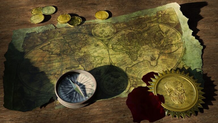
7 Best Map Design Textures
Modern maps aren’t just about displaying dataâthey’re visual stories that come alive through texture and pattern. You can transform bland geographic information into compelling visual narratives that grab attention and communicate complex ideas instantly.
Whether you’re designing for digital platforms or print media, incorporating thoughtful textures and patterns elevates your maps from functional tools to engaging experiences. The right visual elements guide your audience’s eye, establish hierarchy, and make even the most complex data accessible and memorable.
Disclosure: As an Amazon Associate, this site earns from qualifying purchases. Thank you!
Utilize Typography Texture to Create Visual Hierarchy
Typography serves as both an informational tool and a textural element that guides your reader’s eye through complex geographic data. Strategic font choices create visual depth while maintaining cartographic clarity.
P.S. check out Udemy’s GIS, Mapping & Remote Sensing courses on sale here…
Choose Font Weights That Complement Map Elements
Bold fonts work best for major geographic features like capital cities, state names, and primary highways. Medium weights suit secondary features such as county boundaries and regional labels. Light weights effectively label minor roads, small towns, and elevation contours without overwhelming your base map data. You’ll maintain readability by matching font weight intensity to feature importance levels.
Implement Variable Letter Spacing for Different Scale Levels
Tight letter spacing optimizes labels for detailed city maps and neighborhood-level cartography where space constraints demand efficiency. Standard spacing works well for regional maps displaying counties, states, and major transportation networks. Wide letter spacing enhances readability on small-scale continental or world maps where text must remain legible at reduced sizes. You’ll achieve professional results by adjusting spacing based on your map’s zoom level and intended viewing distance.
Get durable, tear-resistant posters made in the USA. Each 18" x 29" poster features high-quality 3 MIL lamination for lasting protection.

Combine Serif and Sans-Serif Fonts for Textural Contrast
Sans-serif fonts excel for modern infrastructure labels including highways, airports, and urban development areas. Serif fonts add classical elegance to natural features like mountain ranges, rivers, and historical landmarks. This combination creates visual texture that separates human-made elements from natural geography. You’ll strengthen your map’s narrative by using serif fonts for traditional place names and sans-serif for contemporary features.
Apply Terrain Textures to Enhance Geographic Representation
Terrain textures bridge the gap between flat geographic data and three-dimensional reality. You’ll transform standard elevation contours into compelling visual narratives that communicate landscape character at first glance.
Incorporate Realistic Mountain and Hill Shading Patterns
Mountain shading patterns create depth through strategic shadow placement that mimics natural light angles. You should apply hillshade algorithms at 45-degree illumination angles for optimal relief visualization. Cross-hatching techniques work exceptionally well for steep terrain, while graduated dot patterns effectively represent gentler slopes. QGIS and ArcGIS offer built-in hillshade tools that generate realistic shadow effects from digital elevation models, allowing you to adjust azimuth and altitude settings for dramatic terrain representation.
Use Stippling Techniques for Desert and Arid Regions
Stippling patterns convey the granular texture of desert landscapes through carefully spaced dot distributions. You’ll achieve authentic representation by varying dot density based on terrain roughness and elevation changes. Fine stippling works best for sand dunes, while coarser patterns represent rocky desert surfaces. Adobe Illustrator‘s scatter brush tools enable precise stipple control, letting you create custom brushes that respond to elevation data. This technique particularly excels in black-and-white mapping where color temperature variations aren’t available.
Learn Adobe Illustrator with the 2025 release of this comprehensive guide. Master essential skills through hands-on lessons.

Add Organic Textures for Forest and Vegetation Areas
Organic textures transform uniform green polygons into recognizable forest canopies through irregular tree symbol placement. You should vary symbol sizes and orientations to create natural randomness that reflects actual forest density patterns. Hand-drawn tree symbols provide authentic texture, while procedural generation tools like those in MAPublisher create randomized vegetation patterns. Layer different tree types at varying opacities to represent mixed forests, and use smaller symbols for background areas to establish visual depth within forested regions.
Implement Pattern-Based Symbols for Consistent Data Visualization
Pattern-based symbols create visual coherence across complex maps while maintaining data clarity. You’ll establish recognizable design languages that help viewers instantly categorize information without overwhelming the underlying geography.
Design Geometric Patterns for Urban Development Zones
Grid patterns work effectively for residential areas, using square or rectangular motifs at 2-3mm spacing to represent planned neighborhoods. Diagonal hatching differentiates commercial zones, with 45-degree lines spaced 1.5mm apart creating clear boundaries. Crosshatch patterns identify mixed-use developments, combining horizontal and vertical elements at varying densities. You’ll achieve optimal results by maintaining consistent line weights between 0.25-0.5pt and testing pattern visibility at multiple zoom levels in your GIS software.
Create Repeating Motifs for Infrastructure Elements
Parallel line patterns represent transportation corridors, with double lines for highways and single lines for local roads. Dotted sequences mark utility lines, using 2mm dots spaced 3mm apart for power lines and smaller 1mm dots for telecommunications. Triangle patterns indicate pipeline networks, with directional arrows showing flow direction. You’ll maintain pattern consistency by creating symbol libraries in ArcGIS or QGIS, ensuring infrastructure elements remain legible when overlapping with terrain textures and urban development zones.
Establish Pattern Libraries for Standardized Map Legends
Categorical pattern sets organize by data type, grouping land use patterns separately from infrastructure symbols. Hierarchical symbol systems use pattern density to indicate data importance, with 25% fills for secondary features and 50% fills for primary elements. Scalable pattern collections maintain visual integrity across print sizes from 8.5×11 inches to large-format displays. You’ll build comprehensive libraries using consistent color palettes and export pattern swatches as .style files for team-wide standardization.
Leverage Color Gradients and Textural Fills for Depth Perception
Color gradients and textural fills transform two-dimensional maps into visually compelling representations that guide your audience through complex geographic data with enhanced spatial understanding.
Apply Subtle Noise Textures to Prevent Flat Color Appearance
Noise textures eliminate the sterile appearance of solid color fills while maintaining data readability. You’ll achieve optimal results by applying 2-3% opacity noise patterns to polygon features in ArcGIS Pro or QGIS. Perlin noise functions work particularly well for water bodies and agricultural zones, creating organic variation that mimics natural surface irregularities. Adjust grain size between 0.5-2.0 pixels to match your map’s final output resolution and viewing distance.
Use Hatching Patterns for Monochromatic Map Designs
Hatching patterns provide visual hierarchy when color isn’t available or appropriate for your mapping project. You’ll find parallel line patterns most effective for distinguishing administrative boundaries, with 45-degree angles offering optimal readability. Vary line spacing from 2-8 points depending on area importance – closer spacing indicates higher significance. Consider using different hatch directions for adjacent polygons to prevent visual confusion along shared boundaries.
Implement Cross-Hatching for Areas of Statistical Significance
Cross-hatching creates unmistakable visual emphasis for statistically significant geographic areas in your analytical maps. Perpendicular line intersections at 45 and 135 degrees generate strong visual weight without overwhelming surrounding features. You’ll want to reserve this technique for areas exceeding 95% confidence intervals or p-values below 0.05. Maintain consistent line weights between 0.25-0.5 points to ensure pattern clarity across different map scales and reproduction methods.
Incorporate Cultural and Regional Pattern Elements
Cultural authenticity in map design creates deeper connections between your visualization and its geographic context. Strategic integration of regional motifs transforms standard cartographic presentations into culturally resonant visual narratives.
Research Traditional Local Design Motifs
Study indigenous textile patterns from your target region to identify recurring geometric elements suitable for map integration. Local museums and cultural centers provide authentic design references that respect traditional artistic heritage while avoiding appropriation concerns.
Document architectural details from historic buildings, focusing on repeating elements like brick patterns, tile arrangements, or decorative stonework. These structural motifs translate effectively into cartographic symbols for representing built environments with regional character.
Analyze regional flora patterns through botanical illustrations and field guides to create organic textures reflecting local ecosystems. Native plant forms provide natural design elements that enhance geographic authenticity without overwhelming data presentation.
Identify North American mushrooms with this updated field guide. It features detailed descriptions and illustrations for accurate identification in the field.

Adapt Historical Cartographic Patterns for Modern Maps
Examine 18th and 19th-century regional maps to identify period-appropriate decorative elements like compass roses, border treatments, and terrain representation techniques. Historical cartographic collections offer tested design solutions adaptable to contemporary digital workflows.
Modernize traditional hachure patterns using vector graphics software to create terrain textures reflecting historical mapping conventions. These time-tested techniques provide visual depth while maintaining compatibility with current GIS output standards.
Create scalable vector graphics with XML using SVG Essentials. This book teaches you to produce high-quality images that remain sharp at any size.

Reference maritime charts from your region’s coastal areas to extract navigation symbols and water pattern conventions. Historical nautical elements add authenticity to coastal mapping projects while respecting established cartographic traditions.
Balance Decorative Elements With Functional Clarity
Limit cultural patterns to 15-20% opacity when overlaying decorative elements on functional map data to maintain readability. Use cultural motifs as subtle background textures rather than dominant visual elements that compete with primary information.
Test pattern visibility across multiple scales to ensure decorative elements remain appropriate from overview to detailed zoom levels. Cultural patterns should enhance rather than obscure critical geographic information at all viewing distances.
Establish clear visual hierarchy by reserving bold cultural elements for non-critical map areas like margins or water bodies. Primary data visualization requires unobstructed presentation while secondary areas accommodate regional design enhancement.
Experiment With Digital Brush Textures for Artistic Appeal
Digital brush textures transform standard cartographic elements into compelling visual narratives that bridge the gap between technical precision and artistic expression.
Apply Watercolor Effects for Environmental Storytelling
Create vibrant watercolor art with this portable set. It includes 40 colors (metallic & fluorescent), a brush pen, watercolor paper, and more, all in a stylish tin box.

Watercolor textures excel at representing dynamic environmental data like precipitation patterns, temperature zones, and seasonal vegetation changes. You’ll achieve optimal results by applying subtle watercolor washes at 15-20% opacity over base geographic features in Adobe Illustrator or Photoshop. These organic textures naturally convey uncertainty and gradual transitions in environmental data, making your maps more intuitive for audiences to interpret. The flowing, irregular edges of watercolor effects perfectly mirror how natural phenomena actually behave across landscapes.
Use Pen and Ink Textures for Vintage Map Aesthetics
Pen and ink textures bring historical authenticity to modern cartographic projects while maintaining contemporary data accuracy. You can recreate traditional cross-hatching and stippling patterns using digital brushes in programs like Procreate or Photoshop, applying them to elevation contours and coastal boundaries. These textures work particularly well for heritage tourism maps, historical atlases, and educational materials that benefit from classical cartographic styling. The high contrast and detailed linework of pen textures ensure excellent readability across both digital displays and print applications.
This 43" Samsung 4K UHD commercial display delivers crisp visuals with a non-glare screen and built-in media player. Designed for 16/7 operation, it offers versatile connectivity and a three-year warranty for reliable performance.

Combine Multiple Brush Styles for Dynamic Visual Interest
Layering different brush textures creates sophisticated visual hierarchies that guide readers through complex geographic information effectively. You can combine rough charcoal textures for mountain ranges with smooth watercolor washes for water bodies, then add fine pen details for urban infrastructure. This multi-texture approach prevents visual monotony while maintaining clear data distinctions between different geographic elements. The key lies in limiting your palette to 3-4 complementary brush styles to avoid overwhelming your audience with competing visual elements.
Optimize Texture and Pattern Scale for Different Output Formats
Successfully scaling textures and patterns across multiple output formats requires careful calibration to maintain visual clarity and data integrity.
Adjust Pattern Density for Print Versus Digital Display
Print materials require 20-30% higher pattern density than digital displays to maintain visual impact. Your dot patterns should use 150-300 DPI resolution for print output while reducing to 72-96 DPI for web display. Screen viewing distances typically range 18-24 inches, while printed maps are viewed at 12-16 inches, necessitating finer detail adjustment. Testing pattern visibility at actual print sizes prevents production issues and ensures consistent visual hierarchy across both formats.
Consider Viewing Distance When Selecting Texture Complexity
Wall-mounted maps viewed from 3-6 feet require simplified texture patterns with larger elements and increased contrast ratios. Desktop reference maps allow intricate stippling and cross-hatching techniques with fine detail preservation. Handheld devices need bold, simplified patterns due to 8-12 inch viewing distances and smaller screen real estate. Your texture complexity should decrease proportionally as viewing distance increases, maintaining readability while preserving essential geographic information across all intended use cases.
Test Pattern Readability Across Various Device Sizes
Mobile devices require pattern elements 40-60% larger than desktop versions to maintain legibility on 4-6 inch screens. Tablet displays accommodate moderate pattern complexity between mobile and desktop specifications. Your testing workflow should include iPhone, Android, tablet, and desktop preview modes using actual device dimensions. Pattern stroke weights need adjustment from 0.5pt minimum for desktop to 1.5pt minimum for mobile viewing, ensuring consistent visual hierarchy across all targeted device categories.
Conclusion
Mastering texture and pattern in map design transforms your geographic visualizations from simple data displays into compelling visual narratives. You’ve learned how strategic typography choices create hierarchy while terrain textures add depth and realism to your landscapes.
The cultural elements and digital brush techniques you incorporate will help your maps resonate more deeply with audiences. Remember that pattern-based symbols and color gradients guide viewers through complex information while maintaining clarity.
Your success depends on optimizing these elements for different output formats. Test your designs across various scales and devices to ensure your textural choices enhance rather than overwhelm your message. With these techniques you’ll create maps that don’t just inform but truly engage your audience.
Frequently Asked Questions
What makes modern maps different from traditional data displays?
Modern maps function as visual stories rather than simple data presentations. They incorporate textures, patterns, and thoughtful design elements to transform standard geographic information into engaging narratives. This approach makes complex data more accessible and memorable while effectively communicating intricate ideas to audiences across both digital and print media.
How does typography enhance map readability and navigation?
Strategic typography creates visual hierarchy by using bold fonts for major features and lighter weights for minor details. Variable letter spacing optimizes readability at different scales, while combining serif and sans-serif fonts adds textural contrast. This approach distinguishes human-made elements from natural geography and guides readers through complex geographic data.
What techniques improve terrain representation in maps?
Realistic mountain and hill shading patterns create depth using natural light effects through tools like QGIS and ArcGIS. Stippling techniques with varying dot densities represent desert landscapes effectively. For forested areas, organic textures with irregular tree symbol placements create natural appearances, collectively enriching visual storytelling.
How do pattern-based symbols enhance map clarity?
Geometric patterns effectively represent urban development zones with specific designs for residential, commercial, and mixed-use areas. Repeating motifs for infrastructure elements like transportation corridors maintain visual coherence. Establishing pattern libraries for standardized legends organizes symbols by data type, ensuring consistency and visual integrity across various print sizes.
What role do color gradients and textural fills play in map design?
Color gradients and textural fills enhance depth perception and guide audiences through complex geographic data. Subtle noise textures at 2-3% opacity prevent flat color appearances. Hatching patterns create visual hierarchy in monochromatic designs, while cross-hatching emphasizes statistically significant areas, maintaining clarity through proper line weights and angles.
How can cultural elements be incorporated into modern map design?
Research traditional local design motifs, including indigenous textile patterns and architectural details, to enhance geographic authenticity. Adapt historical cartographic patterns from 18th and 19th-century maps while balancing decorative elements with functional clarity. Cultural patterns should be used subtly to maintain readability and visual hierarchy.
What are digital brush textures and how do they benefit maps?
Digital brush textures bridge technical precision with artistic expression, transforming standard cartographic elements into compelling visual narratives. Watercolor effects represent dynamic data like precipitation changes, while pen and ink textures add historical authenticity. Combining multiple brush styles creates dynamic visual interest while maintaining clarity.
How should textures and patterns be optimized for different output formats?
Print materials require 20-30% higher pattern density than digital displays. Wall-mounted maps need simplified textures for 3-6 feet viewing distances, while handheld devices require bold, simplified patterns due to smaller screens. Test pattern readability across various device sizes to ensure consistent visual hierarchy and legibility.