7 Best Map Design Techniques for Clear Data Storytelling
Map design can make or break your data visualization – and visual hierarchy is the secret weapon that transforms confusing clutter into clear communication. Whether you’re creating digital maps for websites or print materials for presentations you need strategic design principles that guide your audience’s attention exactly where it needs to go. Smart visual hierarchy techniques help users process spatial information faster while ensuring your most important data points never get lost in the visual noise.
Disclosure: As an Amazon Associate, this site earns from qualifying purchases. Thank you!
Use Color Contrast to Guide the Eye
Color contrast creates natural reading paths across your map layout. Strategic color placement directs viewers to critical data points while maintaining visual balance throughout your design.
Create Focal Points with Bold Color Choices
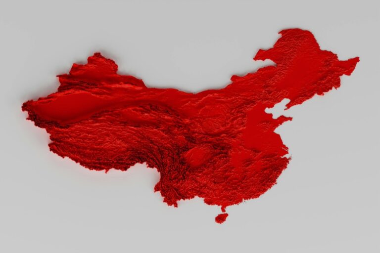
Select high-saturation colors for primary data layers to draw immediate attention to key information. Bright reds work exceptionally well for emergency zones, while electric blues highlight water features effectively. You’ll establish clear data priorities by reserving these vibrant hues for your most important map elements. Test your focal colors against colorblind accessibility standards using tools like Coblis or Color Oracle to ensure universal readability.
P.S. check out Udemy’s GIS, Mapping & Remote Sensing courses on sale here…
Apply Complementary Colors for Maximum Impact
Use complementary color pairs like orange-blue or red-green combinations to create maximum visual separation between data categories. These opposing hues naturally guide the eye between related but distinct information layers. Your demographic data becomes more readable when you pair warm colors for population density with cool colors for geographic boundaries. Remember that complementary relationships work best when one color dominates while the other provides accent contrast.
Utilize Neutral Backgrounds to Enhance Main Elements
Choose muted gray or beige base colors for your background elements to prevent competition with primary data visualization. Neutral backgrounds allow your colored data points to appear more vibrant and accessible to viewers. You’ll reduce visual noise by keeping administrative boundaries, elevation contours, and reference grids in subtle tones between 20-40% opacity. This approach ensures your main data storytelling elements remain the clear focus of attention.
Employ Typography Hierarchy for Clear Communication
Typography serves as the backbone of successful map communication, guiding viewers through information layers with precision. Strategic text placement and sizing create visual pathways that complement your color hierarchy decisions.
Select Appropriate Font Sizes for Different Information Levels
You’ll achieve optimal readability by establishing distinct size relationships between text elements. Primary labels like country names should use 14-16pt fonts, while secondary features like cities require 10-12pt sizing. Tertiary information such as street names or small landmarks work best at 8-10pt to maintain legibility without competing for attention. This systematic approach ensures your audience processes information in the intended order.
Choose Readable Typefaces That Match Your Map’s Purpose
Your typeface selection directly impacts user comprehension and professional credibility. Sans-serif fonts like Helvetica or Arial provide excellent clarity for digital maps and technical applications, while serif options like Times New Roman work well for traditional or historical mapping contexts. Avoid decorative fonts that compromise readability at smaller sizes. Consider specialized cartographic fonts like Avenir or Frutiger for optimal performance across various zoom levels and printing conditions.
Implement Consistent Text Styling Throughout the Design
Consistent styling creates professional polish and reduces cognitive load for map users. Establish standardized formatting rules for each information category—bold weights for major features, italics for water bodies, and regular weight for general labels. Maintain uniform spacing between text elements and apply consistent alignment patterns throughout your design. This systematic approach reinforces your visual hierarchy while ensuring viewers can quickly identify different types of geographic information.
Leverage Size Variations to Show Importance
Size serves as your most intuitive tool for establishing visual hierarchy in map design. Varying element dimensions creates immediate recognition patterns that guide viewers through spatial information naturally.
Scale Elements According to Their Significance
Primary features demand proportionally larger representation to establish clear information hierarchy. Cities with populations over 500,000 should appear 3-4 times larger than towns under 50,000 residents. Highway symbols need 40-50% more thickness than local roads to reflect traffic capacity and navigation importance. Critical landmarks like airports or hospitals require 2-3x scaling compared to secondary points of interest. This proportional approach ensures your most important geographic data captures immediate attention while maintaining accurate spatial relationships.
Create Visual Weight Through Proportional Sizing
Strategic sizing creates visual anchors that control how readers process map information. Large elements naturally draw focus first, while smaller features provide supporting context without overwhelming the composition. Icons representing major transportation hubs should measure 12-16 pixels, while minor stops work effectively at 6-8 pixels. Text labels follow similar scaling: major city names at 14-16pt create strong focal points, while neighborhood labels at 10-12pt provide necessary detail without competing for attention. This weight distribution guides the eye through logical information sequences.
Balance Large and Small Elements for Optimal Composition
Effective size balance prevents visual chaos while maintaining clear information priorities. Distribute large elements across your map canvas to avoid clustering that creates dead zones or overwhelming focal areas. Position major features like capital cities or primary rivers to create triangular compositions that naturally guide eye movement. Fill intermediate spaces with medium-sized elements—regional centers, secondary waterways, or major parks—that bridge visual gaps between dominant and minor features. This layered approach ensures comprehensive coverage while preserving the strength of your primary visual hierarchy.
Apply Strategic Positioning and Spacing
Positioning determines how effectively your map communicates spatial relationships. Thoughtful spacing creates visual breathing room that enhances comprehension while preventing information overload.
Place Critical Information in Prime Visual Areas
Position your most important data in the upper-left quadrant where viewers naturally begin reading. This zone receives maximum visual attention and ensures critical information gets noticed first. Place secondary features along the diagonal reading path from top-left to bottom-right. Reserve peripheral areas for supporting elements like legends and scale bars. Your primary focal points should occupy roughly 30% of the upper-left viewing area for optimal impact.
Use White Space to Prevent Overcrowding
Create buffer zones around major features using adequate white space to improve readability. Maintain minimum 3-5mm spacing between text labels and map elements to prevent visual collision. Allow breathing room between data layers by spacing similar elements at least 1.5 times their size apart. White space acts as a visual separator that reduces cognitive load and helps viewers process complex geographic information more efficiently.
Group Related Elements for Better Organization
Cluster related data points within logical proximity to create visual associations that support your map’s narrative. Position legend items, scale bars, and north arrows as unified blocks rather than scattered elements. Keep similar feature types within 15-20% of each other’s visual space to establish clear categorical relationships. This proximity principle helps viewers understand data connections while maintaining clean organizational structure throughout your map layout.
Implement Layering Techniques for Depth
Effective layering transforms flat map layouts into dimensional visual experiences that guide your audience through complex geographic information. Strategic depth creation helps establish clear information hierarchies while maintaining spatial relationships.
Stack Information in Order of Importance
Arrange your map elements vertically based on their priority to establish visual dominance. Place critical features like major cities or primary data points on the topmost layer to ensure immediate visibility. Position secondary elements like road networks and regional boundaries in middle layers, while background features such as terrain textures or administrative divisions occupy the bottom layers. This z-order approach creates natural reading patterns that mirror your audience’s information needs.
Use Transparency to Show Overlapping Data
Apply alpha transparency levels between 60-80% to reveal underlying information without losing focus on primary data layers. Semi-transparent overlays allow multiple datasets to coexist while maintaining visual clarity for complex geographic relationships. Use higher transparency (70-80%) for less critical overlay data and lower transparency (60-70%) for important contextual information. This technique works particularly well for displaying demographic data over topographic features or showing historical boundaries alongside current administrative divisions.
Create Visual Separation Between Map Layers
Establish distinct visual boundaries using stroke weights, drop shadows, or subtle color variations to differentiate between data layers. Apply 1-2 pixel borders around polygon features and use consistent shadow effects with 2-3 pixel offsets to create depth perception. Maintain uniform separation techniques across similar feature types to preserve visual consistency. This approach prevents layer confusion while preserving the spatial relationships that make your map data meaningful and accessible.
Utilize Shape and Symbol Differentiation
Effective symbol differentiation establishes clear visual categories while maintaining professional cartographic standards across your map design.
Design Distinctive Icons for Different Categories
Create unique iconography that immediately communicates data categories without requiring legend consultation. Use triangular shapes for warning points, circular symbols for population centers, and square markers for infrastructure locations. Apply consistent stroke weights of 2-3 pixels for digital maps to ensure visibility at multiple zoom levels. Design icons with 24×24 pixel dimensions for optimal mobile display performance while maintaining desktop clarity.
Apply Consistent Symbol Systems Across the Map
Maintain uniform scaling throughout your symbol system to prevent visual confusion and establish professional credibility. Set primary symbols at 100% scale, secondary features at 75% scale, and tertiary elements at 50% scale for clear hierarchy. Use identical fill patterns within each category—solid fills for permanent features, hatched patterns for temporary elements. Apply matching stroke colors within symbol families to create visual cohesion across different map regions.
Use Geometric Shapes to Convey Specific Meanings
Leverage shape psychology to communicate information intuitively through geometric form selection. Apply circular shapes for natural features like lakes and forests, angular shapes for human-made infrastructure, and diamond symbols for points of interest. Use pentagon markers for government facilities, hexagonal symbols for commercial zones, and octagonal shapes for regulatory boundaries. Match shape complexity to data importance—simple circles for basic points, complex polygons for detailed administrative areas.
Control Visual Flow with Directional Elements
Directional elements serve as invisible highways that guide your viewers through complex spatial information. You’ll establish logical reading sequences that transform overwhelming data into comprehensible geographic narratives.
Guide Viewers Through Your Map with Visual Pathways
Create intentional visual corridors using aligned elements, consistent spacing, and strategic positioning to direct attention flow. Position your most critical features along natural eye movement patterns—typically from upper-left to lower-right in Western reading cultures. Establish clear entry points with prominent landmarks or distinctive symbols that serve as visual anchors, then connect secondary information through coordinated alignment and proportional sizing relationships throughout your composition.
Use Lines and Arrows to Connect Related Information
Deploy connecting lines strategically to link related geographic features, data points, or explanatory callouts without creating visual clutter. Use varying line weights—2-3pt for primary connections, 1-2pt for secondary relationships—to establish information hierarchy within your directional system. Implement subtle arrows sparingly for complex flow patterns like migration routes or transportation networks, ensuring arrow heads remain proportional to line thickness and maintain consistent styling across your entire map design.
Create Reading Patterns That Support Your Map’s Story
Design deliberate information sequences that mirror your map’s narrative structure, positioning supporting details along logical progression paths from primary to secondary data layers. Establish rhythm through repeated directional cues—consistent symbol placement, aligned text blocks, or coordinated color transitions—that create predictable visual patterns your audience can follow intuitively. Balance directional guidance with spatial accuracy, ensuring your visual flow enhances rather than contradicts the geographic relationships you’re communicating.
Conclusion
Mastering these seven visual hierarchy methods will transform your map designs from cluttered displays into powerful communication tools. When you combine strategic color placement with thoughtful typography sizing and positioning you create maps that guide viewers naturally through complex spatial information.
Remember that effective map design isn’t about using every technique at once but rather selecting the right combination for your specific data story. Whether you’re designing digital interfaces or print materials these principles will help you create maps that communicate clearly and engage your audience effectively.
Your success in map design ultimately depends on how well you balance visual elements to support your message. By implementing these hierarchy techniques consistently you’ll develop maps that not only look professional but also serve their primary purpose: making geographic information accessible and meaningful to your viewers.
Frequently Asked Questions
What is visual hierarchy in map design?
Visual hierarchy in map design refers to the strategic arrangement of elements to guide viewers’ attention and enhance understanding of spatial information. It uses design principles like size, color, typography, and positioning to ensure key data points stand out while supporting information remains accessible. This approach prevents confusion and clutter, making complex geographic data more digestible for audiences.
How does color contrast improve map readability?
Color contrast guides viewers’ eyes across map layouts by creating focal points and visual separation. High-saturation colors highlight primary data layers, while complementary color pairs distinguish between different data categories. Neutral backgrounds reduce visual noise and enhance the vibrancy of main elements, ensuring important information remains immediately noticeable and the overall design maintains visual balance.
What are the recommended font sizes for map typography?
For optimal map readability, use 14-16pt fonts for primary labels, 10-12pt for secondary features, and 8-10pt for tertiary information. Choose sans-serif fonts for digital maps and serif fonts for traditional contexts. Avoid decorative fonts that hinder readability, and maintain consistent text styling throughout the design to create professional appearance and reduce cognitive load.
How should element sizes vary in map design?
Primary features should be proportionally larger to establish clear information hierarchy, with scaling recommendations varying for cities, highways, and landmarks. Larger elements draw focus first while smaller features provide supporting context. Balance large and small elements using a layered approach to prevent visual chaos while ensuring comprehensive coverage and preserving the strength of primary visual hierarchy.
Where should critical information be positioned on maps?
Place critical information in the upper-left quadrant for maximum visual attention, as this follows natural eye movement patterns. Use white space to prevent overcrowding and enhance readability. Group related elements within close proximity to create visual associations and support the map’s narrative. Strategic positioning helps establish clear information flow and spatial relationships.
What are effective layering techniques for maps?
Stack information in order of importance to create visual dominance, with the most critical data on top layers. Use transparency to show overlapping datasets while maintaining clarity, allowing multiple information types to coexist. Create visual separation between layers through distinct boundaries to ensure spatial relationships remain clear and accessible to viewers.
How should symbols be differentiated in map design?
Create distinctive icons for different data categories, such as triangular shapes for warnings and circular symbols for population centers. Maintain consistent stroke weights and dimensions for visibility. Use geometric shapes to convey specific meanings intuitively, matching shape complexity to data importance. Establish a uniform symbol system with specific scaling for primary, secondary, and tertiary elements.
How can visual flow be controlled in map design?
Control visual flow through directional elements like aligned features and strategic positioning that follow natural eye movement patterns. Use connecting lines and arrows with varying weights to link related geographic features without cluttering. Create intentional visual corridors and reading patterns that support the map’s narrative, ensuring visual flow enhances the communication of geographic relationships.