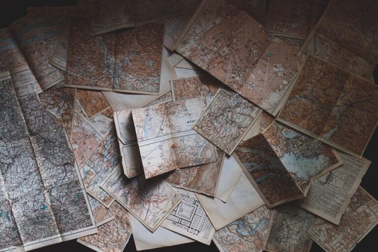
7 Emergency Map Design Ideas That Transform Crisis Response
When disaster strikes you need more than just any map – you need one designed specifically for your environment’s unique challenges. Urban emergency maps must navigate dense infrastructure and high population density while rural maps face vast distances and limited resources. The bottom line: Effective emergency mapping isn’t one-size-fits-all and requires tailored approaches that account for geographic realities and community needs.
Disclosure: As an Amazon Associate, this site earns from qualifying purchases. Thank you!
Understanding Emergency Map Design Fundamentals for Different Environments
Emergency mapping requires distinct approaches based on environmental context. Your design strategy must adapt to specific geographic challenges and community needs.
Key Principles of Emergency Cartography
Clarity becomes your primary objective when designing emergency maps. You’ll need to prioritize essential information while eliminating visual clutter that delays decision-making. Scale consistency ensures accurate distance calculations for response teams. Color coding should follow universal emergency standards – red for danger zones, green for safe areas, and yellow for caution zones. Symbol standardization across all emergency maps helps responders navigate unfamiliar territories quickly.
P.S. check out Udemy’s GIS, Mapping & Remote Sensing courses on sale here…
Urban vs Rural Design Considerations
Urban emergency maps demand high-resolution detail showing building-level information, street networks, and infrastructure systems like subway tunnels or parking structures. You’ll focus on vertical elements including high-rise buildings and multi-level transportation systems. Rural emergency maps require broader geographic coverage with emphasis on natural landmarks, unpaved roads, and terrain features. Distance markers become critical since rural response times depend heavily on accurate mileage calculations between remote locations and emergency services.
Prioritizing High-Contrast Visual Elements for Urban Emergency Maps
Urban emergency maps demand exceptional visual clarity to cut through the complexity of dense metropolitan environments. High-contrast design elements ensure critical information remains visible during high-stress emergency situations.
Bold Color Schemes for City Environments
Select colors with maximum contrast ratios to ensure emergency routes and hazard zones stand out against complex urban backgrounds. Use bright reds (#FF0000) for danger zones, vibrant yellows (#FFFF00) for caution areas, and deep blues (#0000FF) for safe zones. Avoid pastels and muted tones that disappear against building textures and street patterns. Test your color combinations at 4.5:1 contrast ratios minimum to meet accessibility standards in emergency lighting conditions.
Typography Selection for Dense Information Areas
Choose sans-serif fonts with heavy weights like Arial Bold or Helvetica Black for maximum legibility in information-dense urban maps. Set text sizes at minimum 12-point for street names and 14-point for critical emergency information. Use all-caps sparingly for emergency labels only, as mixed case improves reading speed for detailed directions. Implement consistent text hierarchy with 3-4 font sizes maximum to prevent visual confusion during rapid information scanning.
Simplifying Rural Emergency Maps with Clear Landmark Integration
Rural emergency maps require a fundamentally different approach that emphasizes recognizable landmarks over street-level detail. You’ll need to balance geographic accuracy with visual simplicity to create maps that work effectively in areas where traditional urban navigation markers don’t exist.
Natural Feature Emphasis Techniques
Prioritize prominent topographic features like ridgelines, water bodies, and distinctive rock formations as your primary reference points. Use elevation contours sparingly—only highlight major changes that create visible landscape breaks. Rivers and streams should appear in bold blue with consistent line weights throughout your map scale. Combine multiple natural markers within single grid sections to provide redundant navigation options when GPS fails or weather obscures visibility.
Road Network Simplification Strategies
Focus on paved roads and maintained gravel routes while eliminating seasonal tracks that may become impassable during emergencies. Use a three-tier hierarchy: primary evacuation routes in thick red lines, secondary access roads in medium orange, and emergency-only paths as thin dashed lines. Group minor rural roads into simplified connector paths rather than showing every farm access point. This approach reduces visual clutter while maintaining essential routing information for emergency responders unfamiliar with local geography.
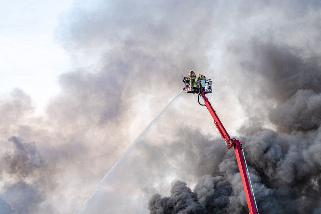
Incorporating Real-Time Data Visualization for Urban Crisis Response
Real-time data integration transforms static emergency maps into dynamic command tools that adapt to changing crisis conditions. Urban environments require continuous data streams to track evolving threats and resource deployment across complex infrastructure networks.
Traffic Flow and Evacuation Route Updates
Traffic flow visualization displays current congestion levels using color-coded arterial networks that update every 30 seconds during active emergencies. You’ll implement graduated color schemes from green (free-flowing) to red (gridlocked) on primary evacuation corridors.
Live route optimization adjusts recommended pathways based on real-time traffic density data from municipal traffic management systems. Integration with GPS tracking allows emergency coordinators to redirect evacuees away from blocked intersections or accident scenes within minutes of detection.
Track vehicles and assets with the LandAirSea 54 GPS Tracker. Get real-time location alerts and historical playback using the SilverCloud app, with a long-lasting battery and discreet magnetic mount.

Population Density Heat Mapping
Population density heat maps reveal current occupancy levels in buildings, transit hubs, and public spaces using mobile device ping data and security camera analytics. You’ll create graduated density overlays that intensify from light blue (sparse) to deep red (overcrowded) zones.
Dynamic capacity tracking monitors evacuation shelter utilization and identifies areas requiring additional resources or alternative routing. This real-time population data helps emergency managers allocate personnel and supplies to high-density zones while avoiding overwhelming single evacuation points during mass displacement events.
Experience smooth, tear-free gaming and video with the Acer KB272 G0bi 27" Full HD monitor, featuring Adaptive-Sync (FreeSync Compatible) and a rapid 1ms response time. Enjoy vibrant colors with 99% sRGB coverage and versatile connectivity through HDMI and VGA ports.

Emphasizing Geographic Context in Rural Emergency Mapping
Rural emergency maps succeed when they prioritize geographic context over detailed infrastructure. You’ll need to focus on natural features and broad spatial relationships that help responders navigate unfamiliar terrain quickly.
Topographical Feature Highlighting
Elevation contours become your primary navigation framework in rural emergency mapping. Display major ridgelines using bold brown lines at 100-foot intervals, with supplementary 20-foot contours in lighter weights for slope assessment. Prominent peaks should feature elevation labels in 14-point bold text, while valley floors require blue-tinted shading to indicate drainage patterns. Water features like rivers and lakes serve as critical reference points—render them in high-contrast blue with consistent 3-pixel line weights for streams and solid fills for standing water bodies.
Enjoy refreshing water with the Avalon Bottom Loading Water Cooler. It offers hot, cold, and room temperature options, a BioGuard anti-microbial coating, and a child safety lock for peace of mind.

Distance and Scale Considerations
Distance markers every 5 miles along major routes provide essential context for rural emergency response timing. Use a consistent scale of 1:24,000 or 1:50,000 to balance detail with coverage area, ensuring your map spans at least 25 square miles around the emergency zone. Place kilometer and mile grids with alternating gray and white squares to help responders estimate travel times accurately. Critical facilities like hospitals or fire stations need distance rings at 10, 20, and 30-mile intervals, displayed as dashed circles in contrasting colors to show response capability zones.
Designing Multi-Scale Emergency Maps for Mixed Environments
Multi-scale emergency maps bridge the gap between detailed urban coverage and broad rural context, enabling seamless navigation across diverse terrains. These hybrid mapping solutions accommodate the complex geographic realities where urban centers transition into rural landscapes within single emergency response zones.
Zoom Level Optimization Techniques
Configure zoom levels strategically to maintain critical information density across scale transitions. Set your primary zoom at 1:24,000 for detailed urban infrastructure visibility, intermediate at 1:50,000 for suburban connectivity, and overview at 1:100,000 for regional context. Use progressive symbol scaling where building footprints appear at close zoom levels while major landmarks remain visible at all scales. Implement dynamic labeling hierarchies that prioritize evacuation routes and critical facilities regardless of zoom level.
Seamless Urban-Rural Transition Methods
Create buffer zones between urban and rural map sections using graduated symbol scaling and selective feature filtering. Design transition areas that blend dense street networks with simplified rural road hierarchies over a 2-mile gradient zone. Maintain consistent color coding for emergency facilities while adjusting symbol density based on local infrastructure patterns. Use geographic reference grids that span both environments, ensuring responders can navigate smoothly between detailed city blocks and broad countryside coverage.
Implementing Accessibility Standards in Emergency Map Design
Emergency maps must serve all users regardless of visual abilities or device limitations. Accessibility standards ensure your maps remain functional during high-stress situations when clarity becomes critical.
Color-Blind Friendly Design Choices
You’ll need to move beyond red-green color schemes that affect 8% of males and 0.5% of females. Use distinct color combinations like blue-orange or purple-yellow for critical zone differentiation. Test your emergency map colors through simulators like Coblis or Stark to verify visibility across deuteranopia, protanopia, and tritanopia conditions. Add pattern fills and texture overlays to danger zones so color-blind responders can distinguish between evacuation routes and hazard areas through shape recognition rather than color alone.
Mobile Device Optimization Strategies
Your emergency maps must function on smartphones with 5-6 inch screens where responders make split-second decisions. Design touch targets at minimum 44×44 pixels for reliable interaction during stressful conditions. Simplify your information hierarchy to three levels maximum and use progressive disclosure to prevent screen clutter. Test loading speeds on 3G networks since cellular towers often experience congestion during emergencies. Cache critical map tiles locally and prioritize vector graphics over raster images to ensure your maps render quickly when network connectivity becomes unreliable.
Experience vivid content on the Galaxy A16 5G's 6.7" display and capture stunning photos with its triple-lens camera. Enjoy peace of mind with a durable design, six years of updates, and Super Fast Charging.

Conclusion
Your emergency mapping strategy will only succeed when it matches your environment’s unique demands. Urban maps require precision and real-time adaptability while rural designs need broader geographic context and clear landmark-based navigation.
The seven design ideas presented here give you the foundation to create maps that actually work during crises. Whether you’re dealing with dense city blocks or vast countryside your maps must prioritize clarity accessibility and rapid information processing.
Achieve a flawless, even complexion with e.l.f. Flawless Satin Foundation. This lightweight, vegan formula provides medium coverage and a semi-matte finish for all-day wear, while hydrating your skin with glycerin.

Remember that effective emergency maps aren’t just about displaying information—they’re about saving lives through better decision-making. By implementing these environment-specific design principles you’ll create mapping tools that serve your community when it matters most.
Frequently Asked Questions
What makes urban emergency maps different from rural emergency maps?
Urban emergency maps focus on high-resolution details of buildings, infrastructure, and dense street networks to navigate crowded areas with high population density. Rural emergency maps emphasize broader geographic coverage, natural landmarks, and simplified road hierarchies to help responders navigate vast distances with limited resources and infrastructure.
What design principles should be followed for effective emergency maps?
Effective emergency maps require clarity, scale consistency, and standardized color coding. Use high-contrast visual elements with bold color schemes like bright reds for danger zones and vibrant yellows for caution areas. Employ sans-serif fonts with heavy weights for legibility and maintain consistent text hierarchy for rapid information scanning.
How should roads be represented in rural emergency maps?
Rural emergency maps should use a three-tier road hierarchy: thick red lines for primary evacuation routes, medium orange for secondary access roads, and thin dashed lines for emergency-only paths. Focus on paved and maintained routes while simplifying the overall road network to reduce visual clutter.
What role does real-time data play in urban emergency maps?
Real-time data transforms static maps into dynamic command tools. It includes traffic flow visualization with color-coded networks updating every 30 seconds, live route optimization based on current conditions, and population density heat mapping using mobile device data to help emergency managers allocate resources effectively.
How can emergency maps accommodate users with visual impairments?
Emergency maps should follow accessibility standards by using color-blind friendly design with distinct color combinations and pattern fills for recognition. Implement high-contrast elements, avoid relying solely on color to convey information, and ensure mobile device optimization for various screen sizes and network conditions.
What geographic features should be emphasized in rural emergency mapping?
Rural emergency maps should prioritize recognizable landmarks and topographic features like ridgelines and water bodies as primary reference points. Use bold brown lines for major ridgelines, blue-tinted shading for valley floors, and elevation contours as the primary navigation framework for unfamiliar terrain.
How do multi-scale emergency maps improve navigation across different terrains?
Multi-scale emergency maps provide seamless navigation between urban and rural areas through zoom level optimization and buffer zones that blend dense street networks with simplified rural hierarchies. They maintain consistent color coding and geographic reference grids while adapting information density to specific contexts.