7 Best Map Layering Techniques for Data Visualization
Why it matters: Map layering transforms static geographic data into dynamic visual stories that reveal hidden patterns and drive better decision-making across industries from urban planning to business intelligence.
The big picture: You’re probably using basic map overlays but missing advanced layering techniques that could unlock deeper insights from your spatial data.
What’s next: These seven creative strategies will help you build more compelling and informative maps that engage audiences and communicate complex geographic relationships with clarity.
Disclosure: As an Amazon Associate, this site earns from qualifying purchases. Thank you!
P.S. check out Udemy’s GIS, Mapping & Remote Sensing courses on sale here…
Understanding the Fundamentals of Map Layering for Creative Visualization
Effective map layering transforms raw geographic data into compelling visual stories that reveal spatial relationships and patterns. You’ll need to master both technical execution and design principles to create maps that communicate complex information clearly.
Digital vs. Analog Layering Techniques
Digital layering offers precise control through GIS software like ArcGIS Pro and QGIS, allowing you to manipulate transparency levels, blend modes, and layer order dynamically. You can instantly adjust visibility settings and apply real-time data updates.
Analog techniques using acetate overlays and hand-drawn elements provide tactile feedback and creative freedom that digital tools sometimes lack. These methods excel for conceptual design phases and community engagement sessions where participants can physically manipulate map components.
Essential Tools and Software for Map Layering
Professional GIS platforms including ArcGIS Pro ($7,000 annually) and QGIS (free) handle complex spatial analysis and multi-layer visualization. These tools support advanced symbology, 3D rendering, and automated cartographic workflows.
Design-focused applications like Adobe Illustrator and Figma complement GIS software for final map production. Mapbox Studio and CartoDB offer web-based solutions for interactive mapping projects requiring real-time data integration and user customization options.
Learn Adobe Illustrator with the 2025 release of this comprehensive guide. Master essential skills through hands-on lessons.

Color Theory and Visual Hierarchy in Map Design
Sequential color schemes using single-hue progressions work best for quantitative data like elevation or population density. You’ll achieve optimal contrast ratios by maintaining 4.5:1 accessibility standards between text and background elements.
Diverging palettes with contrasting hues effectively highlight data above and below critical thresholds. Layer your most important information using saturated colors while relegating reference data to neutral grays, creating clear visual hierarchy that guides reader attention systematically.
Creating Thematic Layers to Tell Compelling Geographic Stories
Building on effective color schemes and visual hierarchy, thematic layers transform complex data relationships into clear narratives that reveal geographic patterns and human stories across space and time.
Population Density and Demographic Overlays
Population density layers serve as your foundation for understanding human settlement patterns and resource distribution. You’ll achieve optimal results by combining census block data with graduated symbols or choropleth mapping techniques that highlight concentration clusters. Overlay demographic variables like age distribution, income levels, or educational attainment using complementary color schemes that maintain readability. Test your density classifications using natural breaks or quantile methods to ensure accurate representation of population variations across your study area.
Achieve a flawless, even complexion with e.l.f. Flawless Satin Foundation. This lightweight, vegan formula provides medium coverage and a semi-matte finish for all-day wear, while hydrating your skin with glycerin.

Historical Timeline Progression Layers
Historical timeline layers enable you to visualize change over time by stacking temporal datasets that show geographic evolution. Create sequential layers for different time periods using consistent symbology and classification schemes that highlight transformation patterns. You’ll need to standardize your historical boundaries and coordinate systems before layering to ensure accurate spatial alignment. Implement slider controls or animation features in digital maps to allow users to progress through time periods and observe territorial changes, urban expansion, or environmental shifts.
Economic and Social Data Integration
Economic data integration requires careful attention to scale relationships and variable correlation when combining datasets like employment rates, housing costs, and business locations. Layer social indicators such as crime statistics, health outcomes, or education metrics using proportional symbols or heat map techniques that reveal socioeconomic patterns. Normalize your economic variables by population or area to prevent misleading visual representations when comparing regions of different sizes. Validate data currency and collection methodologies across datasets to maintain analytical integrity.
Implementing Transparency and Opacity Techniques for Enhanced Readability
Transparency controls how much underlying information shows through your map layers, creating visual depth while maintaining data clarity. Professional cartographers use opacity adjustments to prevent information overload when multiple datasets occupy the same geographic space.
Explore and map the wilderness for the Queen in Cartographers! Draw unique terrain shapes and score points based on randomly selected goals each game, but beware of monster ambushes.

Adjusting Alpha Levels for Optimal Information Display
Set your base layer opacity between 70-85% to maintain geographic context while allowing overlay data to dominate visual attention. Vector layers like road networks perform best at 60-75% transparency, while raster imagery requires 40-60% opacity to preserve underlying topographic details. You’ll find that demographic overlays need higher opacity values around 80-90% to ensure statistical accuracy remains visually apparent across your mapped area.
Using Graduated Transparency for Data Emphasis
Create visual hierarchies by applying graduated transparency based on data confidence levels or importance rankings. High-confidence census data should display at 85-95% opacity, while interpolated or estimated values work better at 50-70% transparency. This technique helps you highlight verified information while acknowledging data limitations. Use graduated transparency in population density maps where core urban areas appear solid while suburban estimates fade gradually toward rural boundaries.
Balancing Multiple Transparent Layers
Layer transparent elements from bottom to top based on data precision and visual weight. Place your most reliable datasets at higher opacity levels closest to the base map, then add supplementary information at progressively lower transparency values. Limit yourself to three transparent layers maximum to prevent visual confusion. Test your layer combinations at different zoom levels since transparency effects change dramatically between overview and detailed map scales.
Developing Interactive Elements Through Strategic Layer Management
Interactive layer management transforms static maps into dynamic exploration tools that respond to user needs and reveal data relationships through user-driven discovery.
Clickable Feature Integration
Clickable features create direct pathways for users to access detailed information without cluttering your map’s visual space. You’ll achieve optimal results by embedding attribute data into polygon boundaries, point markers, and line features using tools like Leaflet.js or Mapbox GL JS. Configure popup windows to display essential statistics, photos, or linked resources when users click specific geographic elements. Modern web mapping libraries support custom click events that trigger database queries, allowing you to present real-time data updates and cross-referenced information seamlessly within your interactive layer framework.
Toggle-Enabled Layer Controls
Toggle controls provide users with selective visibility options that prevent information overload while maintaining access to comprehensive datasets. You can implement checkbox interfaces or radio button selections using OpenLayers or ArcGIS Online’s Web AppBuilder to manage multiple thematic layers simultaneously. Position control panels strategically in your map interface, typically in the upper-right corner, to ensure accessibility without obstructing geographic content. Configure layer groups that logically organize related datasets—such as infrastructure, demographics, and environmental data—enabling users to customize their analytical focus through intuitive on-off switching mechanisms.
Zoom-Dependent Layer Activation
Zoom-dependent activation automatically adjusts layer visibility based on scale thresholds, ensuring appropriate detail levels at different geographic extents. You’ll set minimum and maximum zoom levels for each layer using scale-dependent rendering in QGIS or ArcGIS Pro, typically displaying generalized regional data at smaller scales and detailed local features at larger scales. Configure your layer activation between zoom levels 1-5 for continental datasets, levels 6-10 for regional information, and levels 11-18 for local details. This approach prevents visual clutter while maintaining performance efficiency across various viewing scales and user exploration patterns.
Incorporating Artistic Elements to Transform Functional Maps into Visual Art
Artistic elements elevate maps beyond mere data visualization, creating compelling visual narratives that engage viewers while maintaining cartographic accuracy.
Watercolor and Textural Overlay Applications
Create vibrant watercolor art with this portable set. It includes 40 colors (metallic & fluorescent), a brush pen, watercolor paper, and more, all in a stylish tin box.

Watercolor effects transform harsh geometric boundaries into flowing organic forms that better represent natural phenomena. You’ll achieve the most authentic results using raster graphics software like Photoshop or GIMP to apply watercolor brushes over exported vector layers. Textural overlays work particularly well for elevation data, where rough paper textures emphasize mountainous terrain or canvas textures soften coastal regions. Maintain opacity levels between 15-30% to preserve underlying data visibility while adding visual interest.
Typography and Calligraphy Layer Integration
Custom typography transforms standard map labels into artistic statements that reinforce your map’s theme and historical context. You can implement hand-lettered calligraphy using vector graphics software like Illustrator, creating unique fonts that match your map’s time period or cultural setting. Script fonts work exceptionally well for historical maps, while modern sans-serif treatments suit contemporary urban planning visualizations. Position typography layers above base data but below interactive elements to maintain hierarchy while ensuring readability at various zoom levels.
Create scalable vector graphics with XML using SVG Essentials. This book teaches you to produce high-quality images that remain sharp at any size.

Illustrated Icon and Symbol Placement
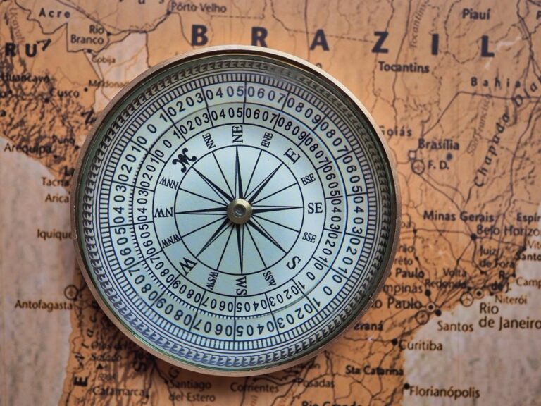
Hand-drawn icons replace generic symbols with distinctive visual elements that strengthen your map’s artistic identity and cultural authenticity. You’ll create the most effective illustrated symbols by designing them at multiple scales using vector software, ensuring crisp rendering across zoom levels. Custom landmark illustrations, decorative compass roses, and themed boundary ornaments transform utilitarian elements into artistic features. Scale icon complexity inversely with data density—use detailed illustrations in sparse areas while maintaining simple symbols in information-rich regions.
Utilizing 3D Elevation and Terrain Layers for Dimensional Mapping
Three-dimensional terrain representation transforms flat geographic data into immersive landscapes that reveal topographic relationships invisible in traditional 2D mapping. You’ll discover how elevation layers create depth perception while maintaining accurate spatial relationships.
Digital Elevation Model Integration
Digital elevation models (DEMs) provide the foundation for all terrain-based mapping applications by supplying precise elevation values at regular grid intervals. You’ll achieve optimal results using USGS 1/3 arc-second DEMs for local projects or SRTM 30-meter data for regional coverage. Proper DEM preprocessing eliminates data voids and smooths artificial boundaries that can distort your final visualization. Most GIS platforms including ArcGIS Pro and QGIS offer built-in tools for DEM processing and analysis workflows.
Hillshade and Relief Shading Techniques
Hillshade algorithms simulate sunlight direction and intensity to create realistic shadow patterns across your terrain surface. You’ll generate compelling relief effects by adjusting sun azimuth between 315-45 degrees and elevation angles from 25-45 degrees depending on your geographic region. Combining multiple hillshade layers with varying light sources eliminates harsh shadows while preserving topographic detail. Blending modes like “multiply” or “overlay” integrate hillshades seamlessly with your base elevation data.
Isometric Projection Applications
Isometric projections display terrain features at standardized angles that maintain proportional relationships while creating three-dimensional appearance. You’ll construct effective isometric views by rotating your elevation data 45 degrees and applying consistent vertical exaggeration factors between 2-5x depending on terrain relief. Block diagrams and profile views work exceptionally well for geological cross-sections and watershed analysis presentations. Tools like Blender or specialized plugins for QGIS enable advanced isometric rendering with customizable lighting and materials.
Combining Multiple Data Sources for Comprehensive Geographic Analysis
You’ll achieve the most revealing geographic insights when you strategically combine diverse data sources into unified analytical frameworks. This multi-source approach transforms individual datasets into comprehensive spatial narratives that reveal complex relationships invisible through single-layer analysis.
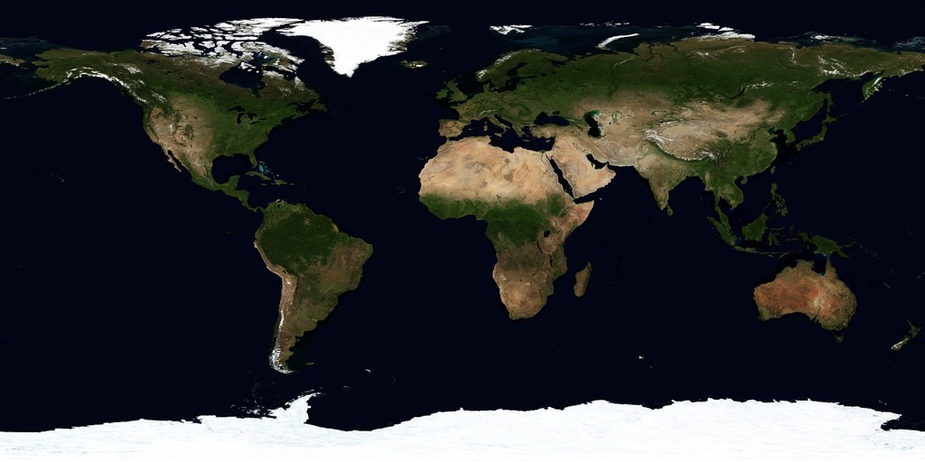
Satellite Imagery and Aerial Photography Layers
Satellite imagery provides the foundation for multi-temporal change detection when you overlay current high-resolution imagery with historical aerial photographs. Landsat 8 and Sentinel-2 data offer consistent spectral bands that you can combine with commercial sources like Planet Labs for enhanced temporal resolution. You’ll find that stacking different sensor types—optical, radar, and thermal—creates comprehensive surface analysis capabilities. Processing workflows in ERDAS IMAGINE or ENVI enable precise georeferencing and radiometric correction across multiple acquisition dates.
Real-Time Data Stream Integration
Real-time feeds transform static maps into dynamic monitoring systems through API connections to weather stations, traffic sensors, and social media platforms. You can integrate streaming data from NOAA weather services, DOT traffic systems, and Twitter’s geolocation API using Python scripts or commercial platforms like FME Server. Buffer your real-time layers with 15-minute update intervals to balance system performance with data currency. WebSocket connections through Leaflet.js or Mapbox GL JS enable smooth data refreshing without full page reloads.
Get real-time weather data with the Ambient Weather WS-2902. This WiFi-enabled station measures wind, temperature, humidity, rainfall, UV, and solar radiation, plus it connects to smart home devices and the Ambient Weather Network.

Cross-Platform Data Synchronization
Cross-platform synchronization ensures data consistency across desktop GIS, web applications, and mobile field collection systems. You’ll need to establish PostgreSQL/PostGIS databases as central repositories with automated sync protocols using tools like GeoServer or ArcGIS Server. File geodatabase replication through ArcGIS Pro maintains version control while Survey123 and Collector apps provide field-to-office data flows. Configure automated backup schedules and implement conflict resolution protocols to handle simultaneous edits from multiple users across different platforms.
Conclusion
These seven creative map layering strategies give you the foundation to transform ordinary geographic data into compelling visual stories. By mastering transparency techniques interactive elements and artistic integration you’ll create maps that not only display information but actively engage your audience.
Remember that effective map layering isn’t just about adding more data—it’s about strategically combining elements to reveal hidden patterns and relationships. Whether you’re working with 3D terrain models or real-time data streams the key lies in maintaining visual clarity while maximizing analytical depth.
Your maps now have the potential to become powerful communication tools that bridge the gap between complex geographic data and meaningful insights. Start experimenting with these techniques today and watch your cartographic projects evolve from simple displays into dynamic storytelling platforms.
Frequently Asked Questions
What is map layering and why is it important?
Map layering is the technique of combining multiple data sources and visual elements to create dynamic geographic visualizations. It transforms static maps into compelling visual narratives that reveal hidden patterns and spatial relationships. This approach is crucial for urban planning, business intelligence, and decision-making because it helps uncover insights that single-layer maps cannot provide, making complex geographic data more accessible and actionable.
What tools do I need for effective map layering?
Essential tools include professional GIS software like ArcGIS Pro and QGIS for data analysis and layer management. For design-focused work, consider Adobe Illustrator or specialized mapping applications. For interactive web maps, Leaflet.js and Mapbox GL JS are popular choices. Many projects also benefit from database systems like PostgreSQL/PostGIS for data management and synchronization across platforms.
How do I choose the right colors for my map layers?
Use sequential color schemes for quantitative data (like population density) and diverging palettes to highlight critical thresholds or contrasts. Maintain optimal contrast ratios for accessibility, ensuring text remains readable against colored backgrounds. Consider your audience and the story you’re telling – warmer colors often draw attention while cooler tones recede, helping establish visual hierarchy.
What are the best practices for using transparency in map layers?
Set base layer opacity between 70-85% to maintain visibility while allowing underlying information to show through. Use graduated transparency to indicate data confidence levels, with more reliable data at higher opacity. Limit transparent layers to three maximum to avoid visual confusion, and always test combinations at different zoom levels to ensure clarity.
How can I make my maps more interactive?
Implement clickable features that reveal detailed information without cluttering the visual space. Add toggle-enabled layer controls so users can selectively view different datasets. Use zoom-dependent layer activation to automatically adjust visibility based on scale, ensuring appropriate detail levels. Tools like Leaflet.js or Mapbox GL JS make these interactive elements easier to implement.
When should I use 3D elevation and terrain layers?
Use 3D terrain representation when topographic relationships are crucial to your story, such as in geological studies, watershed analysis, or hiking trail maps. Digital elevation models (DEMs) work well as foundation layers, enhanced with hillshade effects for realistic shadows. Isometric projections are particularly effective for geological presentations and cross-sectional analysis of terrain features.
How do I effectively combine multiple data sources in one map?
Start by ensuring data compatibility through proper preprocessing and standardization. Use satellite imagery for temporal change detection, integrate real-time data streams through APIs for dynamic monitoring, and maintain cross-platform synchronization with databases like PostgreSQL/PostGIS. Always validate data accuracy and scale appropriately to prevent misrepresentation of relationships between different datasets.