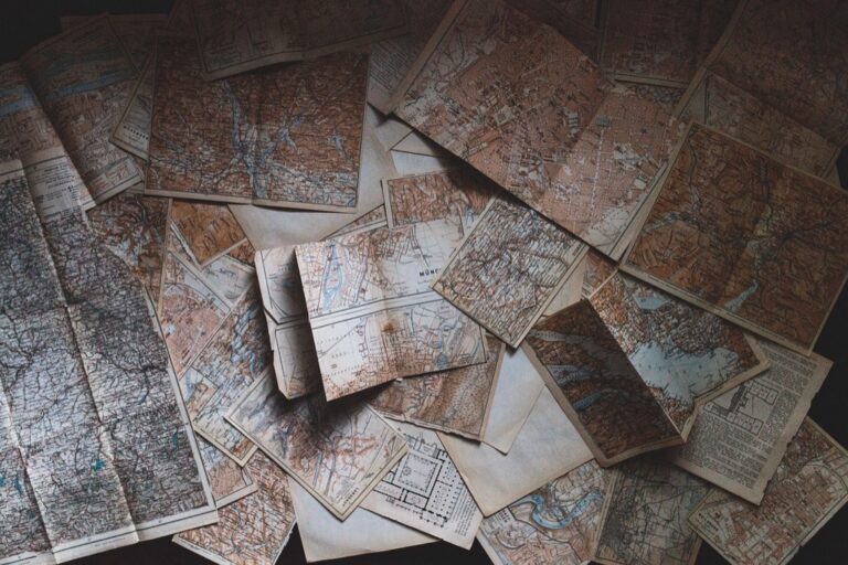
7 Ideas for Mapping Historical Change Creatively That Reveal Hidden Patterns
Why it matters: Traditional history lessons often fail to capture the dynamic nature of change over time — but creative mapping transforms abstract concepts into visual stories that stick.
The big picture: You can revolutionize how you understand and present historical transformations by moving beyond static timelines to interactive visualizations that reveal patterns and connections across different periods.
What’s next: These seven innovative mapping techniques will help you create compelling narratives that make historical change both accessible and memorable for any audience.
Disclosure: As an Amazon Associate, this site earns from qualifying purchases. Thank you!
P.S. check out Udemy’s GIS, Mapping & Remote Sensing courses on sale here…
Interactive Timeline Maps That Bring History to Life
Interactive timeline maps transform static historical data into dynamic visual experiences that reveal the complexity of change over time. These digital tools enable you to layer historical events with geographic contexts, creating compelling narratives that traditional timelines can’t match.
Digital Storytelling Platforms for Historical Visualization
StoryMapJS offers the most accessible entry point for creating narrative-driven historical maps. You’ll combine sequential storytelling with geographic visualization, allowing viewers to follow historical events across both time and space. Esri’s ArcGIS StoryMaps provides advanced cartographic capabilities with professional-grade data visualization tools. Palladio specializes in humanities data, enabling you to map complex historical networks and relationships. Timeline.js integrates seamlessly with Google Maps, making it ideal for educators and researchers working with limited technical resources.
Incorporating Multimedia Elements and Primary Sources
Layer historical photographs directly onto your timeline maps using georeferenced coordinates to show before-and-after transformations. Embed primary source documents like letters, newspaper clippings, and government records as clickable hotspots within your mapped timeline. Audio recordings of oral histories and period music enhance emotional engagement with historical moments. Video testimonials from historians and descendants provide expert context while maintaining human connection. 3D visualizations of historical structures and landscapes help viewers understand spatial relationships that shaped historical events across different time periods.
Layered Geographic Information Systems for Historical Analysis
Geographic Information Systems unlock the power to visualize historical transformation through sophisticated spatial analysis. You can build comprehensive historical narratives by overlaying multiple data layers across different time periods.
Creating Multi-Temporal Map Overlays
Build temporal data layers using QGIS or ArcGIS Pro to stack historical information chronologically. You’ll create separate vector layers for each time period, then use transparency controls to reveal changes over decades or centuries. Start with base maps from different eras – like 1850s cadastral surveys overlaid with modern satellite imagery – to highlight urban expansion patterns. Export time-enabled feature classes that automatically display relevant data based on your selected time range, making complex historical transitions instantly visible to viewers.
Analyzing Spatial Patterns Across Different Time Periods
Compare spatial distributions by creating choropleth maps that display the same variable across multiple decades. You can identify migration patterns, disease outbreaks, or economic shifts by analyzing density changes within defined geographic boundaries. Use statistical hotspot analysis tools in ArcGIS to detect significant clustering patterns over time. Generate temporal buffers around key locations to measure expanding influence zones – like railroad networks affecting settlement patterns or industrial centers driving population growth throughout different historical periods.
Collaborative Mind Maps for Complex Historical Connections
Mind mapping transforms historical analysis by enabling multiple perspectives to converge into comprehensive visual networks. These collaborative tools reveal intricate relationships between events, people, and movements that traditional linear approaches often miss.
Connecting Events, People, and Movements Visually
Connect historical elements using branching structures that show cause-and-effect relationships across multiple timelines. Place key figures at central nodes with radiating connections to their influences, political movements, and contemporaneous events. Link social movements to specific legislative changes, cultural shifts, and economic factors using directional arrows that demonstrate progression. Create cross-connections between seemingly unrelated events to reveal hidden patterns, such as how scientific discoveries influenced political revolutions or how economic crises triggered social reforms.
Using Color-Coding and Symbols for Different Historical Themes
Assign distinct colors to major themes like political changes (red), economic shifts (green), cultural movements (blue), and technological advances (orange) for immediate visual recognition. Implement standardized symbols such as crowns for monarchies, gears for industrial developments, and scales for legal changes throughout your collaborative maps. Develop consistent visual legends that team members can reference when adding new connections or historical elements. Apply transparency effects to overlapping themes, showing where multiple historical forces intersected during specific time periods.
3D Model Reconstructions of Historical Environments
3D model reconstructions transform historical sites into immersive experiences that reveal architectural details and spatial relationships impossible to capture through traditional mapping methods.
Virtual Reality Applications for Historical Immersion
Virtual reality applications transport you directly into reconstructed historical environments using platforms like Unity 3D and Unreal Engine. You’ll create detailed building models from archaeological data and historical blueprints, allowing users to walk through ancient Rome or explore medieval castles. VR headsets like Oculus Quest enable 360-degree exploration of historical spaces, revealing how people lived, worked, and interacted within these environments. Educational institutions now use VR reconstructions to help students experience historical events firsthand, making abstract concepts tangible through immersive digital environments.
Immerse yourself in games with 7.1 surround sound for precise audio. Enjoy clear communication with a noise-canceling microphone and comfortable over-ear pads, compatible with PC, PlayStation, Xbox, Switch, and more.
Physical Dioramas and Scale Models for Tactile Learning
Physical dioramas provide hands-on learning experiences that complement digital reconstructions through tactile engagement and spatial understanding. You’ll construct scale models using 3D printing technology, foam board, and traditional materials to represent historical settlements, battlefields, or urban developments. Museum exhibits increasingly feature interactive dioramas with moveable components that demonstrate how historical environments changed over time. These physical models help kinesthetic learners grasp spatial relationships and chronological changes, while providing collaborative spaces where multiple people can simultaneously explore and discuss historical transformations.
Create 3D art with the SCRIB3D P1 3D Pen! This easy-to-use pen features adjustable speed control and includes PLA filament, a stencil book, and project guide to get you started.
Infographic Flowcharts That Simplify Complex Historical Processes
Transform intricate historical sequences into digestible visual narratives that reveal how events interconnect across time periods. These flowcharts eliminate confusion by presenting clear pathways through complex historical transformations.
Breaking Down Cause-and-Effect Relationships
Create sequential diagrams that trace how single events ripple through history using software like Lucidchart or Canva. Connect primary causes to secondary effects with directional arrows showing chronological progression. Highlight pivotal moments where multiple factors converge using color-coded decision points. Document each connection with brief explanatory text that clarifies the relationship between events. Test your flowchart’s clarity by having others follow the logical progression without additional explanation.
Visualizing Economic, Social, and Political Changes
Layer different change categories using distinct visual elements—economic shifts in green, social movements in blue, political developments in red. Track parallel transformations across multiple timelines within a single flowchart framework. Incorporate quantitative data points like population changes, GDP fluctuations, or election results as visual markers. Design branching pathways that show how economic downturns trigger social unrest or political reforms. Maintain consistent iconography throughout your flowchart to ensure immediate recognition of recurring themes.
Interactive Data Visualizations for Historical Statistics
Transform raw historical data into compelling visual narratives that reveal patterns invisible in traditional charts. Interactive visualizations enable users to explore temporal changes through dynamic interfaces that respond to their curiosity.
Population Changes and Demographic Shifts Over Time
Population data becomes most compelling when visualized through animated bubble charts that show cities expanding and contracting across decades. You’ll create dynamic heat maps using D3.js or Plotly to display migration patterns, with slider controls allowing users to scrub through time periods. Interactive choropleth maps reveal demographic shifts by highlighting age distributions, ethnic compositions, and urbanization trends. Tools like Observable notebooks enable you to build responsive visualizations that update in real-time as users select different census years or demographic categories.
Economic Indicators and Trade Route Evolution
Economic transformations reveal themselves through interactive line graphs that track GDP fluctuations, inflation rates, and trade volumes across multiple countries simultaneously. You’ll design animated flow maps using Flourish or Mapbox GL JS to visualize changing trade routes, with thickness indicating volume and color representing commodity types. Interactive scatter plots correlate economic indicators with historical events, allowing users to identify cause-and-effect relationships. Sankey diagrams effectively display resource flows between regions, while time-series dashboards enable comparative analysis of economic performance across different nations and time periods.
Artistic Interpretation Maps Using Creative Mediums
Traditional artistic techniques offer powerful alternatives to digital mapping, allowing you to create unique historical visualizations that convey emotional depth alongside spatial accuracy.
Hand-Drawn Illustrations and Watercolor Techniques
Create vibrant watercolor art with this portable set. It includes 40 colors (metallic & fluorescent), a brush pen, watercolor paper, and more, all in a stylish tin box.
Hand-drawn maps provide authentic textures that digital tools can’t replicate, especially when documenting historical change through artistic interpretation. You’ll capture subtle environmental details using watercolor washes to show territorial boundaries shifting over decades. Pen-and-ink illustrations work exceptionally well for depicting urban development patterns, while colored pencil techniques help you layer population density changes across multiple time periods. These traditional mediums allow spontaneous creative decisions that often reveal unexpected historical connections through visual storytelling.
Mixed Media Collages Incorporating Historical Artifacts
Mixed media approaches combine original historical documents with contemporary mapping elements to create layered narratives of change over time. You can integrate photocopied census records, vintage photographs, and handwritten letters directly onto base maps using archival adhesives. Fabric scraps from different eras represent cultural shifts, while pressed flowers or soil samples from historical locations add tactile authenticity. This technique transforms static historical data into three-dimensional experiences that viewers can physically examine, creating deeper emotional connections to past events.
Create lasting crafts with this archival-quality, pH neutral PVA adhesive. It dries clear and flexible, offering excellent bonding for bookbinding, paper crafts, and more.
Conclusion
These seven creative mapping approaches give you powerful tools to transform how you present and understand historical change. You’ll discover that combining digital platforms with artistic techniques creates more engaging experiences than traditional methods alone.
Your choice of mapping technique should align with your specific goals and audience needs. Interactive digital maps work well for data-heavy content while artistic interpretations excel at emotional storytelling.
Remember that the most effective historical maps layer multiple elements – geographic data visual design multimedia content and clear narratives. You’ll achieve better results when you experiment with different combinations rather than relying on single approaches.
Start with one technique that matches your current skills and resources. You can always expand your toolkit as you gain confidence and see how your audience responds to these innovative historical presentations.
Frequently Asked Questions
What are the main limitations of traditional history lessons?
Traditional history lessons often fail to convey the dynamic nature of historical change, presenting events as static facts rather than interconnected processes. They struggle to show how events unfolded across different geographic locations and time periods, making it difficult for students to understand the complexity and spatial relationships of historical transformations.
How do interactive timeline maps enhance historical understanding?
Interactive timeline maps transform static historical data into dynamic visual experiences by layering events with geographic contexts. They reveal how historical changes occurred across different locations simultaneously, making abstract concepts more accessible and memorable while showing the interconnected nature of historical events over time.
What digital platforms are best for creating historical story maps?
Understand the structure of a one-hour TV drama pilot. This book provides a guide to story mapping for television.
StoryMapJS, Esri’s ArcGIS StoryMaps, Palladio, and Timeline.js are leading platforms for creating narrative-driven historical maps. These tools offer user-friendly interfaces for combining geographic data with multimedia elements, allowing creators to build engaging visual stories that enhance historical visualization and storytelling capabilities.
How can GIS technology be used for historical analysis?
GIS enables layered spatial analysis through multi-temporal map overlays using tools like QGIS or ArcGIS Pro. It allows historians to stack chronological information, create choropleth maps for analyzing spatial patterns, and employ statistical hotspot analysis to measure the influence of key locations across different time periods.
What are the benefits of collaborative mind mapping for historical research?
Collaborative mind mapping allows multiple perspectives to converge into comprehensive visual networks, connecting events, people, and movements through branching structures. It uses color-coding and standardized symbols to reveal intricate relationships and hidden patterns, enhancing understanding of how various historical forces intersected during specific periods.
How do 3D reconstructions improve historical education?
3D model reconstructions transform historical sites into immersive experiences, revealing architectural details and spatial relationships not captured by traditional methods. VR applications using Unity 3D and Unreal Engine allow 360-degree exploration of historical environments, helping students experience events firsthand and enhancing spatial understanding.
What makes infographic flowcharts effective for explaining historical processes?
Infographic flowcharts simplify complex historical sequences into digestible visual narratives, clearly showing how events interconnect across time periods. They use sequential diagrams to trace cause-and-effect relationships with consistent iconography and quantitative data points, making historical analysis more accessible to diverse audiences.
How do interactive data visualizations reveal historical patterns?
Interactive data visualizations transform raw historical data into compelling visual narratives using animated bubble charts, dynamic heat maps, and interactive line graphs. Tools like D3.js, Plotly, and Flourish create responsive visualizations with slider controls and real-time updates, revealing patterns not visible in traditional charts.
What role do artistic interpretation maps play in historical understanding?
Artistic interpretation maps using hand-drawn illustrations, watercolor techniques, and mixed media collages provide powerful alternatives to digital mapping. They capture authentic textures and environmental details while combining historical artifacts with contemporary elements, fostering deeper emotional connections and enriching understanding of historical events.


