7 Best Color Psychology Examples for Visual Impact
Colors on maps don’t just show data—they trigger deep emotional responses that can make or break your visualization’s impact. The big picture: Your choice between red and blue for temperature data or green versus gray for environmental maps creates powerful psychological reactions that influence how people interpret and trust your information.
Why it matters: Understanding these emotional connections helps you create maps that don’t just inform but actually connect with your audience on a visceral level. From the calming effect of cool blues in water mapping to the urgency conveyed by warm reds in crisis visualization you’ll discover how strategic color choices transform raw data into compelling stories that stick.
Disclosure: As an Amazon Associate, this site earns from qualifying purchases. Thank you!
Red Evokes Urgency and Danger in Emergency Response Maps
Red’s psychological association with danger makes it the most effective color for communicating critical threats and emergency situations in mapping applications. This color choice leverages our instinctive response to red as a warning signal, ensuring immediate attention and appropriate action from map users.
P.S. check out Udemy’s GIS, Mapping & Remote Sensing courses on sale here…
Heat Maps for Wildfire Risk Assessment
Red dominates wildfire risk mapping because it instantly communicates extreme danger zones to firefighters and evacuation coordinators. You’ll find deep crimson representing the highest probability areas where fires can spread rapidly, while lighter red tones indicate moderate risk zones. This color progression from pink to dark red creates an intuitive understanding of threat levels without requiring legend interpretation. Emergency response teams rely on these red-coded maps to prioritize resource deployment and establish containment strategies during active fire seasons.
Crime Hotspot Visualization
Red intensity patterns help law enforcement identify crime concentration areas through heat map visualizations that highlight dangerous neighborhoods. You can distinguish between violent crime hotspots using darker red shades and property crime areas with lighter red tones. This color coding enables police departments to allocate patrol resources effectively and helps community planners identify areas needing increased security measures. The emotional impact of red ensures that stakeholders immediately recognize high-risk zones during community safety presentations.
Emergency Evacuation Route Planning
Red pathways on evacuation maps signal blocked or dangerous routes that residents must avoid during emergencies like hurricanes or chemical spills. You’ll see red X-marks or solid red lines indicating impassable roads, while red arrows show traffic flow restrictions during mass evacuations. Emergency management agencies use red highlighting to mark shelter locations at capacity, ensuring evacuees don’t waste critical time traveling to unavailable facilities. This strategic red placement guides people toward safe alternatives while clearly communicating hazardous areas to avoid.
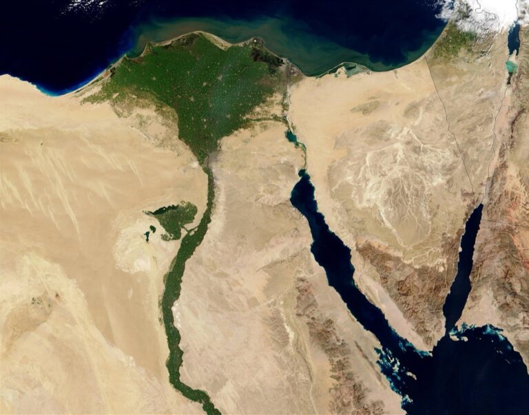
Blue Conveys Trust and Calm in Water Resource Mapping
Blue’s psychological association with stability and tranquility makes it the natural choice for water-related cartographic applications. You’ll find that blue tones create an immediate sense of reliability that helps viewers trust your hydrological data presentations.
Ocean Depth Visualization
Bathymetric maps rely on graduated blue scales to represent ocean floor depths effectively. You can use darker navy blues for deep ocean trenches exceeding 6,000 meters while lighter blues indicate shallow coastal waters under 200 meters. This intuitive color progression mirrors how sunlight penetrates water naturally. NOAA’s bathymetric charts demonstrate this approach perfectly, using 8-10 blue gradations to show depth variations across continental shelves and abyssal plains.
Flood Risk Assessment Charts
Flood zone mapping employs blue intensity levels to communicate inundation probabilities without causing panic. You should apply pale blue for 500-year flood zones and deeper blue for 100-year zones, creating visual hierarchy that emergency managers understand quickly. FEMA flood insurance rate maps use this methodology across 22,000 communities nationwide. The graduated blue system helps property owners assess risk levels while maintaining the calming psychological effect that prevents community alarm during planning discussions.
Watershed Management Maps
Watershed delineation maps use blue flow networks to trace water movement from headwaters to outlets across drainage basins. You can represent stream orders using varying blue line weights—thin lines for first-order streams and thick blue lines for major rivers. The USGS Watershed Boundary Dataset applies this visualization standard across 2.2 million subwatersheds. This blue-based approach helps water resource managers identify connectivity patterns and pollution pathways while maintaining the trusted appearance that stakeholders expect from official hydrological documents.
Green Represents Growth and Safety in Environmental Mapping
Green’s psychological connection to nature and vitality makes it your most powerful tool for environmental data visualization. This color choice creates an immediate sense of ecological health and sustainability that resonates with viewers’ understanding of natural systems.
Forest Coverage and Biodiversity Maps
Forest inventory visualizations rely on green gradients to communicate vegetation density and ecosystem health effectively. You’ll find darker greens representing mature forest canopies while lighter shades indicate younger growth or sparse coverage. National forest service maps use this approach to help land managers identify conservation priorities and timber harvest zones. Biodiversity hotspot maps employ vibrant green overlays to highlight species-rich areas, making it easier for conservationists to allocate protection resources where they’re needed most.
Air Quality Index Visualization
Air quality dashboards use green zones to indicate safe breathing conditions and regulatory compliance levels. Your AQI maps should display green areas where pollutant concentrations fall within acceptable EPA standards, creating visual comfort for public health officials. Real-time monitoring stations often trigger green alerts when particulate matter and ozone levels drop below harmful thresholds. Environmental agencies rely on these green indicators to communicate “all clear” conditions to sensitive population groups like children and elderly residents.
Sustainable Development Zone Planning
Urban planning maps incorporate green coding to designate environmentally-friendly development areas and green infrastructure networks. You’ll use green boundaries to mark sustainable building zones where LEED certification requirements apply. Transit-oriented development maps highlight green corridors that connect residential areas to public transportation hubs, reducing carbon footprint impacts. Municipal zoning applications employ green overlays to identify renewable energy installation sites and urban agriculture zones that support local food security initiatives.
Yellow and Orange Signal Caution in Weather and Traffic Maps
Yellow and orange serve as universal warning colors that immediately communicate the need for heightened awareness and caution. These warm hues trigger psychological responses associated with moderate danger and advisory conditions.
Storm Warning Systems
Weather services rely on yellow and orange color coding to communicate escalating storm threats across multiple warning levels. The National Weather Service uses yellow for weather advisories indicating conditions that may cause inconvenience or minor hazards. Orange appears in weather watches, signaling potential for severe conditions requiring preparation time. Tornado probability maps employ orange gradients to show areas where supercell development is likely within 12-hour periods. Hurricane tracking visualizations use orange zones to indicate tropical storm-force wind probabilities between 39-73 mph, helping coastal communities prepare evacuation timelines.
Traffic Congestion Visualization
Transportation management systems use yellow and orange to indicate moderate to heavy traffic congestion on digital roadway maps. Google Maps displays yellow segments for slow-moving traffic with speeds 25-50% below normal flow rates. Orange coding appears when traffic moves at less than 25% of typical speeds, alerting drivers to expect significant delays. Variable message signs coordinate with mapping applications using orange backgrounds for construction zone warnings. Real-time traffic visualization platforms employ orange heat mapping to identify bottleneck locations where congestion builds during peak commuting hours.
Drought Severity Mapping
Drought monitoring systems utilize yellow and orange classifications to communicate moderate to severe water shortage conditions across agricultural regions. The U.S. Drought Monitor employs yellow coding for abnormally dry conditions affecting 20-30% of normal precipitation levels. Orange indicates moderate drought with crop stress visible and water restrictions beginning in affected municipalities. Soil moisture maps use orange gradients to show areas where agricultural yields may decline by 15-25% compared to normal growing seasons. Reservoir level visualizations incorporate orange zones when water storage drops below 40% capacity, triggering conservation measures.
Purple Indicates Luxury and Exclusivity in Demographic Mapping
Purple commands attention in demographic mapping by conveying sophistication and high-end market positioning. This royal hue triggers associations with wealth and exclusivity that enhance data interpretation in socioeconomic visualizations.
High-Income Neighborhood Visualization
Purple gradients effectively highlight affluent residential districts on demographic maps. Census tract visualizations use deep purple shades to represent households earning above $150,000 annually, creating immediate visual distinction from middle-income areas. Real estate platforms like Zillow employ purple overlays to mark premium neighborhoods where median home values exceed $1 million. Municipal planning departments utilize purple coding to identify areas requiring luxury infrastructure investments, such as enhanced streetscaping and boutique retail zoning.
Premium Service Area Mapping
Purple boundaries delineate exclusive service territories for high-end businesses and luxury providers. Concierge services map their coverage areas using purple polygons to communicate premium positioning to potential clients. Private banking institutions employ purple service zones to indicate wealth management availability, typically targeting areas with concentrated millionaire populations. Luxury transportation companies like private jet charter services use purple coverage maps to show their operational territories, reinforcing their exclusive market positioning.
Luxury Market Analysis Charts
Purple data points distinguish premium market segments in commercial analysis visualizations. Retail location studies use purple markers to identify luxury shopping districts where average transaction values exceed $500 per customer visit. Tourism boards employ purple heat maps to highlight destinations attracting high-spending visitors, with intensity corresponding to average daily expenditures above $400. Market research firms utilize purple coding in consumer spending visualizations to separate luxury purchasers from mainstream buyers, enabling targeted marketing strategy development.
Gray Suggests Neutrality and Data Gaps in Statistical Maps
Gray serves as cartography’s most neutral color choice, creating emotional distance that allows viewers to focus on data patterns without color bias. You’ll find gray particularly effective when representing missing information or establishing baseline comparisons in statistical visualizations.
Population Density Visualization
Gray zones in population density maps indicate areas with insufficient census data or restricted access regions. You can use graduated gray scales to represent unpopulated territories like military bases, national parks, and industrial zones where residential density calculations don’t apply. This neutral approach prevents viewers from misinterpreting empty spaces as zero population versus unavailable data.
No-Data Zone Representation
No-data zones require gray coding to distinguish missing information from actual zero values in your statistical maps. You’ll encounter this frequently with survey data, satellite imagery gaps, and restricted territories where data collection isn’t permitted. Gray polygons clearly communicate to viewers that these areas lack sufficient information for analysis rather than containing confirmed zero measurements.
Infrastructure Mapping
Infrastructure maps use gray to represent inactive or decommissioned facilities without suggesting operational status. You can apply gray coding to abandoned railways, closed airports, and inactive utility lines to maintain historical context while clearly indicating non-functional status. This neutral representation helps emergency responders and planners distinguish between active and inactive infrastructure elements during critical decision-making processes.
Black Commands Attention for Critical Information Display
Black creates maximum visual contrast on maps, demanding immediate attention for life-critical data points. Unlike other colors that might fade into backgrounds, black ensures zero ambiguity when displaying essential emergency information.
Power Outage Emergency Maps
Black zones on power outage maps communicate complete electrical failure with stark clarity. Utility companies use solid black polygons to represent areas experiencing total blackouts, differentiating them from brown or gray zones indicating partial outages. Emergency response coordinators rely on these black-coded regions to prioritize restoration crews and identify hospitals requiring immediate generator deployment. Black’s high contrast against white basemaps eliminates confusion during crisis situations when rapid decision-making saves lives.
Seismic Activity Visualization
Black earthquake epicenters create unmistakable focal points on seismic monitoring displays. Geological surveys employ black dots or crosses to mark earthquake origins, ensuring these critical data points remain visible against complex topographic backgrounds. Real-time seismic networks use black symbols scaled by magnitude, with larger black circles representing stronger tremors. This stark visual hierarchy helps emergency managers quickly identify the most dangerous seismic events requiring immediate attention from search and rescue teams.
Security Perimeter Mapping
Black boundary lines establish unambiguous restricted zones on security maps. Military installations and law enforcement agencies use solid black borders to delineate no-access areas, creating clear visual separation from surrounding territories. Airport security maps employ black hatching patterns to mark sterile zones where unauthorized personnel face immediate detention. These black security overlays maintain their visibility across different map scales and printing conditions, ensuring security protocols remain clearly communicated to all authorized personnel.
Conclusion
Your color choices in mapping carry far more weight than simple aesthetics. Each hue triggers specific emotional responses that directly influence how viewers interpret and trust your data.
When you understand these psychological connections you’ll create more effective visualizations that resonate with your audience. The strategic use of red for urgency blue for trust green for safety and other color associations transforms raw data into compelling stories.
Remember that successful mapping isn’t just about accuracy—it’s about communication. By leveraging the emotional power of color you’ll ensure your maps don’t just display information but actually connect with the people who need it most.
Frequently Asked Questions
Why do colors matter so much in map design?
Colors on maps do more than just represent data—they trigger emotional responses that directly influence how viewers interpret and trust the information presented. Strategic color choices can enhance understanding, create appropriate emotional reactions, and improve the overall effectiveness of data visualization, especially in critical situations where quick comprehension is essential.
When should red be used in mapping applications?
Red is ideal for emergency response maps, crisis situations, and indicating danger zones. Its psychological association with urgency and threat makes it perfect for wildfire risk assessments, crime hotspot visualizations, and evacuation route warnings. Red ensures immediate attention and helps viewers quickly identify high-priority areas without needing to interpret complex legends.
What makes blue effective for water-related maps?
Blue conveys trust, calmness, and reliability, making it perfect for hydrological data presentations. It’s naturally associated with water, creating intuitive understanding in bathymetric maps, flood risk assessments, and watershed management visualizations. Blue tones help communicate water-related information without causing panic while maintaining viewer confidence in the data.
How does green enhance environmental data visualization?
Green represents growth, safety, and ecological health, making it powerful for environmental mapping. It’s naturally connected to nature and sustainability, perfect for forest coverage maps, biodiversity hotspots, air quality indexes, and urban planning applications. Green creates a sense of environmental wellness and helps communicate conservation-related information effectively.
Why are yellow and orange considered warning colors in maps?
Yellow and orange trigger psychological responses associated with caution and moderate danger. They’re universally recognized as warning colors, making them ideal for weather advisories, traffic congestion maps, and drought monitoring systems. These warm hues effectively communicate varying levels of concern without creating extreme alarm.
What role does purple play in demographic mapping?
Purple conveys luxury and exclusivity, making it effective for highlighting affluent neighborhoods and premium market segments. It’s used in real estate mapping, concierge service territories, and market analysis to distinguish high-end areas and communicate premium positioning to specific target audiences.
When should gray be used in cartographic design?
Gray creates emotional neutrality and is perfect for representing missing data, baseline comparisons, or inactive elements. It allows viewers to focus on data patterns without bias and clearly communicates areas with insufficient information, helping prevent misinterpretation of empty spaces or decommissioned infrastructure.
How does black function in critical information display?
Black commands maximum attention and creates the highest visual contrast on maps. It’s essential for life-critical data points like power outage zones, earthquake epicenters, and security boundaries. Black ensures absolute clarity when communicating the most important or dangerous information that requires immediate recognition.