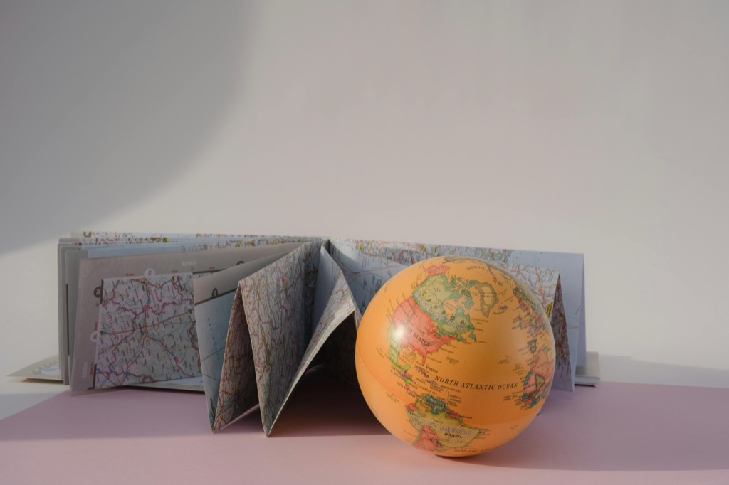
8 Key Features of an Aesthetic Map Explained
Maps aren’t just tools for navigation; they’re canvases for storytelling. Let’s explore the artistry behind crafting an aesthetic map that’s as pleasing to the eye as it is informative.
Aesthetic maps, merging art and cartography, balance the functionality of conveying geographical information with the allure of design. Beyond mere navigational aids, these visual narratives guide viewers through a journey of discovery by blending scientific precision with creative expression, utilizing meticulously chosen elements like color schemes and typography to enhance the overall experience.
Crafting an aesthetic map is akin to hosting a thoughtfully curated feast for the eyes, inviting viewers to linger, explore, and turn even mundane topography into a masterpiece.
Disclosure: As an Amazon Associate, this site earns from qualifying purchases. Thank you!
P.S. check out Udemy’s GIS, Mapping & Remote Sensing courses on sale here…
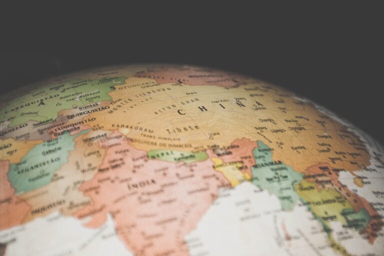
1. Color Harmony: A Visual Pleasure
Color harmony in maps is like the perfect seasoning in a gourmet dish—it enhances without overpowering. The right color palette can delineate boundaries, highlight important features, and set the map’s mood. Aesthetic maps often employ a color scheme that resonates with the theme, be it vibrant hues for tourist maps or subdued tones for historical renditions.
Achieve balanced, vibrant color palettes effortlessly. This tool helps you create harmonious color schemes for any project.

The choice of colors isn’t arbitrary; it’s rooted in color theory, where complementary colors create balance, and analogous colors provide a sense of calm. Colors can also be used to represent data effectively, with warmer colors often signifying higher values and cooler colors indicating lower ones. However, it’s crucial to consider colorblind users, ensuring the map remains functional and beautiful for all.
An aesthetic map uses color to tell a story, guiding the viewer’s eye across the terrain like a skilled conductor leading an orchestra. The hues work in harmony to create a visual rhythm that not only informs but also pleases the eye. It’s a delicate dance of saturation and value, where every color choice is intentional and purposeful.
2. Balance and Proportion in Design
The principle of balance in map design ensures that no single element overwhelms the others. Just as a well-composed photograph captures attention, an aesthetic map distributes visual weight evenly, creating a sense of stability. Balance can be symmetrical, mirroring elements on either side of an axis, or asymmetrical, arranging different elements to achieve visual equilibrium.
Proportion, on the other hand, refers to the size relationship between map elements. It’s crucial for the map’s legibility and aesthetics. A map with well-proportioned features is like a well-tailored suit—it just fits right. The scale of symbols, text, and other elements should be appropriate for the map’s purpose and the message it aims to convey.
In my experience, a map that masters balance and proportion is a joy to explore. It feels intuitive as if every element has found its rightful place in the spatial narrative. The result is a cohesive and harmonious design that invites the viewer to engage with the map’s content without any visual discord.
3. Typography: More Than Just Text
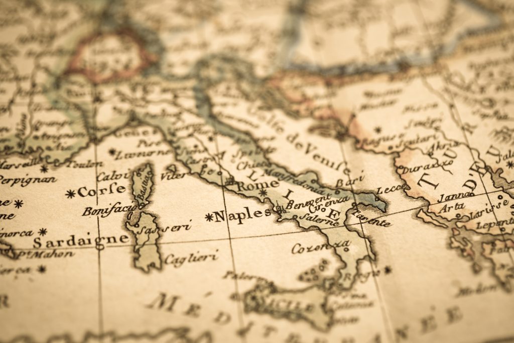 Antique world map Mediterranean” class=”wp-image-641″/>
Decorate creatively with Cavallini's World Map paper sheet. Printed on high-quality Italian archival paper, this 20" x 28" sheet is ideal for wrapping, posters, or framing.

Typography in maps is a powerful tool—it’s more than just text; it’s a design element that contributes to the map’s overall aesthetic. The choice of font can set the tone of the map, with serif fonts suggesting formality and sans-serif fonts imparting a modern feel. Legibility is key; the text must be easily readable at various sizes to cater to different users.
The placement of text is just as important as the font choice. Labels should flow with the map’s geography, curving along coastlines and following mountain ranges. This not only looks natural but also aids in the readability of the map. Consistency in typography is essential—mixing too many fonts can make a map look cluttered and confusing.
I recall a map I once created where the typography was the star; it brought the landscape to life. Each label was carefully positioned, adding to the map’s narrative without detracting from the visual experience. Good typography can elevate a map from a mere tool to a work of art that speaks to the viewer.
4. The Role of Negative Space
Negative space, or white space, in map design, should never be an afterthought. It’s the breathing room that allows the map’s elements to stand out. Just as silence between musical notes is essential to a melody, negative space gives prominence to the map’s features, preventing a cluttered appearance.
This space isn’t necessarily white; it’s any area devoid of textual or graphical elements. It helps to create focal points and guide the viewer’s eye through the map. A map with well-utilized negative space is like a well-organized room—it feels open, uncluttered, and inviting.
In my mapping endeavors, I’ve found that negative space can be a powerful storyteller. It suggests vastness, isolation, or untouched nature, depending on the context. It’s the canvas upon which the map’s content is presented, and its effective use is critical in crafting a visually appealing map.
5. Incorporating Visual Hierarchy
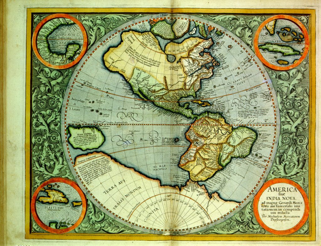 High-Quality Antique Map” class=”wp-image-642″/>
Enhance your space with this 24x36 antique world map poster. Printed in full color on high-quality paper, it ships securely in a protective cardboard tube.

Visual hierarchy in a map organizes information in a way that naturally leads the viewer’s eye to the most important elements first. This is achieved through the strategic use of size, color, and placement. Larger, bolder elements are noticed first, while subtler, smaller features serve as supporting details.
The hierarchy is crucial for quickly conveying information in a way that feels instinctive. Think of it as the map’s storytelling rhythm—certain features act as the chorus, demanding attention, while others form the verses, filling in the narrative. It’s a delicate balance that ensures the map communicates effectively without overwhelming the viewer.
Reflecting on my map-making experiences, I’ve learned that a strong visual hierarchy can make or break a map’s readability. It’s like a guide that silently points out the landmarks and nuances of the landscape. When done right, it creates an intuitive path for the eye to follow, making the map not only informative but also enjoyable to read.
6. Data Symbolization Techniques
Data symbolization is the art of representing quantitative information visually. Symbols, lines, and colors become the language through which data tells its story. The goal is to choose intuitive symbols—think of a car for transportation data or a tree for forest coverage. The symbols should be easily distinguishable and appropriate for the scale of the map.
When symbolizing data, it’s essential to maintain a balance between aesthetics and clarity. The symbols must not only be attractive but also accurately convey the information. It’s like seasoning a dish; too little and it’s bland, too much and it’s overwhelming. The key is to find that perfect measure that enhances the map’s flavor.
In my journey with maps, I’ve seen how creative symbolization can transform raw data into a captivating visual narrative. It’s a process that requires both artistic flair and analytical precision. When executed well, it can turn a map into an insightful and engaging infographic that tells a story at a glance.
7. Effective Use of Map Legends
 Vintage map” class=”wp-image-643″/>
The legend is the key to unlocking a map’s language. It serves as a decoder, allowing viewers to understand the symbols and colors used. An effective legend is clear, and concise, and complements the map’s design. It should be easy to refer to without distracting from the map itself.
Legends should be strategically placed and designed with the same care as the rest of the map. They must be legible and organized, with symbols and descriptions that are easy to cross-reference. A good legend is like a good host, introducing each element of the map and explaining its relevance.
Remember, the legend is not just an add-on; it’s an integral part of the map’s communication. Once, I encountered a beautifully designed map that was nearly indecipherable without its legend. That little box of text and symbols can make the difference between a map that’s a puzzle and one that’s a treasure trove of information.
8. The Importance of Scale
Scale is the relationship between the distance on the map and the actual distance on the ground. It’s a critical feature that ensures the map’s utility and accuracy. The choice of scale impacts the level of detail that can be included and the map’s overall readability. It’s a balancing act between providing enough information and avoiding an overcrowded map.
Maps with a larger scale (where a small distance on the map represents a small area on the ground) can show more detail, which is great for city maps or hiking trails. Conversely, smaller-scale maps (where the same distance on the map represents a larger area on the ground) provide a broader overview, suitable for regional or world maps.
In my practice, I’ve learned that scale can also influence the map’s aesthetic. A large-scale map allows for finer artistic elements, while a small-scale map demands simplicity and broader strokes. The scale sets the stage for the map’s story, shaping its scope and the level of intimacy with which the viewer can engage the landscape.
Conclusion: Crafting Beauty
Crafting an aesthetic map is a blend of science and art, with each element contributing to a harmonious whole. It’s about creating a visual narrative that guides the viewer through the geography with ease and delight. A well-designed map is more than a tool; it’s a piece of art that invites exploration and admiration.
The beauty of a map lies in its ability to communicate complex information in an accessible and engaging manner. It’s a testament to the mapmaker’s skill and creativity. As we’ve explored, the key features of color harmony, balance, typography, and more all come together to create a map that is not only informative but also a joy to behold.
In the end, an aesthetic map is the cartographer’s poem, each line crafted with precision and purpose. It’s a celebration of place, a canvas that beckons us to look closer, and a reminder that beauty can be found in the details of our world.