6 Best Cartogram Design Methods
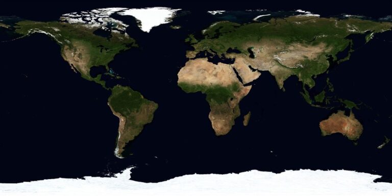
Maps don’t always tell the full story when you’re visualizing data. Traditional geographic maps can mislead viewers because they show geographic area rather than the actual data values you want to highlight â making sparse regions appear more important than densely populated areas with higher data concentrations.
Cartograms solve this problem by distorting geographic boundaries to reflect your data values rather than physical space. These specialized maps transform familiar shapes into powerful visual narratives that immediately communicate patterns and relationships your audience might miss in standard maps.
The bottom line: Six proven cartogram methods can revolutionize how you present geographic data, from simple area adjustments to complex algorithmic transformations that maintain recognizable shapes while accurately representing your information.
Disclosure: As an Amazon Associate, this site earns from qualifying purchases. Thank you!
P.S. check out Udemy’s GIS, Mapping & Remote Sensing courses on sale here…
Area Cartograms: Distorting Geographic Boundaries Based on Data Values
Area cartograms transform geographic regions by scaling their size proportionally to data values rather than actual land area. This method creates powerful visualizations where population density, economic output, or other metrics become immediately apparent through visual distortion.
Contiguous Area Cartograms for Maintaining Spatial Relationships
Contiguous area cartograms preserve adjacency between neighboring regions while scaling each area to reflect data values. You’ll maintain recognizable geographic relationships as states or countries remain connected to their original neighbors. The Gastner-Newman algorithm provides reliable results for creating smooth transformations in QGIS or ArcGIS. Expect processing times of 10-15 minutes for complex datasets with hundreds of regions, but the preserved topology makes interpretation intuitive for viewers.
Non-Contiguous Area Cartograms for Clearer Data Representation
Non-contiguous cartograms sacrifice spatial adjacency to achieve precise proportional scaling of each region. You’ll create individual shapes sized exactly to your data values, arranged to approximate original geographic positions. This approach eliminates the visual distortion common in contiguous methods, making data comparisons more accurate. Use Dorling cartograms for circular representations or rectangular cartograms for cleaner geometric shapes that enhance readability across different media formats.
Best Practices for Area Cartogram Implementation
Start with datasets containing at least 20-30 geographic units to justify cartogram complexity over standard choropleth maps. Normalize your data per capita or per square kilometer to avoid misleading size representations based solely on absolute values. Include reference legends showing both original geographic boundaries and scaled proportions. Test cartograms with focus groups to ensure your target audience can interpret the distorted geography correctly before finalizing publication.
Distance Cartograms: Transforming Geographic Space Through Travel Metrics
You’ll discover how distance cartograms reshape geographic space based on travel patterns rather than physical boundaries. These specialized visualizations reveal transportation networks, economic flows, and accessibility patterns that traditional maps often obscure.
Time-Distance Cartograms for Transportation Analysis
Time-distance cartograms compress or expand geographic areas based on travel duration from specific origin points. You can visualize commuting patterns by warping city maps where neighborhoods appear closer or farther based on actual travel times to downtown cores. Create these visualizations using GTFS data in ArcGIS Pro’s Network Analyst or open-source tools like OpenTripPlanner. Transit agencies use time-distance cartograms to identify service gaps and optimize route planning by showing true accessibility rather than geographic proximity.
Cost-Distance Cartograms for Economic Geography
Cost-distance cartograms distort geographic space based on transportation expenses between locations. You’ll map freight corridors where regions appear closer when shipping costs are lower, revealing economic relationships invisible on standard maps. Generate these using impedance surfaces in GIS software that incorporate fuel costs, tolls, and time penalties. Logistics companies employ cost-distance cartograms to optimize supply chain networks by visualizing the most economical distribution patterns across regional markets.
Accessibility-Based Distance Cartograms for Urban Planning
Accessibility-based cartograms reshape urban areas according to service availability and infrastructure quality. You can create visualizations where neighborhoods expand or contract based on proximity to hospitals, schools, or public transportation hubs. Build these using cumulative opportunity measures in GTFS-to or similar accessibility analysis tools. Urban planners use accessibility cartograms to identify underserved areas and justify infrastructure investments by showing how transportation improvements would reshape the city’s functional geography.
Dot Density Cartograms: Visualizing Population Distribution Through Symbol Placement
Dot density cartograms represent data through strategic symbol placement, where each dot corresponds to a specific quantity of your dataset. You’ll create more intuitive population visualizations by distributing symbols proportionally across geographic areas rather than relying solely on area distortion.
Proportional Dot Placement Techniques
Random distribution places dots randomly within geographic boundaries, creating organic-looking patterns that avoid artificial clustering. You’ll achieve better results using systematic sampling methods in GIS software like ArcGIS Pro or QGIS, which offer built-in dot density symbology tools. Weighted placement considers population centers and infrastructure networks, positioning dots near urban areas and transportation corridors where people actually concentrate. This approach requires additional datasets like road networks or census block data to guide placement algorithms effectively.
Dot Size Scaling Methods for Different Data Types
Uniform sizing works best for categorical data where each dot represents identical quantities, such as 1,000 people or 100 households. You’ll maintain visual consistency by keeping dot sizes between 2-4 pixels for optimal readability across different map scales. Graduated sizing applies proportional scaling for continuous variables, where larger dots represent higher values within each geographic unit. Nested circles handle multiple data layers simultaneously, using concentric rings to show related metrics like total population and median income within single symbols.
Color Coding Strategies for Multi-Variable Dot Cartograms
Sequential color schemes represent ordered data progression using single-hue gradients from light to dark, perfect for showing population density ranges or age distributions. You’ll achieve better contrast by selecting colors with sufficient luminance differences, typically 40-60% variation between adjacent classes. Diverging palettes highlight deviations from central values using opposing color families, ideal for showing population growth versus decline. Categorical colors distinguish unrelated variables through distinct hues, requiring careful selection to ensure accessibility for colorblind users and maintain visual hierarchy.
Prism Cartograms: Adding Three-Dimensional Height to Geographic Data
Prism cartograms elevate traditional flat geographic representations by incorporating vertical dimensions that correspond to data values. You’ll transform standard area cartograms into three-dimensional visualizations where height becomes your primary data encoding mechanism.
Extrusion Techniques for Statistical Representation
Vertical scaling algorithms determine how your data values translate into prism heights using linear, logarithmic, or custom scaling functions. You’ll apply uniform base scaling where all geographic regions maintain their original footprint while extruding upward proportionally to data magnitude.
Advanced stepped extrusion methods create discrete height levels for categorical data visualization, allowing you to represent population density brackets or income quintiles through distinct elevation tiers. Tools like ArcGIS Pro and QGIS 3D support automated extrusion workflows with customizable height multipliers and base elevation adjustments.
Lighting and Shadow Effects for Enhanced Visualization
Directional lighting systems enhance your prism cartograms through strategic illumination that emphasizes height differences and creates visual hierarchy. You’ll position light sources at 45-degree angles to generate consistent shadows that help viewers distinguish between neighboring regions with similar data values.
Ambient occlusion techniques add realistic depth perception by darkening areas where surfaces meet, creating natural visual separation between adjacent prisms. Modern GIS platforms offer real-time shadow casting with adjustable sun angle positioning, enabling you to optimize contrast for specific geographic orientations and data ranges.
Interactive Prism Cartograms for Web-Based Applications
WebGL-based rendering engines like Three.js and Cesium enable smooth rotation, zooming, and real-time height adjustments for browser-compatible prism cartograms. You’ll implement mouse-over tooltips that display precise data values while maintaining fluid 3D navigation controls.
Progressive data loading optimizes performance by rendering high-detail prisms only for visible geographic areas, reducing initial load times for large datasets. Integration with D3.js allows you to combine traditional cartographic controls with interactive legends, temporal sliders, and multi-variable switching capabilities that update prism heights dynamically based on user selections.
Gridded Cartograms: Simplifying Geographic Units Into Regular Shapes
Gridded cartograms transform irregular geographic boundaries into uniform geometric shapes while preserving essential spatial relationships. This standardization approach eliminates the visual bias created by varying polygon sizes and creates more balanced data comparisons across regions.
Square Grid Cartograms for Equal Area Representation
Square grid cartograms replace geographic units with identical squares arranged in tessellated patterns. You’ll maintain adjacency relationships while ensuring each region receives equal visual weight regardless of actual geographic size. This method works exceptionally well for electoral maps where vote counts matter more than land area. Tools like R’s geogrid package and QGIS plugins automate the square arrangement process, preserving neighbor connections through algorithmic optimization.
Hexagonal Grid Systems for Improved Visual Balance
Hexagonal grids offer superior visual flow compared to square arrangements due to their six-sided symmetry and reduced edge effects. You’ll find hexagonal cartograms particularly effective for demographic data visualization since the honeycomb pattern creates natural visual groupings. The hexagon shape reduces visual distortion at grid intersections while maintaining more uniform distances between adjacent units. D3.js libraries and Tableau’s hexagon mapping features provide robust tools for implementing these designs with customizable sizing parameters.
Dorling Cartograms Using Circular Grid Arrangements
Dorling cartograms position circles of varying sizes in grid-like arrangements where circle area represents data values directly. You can scale individual circles proportionally while maintaining approximate geographic positioning through force-directed algorithms. This approach combines the clarity of proportional symbols with spatial organization benefits. OpenStreetMap data combined with Python’s matplotlib libraries enables precise Dorling cartogram creation, while Adobe Illustrator provides manual fine-tuning capabilities for publication-ready graphics.
Create publication-quality plots easily with Matplotlib for Python. This guide helps developers build impactful visualizations using Python's popular plotting library.

Flow Cartograms: Mapping Movement and Connections Between Locations
Flow cartograms reveal dynamic relationships between geographic locations by visualizing movement patterns and connections that static maps can’t effectively communicate. These specialized cartograms transform spatial data into directional narratives that show how people, goods, or information travel across landscapes.
Arrow-Based Flow Visualization Techniques
Arrow-based flow cartograms use directional symbols to represent movement intensity and patterns across geographic space. You’ll create arrows with varying widths to show volume differences – thicker arrows indicate higher traffic flows while thinner ones represent lighter movement. Position arrows along actual transportation routes or create straight-line connections between origin and destination points. Use color gradients within arrows to show temporal changes or different flow types. Software like QGIS and ArcGIS provide arrow symbology tools that automatically scale arrow thickness based on your data values.
Chord Diagram Integration for Complex Relationships
Chord diagram integration transforms flow cartograms into circular network visualizations that highlight interconnected relationships between multiple locations. You’ll arrange geographic regions around a circle’s perimeter with curved bands connecting them to show bidirectional flows. Band thickness represents flow volume while colors distinguish different data categories or time periods. This approach works particularly well for migration patterns, trade relationships, and communication networks. D3.js libraries offer chord diagram functionality that you can embed within web-based cartographic applications for interactive exploration of complex geographic relationships.
Animated Flow Cartograms for Temporal Data Analysis
Animated flow cartograms incorporate time-based sequences to show how movement patterns evolve across different periods. You’ll create frame-by-frame animations that reveal seasonal changes, daily commuting cycles, or long-term migration trends through flowing particle systems or morphing arrow patterns. Use consistent color schemes and scaling factors across animation frames to maintain visual continuity. Tools like Kepler.gl and Mapbox GL JS provide animation capabilities that render smooth transitions between temporal datasets, allowing viewers to observe how geographic flows change over time periods.
Conclusion
These six cartogram methods transform how you present geographic data by moving beyond traditional map limitations. Each technique offers unique advantages for different visualization challenges you’ll encounter.
Your choice depends on your specific data story and audience needs. Area cartograms work best for demographic comparisons while distance cartograms excel at revealing transportation patterns. Dot density methods suit population analysis and prism cartograms add compelling depth to statistical presentations.
Gridded approaches eliminate geographic bias for cleaner comparisons and flow cartograms bring movement data to life. By mastering these techniques you’ll create more accurate and engaging visualizations that truly serve your data’s narrative purpose.
Start with one method that fits your current project then expand your toolkit as you gain confidence. The right cartogram transforms confusing data into clear insights your audience can immediately understand and act upon.
Frequently Asked Questions
What are cartograms and why are they better than traditional maps?
Cartograms are specialized maps that distort geographic boundaries to better reflect data values rather than just physical area. Unlike traditional maps that can mislead by emphasizing geographic size over actual data importance, cartograms create more accurate visual narratives by scaling regions proportionally to the data they represent, such as population or economic output.
What is the difference between contiguous and non-contiguous area cartograms?
Contiguous area cartograms maintain adjacency between neighboring regions while scaling areas to reflect data values, preserving spatial relationships. Non-contiguous area cartograms prioritize precise proportional scaling of data values but sacrifice spatial adjacency, creating gaps between regions for more accurate data representation.
How do distance cartograms work?
Distance cartograms reshape geographic space based on travel patterns, time, cost, or accessibility rather than physical boundaries. They compress or expand areas according to factors like travel duration or transportation expenses, revealing economic relationships and transportation networks that traditional maps often obscure.
What are dot density cartograms used for?
Dot density cartograms visualize population distribution through strategic symbol placement, where each dot represents a specific quantity of data. They use techniques like random distribution for organic patterns, weighted placement considering population centers, and various dot sizing methods to effectively communicate demographic information.
What makes prism cartograms unique?
Prism cartograms add a three-dimensional aspect to geographic data by using height as a primary encoding mechanism. They employ vertical scaling algorithms to translate data values into prism heights, utilize lighting and shadow effects for depth perception, and can be made interactive for web-based applications using WebGL rendering.
How do gridded cartograms eliminate visual bias?
Gridded cartograms transform irregular geographic boundaries into uniform geometric shapes like squares, hexagons, or circles, eliminating visual bias created by varying polygon sizes. This standardization allows for balanced data comparisons across regions while preserving essential spatial relationships and adjacency patterns.
What are flow cartograms designed to show?
Flow cartograms reveal dynamic relationships and movement patterns between geographic locations that static maps cannot effectively communicate. They use arrow-based visualization, chord diagrams for interconnected relationships, and animated sequences to show how movement patterns evolve over time, providing insights into geographic flows and connections.