5 Best Map Design Techniques for Readability
White space isn’t empty space — it’s one of your most powerful design tools in cartography. You’ve probably seen cluttered maps that overwhelm readers with too much information, making them nearly impossible to navigate or understand effectively.
Smart cartographers know that strategic white space creates visual hierarchy, improves readability, and guides your audience’s attention to the most important geographic features and data points on your maps.
Explore and map the wilderness for the Queen in Cartographers! Draw unique terrain shapes and score points based on randomly selected goals each game, but beware of monster ambushes.

Disclosure: As an Amazon Associate, this site earns from qualifying purchases. Thank you!
Create Visual Hierarchy Through Strategic White Space Placement
White space acts as your primary tool for creating information layers that guide readers through complex geographic data. You’ll establish a clear hierarchy by controlling the spacing between different map elements.
P.S. check out Udemy’s GIS, Mapping & Remote Sensing courses on sale here…
Establish Clear Information Layers
Group related elements using consistent white space intervals to create distinct information layers. Place major geographic features like cities and highways with generous spacing around them while keeping related symbols closer together. Use 1.5x spacing between primary elements and 0.5x spacing within element groups. This technique helps readers distinguish between administrative boundaries political markers and transportation networks without visual confusion.
Guide Reader’s Eye Movement
Control visual flow by strategically placing white space to create natural reading paths across your map. Position larger white space areas near important features like capital cities or major landmarks to draw attention. Create breathing room around legend boxes and scale bars using consistent 2:1 ratios. Your eye movement patterns should follow a Z-pattern or circular flow depending on your map’s primary purpose and orientation.
Separate Primary and Secondary Elements
Differentiate feature importance through proportional white space allocation around map components. Give primary features like national borders and major cities 3x more surrounding space than secondary elements such as minor roads or elevation contours. Use buffer zones around text labels that match 150% of the font height. This separation prevents visual competition between essential navigation elements and supplementary geographic information.
Enhance Map Readability With Balanced Negative Space
Balanced negative space transforms cluttered maps into clear, navigable documents that readers can interpret quickly and accurately.
Prevent Visual Overcrowding
Visual overcrowding occurs when map elements compete for attention without adequate spacing buffers. You’ll prevent this by establishing minimum distance requirements between symbols, labels, and geographic features. Create consistent spacing ratios—typically 1.5 to 2 times your text height—around point symbols and place names. Remove redundant labels from dense urban areas and use selective generalization to maintain essential information while eliminating visual noise that confuses your map users.
Improve Text Legibility
Text legibility depends on sufficient white space surrounding labels and annotations throughout your cartographic design. You should maintain clear halos or buffer zones around text elements, especially when placing labels over complex background features like topographic contours or satellite imagery. Position labels with adequate leading and tracking to prevent character overlap. Use consistent font sizing with proportional spacing—generally 12-point minimum for printed maps and 14-point for digital displays—ensuring optimal readability across different viewing conditions.
Navigate the US with ease using this Rand McNally map. Its large, clear print ensures readability for trip planning and travel.

Create Breathing Room Around Complex Features
Complex features like urban centers, transportation networks, and detailed topography require strategic spacing to maintain visual clarity. You’ll achieve this by simplifying feature density in congested areas while preserving essential geographic relationships. Group related elements with consistent margins and use progressive disclosure techniques—showing primary features prominently while subordinating secondary details through reduced emphasis. Establish clear boundaries between different feature types using white space corridors that guide readers’ eyes naturally through your map’s information hierarchy.
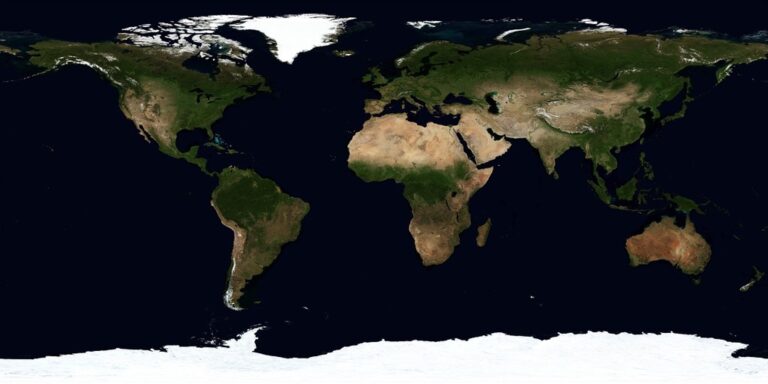
Use White Space to Frame and Define Geographic Boundaries
White space serves as a powerful boundary-defining tool that transforms abstract political and natural divisions into visually comprehensible map elements. Strategic placement of negative space around territorial limits creates clear delineation without overwhelming your map with heavy border lines.
Highlight Coastal Areas and Water Bodies
Maintain generous white space around coastlines to emphasize the land-water boundary relationship. You’ll create natural visual contrast by allowing ocean areas to breathe, making coastal features more prominent and readable. This technique particularly benefits nautical charts and tourism maps where shoreline accuracy matters most. Consider expanding buffer zones around small islands and peninsulas to prevent visual merger with adjacent landmasses.
Emphasize Political and Administrative Borders
Position white space corridors along political boundaries to reinforce territorial divisions without heavy line weights. You can achieve clear country or state separations by creating subtle buffer zones that guide the eye along administrative limits. This approach works exceptionally well for reference maps where border clarity trumps feature density. Strategic spacing also prevents label conflicts near boundary intersections.
Create Natural Separations Between Regions
Leverage white space to distinguish geographic regions through visual breathing room between mountain ranges, river systems, and climate zones. You’ll establish natural flow patterns by allowing topographic features to define their own spatial relationships. This technique helps viewers understand regional characteristics without cluttering the map with additional boundary symbols. Focus white space placement around major geological transitions and watershed divides.
Leverage Empty Areas for Essential Cartographic Elements
White space provides the perfect canvas for positioning crucial map elements that support navigation and understanding. You’ll transform empty areas into functional zones that enhance your map’s usability without competing with geographic content.
Position Scale Bars and North Arrows
Position scale bars in lower corners where they won’t interfere with geographic features or data visualization. You’ll want to maintain at least 0.25 inches of buffer space around these elements to ensure clear visibility. Place north arrows in upper corners with adequate white space separation from map content. Avoid positioning directional indicators near busy geographic areas or complex symbol clusters that could create visual confusion for your map users.
Place Legend and Title Information
Place legends in white space margins that provide sufficient room for clear symbol hierarchies and text readability. You’ll need minimum 0.5-inch spacing between legend boxes and map content to prevent visual overlap. Position map titles in prominent white space areas, typically upper portions with generous padding. Reserve dedicated white space zones for subtitle information and map series identifiers that support your primary title without creating clutter.
Include Attribution and Data Sources
Include data source citations in bottom margin white space where they remain accessible without disrupting map content flow. You’ll maintain professional standards by dedicating specific white space areas for copyright notices and projection information. Position attribution text with consistent spacing from map borders, typically 0.125 inches minimum. Reserve corner white space for coordinate system details and datum specifications that technical users require for accurate interpretation.
Apply Minimalist Design Principles for Professional Map Aesthetics
Minimalist cartography transforms complex geographic data into clean, professional visualizations that prioritize function over ornamentation. You’ll achieve maximum impact by stripping away visual clutter while preserving essential navigation elements.
Remove Unnecessary Decorative Elements
Eliminate ornamental borders, excessive drop shadows, and decorative compass roses that compete with your geographic content. Strip away gradient fills on water bodies and terrain features unless they serve a specific analytical purpose. Remove redundant grid lines, particularly minor tick marks that create visual noise without adding navigational value. Focus on functional elements like scale bars and north arrows in their simplest forms. Your map’s professional appearance depends on restraint rather than embellishment.
Focus on Essential Geographic Information
Prioritize critical features that support your map’s primary purpose while removing secondary details that don’t enhance understanding. Display only the most relevant road classifications for your scale and audience needs. Reduce label density by showing major cities, landmarks, and features that provide spatial context. Eliminate redundant elevation contours in areas where they don’t contribute to navigation or analysis. Your information hierarchy should guide viewers naturally through the most important geographic relationships.
Create Clean, Modern Cartographic Style
Adopt contemporary typography with clean sans-serif fonts that maintain legibility across different scales and output formats. Use consistent line weights throughout your symbology, avoiding heavy outlines that dominate the visual field. Select a limited color palette of 3-5 colors maximum, ensuring sufficient contrast for accessibility standards. Apply uniform spacing rules between all map elements, creating predictable visual rhythms. Your modern aesthetic should emphasize clarity and professional presentation over artistic flourishes.
Conclusion
You’ve now discovered how white space transforms ordinary maps into powerful communication tools. These five strategic approaches will elevate your cartographic work from cluttered confusion to professional clarity.
Remember that effective white space isn’t about leaving areas blank—it’s about creating purposeful breathing room that guides your audience’s eye and enhances understanding. When you apply these techniques consistently you’ll notice immediate improvements in how users interact with your maps.
Your maps should work harder with less visual noise. Start implementing these white space strategies in your next project and watch as complex geographic information becomes more accessible and engaging for your audience.
Frequently Asked Questions
What is white space in cartography?
White space in cartography refers to the empty or unoccupied areas on a map that are not filled with geographic features, labels, or symbols. It’s not merely empty space but a crucial design element that helps create visual hierarchy, enhances readability, and guides the reader’s focus to important information. Strategic use of white space transforms cluttered maps into clear, navigable documents.
Why is white space important for map readability?
White space prevents visual overcrowding and confusion by providing breathing room between map elements. It helps readers distinguish between different features, creates natural reading paths, and allows essential navigation components to stand out. Without adequate white space, maps become cluttered and difficult to interpret, hindering effective navigation and data comprehension.
How does white space create visual hierarchy in maps?
White space creates visual hierarchy by establishing clear information layers and separating primary from secondary elements. Strategic placement guides readers through complex geographic data by grouping related elements with consistent spacing. It allows cartographers to control visual flow, directing attention to key features while maintaining proportional spacing that emphasizes important navigation components over supplementary information.
Where should essential map elements be placed using white space?
Scale bars should be positioned in lower corners, north arrows in upper corners, and legends in margin white space areas. Map titles and subtitles should occupy prominent white space to avoid clutter. Attribution and data sources belong in bottom margin white space, with dedicated areas for copyright notices and technical details to maintain professional standards.
What are the key principles of minimalist map design?
Minimalist map design focuses on removing unnecessary decorative elements that compete with geographic content. Key principles include prioritizing essential geographic information, reducing label density, using contemporary typography, maintaining consistent line weights, applying a limited color palette, and following uniform spacing rules. This approach emphasizes clarity over embellishment for professional presentation.
How should white space be used around geographic boundaries?
White space should frame and define geographic boundaries to make abstract divisions visually comprehensible. Maintain generous white space around coastlines to highlight land-water relationships, use white space corridors along political borders to reinforce territorial divisions, and create natural separations between geographic regions. This allows topographic features to define spatial relationships without cluttering the map.