7 Best Digital Map Innovations for Geopolitical Analysis
Why it matters: Modern geopolitical tensions are reshaping how we create and interpret maps, forcing cartographers to develop new visualization techniques that capture the complexity of today’s interconnected conflicts and power dynamics.
Explore and map the wilderness for the Queen in Cartographers! Draw unique terrain shapes and score points based on randomly selected goals each game, but beware of monster ambushes.

The big picture: Traditional mapping methods can’t adequately represent hybrid warfare, cyber conflicts, economic sanctions, and shifting alliances that define contemporary geopolitics.
What’s next: These emerging cartographic approaches will transform how governments, businesses, and citizens understand global tensions and make strategic decisions in an increasingly complex world.
Disclosure: As an Amazon Associate, this site earns from qualifying purchases. Thank you!
P.S. check out Udemy’s GIS, Mapping & Remote Sensing courses on sale here…
Interactive Conflict Mapping Will Replace Static Border Representations
Interactive mapping platforms now enable real-time visualization of geopolitical tensions, moving beyond traditional static maps that can’t capture the fluid nature of modern territorial disputes.
Real-Time Territorial Dispute Visualization
Real-time dispute tracking transforms how you monitor contested territories through live data feeds from satellite imagery, social media analytics, and government sources. You can now visualize territorial changes as they occur, using platforms like ArcGIS Online or QGIS with live data connectors. These systems update boundary modifications within hours rather than months, displaying contested zones with color-coded intensity levels that reflect escalation patterns. Your mapping workflow benefits from automated alerts when territorial claims shift, enabling immediate cartographic updates for strategic planning.
Dynamic Boundary Line Updates
Dynamic boundary systems allow you to represent fluid territorial changes through animated map sequences and temporal controls. You’ll implement time-slider functionality that shows boundary evolution over specific periods, using tools like Leaflet.js with temporal plugins or Esri’s Time Aware mapping capabilities. These updates reflect disputed areas with graduated transparency levels, indicating confidence intervals in boundary placement. Your maps can now display multiple boundary versions simultaneously, showing de facto versus de jure territorial control through layered visualizations that update automatically from verified data sources.
Multi-Layered Sovereignty Claims Display
Multi-layered sovereignty visualization enables you to map overlapping territorial claims through stackable data layers with adjustable opacity controls. You’ll create comprehensive displays showing maritime boundaries, air defense zones, and economic exclusion areas using vector overlay techniques in professional GIS software. These systems represent competing claims through pattern fills and symbolic representations, allowing users to toggle between different nations’ territorial assertions. Your cartographic approach incorporates uncertainty visualization methods, displaying disputed areas with hatched patterns or gradient fills that indicate the strength of competing sovereignty claims.
Data-Driven Tension Indicators Will Transform Map Symbology
Traditional map symbols can’t capture the nuanced intensity levels of modern geopolitical tensions. Advanced data integration will revolutionize how cartographers represent conflict zones and diplomatic relationships.
Heat Map Integration for Crisis Zones
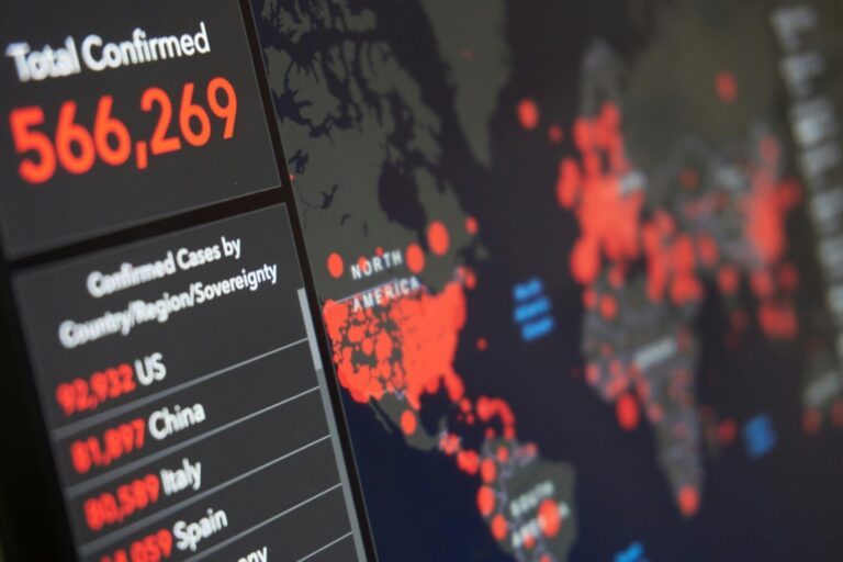
Heat mapping transforms tension visualization by converting complex geopolitical data into intuitive color gradients. You’ll overlay multiple data streams including diplomatic communications frequency, economic sanctions severity, and military activity levels onto base maps. Modern GIS platforms like QGIS and ArcGIS Pro enable real-time heat map generation using APIs from conflict monitoring databases such as ACLED or Uppsala Conflict Data Program. Color intensity automatically adjusts based on weighted tension scores, creating immediate visual recognition of escalating situations across different geographic scales.
Algorithmic Risk Assessment Overlays
Algorithmic overlays provide predictive tension mapping through machine learning analysis of historical conflict patterns. You’ll implement risk assessment algorithms that process variables including economic indicators, political stability indices, and social media sentiment analysis. Tools like R’s spatial packages or Python’s GeoPandas enable automated overlay generation with customizable risk thresholds. These overlays display probability zones using graduated symbols or transparency levels, allowing decision-makers to identify potential flashpoints before traditional intelligence sources recognize emerging threats.
Predictive Modeling Visual Elements
Predictive modeling introduces temporal symbology that forecasts geopolitical developments through visual trend indicators. You’ll create arrow symbols showing projected conflict trajectories, graduated circles representing escalation probabilities, and timeline bars indicating predicted duration of tensions. Specialized cartographic software like MAPublisher or Avenza MAPublisher integrates with statistical modeling platforms to generate dynamic symbols that update based on incoming data feeds. These visual elements transform static maps into forward-looking intelligence tools that guide strategic planning decisions.
Temporal Mapping Will Show Geopolitical Evolution Over Time
Temporal mapping transforms static cartographic representations into dynamic visualizations that capture how geopolitical tensions evolve across different time periods. You’ll discover patterns and trajectories that traditional maps simply can’t reveal.
Historical Conflict Timeline Integration
Timeline integration overlays historical conflict data directly onto geographic territories, creating comprehensive visual narratives of regional instability. You can layer decades of border disputes, territorial changes, and diplomatic incidents using GIS platforms like ArcGIS Pro or QGIS with temporal plugins. These systems enable you to visualize how conflicts migrate geographically over time, revealing underlying patterns in geopolitical behavior and helping predict future hotspots through historical precedent analysis.
Progressive Tension Escalation Tracking
Escalation tracking visualizes how geopolitical tensions intensify or de-escalate through graduated color schemes and animated sequences. You’ll map tension levels using time-series data from diplomatic communications, military movements, and economic sanctions. Modern cartographic tools like Mapbox GL JS and D3.js enable you to create smooth temporal transitions that show gradual tension buildup or rapid crisis development, providing stakeholders with clear visual indicators of when situations require immediate attention or intervention.
Comparative Period Analysis Tools
Comparative analysis tools enable side-by-side visualization of different historical periods, allowing you to identify recurring geopolitical patterns and assess policy effectiveness. You can create split-screen temporal maps using CartoDB or Tableau’s mapping capabilities to compare pre-war versus post-war territories, sanctions impact over multiple timeframes, or diplomatic relationship changes across decades. These tools help you quantify geopolitical stability trends and provide evidence-based insights for strategic planning and risk assessment decisions.
Multi-Perspective Cartography Will Present Competing Territorial Claims
Modern cartographic systems now enable simultaneous visualization of conflicting territorial perspectives, allowing you to represent multiple nations’ claims on disputed regions within the same mapping interface.
Simultaneous Viewpoint Display Systems
Split-screen mapping interfaces let you display competing territorial claims side-by-side within a single viewport. You’ll configure parallel map panels showing identical geographic regions with different sovereignty assertions overlaid on each view. Modern GIS platforms like ArcGIS Pro and QGIS support synchronized navigation between multiple perspectives, maintaining identical zoom levels and center points. Toggle switches enable rapid comparison between contested boundary interpretations, while transparency controls help visualize overlapping claims simultaneously.
Contested Area Highlighting Techniques
Pattern-based symbology systems distinguish disputed territories through specialized visual markers that avoid implying sovereignty preferences. You’ll apply diagonal hatching patterns, crosshatch fills, or stippled textures to contested zones rather than solid colors that suggest ownership. Color-neutral highlighting techniques use graduated gray scales or earth tones to maintain cartographic objectivity. Advanced mapping software enables dynamic highlighting that responds to user queries, automatically identifying disputed areas when specific territorial conflicts are selected from attribute databases.
Diplomatic Recognition Status Indicators
Recognition matrix symbology displays which nations formally acknowledge specific territorial claims through standardized visual indicators. You’ll create legend systems showing recognition percentages using graduated symbols or pie chart markers positioned within disputed territories. Database-driven indicators automatically update recognition status based on diplomatic relationship tables, connecting to foreign ministry databases and treaty repositories. Color-coded recognition networks visualize supporter alliances through connecting lines, while uncertainty indicators mark territories with ambiguous diplomatic status using question mark symbols or dashed boundaries.
Augmented Reality Will Enhance Geopolitical Understanding
AR technology will transform how you visualize complex geopolitical tensions by creating immersive three-dimensional experiences that make abstract territorial disputes tangible and understandable.
Immersive Conflict Zone Exploration
Navigate through contested territories using AR headsets that overlay real-time conflict data onto three-dimensional terrain models. You’ll explore disputed regions like the South China Sea or Kashmir through virtual walk-throughs that display military positions, patrol routes, and incident locations directly onto the landscape. AR platforms like Microsoft HoloLens 2 and Magic Leap enable you to examine conflict zones from multiple angles while accessing historical incident data through gesture-based controls. This immersive approach helps you understand spatial relationships between opposing forces and geographic constraints that traditional flat maps can’t convey effectively.
Immerse yourself in games with 7.1 surround sound for precise audio. Enjoy clear communication with a noise-canceling microphone and comfortable over-ear pads, compatible with PC, PlayStation, Xbox, Switch, and more.

Three-Dimensional Territory Visualization
Render overlapping territorial claims in layered 3D space using AR visualization tools that separate competing sovereignty assertions vertically. You can stack different nations’ territorial boundaries at various heights above the base terrain, creating clear visual separation between conflicting claims. Tools like Unity 3D and Unreal Engine power these AR experiences, allowing you to toggle between different perspective layers and examine how disputed boundaries intersect with topographic features. The vertical stacking approach eliminates the visual confusion of overlapping colored zones that plague traditional 2D mapping approaches.
Interactive Stakeholder Information Layers
Access detailed information about involved parties through AR interface elements that appear when you focus on specific geographic regions. You’ll tap on territorial boundaries or conflict zones to reveal pop-up panels containing diplomatic histories, economic interests, and military capabilities of relevant nations. AR development platforms like ARCore and ARKit enable real-time database connections that update stakeholder information as geopolitical situations evolve. This interactive layer system transforms static territorial data into dynamic information networks that help you understand the complex motivations driving modern territorial disputes.
Social Media Integration Will Reflect Public Sentiment on Maps
Social platforms now generate massive geospatial datasets that reveal public opinion patterns across contested territories. You’ll see cartographers integrating Twitter sentiment analysis, Facebook engagement metrics, and TikTok location tags to create sentiment-driven map overlays that show how different populations perceive ongoing tensions.
Crowd-Sourced Tension Reporting
Crowd-sourced platforms transform ordinary citizens into geopolitical data collectors through mobile applications like Ushahidi and custom mapping interfaces. You can aggregate thousands of real-time reports from border regions, protest zones, and conflict areas to create heat maps showing tension intensity levels. These citizen-generated datasets provide ground-truth validation for satellite imagery analysis while capturing localized perspectives that traditional intelligence sources often miss. Machine learning algorithms filter spam reports and verify credible submissions through cross-referencing multiple sources.
Opinion Polling Geographic Distribution
Opinion polling data creates powerful choropleth maps that visualize public sentiment variations across administrative boundaries and demographic regions. You’ll integrate polling results from organizations like Pew Research and Gallup into GIS platforms to show how support for specific policies varies geographically during territorial disputes. These visualizations reveal correlation patterns between geographic proximity to contested areas and public opinion intensity. Advanced cartographic techniques use graduated symbols and bivariate color schemes to display both polling confidence intervals and response percentages simultaneously.
Social Network Analysis Visualization
Social network mapping reveals influence patterns within geopolitical discussions by analyzing follower relationships, hashtag propagation, and content sharing networks across platforms like Twitter and LinkedIn. You can create node-link diagrams overlaid on geographic maps to show how information flows between regions during international crises. Network centrality metrics identify key influencers and information hubs while community detection algorithms reveal ideological clustering patterns. These visualizations help identify disinformation campaigns and state-sponsored influence operations through anomalous network behavior patterns.
Predictive Analytics Will Forecast Future Geopolitical Hotspots
Advanced algorithms now analyze vast datasets to identify emerging tension patterns before they escalate into full conflicts. You’ll soon map tomorrow’s flashpoints using today’s data streams.
Machine Learning Pattern Recognition
Machine learning algorithms identify recurring tension patterns across decades of historical conflict data. You can train neural networks using satellite imagery changes, diplomatic communication frequency, and economic indicator shifts to recognize pre-conflict signatures. TensorFlow and PyTorch frameworks process millions of data points from sources like ACLED and GDELT databases, detecting subtle patterns human analysts might miss. These algorithms flag unusual military movement patterns, trade disruption indicators, and social media sentiment shifts that historically precede geopolitical escalations.
Early Warning System Mapping
Early warning systems generate automated alerts when predictive models detect elevated conflict probabilities in specific regions. You’ll receive real-time notifications through GIS platforms like ArcGIS Online when algorithms identify concerning data combinations. These systems integrate satellite monitoring, economic indicators, and diplomatic activity levels to create graduated alert zones on your maps. USAID’s FEWS NET and similar platforms already demonstrate how automated mapping systems can forecast humanitarian crises weeks before they occur, providing crucial preparation time.
Risk Probability Visualization Tools
Risk probability tools transform complex statistical models into intuitive heat maps showing conflict likelihood percentages across geographic regions. You can use graduated color schemes ranging from green (low risk) to red (high risk) to display algorithmic assessments on choropleth maps. Platforms like Tableau and Power BI integrate with predictive models to create dynamic dashboards updating risk assessments hourly. These visualizations help policymakers allocate resources proactively, displaying confidence intervals and uncertainty ranges alongside probability scores for transparent decision-making.
Conclusion
The future of cartography lies in embracing these innovative visualization techniques that capture the full complexity of modern geopolitical tensions. You’ll witness maps evolve from static representations into dynamic interactive platforms that integrate real-time data social media sentiment and predictive analytics.
These advanced mapping approaches will empower you to make more informed decisions whether you’re a policymaker business leader or engaged citizen. The integration of AR technology temporal mapping and multi-perspective displays will provide unprecedented insights into territorial disputes and diplomatic relationships.
As geopolitical landscapes continue shifting rapidly you’ll need these sophisticated cartographic tools to navigate an increasingly complex world. The seven visualization methods discussed here represent just the beginning of a cartographic revolution that will reshape how you understand global tensions and territorial dynamics.
Frequently Asked Questions
What are interactive mapping platforms for geopolitical tensions?
Interactive mapping platforms are digital tools that enable real-time visualization of geopolitical conflicts and territorial disputes. Unlike traditional static maps, these platforms capture the fluid nature of modern tensions through live data feeds, allowing for immediate updates and dynamic representation of changing political landscapes and contested territories.
How does real-time dispute tracking work in modern cartography?
Real-time dispute tracking utilizes live data feeds from multiple sources including news outlets, government databases, and satellite imagery to visualize changes in contested territories. This technology allows cartographers to provide immediate updates on territorial disputes, showing evolving boundaries and conflict zones as situations develop.
What are dynamic boundary systems in geopolitical mapping?
Dynamic boundary systems represent evolving territorial changes through animated sequences and multi-layered displays. These systems can show overlapping sovereignty claims, disputed territories, and changing political boundaries over time, providing a more accurate representation of complex geopolitical situations than static traditional maps.
How do heat maps visualize geopolitical tensions?
Heat maps use intuitive color gradients to represent the intensity of geopolitical tensions across different regions. Generated through modern GIS platforms using real-time data streams, these visualizations make it easy to identify areas of high conflict potential, diplomatic strain, or territorial disputes at a glance.
What is temporal mapping in geopolitical cartography?
Temporal mapping transforms static maps into dynamic visualizations that show how geopolitical tensions evolve over time. This technique integrates historical conflict data, tracks tension escalation patterns, and enables comparative analysis of different time periods to identify recurring geopolitical patterns and policy effectiveness.
How does multi-perspective cartography work?
Multi-perspective cartography allows simultaneous visualization of conflicting territorial claims from multiple nations within the same interface. Using split-screen systems and pattern-based symbology, it presents competing claims side-by-side while avoiding bias toward any particular sovereignty assertion, supported by platforms like ArcGIS Pro and QGIS.
What role does augmented reality play in geopolitical mapping?
Augmented reality enhances geopolitical understanding by creating immersive 3D experiences that make territorial disputes more tangible. AR overlays real-time conflict data onto 3D terrain models, allowing users to navigate contested areas while accessing historical data and visualizing overlapping claims in layered space.
How is social media integrated into modern cartography?
Social media platforms generate massive geospatial datasets revealing public sentiment across contested territories. This integration includes sentiment-driven map overlays using Twitter analysis, crowd-sourced tension reporting through mobile apps, and social network analysis to reveal influence patterns in geopolitical discussions.
What are predictive analytics in geopolitical mapping?
Predictive analytics use advanced algorithms and machine learning to analyze datasets and identify emerging tension patterns before they escalate. These systems generate early warning alerts, create risk probability visualizations, and transform statistical models into intuitive heat maps showing conflict likelihood percentages.
Why are traditional mapping methods insufficient for modern geopolitics?
Traditional mapping methods cannot capture the complexity of contemporary conflicts involving hybrid warfare, cyber issues, and fluid territorial disputes. Modern geopolitics requires dynamic visualization tools that can represent real-time changes, multiple perspectives, and the nuanced intensity levels of evolving political tensions.