7 Ways to Build Interactive Maps for Public Engagement
The big picture: Interactive maps have become essential tools for governments and organizations looking to boost community participation and gather meaningful public input on local issues.
Why it matters: These digital platforms transform how citizens engage with urban planning projects, policy decisions, and community initiatives by making complex data accessible and encouraging real-time feedback through intuitive visual interfaces.
What’s next: Building effective interactive maps requires strategic planning, the right technology stack, and understanding your audience’s needs to create experiences that genuinely increase civic participation.
Disclosure: As an Amazon Associate, this site earns from qualifying purchases. Thank you!
P.S. check out Udemy’s GIS, Mapping & Remote Sensing courses on sale here…
Define Your Public Engagement Goals and Target Audience
Before you begin mapping community data and designing interactive features, you’ll need to establish who you’re serving and what outcomes you’re seeking to achieve.
Identify Community Stakeholders and Their Needs
Survey local government officials, community leaders, and residents to understand their specific mapping requirements and technical capabilities. Document whether stakeholders need demographic overlays, zoning information, or infrastructure data visualization. Create user personas that include age ranges, digital literacy levels, and preferred devices for accessing maps. Consider accessibility needs such as screen reader compatibility and mobile optimization. Test prototype interfaces with representative groups to identify navigation preferences and information display formats that resonate with different community segments.
Establish Clear Objectives for Citizen Participation
Define measurable participation outcomes such as comment volume, geographic coverage of input, or demographic representation in responses. Determine whether you’re collecting location-specific feedback, gathering broad policy opinions, or facilitating collaborative planning exercises. Set realistic timelines for engagement phases and specify the decision-making authority your map will support. Structure participation levels from basic viewing and commenting to advanced data contribution and collaborative editing. Align your mapping objectives with existing community planning processes and municipal decision-making cycles.
Determine Key Performance Indicators for Success
Track engagement metrics including unique visitors, time spent on map features, and geographic distribution of user interactions. Monitor data quality indicators such as comment relevance, coordinate accuracy, and duplicate submission rates. Measure demographic representation by comparing participant profiles to census data for your target area. Establish feedback loops that connect map-generated insights to actual policy or planning decisions. Document cost-per-engagement ratios and technical performance metrics like page load times and mobile compatibility scores to optimize future mapping initiatives.
Choose the Right Interactive Mapping Platform and Tools
Selecting the optimal mapping platform determines your project’s technical capabilities and long-term success. Your platform choice directly impacts user experience, data integration options, and ongoing maintenance requirements.
Evaluate Free vs. Paid Mapping Solutions
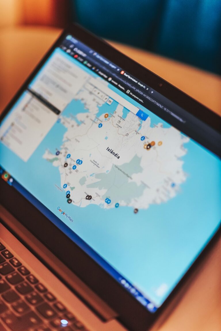
Free platforms like QGIS, Leaflet, and Google My Maps offer basic mapping functionality with limited customization options. You’ll face restrictions on data storage, concurrent users, and advanced features like real-time collaboration tools.
Paid solutions provide enterprise-grade security, unlimited data capacity, and professional support services. These platforms typically offer advanced analytics, custom branding options, and integration capabilities with existing municipal systems for comprehensive public engagement workflows.
Compare Popular Platforms Like ArcGIS Online, Mapbox, and Google Maps
ArcGIS Online excels in government applications with robust data analysis tools and WCAG accessibility compliance. You’ll benefit from pre-built templates specifically designed for public consultation and community feedback collection.
Mapbox offers superior customization capabilities and performance optimization for high-traffic engagement campaigns. The platform provides detailed usage analytics and supports complex data visualization requirements for technical audiences.
Google Maps Platform delivers familiar user interfaces and reliable geocoding services. You’ll leverage existing user familiarity while accessing comprehensive location databases for accurate address validation and search functionality.
Assess Technical Requirements and Team Capabilities
Evaluate your team’s programming skills before committing to code-based solutions like Leaflet or custom Mapbox implementations. Non-technical teams benefit from drag-and-drop platforms like ArcGIS Online or Story Maps that require minimal coding knowledge.
Understand the structure of a one-hour TV drama pilot. This book provides a guide to story mapping for television.

Consider your data infrastructure including file formats, database connections, and real-time update requirements. Cloud-based platforms handle server maintenance automatically, while self-hosted solutions provide complete data control but require dedicated IT support for optimal performance and security compliance.
Gather and Prepare Your Geographic Data Sources
High-quality geographic data forms the foundation of any successful interactive mapping project for public engagement. Your data preparation process directly impacts user experience and the credibility of public input collected through your platform.
Achieve a flawless, even complexion with e.l.f. Flawless Satin Foundation. This lightweight, vegan formula provides medium coverage and a semi-matte finish for all-day wear, while hydrating your skin with glycerin.

Collect Relevant Spatial Data from Government Databases
Government databases provide the most authoritative spatial data for public engagement projects. Start with your local city or county GIS portals which typically offer zoning boundaries, property parcels, and infrastructure layers as downloadable shapefiles or web services.
Federal sources like the U.S. Census Bureau provide demographic data through TIGER/Line files, while the USGS offers elevation models and hydrographic features. State environmental agencies maintain critical datasets including flood zones, protected areas, and environmental monitoring stations that enhance community discussions about local issues.
Clean and Standardize Data Formats for Compatibility
Data cleaning ensures your interactive map functions reliably across different devices and browsers. Convert all spatial data to a consistent coordinate reference system—Web Mercator (EPSG:3857) works best for most web mapping applications.
Standardize attribute field names by removing special characters, spaces, and inconsistent capitalization that cause display errors. Check geometry validity using tools like QGIS or ArcGIS to fix overlapping polygons, unclosed boundaries, and topology errors that prevent proper rendering in web browsers.
Ensure Data Accuracy and Currency for Public Use
Data accuracy builds public trust in your engagement platform and ensures meaningful community input. Verify spatial accuracy by comparing your datasets against recent satellite imagery or street-level photography, particularly for infrastructure and land use features.
Update temporal datasets regularly—census data older than five years may not reflect current demographics, while transportation networks change frequently with new development. Document data sources and collection dates prominently on your platform so users understand the information’s reliability and currency.
Design User-Friendly Interface Elements for Maximum Accessibility
Your interactive map’s interface design directly determines whether community members will actively engage with your public participation platform. Prioritizing accessibility ensures that citizens with varying technical abilities and disabilities can meaningfully contribute to your engagement initiatives.
Create Intuitive Navigation and Search Functions
Navigation controls should prominently display essential functions like zoom, pan, and layer toggles in easily recognizable icons. Position your search bar at the top of the interface and implement autocomplete functionality that recognizes addresses, landmarks, and neighborhood names familiar to local residents. Include breadcrumb navigation for complex mapping workflows and provide clear visual feedback when users interact with clickable elements through hover states and loading indicators.
Implement Mobile-Responsive Design Features
Mobile devices account for over 60% of public engagement interactions, making responsive design critical for community participation. Design touch-friendly interface elements with minimum 44-pixel tap targets and optimize map controls for finger navigation rather than mouse precision. Implement swipe gestures for map panning and pinch-to-zoom functionality while ensuring that popup windows and data entry forms automatically adjust to smaller screen sizes without compromising usability.
Include Accessibility Features for Diverse User Abilities
Accessibility compliance requires implementing WCAG 2.1 AA standards including keyboard navigation support and screen reader compatibility for visually impaired users. Provide alternative text descriptions for map symbols and ensure color contrast ratios meet minimum 4.5:1 standards for text readability. Include zoom functionality up to 200% magnification, offer high-contrast color schemes as user options, and implement voice-to-text input capabilities for users with motor disabilities affecting traditional input methods.
Incorporate Interactive Features That Encourage Participation
Building on your user-friendly interface foundation, strategic interactive features transform passive map viewers into active community contributors.
Add Comment and Feedback Collection Tools
Implement location-based commenting systems that allow users to pin feedback directly onto specific map areas. Modern mapping platforms like ArcGIS Online and Mapbox support customizable comment widgets that capture structured feedback through drop-down categories, text fields, and rating scales.
Configure comment moderation workflows to maintain data quality while encouraging participation. Enable threaded discussions where community members can respond to existing comments, creating natural dialogue around neighborhood issues and proposed developments.
Enable User-Generated Content and Photo Uploads
Deploy photo upload capabilities that link visual documentation to geographic locations, creating powerful before-and-after documentation for infrastructure projects. Platforms like Esri’s Survey123 integrate seamlessly with web maps to capture geotagged images alongside structured data forms.
Establish file size limits and format restrictions to maintain system performance while accepting common image formats. Include metadata capture for timestamps and device information to support data verification processes during community planning initiatives.
Integrate Voting and Polling Mechanisms
Create interactive polling features that gather quantitative community preferences on development proposals, transportation improvements, and resource allocation priorities. Configure voting widgets to display real-time results while preventing duplicate submissions through IP tracking or user authentication.
Design polling questions with clear geographic boundaries to ensure responses align with affected neighborhoods. Implement weighted voting systems that account for population density differences between districts, ensuring equitable representation across diverse community areas.
Implement Data Visualization Techniques for Clear Communication
Effective data visualization transforms complex geographic information into accessible insights that drive meaningful public engagement. Strategic visualization choices determine whether your interactive map empowers community participation or overwhelms users with confusing displays.
Use Color Coding and Symbols for Easy Interpretation
Choose intuitive color schemes that align with user expectations and cultural associations. Red typically signals high priority or danger, while green indicates positive conditions or approval. Apply consistent color coding across all map layers to avoid confusion.
Implement standardized symbols from established cartographic libraries like those in ArcGIS Pro or QGIS. Traffic symbols, zoning icons, and infrastructure markers should follow municipal standards that residents already recognize from street signs and official documents.
Create Dynamic Charts and Graphs Within the Map
Embed interactive charts directly into your map interface using libraries like Chart.js or D3.js. Population demographics, budget allocations, and survey responses display more effectively as bar charts or pie charts than raw numbers in text boxes.
Design responsive visualizations that adapt to different screen sizes and update automatically when users filter data. Link chart interactions to map highlights, allowing users to click demographic bars and see corresponding neighborhoods illuminate on the map display.
Design Effective Pop-ups and Information Windows
Structure information hierarchically with the most critical data appearing first in your pop-up windows. Lead with location names, followed by key statistics, then secondary details like contact information or related links.
Limit text density to 3-4 concise bullet points per pop-up to prevent information overload. Include relevant images, small charts, or progress indicators that communicate status quickly. Test pop-up loading speeds to ensure smooth user experience across different internet connections.
Test Your Interactive Map with Focus Groups Before Launch
Testing validates your map’s effectiveness before public release and identifies critical usability issues that could undermine community engagement.
Conduct Usability Testing with Representative Community Members
Recruit 8-12 participants who reflect your target audience’s demographics, including varying ages, technical skills, and accessibility needs. Schedule individual 45-minute sessions where participants complete specific mapping tasks while thinking aloud. Document navigation patterns, confusion points, and task completion rates to identify interface problems. Include participants who use assistive technologies like screen readers to ensure your map meets accessibility standards. Record sessions with permission to analyze user behavior patterns and share findings with your development team.
Protect your eyes with RaoOG blue light blocking reading glasses. Featuring flexible spring hinges for a comfortable fit and accurate magnification for clear, distortion-free vision.

Gather Feedback on Navigation and Feature Functionality
Present participants with realistic scenarios that mirror actual public engagement tasks, such as finding specific locations or submitting community feedback. Track time spent on each feature and note where users struggle with interactive elements like zoom controls, layer toggles, or comment submission forms. Ask specific questions about icon clarity, menu organization, and mobile responsiveness during testing sessions. Use standardized usability metrics including task success rates, error frequency, and user satisfaction scores to quantify performance across different user groups.
Refine Based on User Experience Insights
Prioritize fixes for critical navigation issues that prevent task completion, such as broken search functions or inaccessible comment forms. Implement immediate improvements to color contrast, button sizing, and text readability based on accessibility feedback. Conduct follow-up testing with 3-4 participants after making major revisions to verify improvements work effectively. Document all changes made during the refinement process and create a launch checklist that includes final accessibility audits and performance testing across different devices and browsers.
Promote Your Interactive Map Through Multiple Channels
Your interactive map’s success depends on strategic promotion across diverse platforms to maximize community reach and engagement.
Leverage Social Media and Community Networks
Share your interactive map on Facebook, Twitter, and Instagram with location-specific hashtags to reach local audiences. Post engaging screenshots highlighting key features and create short video demonstrations showing map functionality. Partner with community influencers and neighborhood leaders who can amplify your message through their established networks. Use LinkedIn to connect with urban planners and civic organizations interested in public engagement tools.
Partner with Local Organizations and Government Agencies
Collaborate with city councils, planning departments, and community boards to integrate your map into official public consultation processes. Reach out to nonprofits, homeowner associations, and advocacy groups that share similar community goals. Present your interactive map at town halls, public meetings, and neighborhood forums to demonstrate its value. Request partnerships with libraries and community centers to host map demonstrations and training sessions.
Create Educational Materials and Tutorials for Users
Develop step-by-step video tutorials showing how to navigate your map’s features and submit feedback effectively. Design printable quick-start guides with screenshots and clear instructions for less tech-savvy users. Create FAQ documents addressing common questions about data sources, privacy concerns, and participation methods. Host virtual workshops and webinars to walk community members through the mapping process and encourage active participation.
Monitor Engagement Metrics and User Analytics
Tracking performance data ensures your interactive mapping project delivers meaningful public engagement outcomes. You’ll need comprehensive analytics to measure success and identify areas for improvement.
Track User Participation and Time Spent on Platform
User engagement metrics reveal how effectively your interactive map captures public attention. Monitor unique visitors, return visitors, and session duration to understand participation patterns across different community segments.
Track feature usage statistics including comment submissions, data layer interactions, and tool utilization rates. You’ll identify which interactive elements generate the most community involvement and which areas need optimization to maintain sustained citizen engagement throughout your project timeline.
Analyze Geographic Distribution of Engagement
Geographic engagement patterns reveal participation equity across your study area. Map user locations to identify neighborhoods with high versus low participation rates and potential digital divide issues.
Examine engagement clustering around specific map features, landmarks, or proposed development sites. You’ll discover whether certain geographic areas generate more community interest and adjust your outreach strategies to ensure representative participation from all affected neighborhoods and demographic groups.
Measure Achievement of Initial Public Engagement Goals
Compare actual participation metrics against your predefined engagement objectives to assess project success. Evaluate whether you’ve reached target demographic groups and achieved desired comment volumes or feedback quality.
Analyze how user-generated content addresses your original engagement questions and policy concerns. You’ll determine if the interactive map successfully facilitated meaningful public input for decision-making processes and identify lessons for future community engagement mapping initiatives.
Maintain and Update Your Interactive Map for Long-Term Success
Successful interactive maps require ongoing maintenance to preserve user engagement and data integrity. Your public engagement platform’s effectiveness depends on consistent updates and responsive management that adapts to changing community needs and technological requirements.
Establish Regular Data Update Schedules
Schedule weekly data refreshes for dynamic community information like development projects and public meetings. You’ll need monthly updates for demographic data and quarterly reviews for base map layers. Create automated workflows using GIS tools like ArcGIS Pro or QGIS to streamline routine updates. Document your update procedures and assign specific team members to maintain consistency across data layers.
Respond to User Feedback and Feature Requests
Monitor user comments and feature requests through your map’s feedback mechanisms and social media channels. You should implement minor interface improvements within two weeks and evaluate major feature additions monthly. Track common user issues like navigation difficulties or missing data categories. Prioritize accessibility improvements and popular visualization requests that enhance community participation without compromising map performance.
Plan for Platform Upgrades and Technical Maintenance
Schedule platform maintenance during low-traffic periods to minimize user disruption. You’ll need quarterly security updates and annual platform version upgrades for tools like Mapbox or ArcGIS Online. Test all interactive features after each update and maintain backup versions of your map configuration. Budget for potential hosting cost increases and evaluate alternative platforms annually to ensure optimal performance and cost-effectiveness.
Conclusion
Building interactive maps for public engagement requires careful planning and execution but the rewards are substantial. You’ll create powerful tools that transform how communities participate in decision-making processes while making complex data accessible to everyone.
Success depends on understanding your audience choosing the right technology and maintaining ongoing engagement through regular updates and responsive design. When you follow these strategic steps you’ll develop platforms that genuinely foster civic participation.
Remember that effective interactive maps aren’t just technical achievements—they’re bridges that connect citizens with their local government and community initiatives. Your investment in creating user-friendly engaging platforms will strengthen democratic participation and improve public policy outcomes for years to come.
Frequently Asked Questions
What are interactive maps for community engagement?
Interactive maps are digital platforms that allow community members to participate in local planning and policy decisions. They make complex geographic data accessible through user-friendly interfaces, enabling residents to provide real-time feedback, share opinions, and contribute to urban planning initiatives. These tools transform traditional public engagement by making participation more accessible and meaningful.
How do interactive maps improve public participation?
Interactive maps enhance public participation by breaking down barriers to engagement. They allow citizens to visualize complex data easily, provide feedback from anywhere with internet access, and participate at their own pace. Features like commenting tools, voting mechanisms, and user-generated content make it easier for community members to contribute meaningfully to local decision-making processes.
What should I consider when choosing an interactive mapping platform?
When selecting a platform, evaluate your budget, technical requirements, and team capabilities. Compare options like ArcGIS Online, Mapbox, and Google Maps based on features, cost, and ease of use. Consider whether you need advanced analytics, customization options, or specific integration capabilities. Also assess your team’s technical expertise for implementation and maintenance.
How important is data quality for interactive mapping projects?
Data quality is crucial for building public trust and ensuring effective engagement. Use authoritative, current, and accurate geographic data from reliable sources. Poor data quality can undermine credibility and lead to incorrect community insights. Maintain transparency about data sources and update information regularly to preserve accuracy and user confidence in the platform.
What makes an interactive map user-friendly?
A user-friendly interactive map features intuitive navigation, clear visual design, and accessible interfaces for users with varying technical abilities. Include helpful tooltips, simple color coding, responsive design for mobile devices, and straightforward interaction methods. Provide tutorials and educational materials to help users understand how to engage effectively with the platform.
How can I promote my interactive map to maximize community engagement?
Use multiple promotional channels including social media, partnerships with local organizations, government websites, and community newsletters. Create educational materials and tutorials to help users navigate the map. Attend community meetings to demonstrate the platform and leverage existing community networks to spread awareness and encourage participation.
What metrics should I track to measure engagement success?
Monitor key metrics including user participation rates, time spent on the platform, feature usage statistics, and geographic distribution of engagement. Track the quality and quantity of feedback received, demographic representation, and achievement of initial engagement goals. These analytics help identify areas for improvement and ensure equitable community participation.
How often should I update my interactive map?
Establish regular update schedules based on your project needs and community feedback. Update geographic data regularly to maintain accuracy, respond promptly to user feedback and feature requests, and plan for periodic platform upgrades. Consistent maintenance ensures continued user engagement and preserves the map’s effectiveness as a community engagement tool.