7 Best Climate Maps for Environmental Data Visualization
Climate change impacts are everywhere but often invisible until it’s too late. Augmented reality maps can transform how you visualize and understand environmental data by overlaying real-time climate information onto your physical surroundings through your smartphone or AR device.
Experience vivid content on the Galaxy A16 5G's 6.7" display and capture stunning photos with its triple-lens camera. Enjoy peace of mind with a durable design, six years of updates, and Super Fast Charging.

These innovative mapping solutions make abstract climate concepts tangible – from showing rising sea levels on your local coastline to displaying air quality data as you walk through your neighborhood. You’ll discover seven practical AR mapping ideas that help communities better understand their environmental challenges and take meaningful action against climate change.
Disclosure: As an Amazon Associate, this site earns from qualifying purchases. Thank you!
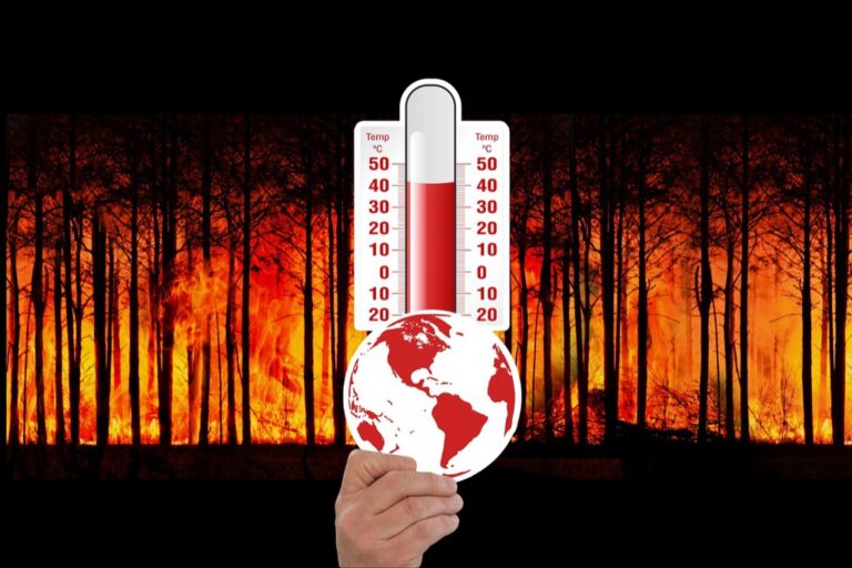
Interactive Temperature Rise Visualization Maps
Temperature visualization maps transform abstract climate data into compelling visual experiences that you can explore through AR technology.
P.S. check out Udemy’s GIS, Mapping & Remote Sensing courses on sale here…
Real-Time Global Temperature Overlays
Real-time temperature overlays display current thermal conditions across your geographical area using color-coded heat maps. You’ll see immediate temperature variations between urban heat islands, green spaces, and water bodies through your AR device. These overlays integrate NASA’s MODIS satellite data and local weather station readings to provide accurate thermal imaging. The visualization updates every 15 minutes, showing temperature fluctuations throughout the day. You can toggle between surface temperatures and air temperatures at different altitudes for comprehensive thermal analysis.
Get real-time weather data with the Ambient Weather WS-2902. This WiFi-enabled station measures wind, temperature, humidity, rainfall, UV, and solar radiation, plus it connects to smart home devices and the Ambient Weather Network.

Historical Temperature Comparison Layers
Historical comparison layers let you visualize temperature changes over decades by switching between different time periods. You’ll access temperature data from 1880 to present, sourced from NOAA’s Global Historical Climatology Network. The AR interface displays side-by-side comparisons showing how your location’s average temperatures have shifted over 10, 50, or 100-year periods. Color gradients highlight warming trends, with red indicating temperature increases and blue showing cooling patterns. You can animate the data to watch temperature evolution unfold chronologically across your landscape.
Future Climate Projection Models
Future projection models display predicted temperature scenarios based on current emission pathways and climate modeling. You’ll explore three standard scenarios: low emissions (RCP2.6), moderate emissions (RCP4.5), and high emissions (RCP8.5) through 2100. The AR visualization shows potential temperature increases ranging from 1.5°C to 4°C depending on your location and chosen scenario. Interactive timelines let you jump to specific decades to see projected conditions. The models incorporate data from the Intergovernmental Panel on Climate Change’s latest assessment reports for scientific accuracy.
Sea Level Rise Impact Simulation Maps
Sea level rise simulation maps reveal the coastal impacts of climate change with unprecedented clarity. These AR visualizations transform theoretical projections into immediate visual understanding of future flood zones.
Coastal Flooding Predictions
Flooding prediction maps overlay projected water levels directly onto coastal landscapes using NOAA’s Sea Level Rise Viewer data. You’ll see real-time visualizations showing flood scenarios from 1-foot to 10-foot sea level increases. The AR interface displays flood depths through color gradients while highlighting evacuation routes and vulnerable infrastructure. Interactive timelines let you explore flooding scenarios across different decades through 2150.
Island Nations Vulnerability Assessment
Vulnerability assessments for island nations display critical elevation data and submersion timelines through AR overlays. You can visualize which areas face immediate risk versus long-term threats using topographic modeling from NASA’s SRTM data. The maps highlight population centers, freshwater sources, and cultural sites at risk. Real-time tidal data integration shows how storm surges compound sea level rise impacts across Pacific and Caribbean islands.
Urban Infrastructure Risk Analysis
Infrastructure risk analysis maps identify vulnerable urban systems including subway networks, power grids, and sewage treatment facilities. You’ll access detailed flood modeling that incorporates storm surge data from FEMA’s National Flood Insurance Program. The AR visualization shows infrastructure failure cascades when critical facilities flood. Color-coded risk assessments help urban planners prioritize adaptation investments for bridges, tunnels, and waterfront developments facing rising seas.
Carbon Footprint Tracking and Reduction Maps
Carbon footprint tracking transforms personal environmental impact from abstract numbers into actionable AR visualizations. These maps connect individual choices to global climate patterns through real-time data integration.
Personal Carbon Emission Monitoring
Personal carbon tracking maps display your daily emission patterns through AR overlays that visualize transportation choices, energy consumption, and purchasing decisions. The AR interface connects smartphone GPS data with emission databases to show real-time carbon impact from activities like driving versus walking routes. You’ll see immediate feedback as color-coded trails following your movements, with green paths indicating low-carbon choices and red zones highlighting high-emission activities throughout your day.
Community-Wide Carbon Impact Visualization
Community carbon visualization maps aggregate neighborhood emission data into comprehensive AR displays showing collective environmental impact across residential areas, businesses, and public spaces. These maps overlay carbon intensity measurements from local utility companies and transportation departments onto street-level views. You can explore community-wide patterns through heat map visualizations that highlight carbon-intensive zones, compare neighborhood performance metrics, and identify opportunities for collective reduction efforts through shared AR experiences.
Green Transportation Route Optimization
Green transportation maps calculate and display the lowest-carbon routes through AR navigation interfaces that prioritize walking paths, bike lanes, and public transit connections. The AR system integrates real-time traffic data with emission calculations to suggest optimal travel choices based on current conditions. You’ll receive dynamic route adjustments that account for electric vehicle charging stations, carpooling opportunities, and multimodal transportation options while visualizing carbon savings compared to traditional driving routes.
Get fast, reliable Level 2 EV charging at home with the ChargePoint HomeFlex. This UL-certified charger offers smart control via the ChargePoint app and safe, durable indoor/outdoor installation.

Extreme Weather Event Prediction Maps
Extreme weather prediction maps transform meteorological forecasting into immersive AR experiences that help communities prepare for climate-related disasters. These maps leverage real-time atmospheric data to create dynamic visualizations of approaching weather systems.
Hurricane and Storm Path Forecasting
Hurricane tracking maps display storm trajectories through AR overlays that project the National Hurricane Center’s cone of uncertainty directly onto your physical environment. You’ll see wind speed projections color-coded from tropical storm conditions to Category 5 intensity levels spanning across landscapes. The visualization updates every six hours with satellite data from GOES-16 weather satellites, showing probability zones for landfall locations. Storm surge predictions appear as three-dimensional water level overlays that demonstrate potential flooding heights across coastal areas.
Drought and Wildfire Risk Assessment
Drought monitoring maps utilize the U.S. Drought Monitor’s weekly assessments to display moisture deficits through AR heat overlays on vegetation and soil surfaces. You can visualize fire weather indices from the National Fire Danger Rating System that highlight ignition probability zones across different terrain types. Fuel moisture content appears as color gradients on forest canopies, while wind pattern arrows show fire spread directions. Historical burn scar data layers reveal areas with increased vulnerability based on previous wildfire patterns and recovery stages.
Flood Zone Early Warning Systems
Flood prediction systems overlay USGS stream gauge data onto river corridors and urban watersheds to show rising water levels in real-time through AR visualization. You’ll access FEMA flood zone classifications that appear as boundary overlays indicating 100-year and 500-year floodplains across your viewing area. Flash flood warnings integrate National Weather Service alerts with topographic data to highlight rapid water accumulation zones. The system displays evacuation routes as highlighted pathways while showing shelter locations and emergency resource distributions during active flooding events.
Renewable Energy Potential Visualization Maps
Transform your community’s clean energy planning with AR maps that reveal untapped renewable power sources. These visualization tools help identify optimal locations for sustainable energy infrastructure.
Solar Panel Efficiency Mapping
Harness solar power on the go with this 100W foldable panel. Featuring 23.5% high-efficiency cells and versatile USB/Type-C outputs, it charges your devices and power stations while camping or during emergencies. Its durable, IP67 waterproof design and included kickstands ensure easy setup and reliable performance.

Solar efficiency maps overlay photovoltaic potential directly onto rooftops and vacant lots through AR visualization. You’ll see real-time irradiance data from NREL’s solar databases combined with shading analysis from building structures. The maps calculate annual kilowatt-hour production estimates for specific locations, factoring in seasonal sun angles and weather patterns. Property owners instantly understand their solar investment potential through color-coded efficiency ratings displayed on individual buildings.
Wind Power Generation Zones
Wind resource maps display average wind speeds and turbulence patterns through AR overlays on landscape terrain. You’ll access wind measurement data from NOAA weather stations and satellite analysis to identify optimal turbine placement zones. The visualization shows wind rose diagrams and power density calculations at different elevation levels. Developers can evaluate site feasibility by viewing annual wind energy potential directly through their AR devices.
Hydroelectric Resource Identification
Hydroelectric potential maps highlight stream flow rates and elevation changes suitable for micro-hydro installations through AR visualization. You’ll see USGS stream gauge data overlaid on waterways, showing seasonal flow variations and head calculations. The maps identify dam sites and run-of-river opportunities while displaying environmental impact zones. Communities can assess small-scale hydroelectric feasibility by viewing power generation estimates directly on local water sources.
Biodiversity and Ecosystem Change Maps
These AR maps reveal the dynamic relationships between climate change and living ecosystems. You’ll discover real-time species movements and habitat transformations through immersive environmental data overlays.
Species Migration Pattern Tracking
Species migration maps overlay animal movement corridors onto landscapes, displaying seasonal shifts in wildlife populations. You’ll track bird migration routes using eBird data and GPS telemetry, visualizing timing changes caused by temperature fluctuations. These AR overlays reveal disrupted migration patterns, showing how warming temperatures alter traditional flyways and breeding grounds for hundreds of species.
Habitat Loss Documentation
Habitat loss maps display ecosystem degradation through time-lapse AR visualizations, comparing current conditions to historical baselines. You’ll examine forest cover changes using Landsat imagery and MODIS data, revealing cleared areas and fragmented landscapes. These maps overlay threatened habitat boundaries onto existing terrain, highlighting critical zones where species face displacement from rising temperatures and human development.
Conservation Success Stories
Conservation success maps showcase restored ecosystems and recovering species populations through positive AR visualizations. You’ll explore reforestation projects using before-and-after satellite imagery, displaying increased canopy cover and wildlife corridor expansion. These maps highlight protected area effectiveness, showing species population growth and habitat restoration progress, demonstrating how targeted conservation efforts create measurable environmental improvements despite climate challenges.
Air Quality and Pollution Monitoring Maps
Air quality monitoring represents one of the most critical applications for AR climate awareness technology. These maps transform invisible atmospheric pollutants into tangible visual data that directly impacts daily health decisions.
Real-Time Air Quality Index Display
Real-time AQI displays overlay current pollution levels onto your immediate environment through color-coded AR visualizations. You’ll see PM2.5 concentrations, ozone levels, and nitrogen dioxide readings updated every fifteen minutes from EPA monitoring stations. These maps integrate Purple Air sensor networks and satellite data from MODIS Terra to provide hyperlocal air quality assessments. The AR interface displays pollution gradients across neighborhoods, helping you identify cleaner walking routes and outdoor activity timing.
Monitor your indoor air quality with the GoveeLife Smart Air Quality Monitor. It accurately measures PM2.5, temperature, and humidity, and seamlessly connects with other GoveeHome appliances for automated air purification.

Pollution Source Identification
Pollution source mapping uses AR overlays to pinpoint emission origins within your viewable landscape. You’ll identify industrial facilities, traffic corridors, and construction sites contributing to local air contamination through EPA’s National Emissions Inventory data. These maps display smokestack emissions, vehicle exhaust patterns, and particulate matter concentrations traced back to specific sources. The AR visualization includes wind direction arrows and dispersion models that show how pollutants travel from their origins to your current location.
Articulate! is a fast-talking description game for 4+ players. Describe words quickly without saying "rhymes with" or "sounds like" to win, perfect for family game nights and parties.

Health Impact Correlation Data
Health correlation displays connect air quality measurements to immediate physiological effects through AR-enhanced medical data. You’ll see respiratory risk assessments, cardiovascular impact warnings, and vulnerable population alerts overlaid onto current pollution readings. These maps integrate CDC health statistics and local hospital admission data to show correlation patterns between air quality spikes and emergency room visits. The AR interface provides personalized health recommendations based on your age, existing conditions, and current exposure levels.
Conclusion
These AR climate awareness maps represent a powerful shift toward making environmental data accessible and actionable for everyone. By transforming complex climate science into intuitive visual experiences you can interact with directly these tools bridge the gap between abstract environmental threats and personal understanding.
The technology exists today to implement these mapping solutions in your community. Whether you’re tracking local air quality monitoring your carbon footprint or exploring renewable energy potential for your property AR maps put climate awareness literally at your fingertips.
The future of environmental action depends on informed communities equipped with the right tools. These AR mapping ideas offer you that pathway forward turning passive climate awareness into active environmental stewardship through immersive technology that makes the invisible impacts of climate change impossible to ignore.
Frequently Asked Questions
What are AR climate maps and how do they work?
AR climate maps are digital tools that overlay real-time environmental data onto physical surroundings using smartphones or AR devices. They transform abstract climate information into visual experiences by displaying temperature changes, sea level projections, and pollution levels directly onto your view of the real world, making climate data more tangible and understandable.
How accurate are future climate projection models in AR maps?
Future climate projection models in AR maps use scientific data from organizations like NASA and NOAA, based on current emission pathways and historical trends. While these models provide valuable insights into potential scenarios through 2100, they represent probable outcomes rather than exact predictions, helping users understand potential climate impacts.
Can AR maps help reduce my personal carbon footprint?
Yes, AR maps can significantly help reduce your carbon footprint by providing real-time visualization of your daily emissions, suggesting green transportation routes, and displaying community-wide impact data. These tools transform abstract environmental concepts into actionable insights, making it easier to make climate-conscious decisions in your daily life.
How do sea level rise simulation maps benefit coastal communities?
Sea level rise simulation maps help coastal communities visualize future flood zones and understand immediate risks to their areas. These AR tools display projected water levels directly onto coastal landscapes, enabling residents to see potential impacts on their homes, infrastructure, and evacuation routes, facilitating better disaster preparedness.
What types of renewable energy can AR maps help identify?
AR renewable energy maps can identify solar panel efficiency on rooftops, wind power generation zones, and hydroelectric resource locations. These maps provide real-time data on irradiance levels, wind speeds, and stream flow rates, helping property owners and communities assess their renewable energy potential and make informed investment decisions.
How do biodiversity AR maps track species migration patterns?
Biodiversity AR maps overlay animal movement corridors onto landscapes, visualizing seasonal wildlife population shifts and disrupted migration patterns caused by climate change. These maps use real-time data to show how temperature fluctuations affect species movements, helping conservationists and communities understand ecosystem changes and support wildlife protection efforts.
Can AR maps predict extreme weather events?
AR extreme weather maps provide forecasting capabilities by displaying storm trajectories, hurricane paths, drought risks, and wildfire probability zones. These maps update regularly with satellite data and meteorological information, helping communities prepare for climate-related disasters by visualizing potential impacts on their immediate environment.
How do air quality AR maps impact daily health decisions?
Air quality AR maps overlay real-time pollution levels onto your environment using color-coded visualizations, providing hyperlocal air quality assessments. They identify pollution sources, correlate air quality with health impacts, and offer personalized recommendations, enabling users to make informed decisions about outdoor activities and exposure to harmful pollutants.