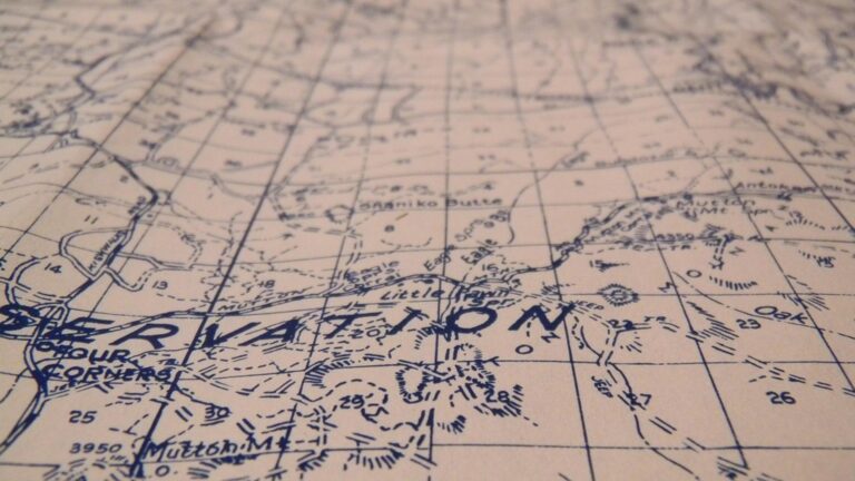
6 Best Cartography Approaches for Spatial Insights
The big picture: You’re missing groundbreaking opportunities if you’re still thinking about cartography as just geography with pretty colors.
Why it matters: Modern mapmaking thrives when it borrows techniques from fields like data science, psychology, and even culinary arts — creating maps that don’t just show where things are but reveal hidden patterns and stories that traditional approaches miss.
What you’ll learn: Six innovative cross-disciplinary methods that’ll transform how you approach spatial data and visualization.
Disclosure: As an Amazon Associate, this site earns from qualifying purchases. Thank you!
P.S. check out Udemy’s GIS, Mapping & Remote Sensing courses on sale here…
Integrating Geographic Information Systems With Data Science and Machine Learning
You can transform traditional cartographic workflows by combining GIS platforms with advanced computational methods. This integration enables you to process massive spatial datasets and uncover patterns that manual analysis would miss.
Leveraging Big Data Analytics for Spatial Pattern Recognition
Processing large-scale spatial datasets requires specialized frameworks like Apache Spark with GeoSpark extensions or Google Earth Engine. You’ll extract meaningful patterns from satellite imagery, IoT sensor networks, and crowdsourced geographic data using clustering algorithms and statistical analysis. Tools like PostGIS with Python’s Pandas library help you handle millions of coordinate points efficiently. Machine learning algorithms such as DBSCAN clustering can identify hotspots in crime data or traffic patterns across metropolitan areas automatically.
Analyze data effectively with Python using this guide. Master data wrangling with pandas, NumPy, and Jupyter for efficient data manipulation and analysis.

Implementing Predictive Modeling for Urban Planning Applications
Predictive models enable you to forecast urban growth patterns using historical land use data and demographic trends. Random Forest algorithms excel at predicting property values based on proximity to transportation hubs, schools, and commercial districts. You can utilize R’s spatial packages or Python’s scikit-learn with GeoPandas to build regression models that anticipate infrastructure needs. Time-series analysis of population density helps planners allocate resources effectively and design sustainable development corridors.
Utilizing Artificial Intelligence for Automated Map Generation
Neural networks can automatically extract features from satellite imagery and generate detailed maps without manual digitization. Convolutional Neural Networks (CNNs) trained on labeled datasets accurately identify buildings, roads, and vegetation boundaries. You’ll use frameworks like TensorFlow or PyTorch with specialized libraries such as Rasterio for geospatial data processing. Natural Language Processing algorithms can generate map labels and annotations automatically, while style transfer techniques create consistent cartographic symbology across different map scales and themes.
Combining Cartography With Environmental Science and Climate Research
Environmental cartography transforms complex climate data into actionable visual intelligence for researchers and policymakers. You’ll discover how advanced mapping techniques reveal environmental patterns that traditional analysis methods often miss.
Creating Climate Change Visualization Maps Using Atmospheric Data
Temperature anomaly mapping requires processing NOAA and ERA5 reanalysis datasets through specialized GIS workflows. You’ll use ArcGIS Pro’s Geostatistical Analyst to interpolate weather station data and create continuous temperature surfaces. Time-series animation techniques help visualize decade-long warming trends across geographic regions.
Get real-time weather data with the Ambient Weather WS-2902. This WiFi-enabled station measures wind, temperature, humidity, rainfall, UV, and solar radiation, plus it connects to smart home devices and the Ambient Weather Network.

Precipitation pattern analysis involves integrating radar data with ground-based measurements using inverse distance weighting algorithms. You can employ QGIS plugins like TimeManager to create temporal visualizations showing seasonal rainfall variations and extreme weather events.
Developing Ecosystem Mapping Through Biodiversity Analysis
Species distribution modeling combines field survey data with environmental variables using MaxEnt software and R statistical packages. You’ll process elevation, climate, and land cover datasets to predict habitat suitability across landscapes. Hotspot identification techniques reveal areas requiring conservation priority through spatial clustering analysis.
Vegetation indices calculation utilizes NDVI values from Landsat and Sentinel imagery to track ecosystem health over time. You can apply supervised classification algorithms in Google Earth Engine to map forest types and monitor deforestation patterns with sub-meter accuracy.
Integrating Satellite Imagery With Environmental Monitoring Systems
Multi-spectral analysis workflows process Landsat 8 and Sentinel-2 data to detect water quality changes and algal blooms in lakes and coastal areas. You’ll use band ratio calculations and machine learning classifiers to identify environmental stress indicators across watersheds.
Change detection algorithms compare historical imagery to current conditions using principal component analysis and image differencing techniques. Real-time monitoring systems integrate API feeds from environmental sensors with satellite data streams, enabling automated alert generation for pollution events and habitat disturbances.
Measure temperature, humidity, pressure, and VOC gases with the BME680 environmental sensor. It supports I2C and SPI communication and is compatible with 3.3V/5V systems, including Raspberry Pi, Arduino, and ESP32.

Merging Historical Research With Digital Mapping Technologies
Historical research gains powerful new dimensions when combined with digital mapping technologies. You’ll discover patterns and connections that traditional archival methods often miss.
Reconstructing Ancient Trade Routes Through Archaeological Evidence
Archaeological data integration transforms scattered excavation findings into comprehensive trade network visualizations. You’ll combine artifact distribution patterns with GIS databases to map ancient commercial pathways across continents. Digital tools like ArcGIS Pro and QGIS enable you to layer pottery fragments, coin discoveries, and architectural remains to reconstruct Silk Road branches or Mediterranean trading circuits. Carbon dating results provide temporal depth, while statistical clustering algorithms identify key trading hubs based on artifact density and cultural exchange evidence.
Creating Interactive Historical Timeline Maps
Timeline mapping platforms allow you to visualize historical events across both space and time dimensions. You’ll use tools like TimeMapper or StoryMapJS to create dynamic visualizations showing territorial changes, population migrations, or conflict progressions. Interactive features enable users to scrub through centuries of data, watching empires rise and fall or tracking disease outbreaks across medieval Europe. Historical demographic data, census records, and boundary treaties provide the foundational datasets for these temporal-spatial narratives that engage audiences far beyond traditional static maps.
Achieve a flawless, even complexion with e.l.f. Flawless Satin Foundation. This lightweight, vegan formula provides medium coverage and a semi-matte finish for all-day wear, while hydrating your skin with glycerin.

Digitizing Historical Documents for Spatial Analysis
Document digitization workflows extract geographic references from historical texts for spatial database integration. You’ll employ Optical Character Recognition (OCR) software and Named Entity Recognition algorithms to identify place names, distances, and directional references from manuscripts, ship logs, and administrative records. Tools like Transkribus and FromThePage facilitate collaborative transcription projects, while geocoding services convert historical place names to modern coordinates. This process reveals settlement patterns, administrative boundaries, and economic networks that existed centuries before modern surveying techniques.
Blending Cartography With Psychology and Human Behavior Studies
Psychology and human behavior research offer valuable insights for creating maps that align with how people naturally process spatial information. This interdisciplinary approach improves navigation effectiveness and user satisfaction.
Understanding Spatial Cognition Through Wayfinding Research
Spatial cognition research reveals how people mentally organize geographic information and navigate environments. You can apply wayfinding studies to design maps that match natural cognitive patterns like landmark-based navigation and route memory formation. Research shows users prefer maps with clear visual hierarchies that emphasize decision points and recognizable features. Studies using eye-tracking technology demonstrate that effective maps reduce cognitive load by presenting information in the sequence people naturally process it during navigation tasks.
Designing Maps Based on Human Perception and Color Theory
Color theory principles from psychology enhance map readability by leveraging how humans naturally perceive visual information. You should apply color contrast ratios of at least 4.5:1 for text readability and use colorblind-friendly palettes like ColorBrewer schemes. Research indicates that warm colors (reds, oranges) appear closer while cool colors (blues, greens) recede, affecting perceived map depth. Sequential color schemes work best for quantitative data while diverging palettes effectively show deviations from central values in your cartographic visualizations.
Analyzing User Experience in Digital Map Interfaces
User experience research methods like usability testing and heat mapping reveal how people interact with digital cartographic interfaces. You can conduct A/B testing on different zoom controls, search functionalities, and information panel layouts to optimize user engagement. Analytics tools like Google Analytics and Hotjar provide interaction data showing where users click, scroll, and encounter difficulties. Studies demonstrate that simplified interfaces with progressive disclosure of information reduce task completion times by up to 40% compared to feature-heavy map applications.
Incorporating Art and Design Principles Into Cartographic Visualization
Visual design principles transform technical spatial data into compelling narratives that resonate with diverse audiences. You’ll discover how artistic approaches enhance map readability while maintaining scientific accuracy.
Applying Aesthetic Theory to Map Design and Layout
Balance and proportion create visual harmony in your cartographic compositions through strategic element placement. You’ll achieve optimal results using the rule of thirds for legend positioning and maintaining 60-30-10 color ratios for primary, secondary, and accent elements. Golden ratio principles guide scale bar placement and text hierarchy, while negative space distribution prevents visual overcrowding. Professional cartographers employ Gestalt principles—proximity, similarity, and continuity—to group related geographic features and guide reader attention through logical information flow patterns.
Using Creative Typography and Iconography in Maps
Typography hierarchy establishes clear information priorities through strategic font selection and sizing across map elements. You’ll enhance readability using sans-serif fonts like Helvetica or Calibri for labels, while serif fonts work effectively for title text. Custom iconography systems replace generic point symbols with culturally appropriate representations—using local architectural styles for building symbols or regional vegetation for forest indicators. Icon scaling maintains consistency across zoom levels, and you’ll implement 12-point minimum font sizes for accessibility compliance while ensuring contrast ratios meet WCAG standards.
Exploring Abstract Mapping Techniques for Data Representation
Abstract visualization methods reveal complex spatial relationships through non-literal representation approaches that prioritize data patterns over geographic accuracy. You’ll create schematic maps using simplified geometric shapes to represent administrative boundaries or transport networks, similar to subway system diagrams. Cartograms distort geographic space proportionally to statistical values—population, economic data, or environmental indicators—while maintaining topological relationships. Heat mapping and isopleth techniques transform point data into continuous surfaces, and you’ll employ artistic color gradients that enhance pattern recognition while preserving quantitative meaning.
Connecting Cartography With Public Health and Epidemiology
Public health cartography transforms epidemiological data into actionable spatial intelligence that guides emergency response and policy decisions. This integration creates powerful visualization tools for tracking disease patterns and health outcomes across populations.
Mapping Disease Outbreaks and Health Disparities
Disease outbreak mapping combines real-time surveillance data with geographic analysis to identify transmission patterns and vulnerable populations. You’ll use tools like CDC’s EpiInfo and ArcGIS Network Analyst to create buffer zones around confirmed cases and model infection spread rates. Health disparity visualization requires overlaying demographic data with disease incidence rates, revealing correlations between socioeconomic factors and health outcomes through choropleth maps and statistical surfaces.
Creating Accessibility Maps for Healthcare Services
Healthcare accessibility mapping analyzes travel distances, transportation networks, and service capacity to identify care deserts and optimize facility placement. You can utilize GTFS data and routing algorithms in QGIS or ArcGIS to calculate realistic travel times via public transportation and driving routes. Isochrone analysis reveals populations within 30-minute access windows, while capacity modeling incorporates provider-to-patient ratios and appointment availability data for comprehensive service gap identification.
Visualizing Social Determinants of Health Through Spatial Data
Social determinants mapping integrates census data, environmental factors, and health outcomes to reveal connections between place and population health. You’ll combine American Community Survey data with environmental monitoring information using tools like R’s leaflet package or Tableau’s spatial analytics. Multi-layered visualizations can display relationships between air quality, income levels, education access, and chronic disease prevalence through correlation matrices and weighted overlay analysis.
Conclusion
Cross-disciplinary cartography represents a fundamental shift in how you approach spatial visualization and analysis. By integrating techniques from data science psychology environmental research historical studies and public health you’re not just creating better maps—you’re unlocking entirely new ways to understand our world.
These innovative approaches demonstrate that modern cartography extends far beyond traditional boundaries. Whether you’re tracking disease outbreaks analyzing historical trade routes or visualizing climate patterns the fusion of diverse methodologies creates more meaningful and actionable spatial intelligence.
The future of cartography lies in your willingness to experiment with unconventional techniques and collaborate across disciplines. As you embrace these cross-disciplinary methods you’ll discover that the most compelling maps often emerge from the intersection of seemingly unrelated fields.
Frequently Asked Questions
What is modern cartography beyond traditional mapping?
Modern cartography extends beyond simple geography and aesthetics by integrating techniques from data science, psychology, and other fields. This interdisciplinary approach creates maps that reveal hidden patterns and narratives often missed by conventional methods, transforming spatial data into actionable intelligence for various applications.
How does GIS integration with data science improve mapping?
GIS combined with machine learning processes large spatial datasets to uncover patterns that manual analysis might miss. This integration uses frameworks like Apache Spark and Google Earth Engine to analyze satellite imagery and crowdsourced data, enabling more comprehensive spatial pattern recognition and analysis.
What role does AI play in automated map generation?
AI, particularly neural networks, can extract features from satellite imagery and create detailed maps without manual input. Convolutional Neural Networks identify geographic features while Natural Language Processing enables automatic map labeling, revolutionizing the speed and accuracy of map creation processes.
How does cartography contribute to climate research?
Advanced mapping techniques transform complex climate data into visual intelligence for researchers and policymakers. This includes creating temperature anomaly maps using NOAA datasets, analyzing precipitation patterns through radar data, and employing multi-spectral analysis to monitor environmental changes in real-time.
What is the connection between cartography and historical research?
Digital mapping technologies reveal patterns in historical data often missed by traditional methods. Archaeological data integration creates comprehensive visualizations of ancient trade routes, while interactive timeline maps visualize events across space and time, uncovering settlement patterns and economic networks from historical texts.
How does psychology influence modern map design?
Psychology-informed cartography creates maps that align with natural cognitive patterns, improving navigation effectiveness. This includes applying spatial cognition research, color theory principles, and user experience methods to reduce cognitive load and enhance how people process spatial information naturally.
What is public health cartography?
Public health cartography transforms epidemiological data into spatial intelligence for emergency responses and policy decisions. It includes disease outbreak mapping, healthcare accessibility analysis, and visualizing social determinants of health to identify transmission patterns, vulnerable populations, and care deserts in communities.
How do art and design principles enhance cartographic visualization?
Art and design principles transform technical spatial data into compelling narratives through aesthetic theory, creative typography, and iconography. Abstract mapping techniques like cartograms and heat mapping prioritize data patterns over geographic accuracy, creating clearer information hierarchies and culturally appropriate representations.