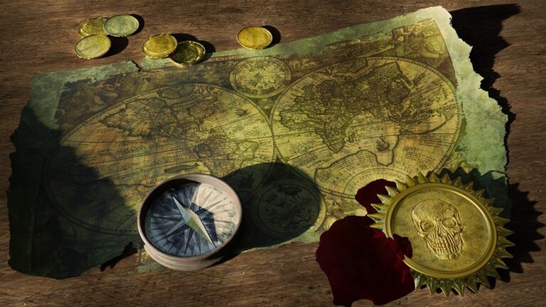
7 Best Map Design Ideas for Storytelling
Maps tell stories but finding your way through complex narratives can leave readers lost without proper guidance. An effective index transforms your storytelling map from a beautiful but confusing visual into a powerful navigation tool that enhances the reader’s journey. The right index design bridges the gap between artistic storytelling and practical usability—turning your map into an engaging experience that readers can actually use.
Disclosure: As an Amazon Associate, this site earns from qualifying purchases. Thank you!
Create Visual Hierarchy Through Color-Coded Categories
Color-coding transforms complex narrative maps into intuitive navigation tools. Strategic color application helps readers instantly categorize and locate different story elements without overwhelming the visual design.
Use Warm Colors for Character Locations
Warm colors like reds, oranges, and yellows naturally draw attention to character-focused index entries. These hues create emotional connections that mirror the human elements in your narrative. Use red markers for primary protagonists, orange for supporting characters, and yellow for character groups or families. This approach helps readers quickly identify where key figures appear throughout your story geography. The warmth of these colors psychologically emphasizes the human drama within your mapped narrative.
P.S. check out Udemy’s GIS, Mapping & Remote Sensing courses on sale here…
Apply Cool Colors for Environmental Features
Cool colors including blues, greens, and purples work perfectly for natural and built environments in your index. Blue markers identify water features like rivers, lakes, and coastlines that shape your story’s geography. Green highlights forests, mountains, and other terrestrial landmarks that provide scenic backdrops. Purple marks architectural elements such as castles, cities, and important buildings. These cooler tones create visual balance while clearly separating environmental context from character-driven plot points in your storytelling map.
Implement Neutral Tones for Historical Events
Neutral colors like grays, browns, and black anchor historical timeline elements without competing for visual attention. These subdued tones work effectively for battles, political events, and temporal markers that provide story context. Gray identifies past conflicts or ruins, brown marks historical settlements or ancient sites, and black highlights significant dates or turning points. Neutral tones ensure historical information supports rather than overshadows the active narrative elements in your map’s index system.
Design Interactive Pop-Up Information Panels
Building on your color-coded visual hierarchy, interactive pop-up panels transform static map elements into dynamic information hubs. These panels create layered storytelling experiences without cluttering your base map design.
Include Character Backstories and Motivations
Character pop-ups should contain 2-3 essential biographical details that drive plot progression. Include their primary motivation, key relationships, and current story arc position. Layer this information using expandable sections – basic details appear first, with deeper backstory accessible through secondary clicks. This approach prevents information overload while satisfying readers who want comprehensive character understanding.
Add Timeline Context for Key Events
Timeline panels work best when they display events in chronological clusters rather than linear sequences. Show the selected event’s immediate causes and consequences within a 3-event window. Include precise dates, duration indicators, and cross-references to related locations on your map. Use consistent timestamp formatting and color-code events by their story impact level to maintain visual coherence.
Provide Location Descriptions and Significance
Location panels should balance atmospheric description with practical narrative function. Start with 1-2 sensory details that establish mood, then explain the location’s role in advancing your story. Include population data, geographical features, and historical significance where relevant. Add directional references to nearby locations using your map’s established navigation system to encourage exploration.
Implement Progressive Disclosure Navigation
Progressive disclosure transforms complex narrative maps into intuitive exploration tools by revealing information in strategic layers. This approach prevents cognitive overload while maintaining narrative momentum.
Start with Main Story Arcs
Display primary character journeys prominently on your map’s initial view to establish narrative hierarchy. Use bold pathways and larger icons to represent protagonist movements, ensuring readers immediately understand the central storyline. Configure your index to show 3-5 main story threads maximum, with clear labels like “Protagonist Journey” or “Central Conflict Arc.” Each arc should connect no more than 7-10 key locations to maintain visual clarity and prevent navigation confusion.
Expand to Secondary Plot Lines
Activate secondary narratives through user interaction rather than displaying them automatically on the base map. Create expandable index categories for subplot elements, side character arcs, and parallel storylines that readers can toggle on demand. Use lighter visual treatments—thinner lines, smaller icons, or muted colors—to distinguish these elements from primary content. This layered approach lets dedicated readers explore deeper narrative complexity while preserving accessibility for casual users seeking main story information.
Reveal Hidden Details and Easter Eggs
Embed discoverable content at specific zoom levels to reward thorough exploration without cluttering your navigation system. Program your index to reveal additional categories like “Character Backstories,” “Historical References,” or “Author Commentary” only after users interact with primary map elements. Use progressive zoom triggers—detailed information appears at 200% zoom, easter eggs unlock at 400% zoom. This creates natural discovery moments while maintaining your map’s primary storytelling focus and preventing information overload.
Incorporate Thematic Icon Systems
Visual symbols serve as your narrative map’s universal language, creating instant recognition that transcends textual descriptions and connects readers emotionally to story elements.
Match Icons to Story Genre and Mood
Fantasy narratives demand mystical symbols like ornate scrolls, crossed swords, and magical crystals that evoke wonder and adventure. You’ll want elaborate, hand-drawn style icons that mirror medieval manuscripts and fantasy artwork traditions.
Modern thrillers require sleek, minimalist icons such as simplified buildings, geometric vehicles, and clean weapon silhouettes. These sharp-edged symbols create tension while maintaining contemporary visual appeal that matches your story’s urgency.
Create Consistent Visual Language
Establish design rules for line weight, corner radius, and fill patterns across all icons to maintain professional cohesion. You should use identical stroke widths of 2-3 pixels and consistent spacing ratios throughout your entire icon family.
Develop hierarchical sizing where primary story elements use larger icons (24-32px) while secondary details remain smaller (16-20px). This creates clear information priority that guides reader attention naturally through your narrative structure.
Use Scalable Vector Graphics for Clarity
SVG format ensures your icons remain crisp at every zoom level, from overview maps to detailed close-ups. You’ll avoid pixelation issues that plague raster graphics while maintaining file sizes under 5KB per icon for optimal loading speeds.
Vector paths allow precise control over curves and angles, creating professional-quality symbols that scale infinitely. Modern mapping platforms like Mapbox and ArcGIS Online natively support SVG, making integration seamless across different display devices and resolutions.
Build Chronological Timeline Integration
Creating temporal connections between map elements transforms static geographic displays into dynamic narrative experiences. Timeline integration provides the backbone for storytelling progression while maintaining spatial context.
Link Map Events to Story Progression
Connect geographic locations to narrative milestones by establishing temporal anchors throughout your map design. Position timeline markers at key locations where plot developments occur, using your established color-coding system to maintain visual consistency. Configure interactive elements to reveal story progression when users select specific locations, showing how events unfold across different map regions. This approach creates a seamless connection between spatial and temporal storytelling elements.
Show Character Movement Over Time
Track character journeys through animated pathways that reveal movement patterns across your narrative landscape. Use dotted or dashed lines to indicate past movements while employing solid lines for current character positions. Implement sequential numbering systems along travel routes to establish clear chronological order. Configure your index to display character locations at specific time periods, allowing readers to follow individual journeys or compare multiple character movements simultaneously.
Display Cause and Effect Relationships
Visualize narrative consequences through connected timeline elements that demonstrate how events influence subsequent story developments. Create visual linkages between related incidents using arrows or connecting lines that span across different map regions. Implement layered information panels that show immediate effects and long-term consequences of specific events. Structure your index to highlight causal relationships, enabling readers to trace decision impacts throughout the narrative timeline while maintaining geographic context.
Develop Search and Filter Functionality
Effective search capabilities transform your narrative map from a static display into an interactive exploration tool. You’ll need robust filtering systems that work seamlessly with your established color-coding and timeline integration.
Enable Character-Based Filtering
Character filtering serves as your primary navigation backbone for story-driven maps. You’ll want to create individual toggle switches for each major character, allowing readers to isolate specific character journeys and hide irrelevant plot threads. Configure your filter system to maintain the established color hierarchy while dimming non-selected characters to 30% opacity. Include protagonist/antagonist groupings and supporting character categories to help readers focus on their preferred narrative depth level.
Add Location Type Categories
Location categorization provides essential geographic context for complex narrative environments. You should establish primary filters for settlements, wilderness areas, battlefields, and mystical locations using your existing icon system. Create secondary filters for specific location functions like taverns, temples, or royal courts to support detailed exploration. Configure hierarchical filtering that allows readers to view all settlements first, then drill down to specific building types within those areas.
Include Story Arc Search Options
Story arc filtering enables readers to follow thematic threads throughout your narrative map. You’ll need to tag map elements with arc identifiers like “revenge quest,” “political intrigue,” or “romantic subplot” to create meaningful search results. Design your search functionality to highlight connected events across different locations and time periods using your timeline integration system. Include advanced search options that combine character involvement with specific story arcs for targeted narrative exploration.
Optimize for Multi-Device Accessibility
Your narrative storytelling map must function seamlessly across smartphones, tablets, and desktop computers to reach today’s diverse readership. Building on your established filtering systems and timeline integration, device optimization ensures every reader can navigate your story effectively.
Experience vivid content on the Galaxy A16 5G's 6.7" display and capture stunning photos with its triple-lens camera. Enjoy peace of mind with a durable design, six years of updates, and Super Fast Charging.

Ensure Mobile-Responsive Design
Configure your index elements to automatically resize based on screen dimensions. Use flexible grid layouts that stack vertically on mobile devices while maintaining horizontal arrangements on larger screens. Test your color-coding system at mobile resolutions to ensure warm character indicators and cool environmental markers remain distinguishable on smaller displays. Implement breakpoint-specific adjustments for your progressive disclosure navigation to prevent cramped interfaces that compromise story exploration.
Implement Touch-Friendly Navigation
Design interactive elements with minimum 44-pixel touch targets for comfortable finger navigation. Space your thematic icons adequately to prevent accidental selections when readers explore character pop-ups or timeline panels. Replace hover effects with tap-based interactions that work consistently across touch devices. Configure your search and filter controls with swipe gestures for quick access to story arc categories and location types, maintaining the intuitive flow you’ve established.
See your shots instantly with these 12x12" splatter targets. The bright fluorescent yellow impact mark is easily visible, making them ideal for all firearms, indoors or outdoors.

Maintain Readability Across Screen Sizes
Scale your typography and icon systems proportionally to preserve narrative clarity on all devices. Use responsive font sizing that maintains hierarchy between main story elements and secondary plot details. Ensure your chronological timeline integration remains legible by adjusting temporal anchor spacing and cause-and-effect connection weights. Test your SVG icon system at various zoom levels to confirm symbols stay crisp and meaningful, particularly when displaying character biographical details within space-constrained mobile viewports.
Conclusion
Your narrative storytelling map’s success hinges on thoughtful index design that balances visual appeal with practical functionality. By implementing these seven strategies—from color-coded hierarchies to multi-device optimization—you’ll create an engaging navigation experience that enhances rather than hinders your story.
Remember that your index serves as the bridge between artistic vision and reader comprehension. Each element you choose should guide your audience deeper into the narrative while maintaining clarity and accessibility across all platforms.
The most effective storytelling maps don’t just display information—they invite exploration and discovery. When you combine strategic design choices with user-centered navigation you’ll transform your map from a static display into an immersive storytelling tool that keeps readers engaged from start to finish.
Frequently Asked Questions
What is the purpose of an index in narrative storytelling maps?
An effective index transforms visually appealing narrative maps into practical navigation tools. It bridges the gap between artistic storytelling and usability, helping readers navigate complex narratives without confusion. A well-designed index enhances the reader’s experience by providing clear guidance through the story’s geographic and temporal elements.
How should colors be used to create visual hierarchy in narrative maps?
Use warm colors (reds, oranges, yellows) for character locations to foster emotional connections. Cool colors (blues, greens, purples) work best for environmental features, providing clarity and balance. Neutral tones (grays, browns, blacks) are ideal for historical events, ensuring they support the narrative without overshadowing key story elements.
What are interactive pop-up information panels and how do they enhance storytelling?
Interactive pop-ups transform static map elements into dynamic information hubs, creating layered storytelling without cluttering the base design. Character pop-ups include biographical details, timeline panels display chronological events, and location panels provide atmospheric descriptions with practical narrative functions, all maintaining visual coherence through consistent formatting.
How does Progressive Disclosure Navigation work in narrative maps?
Progressive Disclosure starts with main story arcs prominently displayed, then allows secondary plot lines to activate through user interaction. This prevents overwhelming casual users while enabling deeper exploration. Hidden details and easter eggs reveal at specific zoom levels, rewarding thorough exploration while maintaining primary storytelling focus.
Why are thematic icon systems important for narrative maps?
Thematic icons create a universal language that enhances emotional connections to story elements. Icons should match the story’s genre and mood—ornate symbols for fantasy, minimalist designs for modern thrillers. Using Scalable Vector Graphics (SVG) ensures icons remain crisp at any zoom level across various platforms.
How does chronological timeline integration enhance narrative maps?
Timeline integration transforms static geographic displays into dynamic experiences by linking map events to story progression. It tracks character movement through animated pathways, establishes temporal anchors at key locations, and displays cause-and-effect relationships, allowing readers to trace decision impacts while maintaining geographic context.
What search and filter functionality should narrative maps include?
Effective filtering systems should align with established color-coding and timeline integration. Include character-based filtering to isolate specific journeys, location type categories for geographic context, and story arc search options to follow thematic threads. This transforms maps into interactive exploration tools with meaningful search results.
How can narrative maps be optimized for different devices?
Use flexible grid layouts and test color-coding systems for smaller screen visibility. Implement touch-friendly navigation with minimum touch target sizes and tap-based interactions. Scale typography and icon systems proportionally across devices to maintain narrative clarity and legibility on smartphones, tablets, and desktop computers.