7 Best Animation Techniques for Digital Maps
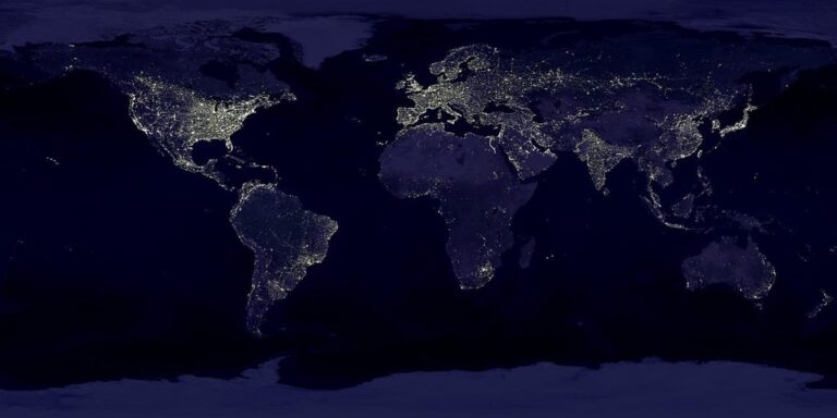
Why it matters: Modern cartography has evolved far beyond static paper maps, and animation now transforms how you understand complex geographical data and spatial relationships.
The big picture: Today’s animated maps don’t just show you where things are â they reveal how patterns emerge, populations shift, and environmental changes unfold over time through dynamic visual storytelling.
What’s next: These seven innovative animation techniques will revolutionize how you create and interact with maps, making complex data more accessible and engaging for audiences across industries.
Disclosure: As an Amazon Associate, this site earns from qualifying purchases. Thank you!
P.S. check out Udemy’s GIS, Mapping & Remote Sensing courses on sale here…
Dynamic Population Flow Visualization
You’ll transform static demographic data into compelling animated narratives that reveal how populations move across regions over time.
Real-Time Migration Pattern Tracking
Track migration flows using animated arrow streams that show movement intensity through line thickness and color gradients. You can integrate census data with mobile phone analytics to create live visualizations of seasonal migration patterns. Tools like D3.js combined with PostGIS databases enable real-time updates every 15 minutes during peak migration periods. Configure heat map overlays to highlight destination clusters while maintaining privacy through data aggregation at the county level.
Urban Growth Time-Lapse Animations
Create compelling urban expansion animations by layering satellite imagery at 5-year intervals with population density overlays. You’ll use QGIS temporal controllers to animate building footprint growth alongside demographic changes from 1990 to present. Combine Landsat data with OpenStreetMap building polygons to show correlation between infrastructure development and population increases. Export frame sequences at 30fps for smooth transitions that clearly demonstrate sprawl patterns and density shifts across metropolitan areas.
Get precise timing control with this reliable timer relay. Set custom on/off schedules and enjoy long-lasting performance with a durable design.

Interactive Climate Change Mapping
Climate change mapping demands animation techniques that transform complex environmental data into compelling visual narratives. You’ll find these interactive visualizations reveal temporal patterns that static maps simply can’t communicate effectively.
Temperature Gradient Transitions
You can create powerful temperature animations by interpolating between annual climate datasets using smooth color transitions. Temperature gradient maps work best when you blend NOAA climate data with satellite thermal readings across 30-year periods. Configure your animation timeline to cycle through decades, allowing viewers to observe warming patterns as color shifts from blue to red gradients. The key lies in maintaining consistent color scales while smoothing temporal transitions to prevent jarring visual jumps between data points.
Sea Level Rise Projections
Sea level animations require layering bathymetric data with IPCC projection models to show future coastal impacts. You’ll achieve the most accurate results by combining high-resolution LIDAR elevation data with conservative sea level rise estimates of 1-8 feet by 2100. Animate the water level changes gradually over your timeline while highlighting vulnerable infrastructure and population centers. Use translucent blue overlays that intensify as water levels rise, and include comparison sliders that let users toggle between current conditions and projected scenarios.
3D Terrain Morphing Animations
3D terrain morphing transforms static elevation models into dynamic visual narratives that reveal Earth’s geological processes. You’ll create compelling animations by interpolating between digital elevation models across different time periods.
Geological Formation Evolution
Mountain building animations showcase tectonic forces through time-compressed elevation changes. You’ll interpolate DEMs from geological surveys spanning millions of years to visualize uplift processes. Software like Blender and ArcGIS Pro enables smooth transitions between elevation states. Volcanic formation sequences demonstrate magma accumulation and crater development through layered bathymetric data. Your animations reveal fault line movements and sedimentary layer deposition across geological timescales.
Erosion and Weathering Effects
River valley carving animations demonstrate water’s landscape-shaping power through morphed elevation data. You’ll combine USGS historical topographic maps with LiDAR datasets to show canyon formation over centuries. Glacial erosion sequences illustrate ice sheet retreat using paleoclimate reconstructions and modern satellite imagery. Coastal cliff retreat animations merge bathymetric surveys with aerial photography to reveal wave action effects. Your morphing techniques highlight sediment transport patterns and delta formation processes.
Plan your next adventure with the 2025 National Geographic Road Atlas, covering the United States, Canada, and Mexico. Its durable, folded format (11 x 15 in) makes it ideal for hiking and camping trips.

Augmented Reality Map Overlays
AR technology transforms traditional cartography by layering digital geographic information onto real-world environments through mobile devices and smart glasses. This animation technique creates immersive mapping experiences that respond to your physical location and orientation.
Enjoy music and calls on the go with these smart sunglasses featuring open-ear Bluetooth speakers and voice control. Polarized lenses provide UV400 protection, while the lightweight, unisex design ensures comfortable wear.

Mobile AR Navigation Integration
Navigate complex urban environments using AR overlays that project turn-by-turn directions directly onto street views through your smartphone camera. Modern AR mapping platforms like Google Live View and Apple’s AR Walking Directions superimpose animated arrow paths and destination markers onto real-time camera feeds.
Experience vivid content on the Galaxy A16 5G's 6.7" display and capture stunning photos with its triple-lens camera. Enjoy peace of mind with a durable design, six years of updates, and Super Fast Charging.

Integrate GPS positioning with computer vision algorithms to anchor directional animations precisely to physical landmarks like buildings and street signs. This combination delivers navigation accuracy within 1-2 meters while reducing the cognitive load of interpreting traditional 2D map interfaces during movement.
Historical Site Reconstruction
Reconstruct historical landscapes by overlaying animated 3D models of ancient structures onto present-day archaeological sites using AR visualization tools. Applications like TimeLooper and HistoryPin allow you to witness animated sequences showing how historical locations appeared centuries ago through your device’s camera.
Layer temporal map data spanning multiple time periods to create animated transitions between historical epochs at specific geographic coordinates. Professional AR platforms like Vuforia and ARCore enable cartographers to anchor historically accurate building reconstructions and population animations to precise GPS locations for educational and tourism applications.
Explore and map the wilderness for the Queen in Cartographers! Draw unique terrain shapes and score points based on randomly selected goals each game, but beware of monster ambushes.

Particle System Weather Visualization
Particle system animations transform meteorological data into dynamic visual narratives that reveal atmospheric patterns invisible in traditional static weather maps. These systems generate thousands of animated particles to represent wind flow, precipitation intensity, and storm development across your cartographic displays.
Storm Movement Tracking
Storm tracking particle systems visualize cyclone movement through animated wind vector fields that show rotation patterns and pressure gradients. You’ll integrate NOAA radar data with particle generators to create swirling animations that reveal storm eye formation and spiral band development. Real-time weather APIs feed your particle systems with updated storm coordinates, allowing you to animate hurricane paths with precise temporal accuracy and intensity variations over multi-day periods.
Get reliable backup power with the Westinghouse 12500-Watt Dual Fuel Generator. It offers remote electric start and runs on either gasoline or propane, with multiple outlets including transfer switch and RV-ready options.

Precipitation Pattern Animation
Precipitation particle animations convert rainfall intensity data into flowing droplet streams that cascade across your map surfaces with realistic physics. You’ll layer meteorological station readings with satellite precipitation estimates to generate particle density variations that match actual rainfall distribution. Color-coded particle systems differentiate between rain, snow, and hail through distinct animation behaviors, while temporal controls let users scrub through weather events to understand precipitation evolution patterns.
Multi-Dimensional Data Storytelling
Animation techniques in cartography unlock the power of multi-dimensional data storytelling by transforming complex datasets into compelling visual narratives that reveal hidden patterns across time and space.
Layered Information Reveals
Layered data visualization creates depth through animated transparency controls and sequential data reveals. You’ll combine demographic layers with infrastructure data using tools like Mapbox GL JS and D3.js to create smooth fade-in transitions. Temporal layering shows how population density, transportation networks, and economic indicators interact across different time periods. Heat map overlays transition between datasets while maintaining spatial relationships, allowing viewers to understand correlations between variables like housing prices and transit accessibility through animated layer switching.
Sequential Narrative Mapping
Sequential mapping builds stories through coordinated animation sequences that guide viewers through data-driven narratives. You’ll script multi-scene animations using GSAP and Leaflet.js to create smooth transitions between geographic focus areas and time periods. Narrative pacing controls information flow through timed reveals of statistical overlays, population changes, and environmental shifts. Coordinated zoom sequences move viewers from continental views to neighborhood-level detail while maintaining data context, creating documentary-style presentations that transform complex geographic datasets into accessible stories about urban development or climate impacts.
Gamified Educational Cartography
Transform traditional geography lessons into interactive adventures where students earn rewards while exploring spatial concepts. These animated mapping approaches turn educational content into engaging experiences that motivate learners through game mechanics.
Quest-Based Learning Modules
Design animated map sequences where students complete geographic missions to unlock new regions and content layers. Create treasure hunt scenarios using animated waypoints that reveal historical events, climate data, or cultural information when discovered. Structure learning paths through animated progression trees that branch based on student choices, allowing exploration of topics like urban planning or environmental conservation. Integrate quiz checkpoints with animated feedback systems that provide immediate visual responses to correct answers, reinforcing spatial learning through interactive map elements that respond to student input.
Achievement-Driven Exploration
Implement animated badge systems that unlock when students master specific cartographic skills like reading contour lines or identifying vegetation patterns. Create animated progress meters that fill as learners complete mapping exercises, with visual celebrations when milestones are reached. Design animated leaderboards showing class-wide exploration statistics, encouraging collaborative learning through shared mapping discoveries. Award animated certificates for completing map analysis challenges, using particle effects and color transitions to celebrate achievements. These visual rewards maintain engagement while students develop critical spatial thinking skills through hands-on cartographic exploration.
Conclusion
These seven innovative animation techniques represent the future of cartographic design and data visualization. You’re witnessing a fundamental shift where maps become living documents that breathe life into complex geographical information.
The power lies in your ability to transform static data into compelling visual stories. Whether you’re tracking climate change impacts or guiding students through gamified geography lessons these techniques make complex information accessible to diverse audiences.
Your success with animated cartography depends on choosing the right technique for your specific goals. Consider your audience’s needs and data complexity when selecting from particle systems weather visualization to AR overlays or 3D terrain morphing.
Start experimenting with these approaches today. The tools and technologies are more accessible than ever and your animated maps could be the key to unlocking new insights in your field.
Frequently Asked Questions
What are animated maps and how do they differ from traditional maps?
Animated maps are dynamic visual tools that show changes over time, unlike static paper maps. They transform geographical data into moving visual stories that reveal patterns, population shifts, and environmental changes. These maps make complex spatial relationships more accessible and engaging by showing how geographic phenomena evolve rather than just displaying fixed locations.
How do dynamic population flow visualizations work?
Dynamic population flow visualizations convert static demographic data into animated narratives showing population movements over time. They use animated arrow streams to display migration intensity, integrate census data with mobile analytics for real-time updates, and employ heat map overlays to protect privacy while illustrating how populations shift across different regions.
What are urban growth time-lapse animations?
Urban growth time-lapse animations layer satellite imagery with population density data to show city expansion from 1990 to present. They illustrate infrastructure development, sprawl patterns, and demographic changes by combining multiple data sources into animated sequences that clearly demonstrate how urban areas have evolved over decades.
How does interactive climate change mapping help visualize environmental data?
Interactive climate change mapping uses animation techniques to make complex environmental data understandable through visual storytelling. It features temperature gradient transitions with smooth color animations showing warming patterns, and sea level rise projections that combine bathymetric data with climate models to illustrate future coastal impacts and vulnerable infrastructure.
What are 3D terrain morphing animations?
3D terrain morphing animations transform static elevation models into dynamic visual narratives that reveal Earth’s geological processes. They showcase mountain building through tectonic forces, volcanic formations, and erosion effects like river valley carving and glacial erosion, using software like Blender and ArcGIS Pro for smooth geological transitions.
How do augmented reality (AR) map overlays enhance navigation?
AR map overlays layer digital geographic information onto real-world environments through mobile devices and smart glasses. They provide immersive navigation by projecting turn-by-turn directions directly onto street views via smartphone cameras, combining GPS positioning with computer vision algorithms for precise navigation accuracy in complex urban environments.
What are particle system weather visualizations?
Particle system weather visualizations transform meteorological data into dynamic visual narratives using animated particles to show atmospheric patterns. They track storm movements with animated wind vector fields, convert rainfall data into flowing droplet streams, and use color-coded particles to differentiate between rain, snow, and hail while revealing weather evolution patterns.
How does gamified educational cartography improve geography learning?
Gamified educational cartography transforms geography lessons into interactive adventures where students earn rewards while exploring spatial concepts. It includes quest-based learning modules with animated map sequences for geographic missions, achievement-driven exploration with animated badge systems, and interactive elements that respond to student input to enhance engagement and spatial thinking skills.