7 Best Map Projection Techniques
Why it matters: You can transform ordinary geographic data into compelling visual stories that reveal hidden patterns and relationships through strategic layer combinations in thematic mapping.
The big picture: Modern mapping software lets you stack multiple data layers to create rich visualizations that tell complete stories – from demographic trends overlaid with economic indicators to environmental changes paired with infrastructure development.
What’s next: These seven projection techniques will help you design maps that not only look professional but also communicate complex spatial relationships with clarity and impact.
Disclosure: As an Amazon Associate, this site earns from qualifying purchases. Thank you!
P.S. check out Udemy’s GIS, Mapping & Remote Sensing courses on sale here…
Understanding Map Projections and Their Impact on Thematic Mapping
Map projections form the mathematical foundation that transforms your three-dimensional geographic data onto flat surfaces for effective thematic visualization.
Achieve a flawless, even complexion with e.l.f. Flawless Satin Foundation. This lightweight, vegan formula provides medium coverage and a semi-matte finish for all-day wear, while hydrating your skin with glycerin.

What Are Map Projections and Why They Matter
Map projections translate Earth’s curved surface onto flat displays, enabling you to create readable thematic maps from complex spatial datasets. You’ll encounter projection systems like Web Mercator for online mapping, Albers Equal Area for demographic analysis, and Robinson for global thematic displays. Your projection choice directly influences how viewers interpret spatial relationships, population densities, and geographic patterns. Professional cartographers select projections based on map purpose, geographic extent, and the specific thematic data being visualized.
How Projection Choice Affects Data Interpretation
Different projections alter how your audience perceives thematic data relationships and spatial patterns. Web Mercator exaggerates polar regions, making Greenland appear larger than Africa in population density maps. Albers Equal Area preserves accurate area measurements, ensuring your choropleth maps display demographic data proportionally. You’ll find that inappropriate projection selection can mislead viewers about climate zones, economic distributions, or population comparisons. State plane coordinate systems provide precise measurements for local thematic mapping projects requiring high spatial accuracy.
Common Distortion Types in Thematic Maps
Projection distortions systematically affect area, distance, direction, and shape measurements across your thematic map displays. Area distortion impacts choropleth maps showing population density, economic indicators, or environmental data by misrepresenting true geographic proportions. Distance distortion affects network analysis, accessibility studies, and buffer zone calculations in your thematic visualizations. Shape distortion influences boundary recognition and feature identification, particularly problematic for coastal mapping or watershed analysis. You can minimize these issues using equal-area projections for statistical data and conformal projections for navigation-based themes.
Mercator Projection for Global Distribution Maps
Mercator projection excels at displaying global distribution patterns due to its unique preservation of angular relationships and straightforward coordinate system. You’ll find this projection particularly valuable when creating thematic maps that require consistent directional accuracy across vast geographic areas.
Best Use Cases for Mercator in Thematic Mapping
Global shipping routes benefit tremendously from Mercator’s angular preservation, allowing you to display accurate navigation paths between continents. Population density overlays work effectively since the projection maintains shape fidelity in equatorial regions where most global population centers exist. Climate data visualization performs well because meteorological patterns follow consistent directional flows that Mercator preserves. You’ll achieve optimal results when mapping phenomena that span multiple continents or require precise directional analysis across oceanic distances.
Handling Distortion at High Latitudes
Area calculations become problematic above 60° latitude where Mercator significantly exaggerates landmass sizes, making Greenland appear larger than Africa. Data normalization techniques help compensate by adjusting symbol sizes or color intensity based on true geographic area rather than projected area. Coordinate clipping at approximately 85° north and south prevents extreme distortion in polar regions. You can implement graduated symbol scaling that accounts for latitudinal distortion factors, ensuring your thematic data maintains visual accuracy despite projection limitations.
Layer Transparency Techniques for Overlapping Data
Alpha blending at 70-80% opacity allows multiple data layers to remain visible while preventing visual clutter in dense distribution areas. Multiplicative blending modes enhance pattern recognition when overlaying related datasets like population and infrastructure networks. Sequential transparency levels help establish visual hierarchy—use 100% opacity for primary data, 60% for secondary layers, and 40% for reference information. You’ll find that combining categorical symbols with continuous surface layers works best when the surface maintains 50% transparency while point symbols remain fully opaque.
Equal-Area Projections for Demographic and Statistical Maps
Equal-area projections preserve the relative sizes of geographic regions, making them essential for accurate demographic analysis and statistical mapping where area relationships directly impact data interpretation.
Albers Equal-Area Conic for Regional Analysis
You’ll find Albers Equal-Area Conic projection ideal for mapping demographic data across continental regions like North America or Europe. This projection maintains accurate area relationships while minimizing shape distortion along your chosen standard parallels. Set your standard parallels at one-sixth and five-sixths of your study area’s latitudinal extent for optimal results. Use this projection when comparing population densities, economic indicators, or health statistics across states or provinces where accurate area representation is crucial for meaningful analysis.
Mollweide Projection for Global Population Data
Mollweide projection excels at displaying worldwide demographic patterns while preserving area relationships essential for global population analysis. You can effectively map population density, migration flows, and economic development indicators using this elliptical projection. The projection’s equal-area property ensures that visual comparisons between continents remain accurate, preventing the size distortions that plague cylindrical projections. Layer multiple demographic datasets using graduated symbols or choropleth mapping to reveal global patterns in urbanization, literacy rates, or income distribution across different regions.
Maintaining Accurate Area Relationships
You must verify that your chosen equal-area projection preserves the proportional relationships between geographic regions throughout your analysis. Use area calculation tools in your GIS software to confirm that region sizes remain mathematically consistent with their real-world counterparts. Apply data normalization techniques when overlaying multiple demographic layers to prevent visual bias from projection distortions. Test your projection’s accuracy by comparing calculated areas against known geographic measurements, particularly when mapping sensitive demographic data like voter distributions or resource allocation studies.
Robinson Projection for General Reference Thematic Maps
Explore the world with this 36"x24" physical wall map featuring current geographic details and Earth elevation profiles. Printed on rolled paper in the U.S.A. using the Robinson Projection.

Robinson projection offers an excellent compromise between shape and area preservation, making it ideal for world maps that need to display multiple thematic layers without overwhelming visual distortion. You’ll find this projection particularly effective when creating reference maps that combine demographic, economic, and environmental data across continents.
Balancing Distortion for Visual Appeal
Robinson projection minimizes extreme distortion at polar regions while maintaining recognizable continental shapes that viewers expect. You can leverage this balanced approach by positioning your most critical data layers in the mid-latitude zones where distortion remains minimal. Focus your primary thematic elements between 45°N and 45°S latitudes to ensure accurate visual representation, while using supplementary data displays for polar regions where stretching occurs.
Effective Color Schemes for Robinson-Based Maps
Sequential color schemes work exceptionally well with Robinson projection because the balanced distortion allows for consistent color perception across different regions. You should implement graduated color ramps using tools like ColorBrewer 2.0, selecting 5-7 color classes for optimal readability. Avoid high-contrast complementary colors in polar regions where projection stretching can create visual artifacts, and instead use monochromatic schemes that maintain clarity despite minor shape distortions.
Combining Multiple Data Layers Seamlessly
Robinson projection’s predictable distortion patterns make it ideal for layering multiple datasets using transparency and blending modes. You can successfully overlay demographic density layers with infrastructure data by applying 60-70% transparency to secondary layers while keeping primary data at full opacity. Use multiplicative blending for environmental overlays and screen blending for infrastructure networks to maintain visual hierarchy while preserving the projection’s natural continental boundaries.
Azimuthal Projections for Focused Regional Analysis
Azimuthal projections excel at depicting specific regions from a single central point, making them ideal for thematic maps that require precise directional relationships and minimal distortion within your study area.
Lambert Azimuthal Equal-Area Applications
Explore the world with this unique topographic map centered on 165 West. Featuring a Lambert Azimuthal Equal Area projection and hexagonal tiling for insightful data visualization.
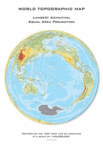
Lambert Azimuthal Equal-Area projection preserves accurate area relationships while maintaining reasonable shape fidelity for continental-scale analysis. You’ll find this projection particularly effective for mapping demographic densities across Europe or population distributions in sub-Saharan Africa. Position your central point at the geographic center of your study region to minimize edge distortion. Layer demographic data using proportional symbols with this projection to ensure your area calculations remain statistically valid for comparative analysis.
Polar Projections for Climate Data
Polar azimuthal projections provide unmatched clarity for Arctic and Antarctic climate datasets by eliminating the extreme distortion found in cylindrical projections. You can effectively layer sea ice extent data with temperature gradients using stereographic or orthographic polar projections. Set your central meridian to highlight critical research areas like the Greenland ice sheet or Antarctic Peninsula. These projections work exceptionally well for time-series animations showing seasonal climate changes across polar regions.
Creating Effective Graduated Symbol Layers
Graduated symbols work seamlessly with azimuthal projections because the consistent scale relationships preserve visual proportions across your map extent. You’ll achieve optimal results by sizing symbols based on square root scaling to maintain accurate visual weight representation. Layer multiple graduated symbol datasets using transparency values between 70-85% to prevent visual overlap while maintaining data readability. Position larger symbols slightly behind smaller ones using z-order controls to ensure all data points remain visible and accessible.
Conic Projections for Mid-Latitude Thematic Maps
Conic projections excel at displaying mid-latitude regions with minimal distortion, making them essential for regional thematic mapping projects. These projections wrap around the Earth like a cone, creating natural fits for countries and continents that span similar latitudinal ranges.
Lambert Conformal Conic for Weather Mapping
Lambert Conformal Conic preserves angular relationships and maintains consistent scale along standard parallels, making it ideal for meteorological data visualization. You’ll find this projection particularly effective for displaying weather patterns, storm tracking, and atmospheric pressure systems across regions like the continental United States or central Europe. Temperature gradients and precipitation data maintain their spatial accuracy when layered using transparency settings between 60-80%. Aviation weather services rely on this projection because flight paths and wind direction vectors display with minimal angular distortion across the mapped area.
Albers Conic for Land Use Classification
Albers Equal-Area Conic maintains accurate area relationships while minimizing shape distortion, making it perfect for land use and land cover mapping projects. You can confidently compare agricultural zones, urban development patterns, and forest coverage statistics because this projection preserves proportional area measurements. Classified land use datasets display with consistent visual weights when you apply categorical color schemes with distinct boundaries. Environmental agencies prefer Albers Conic for habitat mapping because protected areas and conservation zones retain their true relative sizes for accurate spatial analysis.
Optimizing Scale and Detail Balance
Scale optimization requires careful consideration of your study area’s latitudinal extent and the level of detail needed for effective thematic communication. You should position standard parallels to bracket your area of interest, typically placing them at one-sixth and five-sixths of your region’s latitudinal range. Maintain consistent symbol sizing across the projection by using graduated symbols that account for slight scale variations at different latitudes. Test your layer combinations at multiple zoom levels to ensure critical information remains readable while preserving the projection’s geometric advantages for mid-latitude regional analysis.
Web Mercator for Interactive Digital Thematic Maps
Web Mercator serves as the standard projection for interactive web mapping applications due to its seamless integration with major online platforms and its ability to handle real-time data streaming efficiently.
Integration with Online Mapping Platforms
Web Mercator compatibility ensures your thematic layers integrate seamlessly with major mapping services. Most web mapping APIs, including Google Maps, Mapbox, and Leaflet, use EPSG:3857 (Web Mercator) as their default coordinate system. You’ll achieve optimal performance by preparing your data in this projection before uploading to platforms like ArcGIS Online or CARTO.
Tile-based rendering systems work most efficiently with Web Mercator datasets. Popular mapping frameworks automatically handle zoom-level optimization and caching when your thematic data matches the Web Mercator standard. This compatibility reduces loading times and improves user experience across different devices and connection speeds.
Responsive Design Considerations
Web Mercator adapts well to various screen sizes while maintaining consistent visual relationships. The projection’s rectangular grid system scales proportionally across desktop, tablet, and mobile displays without requiring complex recalculation. You can design symbol hierarchies and color schemes that remain readable at different zoom levels and screen resolutions.
Touch-friendly interaction patterns work naturally with Web Mercator’s coordinate system. Pan and zoom gestures translate smoothly across the projection’s linear coordinate space. Consider implementing progressive symbol scaling that automatically adjusts marker sizes and label densities based on the current zoom level to maintain readability on smaller screens.
Dynamic Layer Control Implementation
Web Mercator supports real-time layer switching through standardized web services. You can implement dynamic layer visibility controls using WMS (Web Map Service) or vector tile protocols that work efficiently with the projection’s tile structure. Popular JavaScript libraries like Leaflet and OpenLayers provide built-in layer management tools optimized for Web Mercator datasets.
Multi-layer transparency effects perform consistently across Web Mercator-based platforms. The projection’s uniform grid system enables smooth alpha blending and overlay effects when combining multiple thematic datasets. You can create interactive legends that allow users to adjust layer opacity and toggle different data visualizations without performance degradation.
Conclusion
These seven layering projection techniques provide you with the essential tools to create compelling thematic maps that effectively communicate complex spatial relationships. By matching your projection choice to your data’s geographic scope and analytical requirements you’ll ensure your visualizations maintain accuracy while maximizing visual impact.
Remember that successful thematic mapping combines technical precision with clear visual storytelling. Whether you’re displaying global patterns with Mercator or focusing on regional analysis with conic projections each technique offers unique advantages for different mapping scenarios.
Your projection choice directly influences how viewers interpret your data so take time to consider distortion effects and layer compatibility. With these strategies in your toolkit you’re ready to transform raw geographic data into professional thematic maps that reveal meaningful insights and engage your audience effectively.
Frequently Asked Questions
What is thematic mapping and why is it important?
Thematic mapping transforms ordinary geographic data into compelling visual stories that reveal hidden patterns and relationships. It combines multiple data layers to create rich visualizations that communicate complex spatial information effectively, such as overlaying demographic trends with economic indicators or environmental changes with infrastructure development.
How do map projections affect thematic mapping accuracy?
Map projections serve as the mathematical foundation for translating 3D geographic data onto flat surfaces. Different projections can cause distortions in area, distance, direction, or shape, which may mislead viewers about critical information like population densities. Careful projection selection is essential for accurate thematic mapping.
When should I use the Mercator projection for thematic maps?
Mercator projection excels at displaying global distribution patterns due to its preservation of angular relationships. It’s ideal for mapping global shipping routes, population density overlays, climate data visualization, and phenomena spanning multiple continents. However, it distorts areas significantly at high latitudes.
What are equal-area projections and when are they most useful?
Equal-area projections preserve the relative sizes of geographic regions, making them essential for accurate demographic analysis and statistical mapping. The Albers Equal-Area Conic is perfect for regional analysis, while Mollweide works well for global demographic patterns requiring accurate continental comparisons.
Why choose the Robinson projection for thematic mapping?
Robinson projection offers a balanced compromise between shape and area preservation, making it suitable for world maps displaying multiple thematic layers. It maintains natural continental boundaries and works well with transparency effects, though critical data should be positioned in mid-latitude zones.
Get durable, tear-resistant posters made in the USA. Each 18" x 29" poster features high-quality 3 MIL lamination for lasting protection.

What makes azimuthal projections effective for thematic maps?
Azimuthal projections excel at depicting specific regions from a central point with minimal distortion and precise directional relationships. Lambert Azimuthal Equal-Area is ideal for continental-scale demographic analysis, while polar projections provide clarity for Arctic and Antarctic climate datasets.
When should I use conic projections for thematic mapping?
Conic projections excel at displaying mid-latitude regions with minimal distortion. Lambert Conformal Conic is ideal for meteorological data visualization, while Albers Conic works perfectly for land use classification. They’re essential for regional thematic mapping projects requiring geometric accuracy.
Why is Web Mercator the standard for interactive thematic maps?
Web Mercator serves as the standard for interactive web mapping due to seamless integration with major online platforms like Google Maps and Mapbox. It optimizes performance, reduces loading times, adapts well to various screen sizes, and supports real-time data streaming and dynamic layer controls.