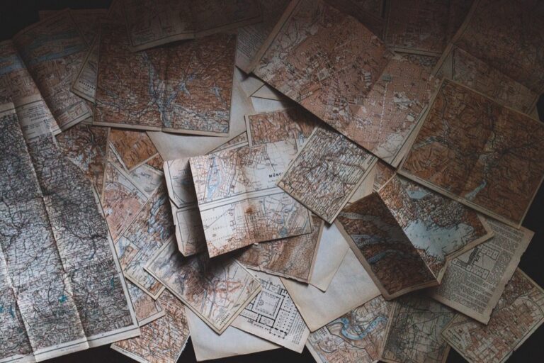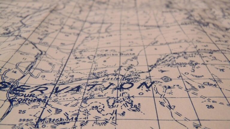
7 Best Color Techniques for Clear Visual Hierarchy
You can transform any map from confusing to crystal clear using strategic color choices that guide your reader’s eye exactly where it needs to go. Visual hierarchy through color isn’t just about making maps pretty—it’s about creating a clear communication system that helps viewers understand complex geographic information at a glance. Whether you’re designing for print publications or digital platforms, mastering these seven color-based techniques will elevate your cartographic work from amateur to professional-grade.
Disclosure: As an Amazon Associate, this site earns from qualifying purchases. Thank you!
Use Color Temperature to Create Depth and Distance
Color temperature creates natural visual depth by mimicking atmospheric perspective in your cartographic designs. This technique leverages the human eye’s tendency to perceive warm colors as closer and cool colors as more distant.
Warm Colors for Foreground Elements
Use reds, oranges, and yellows for features you want to emphasize in your map’s visual hierarchy. These warm hues naturally advance toward the viewer, making them perfect for primary roads, urban areas, or critical infrastructure. Apply warmer versions of base colors to elevation features like mountain ranges or hills that require prominence. Consider using warm-toned symbols for points of interest, landmarks, or administrative boundaries that need immediate attention from your map users.
P.S. check out Udemy’s GIS, Mapping & Remote Sensing courses on sale here…
Cool Colors for Background Features
Apply blues, greens, and purples to create receding background elements in your cartographic composition. These cool tones work effectively for water bodies, forested areas, or secondary transportation networks that support but don’t dominate the map’s message. Use cooler color variations for topographic features like valleys or low-lying terrain to enhance the sense of depth. Employ muted cool colors for reference grids, minor political boundaries, or supplementary information that provides context without competing for attention.
Apply Color Saturation to Establish Importance Levels
Color saturation creates immediate visual differentiation between primary and secondary map elements. You’ll find that varying saturation levels guides viewers naturally to the most critical information first.
High Saturation for Critical Map Elements
Use fully saturated colors for your most important features like major cities, primary transportation routes, and key landmarks. Bright reds for highways, deep blues for major rivers, and vivid greens for national parks immediately capture attention. These high-saturation elements should comprise no more than 20% of your total map area to maintain their dominance. Reserve your most vibrant colors for features that require immediate recognition and user interaction.
Muted Tones for Supporting Information
Apply desaturated versions of your primary colors to supporting elements like secondary roads, minor waterways, and administrative boundaries. Use 40-60% saturation levels for these features to maintain color relationships while reducing visual competition. Implement gray-toned colors for reference grids, elevation contours, and background typography. This approach creates layered information hierarchy where supporting data remains accessible without overwhelming your primary message.
Implement Color Contrast for Enhanced Readability
Effective color contrast forms the foundation of legible cartographic design. You’ll create maps that communicate clearly when text, symbols, and background elements maintain sufficient visual separation.
Achieve a flawless, even complexion with e.l.f. Flawless Satin Foundation. This lightweight, vegan formula provides medium coverage and a semi-matte finish for all-day wear, while hydrating your skin with glycerin.

Light-Dark Contrast for Text and Symbols
Light-dark contrast creates the strongest visual separation for essential map text and symbols. You should maintain at least a 4.5:1 contrast ratio between text and background colors to ensure readability across different viewing conditions. Place white or light yellow text over dark backgrounds like deep blues or blacks, while positioning dark text over light backgrounds such as cream or pale gray. This approach works particularly well for city labels, elevation numbers, and navigation symbols where clarity is critical.
Complementary Colors for Maximum Impact
Complementary color pairs generate maximum visual impact without sacrificing readability in your cartographic designs. You’ll achieve striking contrast by pairing colors directly opposite on the color wheel – such as blue and orange for water features against urban areas, or red and green for elevation changes. These combinations create natural visual separation while maintaining aesthetic appeal. Limit complementary pairs to 2-3 throughout your map to prevent visual chaos, and reserve them for your most important data categories.
Leverage Color Value to Guide Visual Flow
Color value—the lightness or darkness of a hue—creates the strongest visual hierarchy on your map. You’ll direct your reader’s eye through strategic value placement that mimics natural reading patterns.
Darker Values for Primary Features
Use darker color values for the most important elements on your map to establish immediate focal points. Dark values ranging from 15-30% brightness naturally draw attention first, making them perfect for major cities, primary highways, and critical infrastructure. Reserve your darkest values—below 20% brightness—for no more than three feature types to maintain clear hierarchy. Apply this technique to state capitals, interstate highways, and international borders where immediate recognition is essential for map comprehension.
Lighter Values for Secondary Details
Apply lighter color values between 60-80% brightness for supporting information that provides context without competing for attention. These softer tones work effectively for secondary roads, minor waterways, and administrative boundaries that users reference after identifying primary features. Keep supporting elements within this consistent value range to create visual cohesion while ensuring they remain readable at your intended scale. Use values above 70% brightness for the least critical details like township boundaries or elevation contours.
Create Color Groupings for Categorical Organization
Effective color groupings transform cluttered maps into organized visual narratives that communicate data relationships instantly. Strategic categorical organization through color helps viewers process complex geographic information without cognitive overload.
Similar Hues for Related Data Sets
Group related data using variations of the same base color to establish clear visual connections between similar feature types. Use different shades of blue for water-related features like rivers, lakes, and wetlands, or apply various green tones for vegetation categories including forests, grasslands, and agricultural areas.
This monochromatic approach creates intuitive associations while maintaining visual hierarchy through saturation and value differences. Limit each color family to 4-5 variations to prevent confusion and ensure each dataset remains distinguishable from others within the same categorical group.
Distinct Color Families for Different Categories
Assign completely different color families to separate major data categories to create clear visual boundaries between unrelated information types. Use warm colors (reds, oranges, yellows) for human infrastructure like roads and buildings, while reserving cool colors (blues, greens, purples) for natural features.
This separation prevents visual mixing and allows viewers to quickly identify which data category they’re examining. Maintain at least 60 degrees of separation on the color wheel between major categories, ensuring each color family occupies a distinct perceptual space that supports rapid categorization and data interpretation.
Utilize Progressive Color Schemes for Data Visualization
Progressive color schemes transform raw geographic data into intuitive visual narratives that reveal patterns instantly. You’ll create maps where data density, temperature variations, or population changes communicate their meaning through carefully calibrated color transitions.
Sequential Colors for Quantitative Data
Sequential color schemes excel when you’re mapping continuous data like elevation, population density, or rainfall measurements. You should select a single hue family and progress from light to dark values to represent low to high data ranges. Light blue progressing to navy blue works effectively for precipitation maps, while pale yellow transitioning to deep red serves temperature data well. Your color intervals should reflect natural data breaks – use 5-7 color classes maximum to prevent visual confusion while maintaining clear distinctions between data ranges.
Diverging Colors for Comparative Analysis
Diverging color schemes highlight data that deviates from a central value or compares opposing conditions. You’ll use two contrasting color families that meet at a neutral midpoint, typically white or light gray. Red-to-blue schemes work well for temperature anomalies, showing areas above and below average temperatures. Your central class should represent the baseline value, with equal color steps extending toward both extremes. Ensure your color progression maintains equal visual weight on both sides – avoid using one dominant color family that could bias interpretation.
Establish Color Coding Systems for Consistent Navigation
Your color coding system serves as the visual grammar that readers use to decode geographic information instantly across your entire mapping project.
Standardized Colors for Map Legend Items
Create universal color assignments that remain constant throughout your cartographic work. Assign blue tones exclusively to water features, green families to vegetation, and red-orange hues to transportation networks. Document these assignments in a master style guide with specific hex codes like #2E86AB for water bodies and #A23B72 for primary roads. This standardization eliminates confusion when viewers encounter multiple maps in your series.
Master the art of concise writing with The Elements of Style. This classic guide offers clear rules and principles for effective communication.

Uniform Color Application Across Map Series
Maintain identical color values across all maps within a project to build reader confidence and reduce cognitive load. Use the same #F18F01 for urban areas whether mapping downtown districts or suburban zones. Apply consistent saturation levels—keep residential areas at 40% opacity while commercial zones remain at 70% across every map sheet. This uniformity transforms individual maps into cohesive chapters of a larger geographic story.
Conclusion
Mastering color hierarchy in cartography transforms your maps from basic data displays into powerful communication tools. By implementing these seven strategic approaches you’ll guide viewers naturally through complex geographic information while maintaining professional visual standards.
Remember that effective color choices aren’t just about aesthetics—they’re about creating clear pathways for understanding. When you combine temperature contrast with value differences and establish consistent coding systems your maps become intuitive navigation experiences.
Start with one or two techniques and gradually build your color hierarchy skills. Your audience will immediately notice the difference as your cartographic work evolves from cluttered data dumps into compelling visual stories that communicate geographic relationships with clarity and confidence.
Frequently Asked Questions
What is visual hierarchy in map design and why is it important?
Visual hierarchy is the strategic arrangement of map elements using color to guide the viewer’s attention to the most important information first. It helps users understand complex geographic data by creating a clear order of importance, making maps more intuitive and easier to read. This technique transforms amateur maps into professional-quality designs.
How do warm and cool colors affect map perception?
Warm colors (reds, oranges, yellows) appear closer to viewers and should be used for foreground elements like primary roads and landmarks. Cool colors (blues, greens, purples) recede into the background and work best for supporting elements. This color temperature strategy creates natural depth and enhances the three-dimensional feel of flat maps.
What role does color saturation play in map design?
Color saturation establishes importance levels among map elements. Fully saturated colors draw attention to critical features like major cities and primary roads, but should occupy no more than 20% of the map area. Muted tones with 40-60% saturation work well for supporting information, maintaining visual hierarchy without overwhelming the primary message.
What contrast ratio should I maintain for map readability?
Maintain a light-dark contrast ratio of at least 4.5:1 between text and background colors. Use white or light yellow text on dark backgrounds, and dark text on light backgrounds for essential elements. This ensures clarity and accessibility, making your map readable for all users including those with visual impairments.
How should I use complementary colors in maps?
Use complementary color pairs (like blue-orange or red-green) sparingly to create striking visual impact without sacrificing readability. Limit complementary colors to 2-3 pairs maximum to avoid visual chaos. Reserve these high-contrast combinations for your most important data categories, such as water features or elevation changes.
What is color value and how does it guide visual flow?
Color value refers to the lightness or darkness of a hue. Use darker values (15-30% brightness) for primary features like major cities to create focal points. Reserve the darkest values (below 20%) for no more than three feature types. Lighter values (60-80% brightness) work best for secondary details that provide context.
How do I create effective color groupings for map categories?
Use similar hues for related data sets (different blues for water features, various greens for vegetation) to establish visual connections. Assign distinct color families to separate major categories, ensuring at least 60 degrees of separation on the color wheel. This approach helps viewers rapidly categorize and interpret complex geographic information.
What are progressive color schemes and when should I use them?
Progressive color schemes use calibrated color transitions to reveal data patterns. Sequential schemes progress from light to dark within a single hue family for continuous data like elevation. Diverging schemes use two contrasting color families meeting at a neutral midpoint for comparative analysis, making data relationships instantly recognizable.
Why is color coding consistency important across mapping projects?
Consistent color coding builds reader confidence and reduces cognitive load. Standardize color assignments (blue for water, red-orange for transportation) and document them in a master style guide with specific hex codes. Uniform application across all project maps transforms individual maps into cohesive chapters of a larger geographic story.