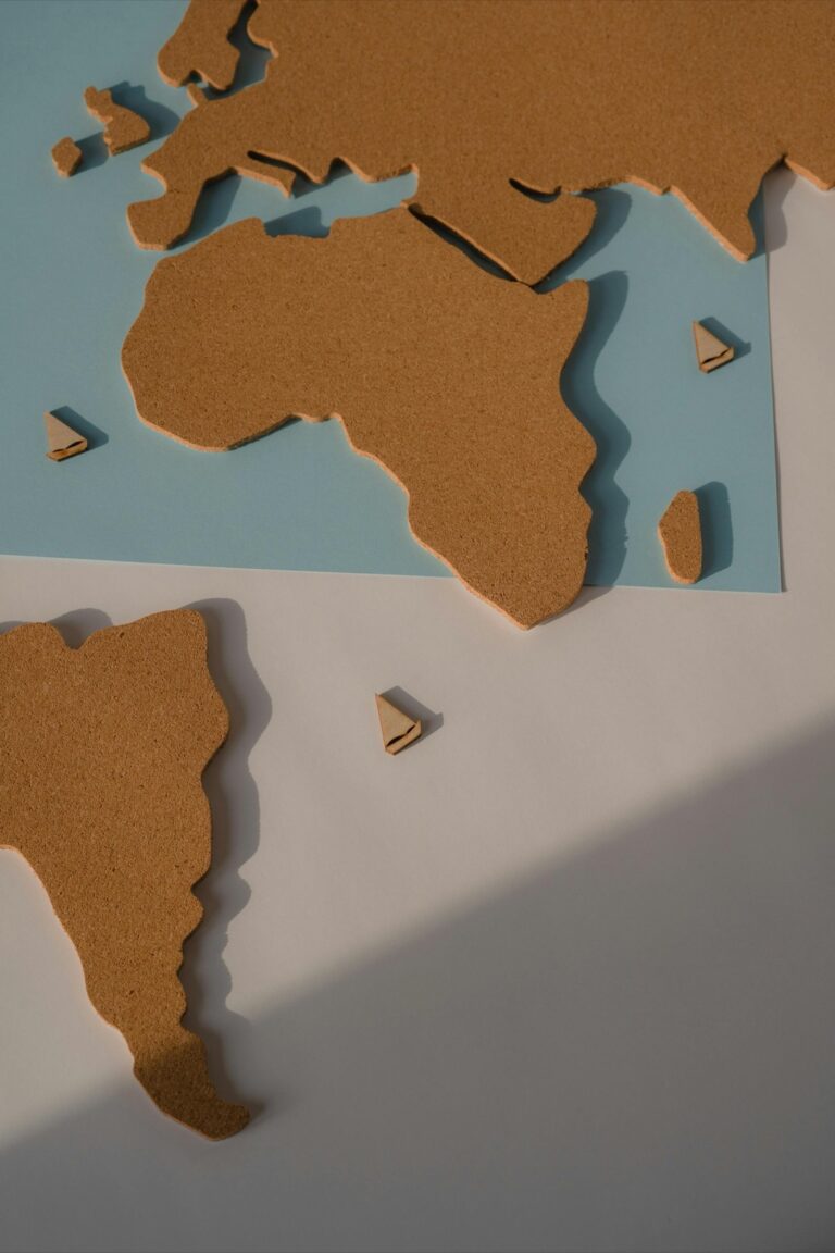
7 Creative Map Projection Alternatives That Reveal Hidden Patterns
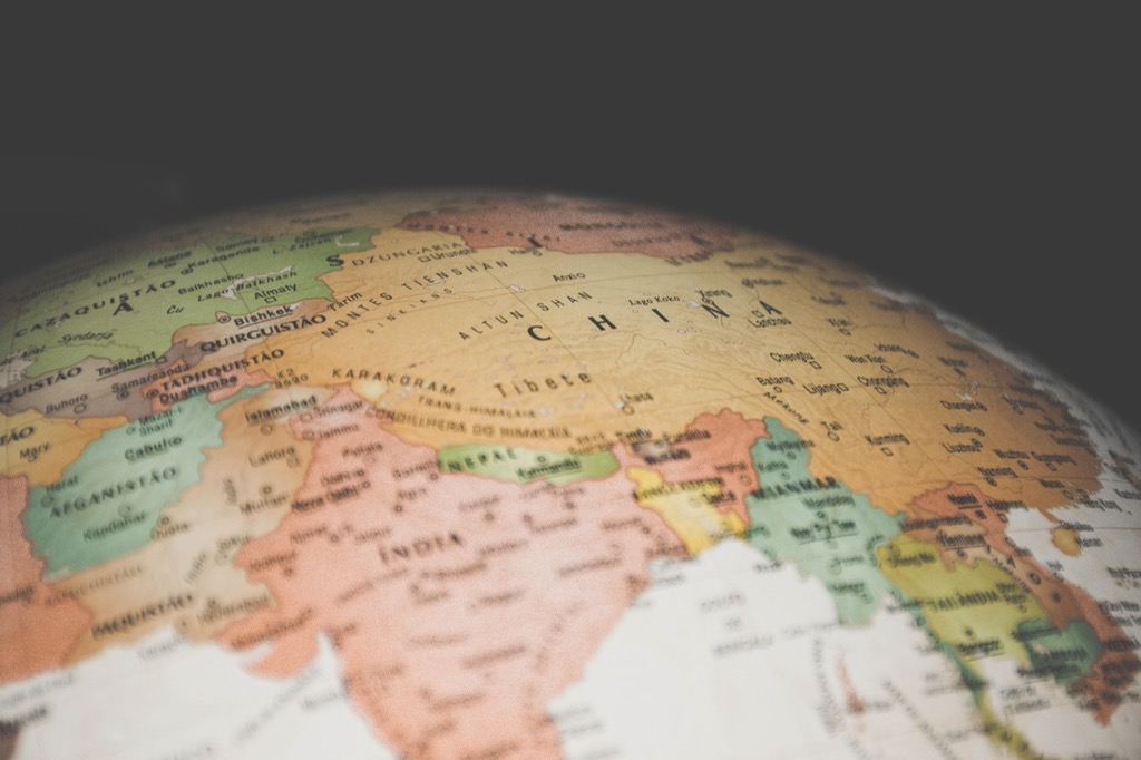
You’ve probably stared at a world map countless times without realizing you’re looking at a fundamentally flawed representation of our planet. Traditional map projections like the Mercator system distort landmasses so dramatically that Greenland appears larger than Africa when it’s actually 14 times smaller.
The big picture: Cartographers have developed dozens of innovative projection methods that offer more accurate or visually striking alternatives to standard world maps. These creative approaches solve different geographical problems while revealing fascinating perspectives on how we view our world.
Get durable, tear-resistant posters made in the USA. Each 18" x 29" poster features high-quality 3 MIL lamination for lasting protection.

Why it matters: Understanding these alternative projections isn’t just academicâit impacts everything from navigation systems to political perceptions about global relationships and territorial importance.
Disclosure: As an Amazon Associate, this site earns from qualifying purchases. Thank you!
P.S. check out Udemy’s GIS, Mapping & Remote Sensing courses on sale here…
Discover the Fascinating World of Alternative Map Projections
You’ll find that modern cartography offers dozens of innovative projection systems that address the fundamental limitations of traditional methods. These alternatives emerged from decades of mathematical research and practical mapping challenges faced by cartographers worldwide.
Equal-area projections maintain accurate size relationships between landmasses, making them essential for demographic analysis and resource management. You can utilize these systems when creating population density maps or comparing territorial sizes across continents.
Conformal projections preserve local angles and shapes, which proves crucial for navigation and surveying applications. Your GPS systems rely on these mathematical frameworks to maintain accuracy during route calculations and position tracking.
Navigate with ease using this 7-inch GPS navigator, featuring real-time voice guidance and pre-loaded 2025 maps. Customize routes based on your vehicle type to avoid restrictions and receive speed & red light warnings.

Compromise projections balance distortion across multiple properties, offering you practical solutions for general-purpose mapping. These hybrid approaches minimize overall visual distortion while maintaining reasonable accuracy for educational and reference materials.
You should consider the intended use case when selecting projection alternatives, as each system optimizes specific geometric properties at the expense of others. Your choice impacts how viewers interpret spatial relationships and geographic proportions in your final mapping products.
The Dymaxion Map: Buckminster Fuller’s Revolutionary Design
Experience the world's terrain with this Dymaxion map, featuring a stunning 3D shaded relief illusion. Printed in the USA on gallery-quality, acid-free fine art paper with archival inks for lasting detail and vibrant colors.

Buckminster Fuller created the Dymaxion map in 1943 as a radical departure from traditional projections. This innovative design transforms the globe into an icosahedron that unfolds into a flat surface.
Minimizes Distortion Through Innovative Folding
You’ll find the Dymaxion map uses a twenty-faced polyhedron structure that distributes distortion more evenly across the surface. This geometric approach reduces the severe size and shape distortions found in cylindrical projections like Mercator. The icosahedral folding method maintains relatively accurate proportions for all continents, making it particularly valuable for comparing land masses. Unlike traditional maps that concentrate distortion at the poles, Fuller’s design spreads minor distortions throughout the projection, resulting in more reliable spatial relationships.
Eliminates Traditional Center-Focused Bias
You’ll notice the Dymaxion projection breaks away from the conventional north-up orientation that places Europe and North America at the center. This map can be oriented in multiple ways, allowing you to view the world from different perspectives and challenge geographic preconceptions. The design presents all continents as a connected landmass surrounded by one world ocean, emphasizing global unity rather than artificial divisions. Fuller’s approach eliminates the implied hierarchy of traditional world maps, where certain regions appear more prominent due to their central positioning.
The AuthaGraph Projection: Japan’s Award-Winning Innovation
The AuthaGraph projection earned Japan’s prestigious Good Design Award in 2016 for revolutionizing world map accuracy. This innovative system transforms the globe into a tetrahedron before unfolding it into a rectangle, creating unprecedented precision in representing Earth’s surface.
Maintains Accurate Land Mass Proportions
The AuthaGraph projection preserves continental size relationships with remarkable fidelity compared to traditional systems. Unlike the Mercator projection that inflates northern territories, this method maintains Africa’s true proportional dominance over other continents. Antarctica appears in its correct relative size rather than as an impossibly stretched landmass. This accuracy proves essential for demographic studies, resource analysis, and educational applications where continental comparisons matter most.
Reduces Ocean Distortion Significantly
Ocean areas retain their proper proportional relationships throughout the AuthaGraph system, eliminating the dramatic expansion typical in cylindrical projections. Pacific Ocean distances appear correctly relative to Atlantic measurements, providing navigators with more reliable maritime references. Coastal boundaries maintain their natural curvature without the artificial straightening seen in other projection methods. This ocean accuracy becomes crucial for climate modeling, shipping route planning, and understanding global water distribution patterns.
The Waterman Butterfly Projection: Unfolding Earth Like Wings
Show off your love for geography with this vibrant world map bumper sticker. Featuring an orange-red map on a blue-black background in Waterman projection, this durable 5" vinyl decal is perfect for cars, laptops, and more.

The Waterman Butterfly projection transforms Earth’s surface into an elegant symmetrical design that resembles butterfly wings when fully extended. This innovative cartographic approach addresses many distortion issues found in traditional rectangular projections.
Creates Symmetrical Continental Display
You’ll notice the Waterman Butterfly projection arranges continents across multiple triangular segments that unfold symmetrically from a central axis. This design maintains continental proportions while creating visual balance between the Northern and Southern hemispheres. Unlike cylindrical projections that compress polar regions, the butterfly format distributes landmasses evenly across wing-like sections. The symmetrical layout eliminates the artificial emphasis on northern continents that dominates many traditional world maps. You can clearly compare continental sizes without the severe distortion that makes Greenland appear larger than South America in Mercator projections.
Offers Multiple Viewing Perspectives
You can rotate and orient the Waterman Butterfly projection to emphasize different geographic relationships and continental connections. The flexible wing arrangement allows you to position any continent at the center of the display while maintaining accurate proportional relationships. This adaptability proves valuable when analyzing global trade routes, migration patterns, or climate data from region-specific perspectives. Unlike fixed rectangular maps, you’ll find multiple valid orientations that highlight different aspects of global geography. The projection’s modular triangular segments can be rearranged to show various continental groupings while preserving mathematical accuracy across all configurations.
The Cahill-Keyes Projection: Octahedral Precision Mapping
The Cahill-Keyes projection revolutionizes world mapping by transforming Earth’s surface onto an octahedron before unfolding it into a distinctive butterfly-like pattern. This mathematical approach creates eight triangular faces that distribute distortion more evenly than traditional rectangular projections.
Balances Area and Shape Accuracy
Cahill-Keyes projection maintains superior area accuracy while preserving recognizable continental shapes through its octahedral geometry. You’ll find that landmasses retain their proportional relationships without the extreme size distortions present in cylindrical projections. The triangular segments minimize angular distortion across continental boundaries, ensuring that countries like Brazil and Australia appear in their correct relative sizes. This balance makes the projection particularly valuable for demographic analysis and resource distribution studies where both area precision and shape recognition matter.
Provides Continuous Landmass Representation
Connected continental masses emerge naturally from the Cahill-Keyes design, eliminating artificial breaks that plague other alternative projections. You can trace migration routes and continental drift patterns without encountering arbitrary map edges that interrupt geographic relationships. The octahedral structure keeps major landmasses visually connected, particularly between Asia and North America across the Bering region. This continuity proves essential for climate modeling and ecological studies that require uninterrupted data flow across traditional map boundaries.
The Peirce Quincuncial Projection: Square Earth Visualization
The Peirce Quincuncial projection stands out as one of cartography’s most mathematically elegant solutions, transforming our spherical planet into a perfect square format.
Fits Entire Globe Into Perfect Square
Square boundaries contain Earth’s complete surface with remarkable geometric precision. You’ll find all continents, oceans, and polar regions compressed into four identical triangular sections that meet at a central point. This ingenious design eliminates the edge-cutting problems that plague cylindrical projections like Mercator. The mathematical framework transforms spherical coordinates through stereographic projection onto a square, creating seamless transitions between adjacent triangular segments while maintaining complete global coverage.
Maintains Conformal Properties
Conformal accuracy preserves local angles and shapes throughout the square projection surface. You can rely on this system for navigation purposes since compass bearings remain locally correct within each triangular section. Small geographic features retain their recognizable shapes, though scale varies across the projection. The mathematical conformality ensures that intersecting lines maintain their angular relationships, making the Peirce Quincuncial valuable for detailed regional analysis despite its unconventional square appearance.
The Hobo-Dyer Equal Area Projection: Cylindrical Fairness
The Hobo-Dyer projection maintains cylindrical structure while addressing fundamental size distortions that plague traditional world maps. You’ll discover how this system preserves accurate area relationships across all continents.
Corrects Size Distortions of Mercator
Eliminates Greenland’s inflated appearance that makes it seem comparable to Africa’s size in Mercator projections. The Hobo-Dyer system shows Greenland at roughly 2.2 million square kilometers while correctly displaying Africa’s 30.3 million square kilometers. Reduces polar exaggeration by maintaining consistent scale relationships from equator to poles. Preserves continental proportions so Brazil appears appropriately larger than the entire United States, and India displays its true size relative to Scandinavia.
Emphasizes Global South Representation
Centers landmasses more equitably by positioning the equator at the map’s middle rather than the traditional northern bias. You’ll notice developing nations in Africa, South America, and Southeast Asia receive proportional visual weight matching their actual geographic significance. Balances northern and southern hemisphere representation equally across the cylindrical frame. Highlights tropical regions’ true extent, showing the Amazon rainforest and Congo Basin at their correct relative scales for environmental and demographic analysis.
The Spilhaus Projection: Ocean-Centered Perspective
The Spilhaus projection revolutionizes your understanding of Earth by placing the world’s interconnected ocean system at the center rather than traditional land-focused approaches.
Highlights Ocean Connectivity
Ocean-centered mapping reveals the continuous nature of Earth’s marine environment through the Spilhaus projection’s unique circular design. You’ll discover how the Atlantic, Pacific, and Indian Oceans connect as one vast water body surrounding scattered landmasses. This perspective transforms your understanding of marine ecosystems, ocean currents, and global water circulation patterns. Scientists use this projection for studying climate change impacts, marine migration routes, and oceanographic research where water connections matter more than continental boundaries.
Challenges Land-Centric Worldview
Land-centric projections traditionally dominate your geographic perspective, placing continents at the center while fragmenting ocean spaces across map edges. The Spilhaus projection disrupts this bias by positioning landmasses as islands within Earth’s dominant aquatic environment. You’ll notice how this approach emphasizes that water covers 71% of our planet’s surface, reshaping discussions about resource management and environmental policy. This ocean-first perspective proves essential for marine biologists, climate researchers, and policy makers addressing global water-related challenges.
Conclusion
These seven alternative map projections demonstrate that there’s no single “correct” way to represent our three-dimensional world on a flat surface. Each projection offers unique advantages depending on your specific needs – whether you’re analyzing global demographics studying ocean currents or simply seeking a more accurate visual representation of Earth.
The key is understanding that traditional maps like Mercator aren’t inherently wrong but rather limited in their applications. By exploring these innovative alternatives you’ll develop a more nuanced understanding of geography and spatial relationships.
Next time you view a world map consider what story it’s telling and what perspective it’s emphasizing. The projection you choose can fundamentally change how you perceive our planet’s true proportions and connections.
Frequently Asked Questions
Why does Greenland appear larger than Africa on most world maps?
Traditional map projections like the Mercator system distort the size of landmasses, particularly near the poles. This makes Greenland appear much larger than Africa, even though Africa is actually about 14 times bigger than Greenland. The Mercator projection stretches polar regions to maintain navigation accuracy, creating these size distortions.
What is the Dymaxion map and how is it different?
The Dymaxion map, created by Buckminster Fuller in 1943, transforms the globe into a 20-faced polyhedron (icosahedron) before unfolding it. This design minimizes distortion by distributing it more evenly across the surface, maintains accurate continental proportions, and presents all continents as connected landmasses surrounded by one world ocean.
What makes the AuthaGraph projection special?
The AuthaGraph projection won Japan’s Good Design Award in 2016 for its accuracy. It transforms the globe into a tetrahedron before unfolding into a rectangle, preserving continental size relationships with remarkable fidelity. Unlike Mercator, it maintains Africa’s true proportional dominance and accurately represents Antarctica while reducing ocean distortion.
How does the Waterman Butterfly projection work?
The Waterman Butterfly projection arranges Earth’s surface into triangular segments that unfold symmetrically from a central axis, creating a butterfly-wing appearance. This design maintains continental proportions, provides visual balance between hemispheres, and offers flexible viewing perspectives for analyzing global patterns like trade routes and migration.
What is unique about the Peirce Quincuncial projection?
The Peirce Quincuncial projection fits the entire globe into a perfect square format, dividing it into four identical triangular sections that meet at a central point. It maintains conformal properties, preserving local angles and shapes for navigation while eliminating edge-cutting issues found in cylindrical projections.
How does the Hobo-Dyer projection address traditional map problems?
The Hobo-Dyer Equal Area Projection corrects size distortions while maintaining a cylindrical structure. It accurately shows Greenland as much smaller than Africa and emphasizes global south representation by centering the equator in the middle, giving proportional visual weight to developing nations.
What makes the Spilhaus projection revolutionary?
The Spilhaus projection centers the world’s oceans rather than landmasses, revealing the interconnected nature of Earth’s marine environment. This ocean-centered perspective shows the Atlantic, Pacific, and Indian Oceans as one vast water body, challenging traditional land-centric views and highlighting Earth’s water coverage.
Why should I care about different map projections?
Different map projections serve different purposes and influence how we perceive the world. Understanding these alternatives helps combat geographic bias, provides more accurate representations for specific uses like navigation or demographic analysis, and challenges preconceptions about global relationships and territorial significance.