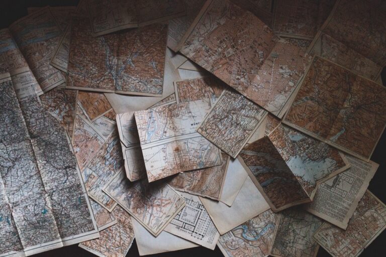
7 Best Color Strategies for Cultural Mapping
Why it matters: Cultural mapping projects often fall flat because they rely on predictable color schemes that fail to capture the vibrancy and complexity of diverse communities.
The big picture: You’re missing opportunities to tell compelling cultural stories when your maps default to basic primary colors or tired demographic palettes that don’t resonate with the communities you’re representing.
What’s next: These seven innovative color approaches will transform how you visualize cultural data — from emotion-based gradients that reflect community sentiment to locally-sourced color palettes that honor indigenous traditions and contemporary cultural expressions.
Disclosure: As an Amazon Associate, this site earns from qualifying purchases. Thank you!
P.S. check out Udemy’s GIS, Mapping & Remote Sensing courses on sale here…
Interactive Color-Coded Heritage Trails That Bring History to Life
Interactive heritage trails transform static cultural maps into dynamic storytelling platforms. You’ll create immersive experiences that guide visitors through historical narratives using strategic color coding and digital technology.
Digital Wayfinding Systems
Digital wayfinding transforms heritage exploration through color-coded navigation systems that respond to user preferences and interests. You’ll implement GPS-enabled applications that display different colored pathways based on themes like architectural periods, cultural communities, or historical events. Modern platforms like Esri’s ArcGIS Online and Mapbox allow you to create custom color schemes that adapt to lighting conditions and accessibility needs. These systems integrate real-time data feeds to highlight seasonal exhibitions, active archaeological sites, or community events along your mapped routes.
Augmented Reality Integration
Augmented reality overlays bring historical contexts directly into your field mapping through color-enhanced visual layers. You’ll use AR development platforms like Unity or Vuforia to create location-triggered experiences where historical buildings appear in their original colors or cultural significance markers display through smartphone cameras. Color-coded AR elements help visitors distinguish between different time periods, with warm tones representing older structures and cooler hues indicating modern additions. These applications require precise GPS calibration and detailed 3D modeling to ensure accurate historical color representation.
Experience vivid content on the Galaxy A16 5G's 6.7" display and capture stunning photos with its triple-lens camera. Enjoy peace of mind with a durable design, six years of updates, and Super Fast Charging.

Community Storytelling Elements
Community storytelling elements embed local voices directly into your color-coded mapping systems through participatory design processes. You’ll establish color associations that reflect community input, allowing residents to assign meaningful hues to significant locations based on personal and collective memories. Interactive audio stations trigger through proximity sensors, with visual color cues indicating available languages or story types. Digital platforms like StoryMapJS enable you to layer community-contributed content over base maps, creating collaborative heritage documentation that evolves with ongoing community engagement and oral history collection efforts.
Emotion-Based Color Psychology Mapping for Cultural Experiences
You’ll find that color psychology transforms static cultural documentation into emotionally resonant experiences that connect viewers to community narratives. This mapping approach leverages psychological color responses to guide users through different cultural experiences and emotional landscapes.
Warm Colors for Celebratory Traditions
Use reds, oranges, and yellows to map festivals, markets, and community celebrations. These warm tones naturally evoke energy and joy, making viewers feel the vibrancy of cultural events like harvest festivals or street markets. You’ll create stronger emotional connections by assigning golden yellows to religious ceremonies, bright oranges to food festivals, and deep reds to traditional dance venues. This color strategy helps users identify celebration-focused cultural sites at a glance while conveying the festive atmosphere of these important community gathering spaces.
Cool Colors for Reflective Spaces
Apply blues, purples, and teals to memorial sites, museums, and contemplative cultural locations. Cool colors psychologically promote calm reflection and respect, making them perfect for marking sacred spaces, historical monuments, and educational centers. You’ll enhance the mapping experience by using deep blues for memorial gardens, soft purples for meditation spaces, and muted teals for libraries or cultural study centers. These color choices guide visitors toward appropriate emotional states while navigating culturally significant areas that require thoughtful engagement.
Neutral Tones for Historical Documentation
Choose grays, browns, and muted earth tones for archaeological sites and historical preservation areas. Neutral colors convey timelessness and authenticity without overwhelming the historical narrative or competing with artifact photography. You’ll maintain visual clarity by using warm grays for ancient structures, rich browns for archaeological dig sites, and soft beiges for historical districts. This neutral palette ensures that the historical content remains the focal point while providing subtle visual organization for complex cultural heritage documentation.
Seasonal Color Palettes That Reflect Cultural Celebrations
Seasonal color systems provide powerful frameworks for mapping cultural celebrations throughout the year. These palettes connect communities to natural cycles while honoring traditional ceremonial colors that hold deep cultural significance.
Spring Festival Color Schemes
Spring celebrations demand vibrant color palettes that mirror renewal and growth across diverse cultures. You’ll find cherry blossom pinks for Japanese Hanami festivals work effectively alongside fresh greens for Celtic Beltane traditions. Chinese New Year mapping benefits from bold reds and golds, while Hindu Holi festivals require rainbow spectrums with emphasis on magenta, yellow, and turquoise gradients that capture the essence of color powder celebrations.
Harvest Season Representations
Harvest celebrations translate beautifully into warm, earth-toned mapping palettes that reflect agricultural abundance. You should incorporate deep oranges and burgundies for autumn festivals like Oktoberfest or American Thanksgiving traditions. Mexican Día de los Muertos requires vibrant marigold yellows paired with purple accents, while Mid-Autumn Festival mapping benefits from golden yellows and harvest browns that represent moon cakes and lantern displays across Asian communities.
Winter Solstice Traditions
Winter solstice mapping demands sophisticated color schemes that balance darkness with celebration. You’ll achieve optimal results using deep blues and silvers for Scandinavian Lucia festivals, while Kwanzaa celebrations require red, black, and green combinations that honor African heritage principles. Christmas mapping benefits from traditional red and green palettes, though Hanukkah representations work better with blue and white gradients that reflect Jewish cultural traditions and ceremonial lighting.
Demographic-Driven Color Coding for Inclusive Representation
You’ll need demographic-aware color systems that acknowledge how different age groups, generations, and cultural backgrounds experience and interpret visual information. This approach ensures your cultural maps serve all community members effectively.
Age-Specific Cultural Narratives
You can optimize accessibility by adjusting color intensity and contrast for different age demographics. Use high-contrast color pairs like navy blue and bright yellow for elderly users who may experience diminished color perception. Children respond better to saturated primary colors like vibrant reds and blues that clearly distinguish cultural sites. Teen and young adult audiences connect with contemporary color palettes that include trendy combinations like teal and coral for modern cultural spaces.
Generational Perspective Mapping
You should layer generational experiences through distinct color families that represent different historical periods. Map Baby Boomer cultural memories using muted earth tones like olive green and rust orange that reflect their formative decades. Generation X perspectives work well with bold neon accents like electric blue and hot pink that capture their cultural zeitgeist. Millennial and Gen Z viewpoints benefit from gradient techniques that blend traditional colors with digital-inspired hues like cyber lime and holographic purple.
Cross-Cultural Color Sensitivity
You must research cultural color meanings before implementing your mapping scheme to avoid unintended associations. Red signifies prosperity in Chinese culture but mourning in South African traditions, requiring careful context consideration. White represents purity in Western cultures while symbolizing death in many Asian communities. Green carries positive environmental associations globally but can represent jealousy or inexperience in specific cultural contexts, making cultural consultation essential for accurate representation.
Geographic Color Gradients That Show Cultural Migration Patterns
Geographic color gradients transform migration data into compelling visual narratives that reveal how communities move and establish roots across landscapes. This approach uses sophisticated color transitions to map the complex relationships between origin points, migration routes, and settlement areas.
Origin Point Identification
Origin point identification requires distinctive color anchors that establish cultural source regions with high visual impact. You’ll achieve optimal results using saturated primary colors – deep reds for East Asian origins, vibrant blues for European sources, and rich greens for African homelands. These anchor colors create immediately recognizable reference points that viewers can trace throughout your migration visualization. Apply color intensity at 85-90% saturation to ensure clarity while maintaining professional cartographic standards.
Migration Route Visualization
Migration route visualization employs gradient transitions that blend origin colors with destination hues along documented pathways. You’ll create smooth color progressions using linear interpolation techniques, with origin colors at 100% intensity gradually fading to 30% while destination colors emerge at increasing saturation levels. This creates flowing ribbons of color that show movement patterns across time periods, with route width indicating migration volume and color opacity representing temporal phases.
Settlement Area Highlighting
Settlement area highlighting uses cluster mapping techniques where destination colors achieve full saturation to show established communities. You’ll apply warm overlay tones – amber for agricultural settlements, terracotta for urban centers, and sage green for mixed communities – at 70% opacity over base colors. This layering approach reveals both the cultural origins and local adaptation patterns, with color boundaries showing community integration levels and cultural preservation areas.
Collaborative Community Color Selection for Authentic Representation
You’ll achieve the most authentic cultural mapping results when community members directly participate in color selection decisions. This collaborative approach ensures that color choices reflect genuine cultural meanings rather than external assumptions.
Resident Input Workshops
Organize facilitated workshops where community residents share personal color associations with significant cultural locations and traditions. You’ll discover that residents often connect specific hues to childhood memories, family gatherings, and neighborhood celebrations that outsiders wouldn’t recognize. Use structured activities like color-coding exercises and group discussions to capture these meaningful associations. Document resident preferences through digital color palettes and voting systems to create consensus-based color schemes that truly represent community perspectives.
Cultural Leader Consultations
Engage with recognized cultural leaders, elders, and tradition keepers to validate color selections and identify sacred or ceremonial color meanings. You’ll find that cultural leaders possess deep knowledge about traditional color symbolism, seasonal celebrations, and historical significance that inform authentic mapping choices. Schedule individual consultations to discuss color protocols and cultural sensitivities before implementing any mapping scheme. These leaders can guide you away from inappropriate color combinations and toward culturally respectful representations.
Youth Engagement Programs
Create youth-focused programs that capture contemporary cultural expressions while honoring traditional color meanings passed down through generations. You’ll engage younger community members through digital platforms, social media polls, and interactive mapping sessions that blend modern technology with cultural heritage. Youth participants often bridge traditional and contemporary perspectives, suggesting color combinations that reflect evolving cultural identities. Their involvement ensures that cultural maps remain relevant to future generations while maintaining connections to historical roots.
Accessibility-Focused Color Schemes for Universal Cultural Understanding
Building on collaborative community input and seasonal color strategies, you’ll need to ensure your cultural mapping project reaches all users regardless of visual abilities or technical limitations.
Color-Blind Friendly Alternatives
Replace problematic red-green combinations with blue-orange or purple-yellow pairings that maintain cultural meaning while ensuring accessibility. Test your cultural mapping palettes using color-blind simulation tools like Coblis or Stark to verify readability across deuteranopia, protanopia, and tritanopia conditions. Implement pattern overlays and texture fills alongside color coding for heritage sites, allowing users with color vision deficiencies to distinguish between cultural districts through multiple visual cues rather than relying solely on hue differentiation.
High Contrast Design Elements
Optimize your cultural mapping contrast ratios to meet WCAG 2.1 AA standards with minimum 4.5:1 ratios for text and 3:1 for graphical elements representing cultural landmarks. Enhance boundary definitions between cultural zones using bold outlines and increased stroke weights that remain visible across different display conditions and lighting environments. Balance background colors with foreground cultural markers by employing darker backgrounds for lighter heritage symbols and vice versa, ensuring maximum readability for users with low vision or aging-related visual changes.
Multi-Sensory Integration Options
Incorporate audio descriptions triggered by color-coded cultural zones, allowing screen readers to announce neighborhood histories and cultural significance when users navigate mapped areas. Design tactile feedback systems for touch-enabled devices that provide haptic responses corresponding to different cultural mapping colors, creating physical sensations that reinforce visual information. Develop alternative text descriptions for each color-coded cultural element that convey both the visual appearance and cultural meaning, ensuring assistive technologies can communicate the full context of your heritage mapping to users with visual impairments.
Read comfortably with this lightweight, full-page 5X magnifying glass. Its large viewing area and ergonomic handle make it ideal for seniors and those with low vision to easily read small print.

Conclusion
These seven innovative color strategies will transform your cultural mapping projects from basic documentation into powerful storytelling tools. You’ll create deeper emotional connections with your community while ensuring every member can engage with your cultural heritage representation.
Remember that successful cultural mapping isn’t just about accurate data—it’s about honoring the voices and experiences of the people you’re representing. When you combine thoughtful color psychology with community collaboration you’ll develop maps that truly reflect your area’s unique cultural identity.
Your commitment to accessibility and inclusive design will ensure these cultural narratives reach the widest possible audience. Start implementing these color innovations today and watch your cultural mapping projects become more engaging meaningful and representative of the vibrant communities they celebrate.
Frequently Asked Questions
What are the main problems with traditional cultural mapping color schemes?
Traditional cultural mapping often relies on simplistic color schemes that fail to capture the true diversity and vibrancy of communities. Basic colors can miss opportunities to convey meaningful cultural narratives, leading to inadequate representation of rich cultural heritage and community stories.
How can emotion-based color psychology improve cultural maps?
Emotion-based color psychology transforms static cultural documentation into emotionally resonant experiences. Warm colors like reds and oranges represent celebratory traditions, cool colors like blues create reflective spaces for memorials, and neutral tones ensure historical narratives remain the focal point.
What are interactive heritage trails and how do they work?
Interactive heritage trails transform static cultural maps into dynamic storytelling platforms. They use color-coded navigation systems that allow users to follow themed pathways based on architectural periods or cultural communities, enhanced with augmented reality overlays for immersive historical experiences.
Why are seasonal color palettes important for cultural mapping?
Seasonal color palettes connect communities to natural cycles while honoring traditional ceremonial colors. Spring festivals use cherry blossom pinks, harvest celebrations feature warm earth tones, and winter traditions incorporate sophisticated schemes that balance darkness with celebration, enhancing cultural representation.
How does demographic-driven color coding ensure inclusive representation?
Demographic-driven color coding optimizes accessibility across different age groups and cultural backgrounds. It uses high-contrast pairs for elderly users, saturated primary colors for children, and distinct color families for generational perspectives while maintaining cross-cultural sensitivity to avoid unintended associations.
What role do geographic color gradients play in showing cultural migration?
Geographic color gradients illustrate cultural migration patterns through visual narratives. They use distinctive color anchors for origin points, gradient transitions for migration routes, and warm overlay tones for settlement areas, revealing cultural origins and local adaptation patterns effectively.
How can communities participate in color selection for cultural maps?
Communities can participate through resident input workshops, cultural leader validation, and youth engagement programs. This collaborative approach ensures color schemes genuinely reflect community perspectives, capture contemporary expressions while honoring traditions, and foster deeper connections to cultural heritage.
What accessibility features should cultural maps include?
Cultural maps should include color-blind friendly alternatives using blue-orange or purple-yellow pairings, high contrast design elements meeting accessibility standards, and multi-sensory integration options like audio descriptions and tactile feedback systems for users with visual impairments.