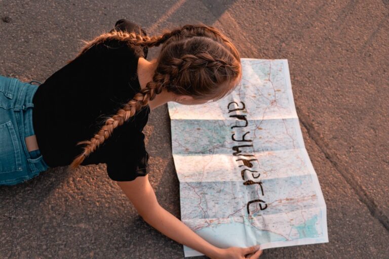
7 Best Typography Design Tips
Why it matters: Multilingual maps require thoughtful typography that balances readability across different languages while maintaining visual harmony and cultural sensitivity.
The challenge: Traditional map typography often fails when dealing with multiple scripts, character sets, and reading directions, creating confusion rather than clarity for global audiences.
What’s ahead: These seven creative approaches will transform how you handle typography on multilingual maps, from strategic font pairing to innovative labeling systems that respect linguistic diversity while enhancing user experience.
Disclosure: As an Amazon Associate, this site earns from qualifying purchases. Thank you!
P.S. check out Udemy’s GIS, Mapping & Remote Sensing courses on sale here…
Use Layered Font Hierarchies to Distinguish Language Groups
Creating distinct visual layers through font weight and style variations helps you establish clear information hierarchies that guide readers naturally through multilingual content. This systematic approach prevents linguistic confusion while maintaining map readability across different cultural contexts.
Primary Language in Bold Sans-Serif Fonts
Primary language labels demand maximum visibility and clarity on your multilingual maps. Bold sans-serif typefaces like Helvetica Bold or Arial Black provide excellent legibility at various zoom levels while ensuring dominant languages remain immediately recognizable. You’ll want to reserve weights between 700-900 for these primary labels, positioning them prominently near major geographic features. This approach works particularly well for country names, major cities, and primary administrative boundaries where instant recognition matters most.
Secondary Languages in Lighter Serif Typefaces
Secondary language text benefits from serif fonts at medium weights to create visual distinction without overwhelming primary content. Fonts like Times New Roman at 400-500 weight or Georgia Regular offer excellent readability while clearly establishing their subordinate role in your map’s hierarchy. You can position these labels slightly offset from primary text or use smaller point sizes to maintain clear separation. This technique works effectively for regional names, secondary cities, and cultural landmarks that require multilingual representation.
Tertiary Languages in Condensed or Italic Styles
Tertiary language labels work best with condensed widths or italic styling to maximize space efficiency while maintaining readability. Fonts like Arial Narrow Italic or Helvetica Condensed allow you to include additional linguistic context without cluttering your map design. You’ll find these styles particularly useful for historical names, local dialects, or specialized terminology that adds cultural depth. Position these labels in available white space or use leader lines to connect them with their corresponding geographic features.
Implement Color-Coded Typography Systems for Different Languages
Color-coding transforms multilingual maps from confusing text clusters into intuitive navigation tools. You’ll create visual patterns that guide readers through complex linguistic landscapes while maintaining professional cartographic standards.
Assign Distinct Color Palettes to Each Language Family
Designate specific color families for major language groups to establish immediate visual recognition. Use warm colors like oranges and reds for Romance languages, cool blues and teals for Germanic languages, and earth tones for indigenous languages. Your color assignments should remain consistent across the entire map series, creating a visual vocabulary that users learn and trust. Test your palette selections against colorblind accessibility standards using tools like Stark or ColorBrewer to ensure universal readability.
Use Gradient Effects to Show Language Transitions
Apply subtle color gradients in regions where languages naturally blend or transition. Create smooth color shifts from Spanish red to Portuguese orange in border regions, or blend French blue into German green across linguistic boundaries. Your gradient effects should span 2-3 color stops maximum to avoid overwhelming the base map design. Position these transitions strategically along actual linguistic boundaries rather than arbitrary geographic divisions, reflecting real-world language usage patterns.
Apply Consistent Color Rules Across All Map Elements
Maintain your color-coding system throughout every map component including legends, insets, and supplementary graphics. Extend your language colors to border lines, background fills, and even small decorative elements that support each linguistic region. Your consistency builds user confidence and reduces cognitive load when interpreting complex multilingual information. Document your color specifications using hex codes and Pantone references to ensure accurate reproduction across different media and printing processes.
Create Visual Separation Through Strategic Font Pairing
Strategic font pairing creates clear visual boundaries between language groups while maintaining professional cartographic standards. You’ll achieve optimal multilingual typography by selecting complementary typefaces that work together harmoniously without competing for attention.
Combine Western and Non-Latin Script Fonts Harmoniously
Pairing Western fonts with non-Latin scripts requires careful consideration of baseline alignment and character weight distribution. Choose fonts with similar x-heights and stroke weights to create visual cohesion across Arabic, Cyrillic, and Latin character sets. Google Fonts’ Noto family provides excellent cross-script compatibility, while Adobe’s Source Sans Pro offers reliable pairing with Devanagari and Thai scripts. Test your combinations at various zoom levels to ensure readability remains consistent across all script types.
Balance Readability Between Contrasting Typeface Styles
Balancing serif and sans-serif combinations demands attention to contrast ratios and visual hierarchy principles. Use high-contrast pairings like Helvetica with Times New Roman for maximum differentiation between primary and secondary languages. Maintain consistent font weights across typeface families to prevent one language from dominating others visually. Consider using condensed versions of your primary font for dense urban areas while keeping expanded versions for rural regions with more spacing available.
Maintain Consistent Character Spacing Across Languages
Character spacing consistency prevents visual fragmentation that confuses map readers navigating between language zones. Set uniform tracking values for all languages, typically between -0.02em and 0.05em depending on font choice and map scale. Adjust kerning pairs manually for problematic character combinations in non-Latin scripts, particularly where diacritical marks create spacing irregularities. Use your GIS software’s typography tools to establish baseline grids that accommodate ascenders and descenders across all script types while maintaining consistent line spacing.
Design Custom Typography Solutions for Script-Specific Challenges
Multilingual maps demand sophisticated typography solutions that accommodate the unique characteristics of different writing systems. You’ll need to develop custom approaches that respect each script’s inherent properties while maintaining overall visual harmony.
Adapt Font Sizes for Different Writing Systems
Adjust base font sizes to ensure equal visual weight across scripts. Latin characters typically require 12-point sizing, while Arabic scripts need 14-point to maintain comparable readability. Chinese characters demand 16-point minimum sizing due to their complex internal structure. Japanese hiragana and katakana work effectively at 13-point, while Devanagari scripts require 15-point for optimal clarity. Test your size ratios at various zoom levels to maintain consistent hierarchy across all viewing distances.
Address Right-to-Left and Top-to-Bottom Text Orientations
Establish clear directional flow patterns for non-Latin scripts. Arabic and Hebrew labels require right-to-left alignment with careful attention to punctuation placement and number formatting. Traditional Chinese and Japanese vertical text flows demand top-to-bottom orientation with proper character rotation. Create dedicated text anchoring points that accommodate these directional requirements without disrupting the overall map layout. Mixed-direction labels need buffer zones to prevent visual conflicts between opposing text flows.
Create Special Characters for Unique Linguistic Elements
Develop custom glyphs for region-specific linguistic features. Tone markers in Vietnamese require precise diacritical positioning above and below base characters. Cherokee syllabary needs specialized character spacing to prevent visual crowding. Design ligature solutions for Arabic script connections and create custom combining characters for indigenous languages lacking standard Unicode support. Establish consistent baseline alignments for scripts with varying character heights to maintain professional typographic standards across your multilingual map elements.
Utilize Geographic Typography Placement Techniques
Strategic placement of multilingual typography transforms maps from cluttered text displays into intuitive geographic narratives. These positioning techniques leverage natural landscape features to create logical reading flows that honor both cartographic principles and linguistic traditions.
Position Text Along Natural Geographic Features
Natural geographic features provide ideal anchoring points for multilingual text placement on maps. Rivers, mountain ranges, and valleys create visual pathways that guide readers through complex linguistic information while maintaining geographic context.
Primary language labels work best when positioned directly above major geographic features like mountain ranges or river systems. Place secondary language translations 2-3mm below the primary text, following the same natural contour line. This creates a visual hierarchy that mirrors the landscape’s natural flow.
Coastal regions require careful consideration of text orientation relative to shoreline curves. Position text at 15-20 degree angles that complement the coastline’s natural direction, ensuring both languages remain readable without conflicting with bathymetric information or maritime boundaries.
Stack Multiple Languages in Logical Reading Order
Vertical stacking systems create clean multilingual hierarchies that respect cultural reading patterns and geographic space constraints. This technique prevents text overlap while maintaining clear language relationships across different script systems.
Reading order priority should follow local demographic patterns and official language status. Stack primary administrative languages at the top, followed by regional languages, then minority languages in descending order. Maintain consistent 1.5-2mm spacing between each language layer.
Script-specific considerations require adjusted line spacing for different writing systems. Arabic and Hebrew text needs 25% more vertical space than Latin scripts, while Chinese characters require uniform square spacing. Thai and Devanagari scripts need additional ascender space to prevent character collision.
Implement Curved Text Following Coastlines and Borders
Curved text placement along coastlines and political boundaries creates dynamic multilingual labels that enhance geographic storytelling. This technique works particularly well for regional names, territorial designations, and cross-border linguistic areas.
Coastline typography should curve at 5-10 degree increments to match natural shoreline patterns. Use baseline offset tools to position secondary languages 3-4mm inside the primary text curve, creating parallel text paths that follow the same geographic feature without visual interference.
Border region labeling requires careful consideration of political sensitivities and linguistic accuracy. Place disputed territory names using neutral positioning that doesn’t favor either side, while ensuring both languages maintain equal visual prominence and readability at standard map viewing distances.
Incorporate Interactive Typography Elements for Digital Maps
Digital mapping platforms offer dynamic typography capabilities that transform static multilingual labels into responsive user interfaces. Interactive elements reduce visual clutter while maintaining comprehensive language coverage across diverse user needs.
Add Hover Effects to Reveal Additional Language Options
Hover-triggered typography expands language accessibility without overwhelming your map’s visual hierarchy. Configure primary labels to display in your map’s dominant language, then program secondary and tertiary translations to appear when users hover over specific geographic features. This approach works particularly well for city names, landmark labels, and regional boundaries where multiple language variants exist. JavaScript libraries like Leaflet and Mapbox GL JS provide built-in hover event handlers that seamlessly integrate with your existing typography systems.
Create Toggle Switches for Language Visibility
Language toggle controls give users complete control over their multilingual map experience through selective visibility options. Position toggle switches in your map’s control panel to allow users to activate or deactivate specific language groups based on their preferences. You can organize toggles by language family, script type, or geographic region to create intuitive groupings. This functionality proves essential for educational maps covering linguistically diverse regions where users may want to focus on specific language patterns or distributions.
Design Expandable Text Boxes for Detailed Translations
Expandable typography containers accommodate comprehensive multilingual information without compromising your map’s spatial organization. Create clickable text elements that expand into detailed information panels containing full translations, pronunciation guides, and cultural context. These expandable boxes work exceptionally well for complex geographic names with historical significance or places where multiple naming conventions coexist. Configure expansion triggers through click events or tap gestures, ensuring smooth transitions that maintain your map’s professional appearance while delivering rich multilingual content.
Apply Contextual Typography Scaling Based on Map Zoom Levels
Typography scaling transforms multilingual maps into dynamic geographic tools that reveal appropriate linguistic information at every zoom level. Smart scaling ensures users encounter relevant languages without overwhelming visual clutter.
Prioritize Languages by Geographic Relevance at Each Scale
Set primary languages to display at broad continental views, focusing on official national languages and major regional dialects. Secondary languages appear at regional scales, revealing indigenous languages and minority dialects within specific territories. Tertiary languages activate at local scales, showing neighborhood-specific linguistic communities and street-level language variations. Configure your GIS software to automatically adjust language visibility thresholds based on scale denominators—typically 1:50,000,000 for continental, 1:5,000,000 for regional, and 1:500,000 for local linguistic details.
Implement Smart Text Rendering for Optimal Readability
Deploy text collision detection algorithms to prevent multilingual label overlap during zoom transitions, ensuring clean typography presentation across scale changes. Configure dynamic font sizing that maintains consistent readability ratios—increase primary language fonts by 1.5x at each zoom level while adjusting secondary languages proportionally. Implement text buffering zones around geographic features to preserve label spacing as users navigate between scales. Modern mapping platforms like Mapbox and ArcGIS Pro offer automated text rendering engines that optimize multilingual typography positioning based on current viewport dimensions.
Design Responsive Typography That Adapts to User Needs
Create adaptive typography systems that respond to user device capabilities and viewing contexts, scaling fonts appropriately for mobile screens versus desktop displays. Implement progressive disclosure techniques where additional languages appear as users zoom deeper into specific regions, revealing community-specific linguistic information. Configure typography density controls that automatically reduce secondary language visibility when screen real estate becomes limited. Design fallback typography hierarchies that gracefully degrade multilingual content on older devices while maintaining essential geographic information and primary language accessibility across all platforms.
Conclusion
These seven creative typography strategies will transform your multilingual maps from confusing displays into intuitive navigation tools. By implementing layered hierarchies color-coded systems and strategic font pairings you’ll create maps that respect linguistic diversity while maintaining professional cartographic standards.
Remember that successful multilingual typography isn’t just about fitting multiple languages onto one map—it’s about creating meaningful connections between geography and culture. Your thoughtful approach to custom typography solutions and interactive elements will ensure every user can navigate confidently regardless of their primary language.
Start implementing these techniques gradually and test them with diverse user groups to refine your approach. With consistent application of these principles your multilingual maps will become powerful tools for cross-cultural communication and geographic understanding.
Frequently Asked Questions
What makes typography challenging in multilingual maps?
Traditional map typography struggles with various scripts, reading directions, and cultural differences. Different languages require distinct font treatments, spacing adjustments, and directional flows. These challenges often lead to visual confusion, poor readability, and cultural insensitivity when multiple languages compete for space on the same map.
How should fonts be prioritized in multilingual maps?
Use bold sans-serif fonts for primary languages to ensure maximum visibility. Apply lighter serif typefaces for secondary languages to create visual distinction. Tertiary languages work best with condensed or italic styles to maximize space efficiency while maintaining readability across all language levels.
What role do colors play in multilingual map typography?
Color-coded typography systems transform maps into intuitive navigation tools. Assign distinct color palettes to language families: warm colors for Romance languages, cool tones for Germanic languages, and earth tones for indigenous languages. Consistent color application reduces cognitive load and builds user confidence.
How do you handle different writing systems on the same map?
Adapt font sizes to ensure equal visual weight across scripts. Latin text works at standard sizes, while Arabic needs 10-15% larger fonts, Chinese requires 20-25% increases, and Devanagari benefits from 15-20% scaling. Establish clear directional flow patterns and dedicated anchoring points for right-to-left and vertical text orientations.
Where should multilingual text be positioned on maps?
Position text along natural geographic features like rivers and mountains for logical reading flows. Place primary language labels above major features with secondary translations below. Use vertical stacking systems to maintain clear language relationships without overlap, especially in politically sensitive areas.
How can digital maps enhance multilingual typography?
Incorporate interactive elements like hover effects to reveal additional language options without cluttering the interface. Add language toggle controls for selective activation of specific language groups. Design expandable text boxes for detailed translations while maintaining spatial organization and visual hierarchy.
What is contextual typography scaling?
This technique displays relevant linguistic information based on map zoom levels without visual clutter. Show primary languages at continental views, with secondary and tertiary languages appearing at localized scales. Smart text rendering prevents label overlap during zoom transitions while responsive typography adapts across different devices.