7 Best Artistic Map Techniques
You’ve probably seen countless maps throughout your life but artistic maps transform ordinary cartography into stunning visual narratives that tell stories beyond simple navigation. These creative interpretations blend traditional mapmaking with diverse artistic techniques to produce pieces that captivate viewers while maintaining geographic accuracy.
Mixed media approaches unlock endless possibilities for map artists who want to push creative boundaries. By combining materials like watercolors paint collage elements and digital tools you can create maps that serve as both functional references and compelling artwork that draws people into exploring new places through your unique artistic lens.
Disclosure: As an Amazon Associate, this site earns from qualifying purchases. Thank you!
Layered Paper Collage Mapping
Layered paper collage mapping transforms flat cartographic surfaces into dimensional artistic narratives. You’ll build visual depth through strategic material layering while maintaining geographic accuracy in your artistic map compositions.
P.S. check out Udemy’s GIS, Mapping & Remote Sensing courses on sale here…
Using Vintage Maps as Base Layers
Explore history's most significant maps with *Great Maps*. This book delves into cartographic masterpieces and their historical context.

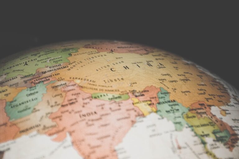
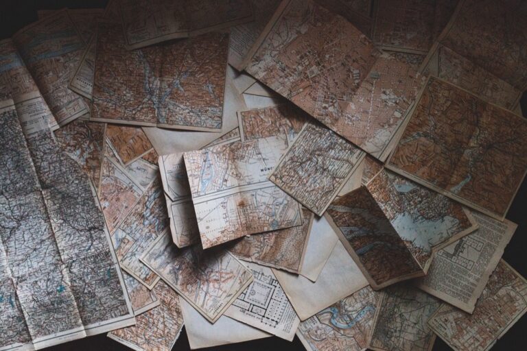
Vintage maps provide authentic cartographic foundations with historical character and visual texture. You’ll want to source maps from estate sales, antique shops, or digital archives like the Library of Congress collections. Select base maps that complement your artistic vision while ensuring the scale matches your project boundaries. Consider maps from different time periods to create temporal layers that tell evolving geographic stories. The aged paper texture and faded colors of vintage maps add instant authenticity to your mixed media compositions.
Incorporating Textured Papers and Fabrics
Textured materials add tactile dimension that enhances the visual impact of your layered map compositions. You can incorporate handmade papers, tissue paper, fabric scraps, or specialty art papers to represent different geographic features. Use burlap or canvas for rural areas, metallic papers for urban zones, and translucent vellum for water features. Layer these materials strategically to create visual hierarchy while maintaining readability of essential cartographic information. Test adhesive compatibility with different materials to ensure long-term durability of your artistic map.
Create beautiful crafts with this A4 mulberry paper. Made from natural plant fibers, these sheets offer a unique texture perfect for painting, writing, decoupage, and more.

Creating Depth with Torn Edge Techniques
Torn edge techniques generate organic boundaries that soften hard cartographic lines while creating visual depth. You’ll achieve the most natural results by tearing paper toward yourself rather than away from your body. Create varied tear patterns by adjusting paper moisture levels and tearing speed for different geographic features. Layer torn elements with slight overlaps to build dimensional depth that draws viewers into your artistic map composition. This technique works particularly well for representing coastlines, mountain ranges, or political boundaries with historical significance.
Watercolor and Ink Wash Combinations
Create vibrant watercolor art with this portable set. It includes 40 colors (metallic & fluorescent), a brush pen, watercolor paper, and more, all in a stylish tin box.

This fluid technique combines watercolor‘s natural blending properties with ink’s precise linework to create maps that feel both organic and structured.
Blending Watercolor Backgrounds for Terrain
Create atmospheric terrain representations by applying watercolor washes in gradual layers across your map base. Start with light blue-gray washes for water bodies, allowing each layer to dry completely before adding depth with darker tones. Apply warm earth tones like burnt sienna and raw umber for landmasses, using wet-on-wet techniques to achieve natural color transitions. Build elevation through color intensity—lighter washes for lowlands and deeper saturations for mountainous regions, creating an intuitive visual hierarchy that guides viewers through your geographic narrative.
Adding Fine Line Details with Ink Pens
Layer precise cartographic details over your watercolor foundation using waterproof ink pens in varying line weights. Use 0.3mm pens for major roads and boundaries, switching to 0.1mm for secondary features like trails and minor waterways. Apply cross-hatching techniques with fine nibs to indicate urban areas and dense vegetation zones. Choose archival pigment inks that won’t bleed or fade over time, ensuring your linework remains crisp against the soft watercolor background while maintaining professional cartographic standards.
Using Masking Techniques for Highlight Areas
Preserve critical map elements by applying masking fluid before watercolor washes to create clean highlight areas for text labels and important landmarks. Use liquid masking agents on roads, city names, and compass roses to maintain readable white spaces against colored backgrounds. Apply painter’s tape for straight-edged features like political boundaries or grid lines. Remove masking materials only after watercolors are completely dry, then add final ink details to these preserved areas for maximum contrast and legibility.
Three-Dimensional Relief Elements
Physical elevation transforms flat maps into tactile landscapes that invite viewers to explore terrain through touch and shadow.
Building Topography with Modeling Paste
Add texture and dimension to your art with Bluebird Modeling Paste. This high-density acrylic medium dries quickly without cracking and is ideal for sculpting on canvas, wood, and more.

Modeling paste creates realistic mountain ranges and valley systems on your artistic maps. Apply the paste with palette knives in varying thicknesses to represent elevation changes. Start with thin base layers for gentle hills and build up thicker applications for dramatic peaks. Allow each layer to dry completely before adding details. Mix the paste with acrylic paint to create colored terrain that eliminates the need for post-application painting. Focus on natural ridge patterns and watershed divisions to maintain geographic accuracy while enhancing visual impact.
Adding Raised Features with Foam Board
Lightweight yet rigid foam boards are perfect for crafts, displays, and school projects. The 3/16" thickness is easy to cut and handle.

Foam board construction allows you to create precisely cut geographic features with clean edges and consistent heights. Cut individual pieces to represent buildings, plateaus, or urban districts using craft knives and metal rulers. Layer multiple foam pieces to achieve varying elevations that correspond to actual topographic data. Seal the foam edges with acrylic medium before painting to prevent absorption and ensure smooth finishes. This technique works particularly well for architectural elements like cityscapes or historical landmarks that require geometric precision rather than organic terrain textures.
Incorporating Natural Materials Like Sand and Pebbles
Real sand and small pebbles provide authentic texture for beaches, deserts, and rocky terrain features on your maps. Mix fine sand with acrylic medium to create adhesive paste that represents coastal areas and arid regions. Apply the mixture while wet and allow natural settling patterns to emerge. Select pebbles in appropriate scales—tiny aquarium gravel works well for mountain areas while fine sand suits desert regions. Seal these materials with matte varnish to prevent shedding while preserving their natural appearance and tactile qualities.
Digital Printing with Hand-Painted Accents
Digital printing with hand-painted accents bridges the precision of modern cartographic technology with the organic warmth of traditional art media. This technique lets you combine GIS-accurate base maps with expressive painterly elements that breathe life into geographic data.
Printing Base Maps on Specialty Papers
Print your digital maps on watercolor paper or mixed media surfaces to create ideal foundations for hand-painted elements. Heavy-weight watercolor paper (140lb or higher) accepts both inkjet printing and wet media without warping or bleeding. Cotton-based papers provide superior paint adhesion compared to standard copy paper.
Set your printer to highest quality settings and use archival pigment inks for longevity. Test print small sections first to ensure your chosen paper feeds properly through your printer mechanism. Textured papers may require manual feeding to prevent jams.
Enhancing with Acrylic Paint Details
Create vibrant art with this acrylic paint set! It features 24 richly pigmented, non-toxic colors that blend easily and dry quickly on various surfaces. The tightly sealed bottles prevent leaks and drying.

Apply acrylic paint strategically to highlight specific geographic features while preserving the printed base layer’s accuracy. Use transparent glazes to tint water bodies or add atmospheric perspective to elevation changes. Opaque applications work best for emphasizing political boundaries or adding decorative cartouches.
Layer thin paint applications to build depth gradually. Start with lighter tones and add darker accents for shadows and definition. Acrylic’s quick-drying properties let you work efficiently without extended waiting periods between layers.
Combining Digital Elements with Traditional Media
Integrate printed digital elements with hand-painted sections by matching color palettes and maintaining consistent visual hierarchy. Print selected map components like street networks or topographic contours on transparent film, then overlay them onto painted backgrounds for seamless integration.
Use digital masking techniques during printing to leave specific areas blank for hand-painted features. This approach ensures your painted elements align perfectly with the digital framework while maintaining geographic accuracy throughout your artistic interpretation.
Mixed Photography and Drawing Techniques
You’ll create compelling cartographic narratives by merging photographic elements with traditional drawing methods. This hybrid approach transforms static maps into dynamic visual stories that capture both geographic accuracy and artistic expression.
Integrating Aerial Photography Backgrounds
Aerial photography provides authentic terrain foundations that enhance your map’s visual credibility. You’ll achieve optimal results by sourcing high-resolution satellite imagery from USGS Earth Explorer or Google Earth Pro, then printing these backgrounds on matte photo paper to reduce glare. Adjust contrast levels to 70-80% before printing to ensure your hand-drawn elements remain visible. Scale your aerial prints to match your intended map dimensions, typically 150-300 DPI for detailed work.
Overlaying Hand-Drawn Route Markers
Hand-drawn route markers add personalized navigation elements that complement photographic backgrounds perfectly. You’ll create distinctive pathway symbols using fine-tip archival pens in contrasting colors like bright red or orange against natural terrain tones. Draw varying line weights from 0.3mm for hiking trails to 1.0mm for major roads, ensuring your markers follow actual geographic features visible in the aerial photography. Use dotted lines for seasonal or temporary routes.
Using Photo Transfer Methods for Texture
Photo transfer techniques incorporate realistic surface textures directly onto your map’s drawing surface. You’ll apply gel medium transfers by coating printed photographs with acrylic gel medium, then burnishing the image onto watercolor paper after 24-hour drying. This method works exceptionally well for adding stone textures to urban areas or bark patterns to forested regions. Remove paper backing carefully with water and soft brushes to reveal embedded photographic details.
Textile and Thread Integration Methods
Textile integration elevates your artistic maps from flat surfaces to tactile experiences that invite touch and exploration.
Embroidering Transportation Routes
Embroidering major highways and railways transforms linear map features into raised dimensional elements. Use cotton embroidery floss in colors that contrast with your base map – deep blue for waterways and burgundy for major roads. Chain stitch creates continuous lines perfect for interstate highways, while French knots mark cities and waypoints. This technique works especially well on canvas or heavy watercolor paper that can support thread tension without warping.
Adding Fabric Patches for Regional Highlights
Adding fabric patches creates distinct visual zones that represent different geographic or cultural regions. Cut small pieces of textured fabrics like corduroy for mountain areas, silk for urban centers, and burlap for agricultural zones. Apply fabric glue sparingly around edges to prevent stiffening, then secure with small hand stitches. Choose fabrics with colors that complement your overall palette while providing enough contrast to define regional boundaries clearly.
Using String Art for Connecting Pathways
Using colored string creates flowing connections between related map elements like trade routes or migration patterns. Anchor thin cotton string with small map pins at key locations, then create gentle curves that follow natural geographic flow. Vary string thickness – use embroidery floss for major connections and sewing thread for secondary routes. This technique works particularly well for showing historical pathways or conceptual relationships between distant locations on your artistic map.
Metallic Leaf and Foil Applications
Metallic accents transform ordinary map elements into eye-catching focal points that command attention. You’ll add professional-grade brilliance to your artistic maps through strategic metallic applications.
Highlighting Water Features with Metallic Accents
Silver leaf creates stunning reflective surfaces that mimic natural water properties on your maps. Apply size adhesive in thin, even strokes along river channels and coastlines using a fine brush. Press silver leaf sheets gently with a soft cloth, burnishing edges for seamless coverage. Remove excess leaf with a dry brush, revealing shimmering waterways that catch light from multiple angles. This technique works particularly well on darker base papers where metallic contrast enhances visual depth.
Creating Compass Rose Details with Gold Leaf
Gold leaf elevates traditional compass roses into sophisticated navigational centerpieces on your artistic maps. Sketch your compass design lightly with pencil, then apply size adhesive to directional points and decorative elements. Wait until the adhesive reaches proper tack before positioning gold leaf sheets carefully over each section. Use a gilder’s brush to remove loose fragments and define sharp edges around cardinal directions. Layer multiple gold tones for dimensional effects that create authentic nautical chart aesthetics.
Adding Shimmer Effects to Important Landmarks
Metallic foil pens deliver precise shimmer accents to significant landmarks without requiring traditional leafing techniques. Select copper tones for mountain peaks and bronze for historical sites to create visual hierarchy across your map. Apply foil directly over dried paint layers, varying pressure to control metallic intensity. Highlight building outlines, monument symbols, and elevation markers with controlled strokes that enhance geographic importance. These accents guide viewers’ attention to key destinations while maintaining cartographic accuracy.
Conclusion
These seven mixed media techniques open endless possibilities for transforming ordinary maps into extraordinary works of art. You’ll discover that combining traditional materials with modern methods creates maps that engage viewers on multiple sensory levels while maintaining their navigational purpose.
Your artistic map journey doesn’t end with mastering one technique. Experiment with combining watercolor washes and metallic leaf accents or merge textile elements with digital printing for truly unique results. The beauty lies in how these methods complement each other to tell richer geographic stories.
Remember that successful artistic maps balance creativity with accuracy. Your viewers should feel inspired to explore new destinations while still being able to navigate effectively using your creation as their guide.
Frequently Asked Questions
What are artistic maps and how do they differ from traditional maps?
Artistic maps are creative interpretations of traditional cartography that blend visual artistry with geographic accuracy. Unlike standard maps focused purely on navigation, artistic maps transform cartographic information into visually captivating narratives using various artistic techniques, mixed media, and creative materials while maintaining their functional purpose.
What materials work best for creating layered paper collage maps?
Vintage maps serve as excellent base layers, providing historical character and visual texture. Incorporate textured papers, fabrics, and use torn edge techniques to create organic boundaries. These materials enhance visual impact and effectively represent different geographic features like coastlines and mountain ranges.
How do you combine watercolor and ink techniques for map creation?
Start with light watercolor washes for backgrounds – use cool tones for water bodies and warm earth tones for landmasses. Once dry, add precise line details with waterproof ink pens using varying line weights for different features. This combination creates maps that feel both organic and structured.
What are three-dimensional relief elements in artistic maps?
Three-dimensional relief elements transform flat maps into tactile landscapes using modeling paste for mountain ranges, foam board for architectural features, and natural materials like sand and pebbles for authentic textures. These elements invite viewers to explore terrain through touch and shadow.
How can digital printing be combined with hand-painted accents?
Print base maps on specialty papers like watercolor or mixed media surfaces. Use acrylic paints to enhance geographic features, building depth through layering. Match color palettes between digital and hand-painted sections, and use digital masking techniques to ensure proper alignment and geographic accuracy.
What role does photography play in artistic map creation?
Photography adds visual credibility through aerial imagery backgrounds and realistic textures via photo transfer methods. High-resolution satellite imagery provides detailed foundations, while hand-drawn route markers using archival pens add personalized navigation elements, creating dynamic visual stories.
How are textiles and threads incorporated into artistic maps?
Embroidery creates raised dimensional elements for transportation routes using contrasting cotton floss. Fabric patches represent different geographic or cultural regions, while string art connects pathways. These techniques transform flat surfaces into tactile experiences that enhance the map’s visual narrative.
What are metallic leaf and foil applications used for in artistic maps?
Metallic applications highlight key map elements – silver leaf for water features, gold leaf for compass roses, and metallic foil pens for important landmarks. These techniques create eye-catching focal points that guide viewers’ attention to key destinations while maintaining cartographic accuracy.