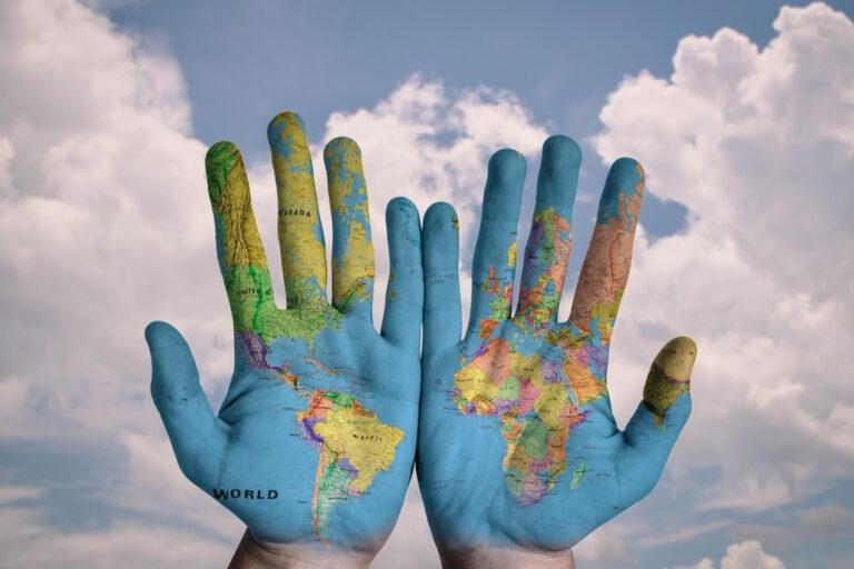
7 Ideas For Maps As Tools For Social Change That Reveal Hidden Patterns
Maps aren’t just tools for navigation anymore â they’re powerful weapons for social justice and community transformation. You’ll discover how activists data scientists and nonprofits are using cartography to expose inequality document injustice and drive meaningful policy changes across communities worldwide.
The big picture: From revealing environmental racism to tracking voter suppression these seven innovative mapping strategies show how visual data can amplify marginalized voices and create lasting social impact.
Disclosure: As an Amazon Associate, this site earns from qualifying purchases. Thank you!
Mapping Environmental Justice Issues to Expose Inequality
Environmental justice mapping reveals how pollution and climate risks disproportionately affect low-income communities and communities of color. You’ll discover patterns that traditional data analysis often misses when geographic visualization exposes these environmental inequities.
P.S. check out Udemy’s GIS, Mapping & Remote Sensing courses on sale here…
Identifying Pollution Hotspots in Underserved Communities
Pollution mapping tools help you document toxic exposure disparities across demographic boundaries. EPA’s EJSCREEN platform combines demographic data with environmental indicators like air quality indexes, proximity to hazardous waste facilities, and industrial emissions. You can layer census tract information showing income levels and racial demographics over pollution source locations to create compelling visual evidence. Community-based participatory mapping projects often use smartphones and GPS devices to crowdsource real-time air quality measurements, creating hyperlocal pollution heat maps that complement official monitoring stations.
Experience vivid content on the Galaxy A16 5G's 6.7" display and capture stunning photos with its triple-lens camera. Enjoy peace of mind with a durable design, six years of updates, and Super Fast Charging.

Tracking Climate Change Impact on Vulnerable Populations
Climate vulnerability mapping identifies which communities face the greatest risks from extreme weather and rising temperatures. NOAA’s Climate Explorer and CDC’s Environmental Public Health Tracking Network provide datasets for mapping heat islands, flood zones, and drought patterns against socioeconomic indicators. You can visualize how elderly populations in areas with limited air conditioning face higher heat-related health risks, or map flood evacuation routes in neighborhoods with fewer vehicle owners. Interactive dashboards showing sea-level rise projections over affordable housing locations demonstrate long-term displacement threats facing low-income coastal communities.
Creating Community Asset Maps to Strengthen Neighborhoods
Community asset mapping transforms neighborhoods by revealing hidden strengths and documenting valuable resources that residents can leverage for collective action.
Highlighting Local Resources and Services
Map existing community assets using platforms like Google My Maps or ArcGIS Online to catalog schools, health clinics, libraries, and community centers. Document small businesses, faith organizations, and recreational facilities that serve as neighborhood anchors. Include contact information, operating hours, and specialized services each location provides. Survey residents to identify informal resources like community gardens, tutoring services, or neighborhood watch groups that don’t appear in official databases.
Building Networks Between Community Organizations
Connect organizations through visual mapping that shows partnership opportunities and service overlaps within your neighborhood boundaries. Plot nonprofit locations, government agencies, and grassroots groups on interactive maps using tools like Mapbox or CARTO. Identify geographic gaps where residents lack access to essential services or programs. Create network diagrams that link organizations sharing similar missions, enabling collaboration on community initiatives and resource sharing agreements that strengthen collective impact.
Using Participatory Mapping to Amplify Marginalized Voices
Participatory mapping transforms residents from passive data subjects into active storytellers who control their own narratives. This collaborative approach democratizes cartography by placing mapping tools directly into community members’ hands.
Empowering Residents to Document Their Experiences
Resident-led mapping initiatives give community members direct control over documenting lived experiences that official surveys often miss. You can facilitate mapping workshops where residents use smartphones with apps like KoBo Toolbox or Survey123 to record observations about housing conditions, safety concerns, or accessibility barriers. These ground-truth accounts capture nuanced neighborhood realities that government data frequently overlooks, creating authentic visual narratives that challenge external assumptions about community needs.
Collecting Grassroots Data for Policy Advocacy
Community-generated mapping data provides compelling evidence for policy change by documenting patterns invisible to traditional research methods. You’ll find that resident-collected information about issues like illegal dumping, broken streetlights, or transportation gaps creates powerful advocacy tools when aggregated into visual formats. Platforms like Ushahidi or OpenStreetMap enable communities to build comprehensive datasets showing systematic problems across neighborhoods, giving advocates concrete evidence to present to policymakers and funding agencies.
Tracking Human Rights Violations Through Geographic Documentation
Human rights organizations increasingly rely on geographic mapping tools to document violations and create compelling evidence for international tribunals and advocacy campaigns.
Monitoring Displacement and Migration Patterns
Tracking forced migration reveals critical patterns of population movement across conflict zones and persecution areas. You can use satellite imagery analysis through platforms like Google Earth Engine or UNOSAT to identify abandoned settlements and refugee camp expansions. GPS tracking applications such as KoBo Collect enable field workers to document displacement routes and settlement conditions in real-time. Organizations like the Internal Displacement Monitoring Centre utilize these mapping techniques to quantify displacement statistics and identify vulnerable populations requiring immediate humanitarian assistance.
Track vehicles and assets with the LandAirSea 54 GPS Tracker. Get real-time location alerts and historical playback using the SilverCloud app, with a long-lasting battery and discreet magnetic mount.

Recording Conflict Zones and Safety Concerns
Documenting conflict incidents through crowdsourced mapping platforms creates comprehensive databases of human rights violations and security threats. You can deploy crisis mapping tools like Ushahidi or HumanitarianID to aggregate incident reports from multiple sources including social media, eyewitness accounts, and news reports. These platforms enable real-time visualization of violence patterns, targeting trends, and safe passage corridors. Human rights monitors use geographic clustering analysis to identify systematic persecution patterns and present evidence of coordinated attacks to international courts.
Mapping Food Deserts to Address Nutritional Inequality
Food access mapping reveals stark nutritional disparities that traditional grocery store density measurements often miss. These spatial analysis tools transform abstract food security data into compelling visual narratives that drive policy reform and community investment.
Identifying Areas Lacking Healthy Food Access
Combine census tract data with SNAP retailer databases to pinpoint food desert boundaries accurately. The USDA’s Food Access Research Atlas provides baseline measurements, but you’ll need local verification through field surveys. Use ArcGIS’s Network Analyst extension to calculate realistic travel distances, accounting for public transit limitations and walking barriers. Layer demographic data from the American Community Survey to identify vulnerable populations within these areas. Document the quality gap between available food options and nutritional standards, creating heat maps that showcase both distance-based and quality-based food insecurity patterns.
Connecting Communities with Food Resources
Overlay existing food assistance programs with identified need areas to reveal service gaps and transportation barriers. Map mobile food pantries, community gardens, and farmers markets using GPS coordinates collected through partnerships with local food banks. Create routing solutions that connect residents to multiple food sources, considering factors like operating hours and accessibility requirements. Use platforms like Google My Maps or Leaflet to build interactive resources that residents can access via smartphones. Document success stories where mapping interventions led to new grocery store locations or expanded SNAP acceptance, providing measurable outcomes that demonstrate mapping’s role in reducing nutritional inequality.
Visualizing Housing Discrimination and Gentrification Patterns
Housing discrimination and gentrification patterns reveal themselves through spatial analysis that exposes systematic inequalities affecting vulnerable communities. These mapping techniques transform housing data into visual evidence that drives policy reform and community advocacy.
Documenting Affordable Housing Shortages
Mapping affordable housing shortages requires combining HUD Fair Market Rent data with local property records to identify housing cost burden patterns. You’ll create heat maps showing areas where median rent exceeds 30% of median household income, revealing communities facing displacement pressure. Use ArcGIS Online or QGIS to overlay census tract demographics with rental listing data from sources like PadMapper API. Document the gap between available affordable units and demand by calculating housing shortage ratios for different income brackets across neighborhoods.
Tracking Neighborhood Demographic Changes
Tracking demographic shifts involves analyzing American Community Survey data across multiple time periods to visualize gentrification indicators. You’ll map changes in median income, educational attainment, and racial composition using five-year intervals to identify rapid transformation patterns. Create dot density maps showing population displacement and use change detection analysis to highlight areas experiencing over 20% demographic shifts. Tools like PolicyMap and Social Explorer provide pre-processed datasets for tracking homeownership rates, rent increases, and business turnover that signal neighborhood transition phases.
Developing Crisis Response Maps for Emergency Preparedness
Crisis mapping transforms chaotic emergency situations into coordinated response efforts through real-time spatial visualization. These strategic mapping tools enable first responders and relief organizations to make data-driven decisions during natural disasters, public health emergencies, and humanitarian crises.
Coordinating Disaster Relief Efforts
Coordinate relief operations by creating centralized command maps that track resource deployment and emergency personnel locations in real-time. Use ArcGIS Operations Dashboard or ESRI’s Emergency Management Solution to visualize shelter capacity, medical supply distribution, and evacuation route status across affected areas. Deploy mobile mapping applications like Survey123 to enable field teams to update resource availability and damage assessments instantly. Connect multiple agencies through shared mapping platforms that display unified situational awareness data, preventing duplicate efforts and ensuring critical resources reach the most urgent areas first.
Identifying At-Risk Populations During Emergencies
Identify vulnerable populations by overlaying demographic data with hazard zones to prioritize evacuation and assistance efforts. Combine census tract information showing elderly residents, disability statistics, and household income levels with flood zones, wildfire risk areas, or evacuation boundaries using tools like CDC’s Social Vulnerability Index mapping platform. Create heat maps highlighting neighborhoods with limited transportation access, language barriers, or medical dependencies that require specialized emergency support. Document population density patterns and critical infrastructure locations to ensure emergency responders can quickly locate and assist the most vulnerable community members during crisis situations.
Conclusion
These seven mapping strategies demonstrate how you can transform raw data into powerful tools for social transformation. When you combine geographic visualization with community engagement you create compelling evidence that drives meaningful policy change and resource allocation.
The future of social justice mapping lies in your ability to democratize data collection and empower marginalized communities to tell their own stories. By mastering these techniques you’ll help bridge the gap between grassroots advocacy and institutional decision-making.
Your commitment to ethical mapping practices ensures that technology serves humanity rather than exploiting vulnerable populations. Start with one mapping approach that resonates with your community’s needs and watch how visual data amplifies voices that deserve to be heard.
Frequently Asked Questions
What is social justice mapping and how does it work?
Social justice mapping uses cartography and spatial data visualization to uncover inequality, document injustices, and promote policy changes. Activists, data scientists, and nonprofits combine demographic information with various indicators to create compelling visual evidence of systemic issues affecting marginalized communities. These maps help transform complex data into accessible formats that can drive community advocacy and policy reform.
How does environmental justice mapping reveal pollution disparities?
Environmental justice mapping combines demographic data with pollution indicators to show how toxic exposure disproportionately affects low-income communities and communities of color. Tools like the EPA’s EJSCREEN platform visualize these disparities by overlaying environmental hazards with population data, providing clear evidence of environmental racism and supporting arguments for protective policy interventions.
What is community asset mapping and why is it important?
Community asset mapping identifies and catalogs local resources, strengths, and organizations within neighborhoods to foster collaboration and collective action. Using platforms like Google My Maps or ArcGIS Online, communities can document schools, health clinics, community centers, and informal resources. This approach transforms deficit-focused narratives into strength-based strategies that enhance community resilience and partnership opportunities.
How does participatory mapping empower communities?
Participatory mapping enables residents to document their lived experiences and become active storytellers of their neighborhoods. Through mapping workshops and tools like KoBo Toolbox, community members capture nuanced realities about housing conditions, safety concerns, and accessibility issues often overlooked by official surveys. This grassroots data collection provides compelling evidence for policy advocacy and funding requests.
How do human rights organizations use mapping for documentation?
Human rights organizations use geographic mapping tools to track violations, forced migration patterns, and conflict incidents. Through satellite imagery analysis and crowdsourced platforms like Ushahidi, they create comprehensive databases of violations and displacement statistics. These visual documentation methods provide crucial evidence for international tribunals and help identify vulnerable populations needing immediate humanitarian assistance.
What is food access mapping and how does it address inequality?
Food access mapping reveals nutritional disparities by analyzing spatial relationships between demographics and food availability. By combining census data with SNAP retailer databases, researchers can accurately identify food desert boundaries and document quality gaps between available options and nutritional standards. These maps help drive policy reform and community investment in food security initiatives.
How does housing discrimination mapping expose systematic inequalities?
Housing discrimination mapping visualizes gentrification patterns and affordable housing shortages through spatial analysis. By combining HUD Fair Market Rent data with property records and demographic information, these maps reveal displacement pressure and rapid neighborhood transformation patterns. Tools like PolicyMap help document the gap between affordable housing supply and demand, supporting community advocacy efforts.
What role does crisis response mapping play in emergency situations?
Crisis response mapping transforms emergency situations into coordinated relief efforts through real-time spatial visualization. These tools help first responders and relief organizations make data-driven decisions by creating centralized command maps that track resource deployment, identify at-risk populations, and coordinate disaster relief efforts. This ensures priority assistance reaches the most vulnerable community members during crises.