7 Artistic Ideas for Data Visualization in Maps That Create Visual Impact
Why it matters: Traditional maps filled with boring bar charts and pie graphs don’t capture attention or tell compelling stories with your data.
The big picture: Creative data visualization transforms complex geographic information into visually stunning maps that engage audiences and make insights instantly clear.
What’s next: These seven artistic approaches will help you turn raw datasets into beautiful interactive maps that inform and inspire viewers.
Disclosure: As an Amazon Associate, this site earns from qualifying purchases. Thank you!
P.S. check out Udemy’s GIS, Mapping & Remote Sensing courses on sale here…
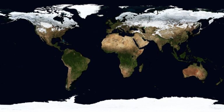
Heat Maps With Gradient Color Schemes
Heat maps transform raw data into intuitive visual narratives through strategic color application. You’ll create compelling geographic stories when you master gradient color schemes that guide viewers naturally through data intensity patterns.
Temperature-Based Color Palettes
Temperature-based gradients provide immediate visual context for your heat map interpretations. You’ll achieve optimal results using cool blues for low values transitioning through yellows to hot reds for peak intensities. This familiar color progression leverages viewers’ natural associations with thermal imagery. Consider using ColorBrewer’s sequential schemes like YlOrRd or Plasma for scientific datasets requiring precise temperature correlations. Your gradient intervals should maintain consistent mathematical progression to avoid misleading data interpretations across temperature ranges.
Population Density Visualizations
Population density mapping requires careful gradient selection to highlight settlement patterns effectively. You’ll want to use single-hue progressions like light yellow to deep orange for urban density visualization. This approach prevents color confusion while maintaining clear hierarchical data representation. Census tract boundaries often create visual noise so apply transparency settings between 60-80% for your population layers. Your color breaks should follow natural population clustering patterns rather than equal intervals to reveal meaningful demographic concentrations.
Economic Activity Intensity Mapping
Economic activity visualization demands gradient schemes that communicate business concentration intuitively. You’ll create impactful economic maps using purple-to-yellow gradients that emphasize commercial hotspots without overwhelming baseline areas. Revenue density data works particularly well with diverging color schemes centered on regional economic averages. Consider logarithmic scaling for economic datasets spanning multiple orders of magnitude. Your gradient application should account for temporal economic fluctuations by incorporating confidence intervals into your color classification methodology.
3D Terrain and Elevation Data Displays
You’ll transform flat geographic data into compelling three-dimensional visualizations that reveal Earth’s topographic complexities. These elevation-based displays create immediate spatial understanding that traditional 2D maps can’t achieve.
Topographic Relief Representations
Contour-based relief mapping showcases elevation changes through carefully spaced interval lines that follow terrain features. You’ll enhance these displays using digital elevation models (DEMs) from USGS or NASA SRTM data sources. Modern GIS software like ArcGIS Pro and QGIS generate smooth contour lines at customizable intervals – typically 10-foot or 20-foot spacing for detailed topographic work. Hillshade techniques add realistic shadow effects that emphasize ridges and valleys, creating depth perception through light-angle manipulation.
Mountain Range Height Visualizations
Peak-to-valley mapping emphasizes dramatic elevation differences using color-coded height scales and exaggerated vertical profiles. You’ll apply hypsometric tinting – a cartographic technique using green-to-brown-to-white color progressions that intuitively represent sea level to summit transitions. 3D perspective rendering transforms elevation data into flyover-style visualizations using tools like Blender GIS or ArcScene. Consider vertical exaggeration factors between 2x-5x to enhance mountain prominence while maintaining geographic accuracy for effective visual storytelling.
Ocean Depth and Bathymetric Charts
Underwater topography mapping reveals seafloor features through negative elevation data from NOAA’s bathymetric surveys and multibeam sonar datasets. You’ll create depth visualizations using blue-to-purple color schemes that darken with increasing depth – following international hydrographic standards. Submarine canyon rendering highlights underwater geological formations through contour intervals at 50-meter to 200-meter spacing. Modern bathymetric tools like MB-System process raw sonar data into publication-ready depth charts that reveal oceanic mountain ranges and abyssal plains.
Flow Maps Showing Movement and Migration Patterns
Flow maps transform movement data into compelling visual narratives that reveal how people, goods, and transportation systems connect across geographic space. These dynamic visualizations use directional lines, arrows, and varying line weights to represent the volume and direction of flows between origins and destinations.
Population Migration Streams
Migration flow maps use proportional arrows and curved flow lines to visualize human movement patterns across regions and time periods. You’ll achieve optimal clarity by varying line thickness based on migration volume—thicker lines for major population streams, thinner ones for smaller flows. Color-coding by time periods or migration types helps distinguish between refugee movements, economic migration, and internal displacement patterns. Census data and immigration statistics provide the most reliable datasets for these visualizations.
Trade Route Visualizations
Commercial flow mapping reveals global supply chains and economic relationships through weighted directional vectors connecting trading partners. You should scale line width proportionally to trade volume values, using logarithmic scaling for datasets spanning multiple orders of magnitude. Implement color schemes that differentiate commodity types—blue for manufactured goods, green for agricultural products, brown for raw materials. World Bank trade statistics and customs data offer authoritative sources for accurate commercial flow representations.
Transportation Network Flows
Transit flow visualization maps passenger and freight movement across transportation infrastructure using animated or static directional indicators. You’ll capture traffic density by varying line opacity and thickness based on vehicle counts or passenger volumes. Multi-modal networks require distinct visual treatments—solid lines for highways, dashed lines for rail corridors, dotted patterns for shipping routes. Transportation agencies and logistics companies provide detailed flow data through API access and public datasets.
Choropleth Maps With Creative Color Coding
Choropleth mapping transforms statistical data into compelling visual stories through strategic color application across geographic boundaries. You’ll discover how creative color schemes can elevate standard regional data displays into engaging artistic visualizations that maintain statistical accuracy.
Statistical Data by Geographic Regions
Statistical choropleth maps require diverging color palettes to highlight data variations across administrative boundaries effectively. You’ll achieve optimal results using sequential color schemes for continuous variables like income levels or education rates. ColorBrewer provides scientifically-tested palettes that ensure accessibility for colorblind viewers while maintaining visual hierarchy. Consider using bivariate choropleth techniques to display two related variables simultaneously through color mixing. Population-adjusted choropleth maps prevent misleading interpretations by normalizing raw counts against geographic area or population density.
Election Results and Political Boundaries
Election mapping demands careful color selection to avoid partisan bias while clearly communicating voting patterns across districts. You’ll want to employ neutral color schemes like purple-to-orange gradients instead of traditional red-blue combinations for balanced visual representation. Cartogram techniques can resize geographic areas proportional to voter turnout or population to prevent visual distortion. Multi-party election results benefit from categorical color palettes with high contrast ratios. Consider using transparency overlays to show margin of victory while maintaining base geographic reference information for enhanced context.
Demographic Distribution Patterns
Demographic choropleth visualizations excel when combining age, ethnicity, or socioeconomic data with carefully chosen color progressions that respect cultural sensitivities. You’ll create more inclusive maps by avoiding color associations that might reinforce stereotypes or cultural biases. Dot density overlays complement choropleth fills by showing population distribution within larger administrative areas. Multi-temporal demographic maps require consistent color scaling across time periods to enable accurate comparison. Population pyramid integration with choropleth mapping provides comprehensive demographic storytelling through linked visualization techniques that reveal both spatial and structural population characteristics.
Dot Density Maps for Population Distribution
Dot density mapping represents one of the most intuitive methods for visualizing population distribution across geographic areas. Each dot represents a specific number of people, creating immediate visual understanding of where populations concentrate or disperse across your mapped region.
Urban vs Rural Population Clusters
Urban population clusters emerge clearly through dot density visualization, with concentrated dot patterns revealing metropolitan areas and suburban growth corridors. You’ll notice distinct clustering around city centers, with gradual dispersal toward periphery zones. Rural areas display scattered dot patterns that highlight agricultural communities, small townships, and isolated settlements. Use consistent dot values between 100-1,000 people per dot depending on your study area’s total population to maintain visual clarity and prevent overcrowding in dense urban zones.
Resource Location Mapping
Resource distribution patterns become immediately apparent when you apply dot density techniques to mineral deposits, water sources, or agricultural assets. Each dot represents a quantified resource unit – whether it’s oil wells, mining sites, or fertile farmland parcels. You can overlay multiple resource types using different dot colors and sizes, creating comprehensive resource inventory maps. Consider using graduated dot sizes to represent resource quality or extraction volume, with larger dots indicating higher-value deposits or more productive sites.
Event Occurrence Frequency
Event frequency visualization through dot density mapping transforms temporal data into spatial understanding, with each dot representing crime incidents, disease outbreaks, or natural disasters within specific time periods. You’ll create powerful analytical tools by adjusting dot values to represent weekly, monthly, or annual occurrence rates. Use temporal animation sequences to show how event patterns shift over time, revealing seasonal trends or emerging hotspots that require attention from planning authorities or emergency response teams.
Isoline Maps for Continuous Data Representation
Isolines create smooth curves connecting points of equal value, transforming continuous data into elegant visual patterns that reveal gradual transitions across geographic space. You’ll find these maps particularly effective for atmospheric, environmental, and geological data where phenomena change gradually rather than abruptly.
Weather Pattern Contours
Weather Pattern Contours transform meteorological data into flowing lines that reveal atmospheric dynamics across your study area. You can create isobars connecting equal pressure points using NOAA’s surface analysis data, spacing contour intervals at 4-millibar increments for standard synoptic maps. Temperature isotherms work best with 5-degree intervals, while precipitation isohyets require careful consideration of local topography. QGIS’s contour tool generates smooth curves from point weather station data, though you’ll need to apply Gaussian smoothing to eliminate artificial peaks caused by sparse station networks.
Get real-time weather data with the Ambient Weather WS-2902. This WiFi-enabled station measures wind, temperature, humidity, rainfall, UV, and solar radiation, plus it connects to smart home devices and the Ambient Weather Network.

Pollution Level Gradients
Pollution Level Gradients reveal contamination patterns through continuous contour lines that connect areas of equal pollutant concentration. You’ll achieve optimal results using EPA’s Air Quality System data, creating isopleth maps for PM2.5 concentrations at 5-microgram intervals. Inverse distance weighting interpolation works well for sparse monitoring networks, though kriging provides superior accuracy when you have sufficient sample points. Color your isolines using sequential schemes from yellow to deep red, ensuring 5-10 contour classes maintain visual clarity while highlighting dangerous pollution thresholds above WHO guidelines.
Seismic Activity Zones
Seismic Activity Zones emerge through isoseismal lines connecting points of equal earthquake intensity, revealing how ground motion decreases with distance from epicenters. You can generate these contours using USGS ShakeMap data, applying Modified Mercalli Intensity scales with half-step intervals for detailed zonation. Peak ground acceleration isolines require logarithmic spacing due to exponential decay patterns, typically using intervals of 0.1g, 0.2g, and 0.5g. ArcGIS’s Spatial Analyst extension handles the complex interpolation needed for seismic data, though manual adjustment near fault zones ensures geological accuracy.
Interactive Timeline Maps Showing Change Over Time
Interactive timeline maps transform temporal data into dynamic visualizations that reveal how geographic patterns evolve across years, decades, or centuries. You’ll create compelling narratives by combining spatial data with time controls that allow viewers to explore changes at their own pace.
Historical Boundary Evolution
Historical boundary evolution maps showcase political transformations through interactive temporal controls that reveal territory changes over time. You’ll integrate archival cartographic data with modern GIS techniques to create accurate temporal sequences. Use standardized historical atlas datasets from sources like the Digital Collaboration for Medieval and Early Modern Studies (DigiMap) for reliable boundary information. Implement slider controls or step-through animations to display territorial changes during specific periods. Your visualization should maintain consistent projection systems across time periods and include popup annotations explaining key political events that triggered boundary modifications.
Climate Change Progression
Climate change progression maps utilize time-series environmental data to visualize long-term atmospheric and surface changes across geographic regions. You’ll combine NOAA’s Global Historical Climatology Network data with NASA’s Earth Observing System datasets to create accurate temporal visualizations. Implement graduated color schemes that clearly show temperature increases, precipitation changes, or sea level rise over decades. Use animation controls that allow viewers to observe gradual changes or rapid climate events. Your maps should include uncertainty indicators for projected future scenarios and reference baseline periods for accurate change calculations.
Urban Development Growth Patterns
Urban development growth patterns reveal city expansion through satellite imagery time-lapse integration and demographic data visualization techniques. You’ll source historical aerial photography from USGS Earth Explorer combined with contemporary high-resolution satellite data to track urbanization patterns. Create boundary overlays showing development phases with distinct color coding for residential, commercial, and industrial zones. Implement zoom functionality that maintains detail at multiple scales while preserving temporal accuracy. Your visualization should include population density indicators and transportation network evolution to provide comprehensive urban growth context for planning applications.
Conclusion
These seven artistic visualization techniques give you the power to transform boring spreadsheets into captivating geographic stories. Whether you’re mapping population flows or tracking climate changes over decades your data deserves more than basic charts.
Remember that effective data visualization isn’t just about making pretty pictures—it’s about making complex information accessible and memorable. Your audience will connect with visual narratives far better than they’ll engage with raw numbers.
Start experimenting with these techniques today. Pick one method that aligns with your current project and watch how artistic data visualization transforms your geographic insights into compelling visual experiences that truly resonate with viewers.
Frequently Asked Questions
What are the main limitations of traditional data visualization methods?
Traditional data visualization methods like bar charts and pie graphs often fail to engage audiences effectively. They struggle to present complex geographic information in a way that clearly conveys insights and captures viewer attention. These static formats lack the visual appeal and intuitive understanding that modern interactive maps can provide.
How do heat maps with gradient color schemes improve data visualization?
Heat maps with gradient color schemes create intuitive visual narratives by using familiar color progressions, such as cool blues to hot reds, to represent data intensity. Temperature-based color palettes enhance interpretation by leveraging natural color associations, making it easier for viewers to understand data patterns at a glance.
What are the benefits of 3D terrain and elevation data displays?
3D terrain and elevation displays reveal Earth’s topographic complexities, offering spatial understanding that traditional 2D maps cannot achieve. They utilize digital elevation models (DEMs) to create smooth contour lines and realistic shadow effects through hillshade techniques, providing a more comprehensive view of geographic features.
How do flow maps enhance geographic data visualization?
Flow maps transform movement data into compelling visual narratives that reveal connections across geographic space. They use directional lines, arrows, and varying line weights to represent the volume and direction of flows, making patterns in migration, trade routes, and transportation networks immediately visible and understandable.
What makes choropleth mapping effective for statistical data?
Choropleth mapping transforms statistical data into visual stories through strategic color application across geographic boundaries. It uses diverging color palettes to highlight data variations and sequential color schemes for continuous variables, making complex statistical information accessible and engaging for viewers.
How does dot density mapping visualize population distribution?
Dot density mapping uses individual dots to represent specific numbers of people, allowing for immediate visual understanding of population concentrations. Each dot placement reveals urban clusters versus rural distributions, making population patterns intuitive and easy to interpret across different geographic areas.
What are isoline maps and when should they be used?
Isoline maps create smooth curves connecting points of equal value, making them particularly effective for atmospheric, environmental, and geological data. They’re ideal for visualizing continuous data like weather patterns, pollution levels, and seismic activity zones where smooth transitions between values are important.
How do interactive timeline maps enhance data storytelling?
Interactive timeline maps transform temporal data into dynamic visualizations, showcasing how geographic patterns evolve over time. They combine spatial and temporal data to create engaging narratives about historical boundary changes, climate progression, and urban development, providing deeper insights than static maps.