7 Best Map Typography Techniques for Visual Impact
The big picture: Map typography isn’t just about labeling cities and roads—it’s a critical design element that can make or break your entire visual experience. Poor font choices create cluttered confusion while strategic typography guides users effortlessly through complex geographic information.
Why it matters: Whether you’re designing a navigation app or creating infographics every typographic decision affects readability usability and overall aesthetic appeal. Smart designers know that mastering map typography separates amateur work from professional-grade cartographic design.
Disclosure: As an Amazon Associate, this site earns from qualifying purchases. Thank you!
Typography Establishes Visual Hierarchy and Information Priority
Typography serves as your primary tool for organizing spatial information and guiding users through complex cartographic data. Strategic font choices create distinct information layers that prevent visual confusion while maintaining map readability.
P.S. check out Udemy’s GIS, Mapping & Remote Sensing courses on sale here…
Primary Label Prominence Through Font Size Variation
Primary labels require 14-18 point fonts to establish immediate visual dominance on your maps. Major cities like New York or Los Angeles demand this prominence to anchor user navigation and provide geographic reference points. You’ll achieve optimal hierarchy when primary labels are 2-3 times larger than secondary text, creating clear distinction between major features and supporting information across your cartographic design.
Secondary Information Layering With Font Weight
Secondary labels benefit from medium or semi-bold weights that maintain visibility without competing with primary elements. State names, major highways, and regional features require this intermediate emphasis to support navigation while preserving visual balance. You’ll find that 400-600 font weights provide sufficient contrast against regular text while avoiding the visual heaviness that disrupts your map’s information flow.
Tertiary Details Using Font Style Differentiation
Tertiary information utilizes italic or condensed styles to convey supporting details without cluttering your map’s primary message. Small towns, minor roads, and geographic annotations work effectively in these differentiated styles. You’ll maintain readability by keeping tertiary labels at 8-10 points while using consistent styling that creates subtle visual separation from more prominent map elements.
Typography Enhances Readability Across Different Map Scales
Scale-responsive typography ensures your map labels remain legible and functional as users zoom in and out. The relationship between font size, character spacing, and resolution becomes critical when designing maps that work across multiple viewing levels.
Optimal Font Selection for Zoom Level Transitions
You’ll need fonts that maintain clarity at both high and low zoom levels for effective map communication. Sans-serif typefaces like Helvetica and Open Sans perform exceptionally well at small scales, while serif fonts like Georgia provide better readability when zoomed in for detailed viewing. Choose fonts with multiple weights and styles within the same family to maintain visual consistency across zoom transitions. Your font selection should prioritize geometric clarity over decorative elements, ensuring place names remain distinguishable even when rendered at 6-point sizes on mobile devices.
Character Spacing Adjustments for Scale Changes
You must adjust letter spacing (tracking) dynamically as users change zoom levels to prevent text overlap and maintain readability. Increase character spacing by 0.1-0.2 em units when zooming out to smaller scales, allowing individual letters to breathe and remain distinct. Conversely, tighten spacing slightly at larger scales to prevent text from appearing too loose or disconnected. Your spacing adjustments should account for different label types – highway markers need tighter spacing than city names to fit within road corridors effectively.
Legibility Maintenance at Varying Resolutions
You need consistent stroke weights and clear character forms that render properly across different screen densities and print resolutions. Design your typography system to handle everything from 72 DPI mobile screens to 300 DPI print materials without losing clarity. Use fonts with sufficient x-height ratios and avoid thin stroke weights that disappear at small sizes or low resolutions. Your text rendering should include proper hinting and anti-aliasing settings to ensure smooth character edges across all display types and zoom levels.
Typography Creates Visual Balance and Spatial Organization
Typography anchors your map’s visual structure by establishing clear spatial relationships between geographic elements. Your font choices directly influence how readers navigate complex cartographic information and maintain visual equilibrium across diverse map regions.
Text Placement Strategies for Balanced Compositions
Strategic label positioning creates visual stability by distributing textual weight evenly across your map canvas. You’ll achieve optimal balance by placing major city labels in opposing quadrants while keeping water body names centered within their boundaries. Position linear feature labels—such as river and road names—parallel to their geographic elements to maintain directional flow. Avoid clustering multiple labels in single map areas, which creates visual heaviness and disrupts compositional harmony.
Font Distribution Techniques Across Map Regions
Systematic font allocation prevents visual overcrowding by establishing consistent typographic patterns throughout different map zones. You should assign specific typefaces to geographic categories: sans-serif fonts for urban areas, serif fonts for historical regions, and condensed fonts for dense coastal zones. Distribute font weights proportionally—use bold typography sparingly in high-density areas while employing regular weights in open spaces. This approach ensures each map region maintains appropriate visual density without overwhelming neighboring areas.
White Space Management Through Typographic Choices
Effective white space control enhances map readability by creating breathing room around critical geographic information. You can maximize negative space by selecting condensed typefaces for lengthy place names and using smaller font sizes for secondary labels. Position text strategically within natural geographic breaks—such as water bodies or mountain ranges—to preserve visual clarity. Maintain consistent letter spacing and line height to prevent typographic elements from competing with cartographic features for visual attention.
Typography Reinforces Brand Identity and Design Consistency
Typography serves as your visual signature across all cartographic projects, establishing immediate brand recognition while maintaining professional standards throughout your mapping portfolio.
Custom Typeface Integration for Brand Recognition
Custom typefaces differentiate your mapping brand from competitors while ensuring consistent visual identity. You’ll create stronger brand recall when you develop or license exclusive fonts for your cartographic work. Organizations like National Geographic and Google Maps leverage proprietary typefaces to establish instant recognition across their mapping platforms. Your custom typography choices should reflect your brand’s personality—whether technical and precise for engineering maps or approachable and clean for consumer navigation products.
Color Palette Coordination With Typography
Color coordination between typography and map elements creates cohesive visual systems that strengthen brand identity. You’ll achieve professional consistency by establishing specific color relationships between text and cartographic features. Your brand colors should extend beyond background elements to include carefully selected text colors that maintain readability while reinforcing visual identity. Consider developing a systematic approach where primary brand colors appear in major labels, secondary colors highlight important features, and neutral tones support tertiary information without competing for attention.
Style Guide Implementation Across Map Series
Master the art of concise writing with The Elements of Style. This classic guide offers clear rules and principles for effective communication.

Style guides ensure typography consistency across multiple maps and cartographic products within your brand ecosystem. You’ll maintain professional standards by documenting specific font selections, sizing hierarchies, and color applications for different map types and scales. Your comprehensive style guide should include character spacing specifications, weight variations for different information levels, and approved color combinations that work across digital and print applications. This systematic approach prevents typography inconsistencies that can weaken brand recognition and confuse users navigating between different maps in your portfolio.
Typography Guides User Navigation and Wayfinding
Master the art of typography with this comprehensive guide. Learn to set perfect type with clear explanations and practical examples.

Typography functions as your map’s primary navigation system, directing users through spatial information with the same precision as street signs guide drivers through city intersections.
Directional Text Placement for Route Guidance
Directional text placement creates intuitive navigation flows by positioning route labels along the natural reading direction of pathways. You’ll achieve optimal wayfinding by placing highway names parallel to road segments and positioning turn-by-turn instructions at decision points. Strategic text rotation between 15-45 degrees maintains readability while following curved routes, ensuring drivers can quickly identify their intended path without breaking visual flow.
Landmark Emphasis Through Strategic Font Choices
Landmark emphasis relies on distinctive typography to establish visual anchors that users recognize instantly during navigation. You should apply bold weights and increased font sizes to major landmarks like airports, hospitals, and universities, making them 20-30% larger than surrounding labels. Sans-serif typefaces with strong character definition work best for landmark identification, while maintaining consistent spacing prevents visual clutter around high-traffic navigation points.
Contextual Typography for Location-Based Information
Contextual typography adapts information density to match user proximity and navigation needs at different geographic scales. You’ll need to implement progressive disclosure through font sizing, displaying detailed business names and addresses only at street level while showing broader district labels at city scale. Color-coded typography systems help users distinguish between residential areas, commercial zones, and transportation networks, creating instant visual context for location-based decision making.
Typography Conveys Geographic and Cultural Context
Map typography extends beyond legibility to communicate deeper cultural meanings and geographic authenticity. Your font choices can instantly signal regional identity and historical context to users.
Regional Font Selection for Cultural Authenticity
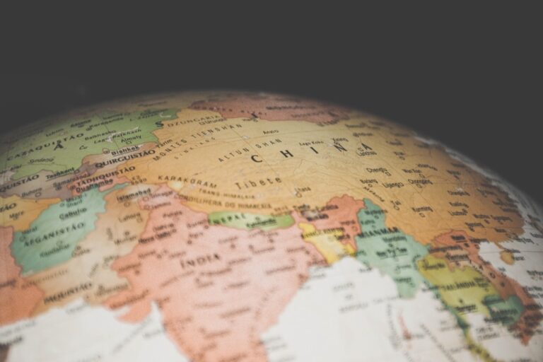
Regional typefaces establish immediate cultural connections through carefully selected fonts that reflect local design traditions. You’ll find success using serif fonts like Trajan Pro for Roman archaeological sites or brush-style typefaces for East Asian regions. Nordic maps benefit from clean, minimalist sans-serif fonts like Futura, while Mediterranean regions work well with warmer, humanist typefaces. Traditional cultural scripts alongside Latin characters create authentic multilingual experiences that respect local writing systems.
Language-Specific Typography Considerations
Language-specific typography requires technical adjustments for optimal readability across different writing systems. You’ll need increased line spacing for Arabic and Hebrew right-to-left text, while Chinese and Japanese characters demand larger minimum font sizes (typically 12-14 points) for clarity. Diacritical marks in European languages require additional vertical spacing, and Thai or Vietnamese text needs specialized font selections that support complex character combinations. Unicode compliance ensures proper character rendering across all supported languages.
Historical Period Representation Through Type Styles
Historical typography choices communicate specific time periods through authentic typeface selections that match cartographic eras. You’ll achieve Renaissance-era authenticity using fonts like Centaur or Bembo, while Victorian maps benefit from ornate serif typefaces with decorative elements. Art Deco period maps work best with geometric sans-serif fonts like Futura or Gotham. Modern digital mapping maintains historical accuracy by avoiding anachronistic font choices that would confuse temporal context for educational or historical reconstruction projects.
Typography Affects Emotional Response and User Experience
Map typography directly influences how users feel about your cartographic work and shapes their interaction with spatial information. Professional typographic choices create emotional connections that enhance user engagement and navigation confidence.
Mood Creation Through Typographic Personality
Serif fonts generate traditional and authoritative feelings in historical or educational maps. Times New Roman and Georgia establish scholarly credibility for academic cartography, while decorative serifs like Trajan Pro convey heritage and permanence for cultural mapping projects.
Sans-serif typefaces create modern and approachable atmospheres for contemporary navigation systems. Helvetica and Arial project clean professionalism in urban planning maps, while rounded fonts like Nunito establish friendly accessibility for recreational trail guides and tourist maps.
Trust Building With Professional Font Choices
System fonts establish immediate credibility through familiar recognition patterns. Arial, Calibri, and Helvetica leverage users’ existing trust relationships with established digital interfaces, reducing cognitive load and increasing map acceptance rates among professional audiences.
Consistent font families throughout map series build institutional confidence. National Geographic’s custom Minion Pro creates recognizable authority across publications, while USGS standardized fonts ensure government mapping reliability and establish visual continuity across different scale products.
Accessibility Enhancement Through Inclusive Typography
High contrast typography combinations improve readability for visually impaired users. Black text on white backgrounds achieves 21:1 contrast ratios exceeding WCAG AA standards, while avoiding problematic red-green color dependencies ensures colorblind accessibility across demographic groups.
Scalable font sizing accommodates diverse viewing conditions from mobile screens to large format prints. Minimum 12-point fonts for body text and 16-point labels for primary features ensure legibility across devices, while adjustable text scaling maintains usability for aging populations and vision-assisted users.
Conclusion
Typography serves as the invisible foundation that transforms your maps from simple graphics into powerful communication tools. When you master these seven typographic principles you’ll create designs that don’t just look professional—they’ll guide users intuitively through complex spatial information.
Achieve a flawless, even complexion with e.l.f. Flawless Satin Foundation. This lightweight, vegan formula provides medium coverage and a semi-matte finish for all-day wear, while hydrating your skin with glycerin.

Your font choices will ultimately determine whether users trust your cartographic work or abandon it in frustration. The difference between amateur and expert map design often comes down to these subtle typographic decisions that most people never consciously notice but always feel.
Remember that every text element on your map should earn its place through strategic purpose and visual harmony. Your typography isn’t just decoration—it’s the bridge between raw geographic data and meaningful user experience.
Frequently Asked Questions
What is map typography and why is it important?
Map typography refers to the art and science of selecting and arranging fonts on maps to enhance readability and user experience. It’s crucial because poor font choices can lead to confusion and navigation errors, while effective typography creates clear visual hierarchy, guides users through complex information, and distinguishes professional cartographic design from amateur work.
How do I choose the right font size for different map elements?
Use 14-18 point fonts for primary labels like major cities to ensure they stand out. Secondary elements such as state names and highways should use medium or semi-bold weights at moderate sizes. Tertiary details like street names work best at 8-10 points using italic or condensed styles to maintain clarity without cluttering.
What are the best font types for different map zoom levels?
Sans-serif typefaces work best for small-scale maps as they remain legible at reduced sizes. Serif fonts are ideal for detailed viewing at larger scales. Always ensure consistent stroke weights and clear character forms across different zoom levels, and adjust character spacing dynamically to prevent text overlap.
How does typography create visual hierarchy on maps?
Typography establishes information priority through size variation, weight differences, and style choices. Larger, bolder fonts draw attention to primary elements, while smaller, lighter fonts handle secondary information. This hierarchy guides users naturally through the map’s spatial information, making navigation intuitive and efficient.
How can typography reinforce brand identity in maps?
Custom typefaces serve as visual signatures that differentiate mapping brands and enhance recognition. Coordinate color palettes with typography to create cohesive visual systems. Develop comprehensive style guides documenting font selections, sizing hierarchies, and color applications to maintain consistency across all cartographic products and strengthen brand identity.
What role does typography play in cultural and geographic context?
Typography can signal regional identity and historical context through strategic font choices. Use serif fonts for classical Roman sites, brush-style typefaces for East Asian regions, and period-appropriate fonts for historical maps. Consider language-specific requirements like increased line spacing for right-to-left languages and larger sizes for Chinese characters.
Explore history's most significant maps with *Great Maps*. This book delves into cartographic masterpieces and their historical context.

How do I ensure my map typography is accessible?
Implement high-contrast typography combinations to improve readability for visually impaired users. Use scalable font sizing that accommodates diverse viewing conditions and screen densities. Maintain clear character forms and adequate spacing between text elements. Test your typography across different devices and lighting conditions to ensure universal accessibility.
What are common typography mistakes to avoid in map design?
Avoid overcrowding text elements, using too many different font families, or neglecting visual hierarchy. Don’t use fonts that are too small or lack contrast with the background. Prevent text overlap by managing character spacing properly, and avoid inconsistent styling that can confuse users and undermine professional credibility.