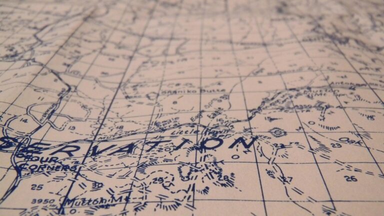
7 Best Map Design Typography Tips
Typography can make or break your map design — and most cartographers get it wrong. Your choice of fonts affects everything from readability at different zoom levels to the overall user experience when people navigate your maps. Getting typography right means understanding how text hierarchy visual weight and spacing work together to guide your audience through complex geographic information seamlessly.
Disclosure: As an Amazon Associate, this site earns from qualifying purchases. Thank you!
Choose the Right Font Family for Map Readability
Font family selection directly affects how users interact with your maps and determines whether critical geographic information reaches its intended audience.
Sans-Serif Fonts for Modern Digital Maps
Sans-serif fonts like Helvetica, Arial, and Open Sans deliver superior screen readability across multiple zoom levels and device types. These fonts maintain consistent stroke width and eliminate decorative elements that can pixelate or blur on digital displays. You’ll find that sans-serif typefaces render cleanly at small sizes while preserving legibility when users zoom into detailed street-level views.
P.S. check out Udemy’s GIS, Mapping & Remote Sensing courses on sale here…
Serif Fonts for Traditional Print Maps
Serif fonts including Times New Roman, Georgia, and Minion Pro excel in high-resolution print applications where fine detail reproduction supports extended reading sessions. The serif edges guide the eye naturally along horizontal text strings and enhance character distinction in dense label clusters. Professional cartographers choose serif fonts for atlases, wall maps, and technical documentation where print quality allows full serif detail to enhance readability.
Avoiding Decorative Fonts That Compromise Legibility
Decorative fonts sacrifice readability for visual appeal and create accessibility barriers for users with visual impairments or reading difficulties. Script fonts, display typefaces, and ornamental lettering styles become illegible at typical map viewing distances and fail to maintain clarity across different output formats. You should reserve decorative typography only for map titles or headers where large size allows clear character recognition.
Establish a Clear Typographic Hierarchy
Effective map typography requires systematic hierarchy development that guides users through information layers with visual clarity and logical structure.
Using Font Size to Indicate Information Priority
Size differentiation creates immediate visual hierarchy in map typography systems. Major cities typically use 12-14pt fonts while smaller towns display at 8-10pt sizes. Country names command 16-18pt fonts for continental-scale maps. Ocean labels often span 20-24pt sizes due to their extensive coverage areas. You’ll establish clear reading patterns when size differences exceed 2pt increments between hierarchy levels.
Implementing Font Weight for Visual Organization
Font weight variations organize map elements through systematic boldness applications across geographic features. Bold weights highlight capital cities and major highways while regular weights display secondary roads and smaller settlements. Medium weights bridge the gap for state capitals and regional centers. You’ll create effective visual separation when weight differences span at least two increments (regular to bold rather than regular to medium).
Creating Distinction Between Major and Minor Labels
Label distinction requires combining multiple typographic variables to separate primary geographic features from supporting information. Major rivers use bold sans-serif fonts at 10pt while tributaries display regular weight at 8pt. Mountain ranges appear in all-caps bold formatting while individual peaks use title case regular text. You’ll achieve optimal readability when major labels maintain 150% size difference over minor elements.
Optimize Font Size for Different Map Scales
Font size optimization directly impacts map usability across different viewing scales. You’ll need to adjust typography systematically as your map scale changes to maintain consistent readability and visual hierarchy.
Large Scale Maps and Detailed Text Requirements
Large scale maps displaying limited geographic areas require generous font sizing to accommodate detailed labeling. You should use 12-14 point fonts for primary features like street names and major landmarks, allowing readers to process dense information layers without eye strain. Detailed urban maps benefit from 10-12 point sizing for secondary features such as building numbers and point-of-interest labels, ensuring comprehensive information remains legible during close examination.
Small Scale Maps and Condensed Typography
Small scale maps covering extensive geographic regions demand compact typography to prevent text overcrowding. You’ll achieve optimal results using 8-10 point fonts for major cities and geographic features, maintaining readability while preserving map space for essential elements. Regional and country-level maps require careful text placement with 6-8 point fonts for secondary features, ensuring critical information remains visible without overwhelming the cartographic design.
Balancing Readability with Map Real Estate
Effective font sizing balances information density with visual clarity across your available map space. You should establish a consistent sizing ratio where primary labels use fonts 1.5-2 times larger than secondary text, creating clear information hierarchy without wasting valuable real estate. Strategic font scaling allows you to maximize information display while maintaining professional cartographic standards that guide users through complex geographic data efficiently.
Select Appropriate Colors for Text Contrast
Effective color contrast in map typography ensures your labels remain readable across diverse backgrounds and viewing conditions. Strategic color selection transforms cluttered maps into clear communication tools that serve users effectively.
High Contrast Combinations for Maximum Readability
Black text on white backgrounds provides the highest contrast ratio at 21:1, making it ideal for dense urban areas with complex street networks. White text with black outlines works exceptionally well over satellite imagery and varied terrain features. Dark blue (#003366) on light gray (#F5F5F5) offers professional aesthetics while maintaining 12:1 contrast ratio for corporate mapping projects. Yellow text performs poorly on white backgrounds but excels on dark green forest areas.
Color Psychology in Geographic Typography
Blue text conveys water-related features like rivers, lakes, and coastal boundaries, creating intuitive geographic associations for map users. Green typography naturally represents vegetation, parks, and recreational areas, reducing cognitive load during navigation tasks. Red text commands attention for emergency services, danger zones, and critical infrastructure markers like hospitals and fire stations. Brown labels effectively communicate elevation changes, hiking trails, and geological features without overwhelming the underlying topography.
Accessibility Considerations for Color-Blind Users
Deuteranopia affects 6% of males and requires avoiding red-green color combinations that appear identical to affected users. High contrast ratios exceeding 4.5:1 ensure compliance with WCAG 2.1 standards and accommodate various visual impairments. Texture patterns and font weight variations supplement color coding, providing redundant visual cues for critical map information. Testing your color palette through ColorBrewer or Coblis simulators identifies problematic combinations before map publication and distribution.
Master Strategic Text Placement and Positioning
Strategic text placement transforms cluttered maps into clear navigation tools. Your label positioning decisions directly impact how users interpret geographic relationships and find essential information.
Following Cartographic Labeling Standards
Standard placement rules create intuitive map reading experiences that users expect from professional cartography. You’ll position city labels to the upper right of point symbols, place linear feature names along their natural curves, and align area labels horizontally within polygon boundaries. These conventions eliminate confusion about which features your text describes. International cartographic organizations like the International Cartographic Association provide detailed guidelines that ensure your maps meet professional standards across different cultures and applications.
Avoiding Overlaps with Map Features
Feature conflict resolution requires systematic approaches to prevent text from obscuring critical map elements. You’ll offset labels from roads, rivers, and boundaries while maintaining clear associations through proximity and visual hierarchy. Automated label engines in GIS software detect potential overlaps, but manual adjustment often produces superior results. Consider using transparency effects or knockout techniques when labels must cross features, ensuring both the text and underlying geography remain visible and interpretable.
Using Leader Lines and Callouts Effectively
Leader line implementation connects labels to features when direct placement isn’t feasible due to space constraints or visual clarity requirements. You’ll use thin, subtle lines that don’t compete with map features while maintaining clear connections between text and geography. Callout boxes work best for complex areas with multiple overlapping features, allowing you to group related information while preserving map readability. Keep leader lines short and avoid crossing them with other map elements to maintain professional appearance and user comprehension.
Maintain Consistent Typography Standards
Consistency transforms chaotic maps into professional navigation tools that users trust and understand intuitively. Typography standards ensure your maps deliver a unified experience across different scales and viewing contexts.
Developing a Comprehensive Style Guide
Master the art of concise writing with The Elements of Style. This classic guide offers clear rules and principles for effective communication.

Create a documented typography reference that specifies font families, sizes, and weights for each map element category. Your style guide should define exact specifications for city labels, road names, water features, and administrative boundaries. Document color codes, spacing requirements, and capitalization rules to maintain consistency across multiple map sheets. Include examples of correct and incorrect applications to guide team members and prevent typography drift over time.
Standardizing Label Formats Across Map Elements
Apply uniform formatting rules that create predictable label patterns throughout your mapping project. Use consistent capitalization schemes like ALL CAPS for countries, Title Case for cities, and lowercase for natural features. Establish standard abbreviation protocols for common terms like “Street” becoming “St.” and “Mountain” becoming “Mt.” Maintain identical spacing between text and symbols across all feature types to create visual rhythm and professional appearance.
Ensuring Brand Consistency in Map Typography
Align your map typography with existing brand guidelines while maintaining cartographic best practices for readability. Select fonts that complement your organization’s visual identity without compromising map functionality at various zoom levels. Apply brand colors strategically to text elements while preserving essential contrast ratios for accessibility compliance. Document approved typography combinations that satisfy both branding requirements and cartographic standards for future reference and team consistency.
Consider Technical Typography Constraints
Typography constraints directly impact your map’s functionality across different output formats and viewing environments. Understanding these limitations prevents design failures and ensures consistent performance.
Print Resolution and Font Rendering Requirements
Print typography requires minimum 300 DPI resolution to maintain crisp font edges and character definition. You’ll need fonts sized at least 6 points for body text and 8 points for optimal readability in final printed output. Vector-based fonts render better than rasterized text at high resolutions, preventing pixelation when scaling map dimensions. Test your font choices at actual print size before finalizing designs, as screen preview doesn’t accurately represent printed clarity.
Digital Display Compatibility Across Devices
Screen typography faces variable pixel densities from 72 DPI desktop monitors to 300+ DPI mobile displays. You should select web-safe fonts like Helvetica, Arial, or system fonts that render consistently across operating systems and browsers. Font hinting becomes critical for small text sizes on low-resolution screens, ensuring characters remain legible at 10-12 pixel heights. Consider touch interface requirements where labels need adequate spacing for finger navigation on tablets and smartphones.
Experience smooth, tear-free gaming and video with the Acer KB272 G0bi 27" Full HD monitor, featuring Adaptive-Sync (FreeSync Compatible) and a rapid 1ms response time. Enjoy vibrant colors with 99% sRGB coverage and versatile connectivity through HDMI and VGA ports.

File Size Optimization Without Quality Loss
Font embedding significantly increases file sizes, particularly with multiple weights and styles in your typography system. You can reduce file sizes by subsetting fonts to include only required characters or using web font formats like WOFF2 for digital maps. Limit your font family selection to 2-3 typefaces maximum to balance visual hierarchy with performance constraints. Vector text maintains smaller file sizes than outlined text paths while preserving editability and search functionality.
Conclusion
Typography serves as your map’s silent navigator guiding users through complex geographic information with clarity and purpose. When you master these seven considerations you’ll transform ordinary maps into powerful communication tools that users can navigate effortlessly.
Remember that effective map typography isn’t just about making text readable—it’s about creating an intuitive information hierarchy that enhances the overall user experience. Your font choices spacing decisions and color selections work together to tell a geographic story.
The investment you make in developing consistent typography standards will pay dividends across all your future mapping projects. Whether you’re designing for print or digital platforms these foundational principles will help you create maps that not only look professional but actually improve how people interact with geographic information.
Achieve a flawless, even complexion with e.l.f. Flawless Satin Foundation. This lightweight, vegan formula provides medium coverage and a semi-matte finish for all-day wear, while hydrating your skin with glycerin.

Start implementing these typography strategies in your next map design project and watch how small typographic improvements can make a significant impact on usability and visual appeal.
Frequently Asked Questions
What type of fonts work best for digital maps?
Sans-serif fonts like Helvetica and Arial are ideal for digital maps because they offer superior screen readability and maintain clarity at various zoom levels. These fonts display well on different devices and screen resolutions, making them the preferred choice for modern digital mapping applications.
Should I use serif or sans-serif fonts for print maps?
For print maps, serif fonts such as Times New Roman and Georgia are recommended. Their fine details enhance reading comfort on paper, while sans-serif fonts work better for digital displays. The choice depends on your map’s primary output format and intended use.
How do I create effective typography hierarchy in maps?
Establish clear hierarchy using font size, weight, and contrast. Use larger fonts (12-14 points) for major cities and smaller sizes (8-10 points) for towns. Apply bold weights to highlight significant features while using regular weights for secondary information to guide users through information layers.
What font sizes should I use for different map scales?
For large-scale maps, use 12-14 point fonts for primary features and 10-12 points for secondary features. Small-scale maps require more compact typography: 8-10 points for major cities and 6-8 points for secondary features to prevent overcrowding while maintaining readability.
How do I ensure good text contrast on maps?
Use high-contrast combinations like black text on white backgrounds for urban areas and white text with black outlines for satellite imagery. Test contrast ratios for accessibility compliance and consider color-blind users by incorporating supplementary visual cues beyond color alone.
Where should I place labels on my map?
Follow standard placement rules: position city labels to the upper right of point symbols and align area labels horizontally within polygon boundaries. Avoid overlapping with map features and use leader lines or callouts when direct placement isn’t feasible to maintain clarity.
Why is consistent typography important in map design?
Consistent typography creates professional, intuitive maps that users can easily navigate. Develop a comprehensive style guide documenting font families, sizes, weights, and color codes. Standardize label formats, capitalization, and abbreviations to create predictable patterns that enhance user experience.
What technical considerations affect map typography?
Consider your output format: print maps need 300 DPI minimum for clear font rendering, while digital maps require web-safe fonts and device compatibility. Optimize file sizes through font subsetting and vector text usage while maintaining quality across different viewing environments.