5 Best 3D Mapping Solutions for Complex Datasets
Why it matters: You’re sitting on massive amounts of complex data that could transform how you visualize and understand your world. 3D mapping technology turns those overwhelming datasets into actionable insights that drive better decisions across industries from urban planning to environmental monitoring.
The big picture: Traditional data analysis methods often fall short when dealing with multidimensional information that includes spatial relationships, temporal changes, and layered attributes. 3D mapping bridges this gap by creating immersive visual representations that reveal patterns and connections you’d never spot in spreadsheets or 2D charts.
Disclosure: As an Amazon Associate, this site earns from qualifying purchases. Thank you!
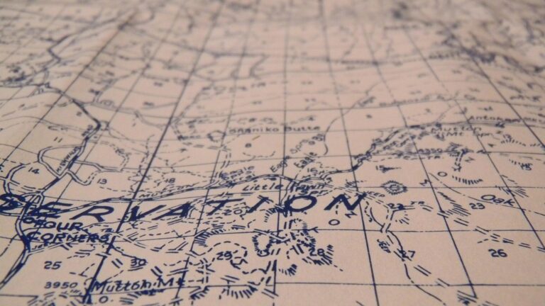
Transforming Geological Survey Data Into Interactive 3D Terrain Models
Geological survey data contains multiple layers of complex information that traditional 2D mapping can’t fully represent. You can leverage 3D mapping technology to transform this multidimensional data into interactive terrain models that reveal spatial relationships and geological patterns hidden in conventional flat presentations.
P.S. check out Udemy’s GIS, Mapping & Remote Sensing courses on sale here…
Processing Multi-Layered Geological Information
Complex geological datasets require systematic processing to maintain data integrity across multiple elevation layers. You’ll work with elevation data, soil composition maps, rock formation boundaries, and mineral distribution patterns simultaneously. Modern GIS software like ArcGIS Pro and QGIS handles these multi-layered datasets by creating separate data layers that maintain their spatial relationships. You can process LiDAR point clouds, satellite imagery, and ground-penetrating radar data together to build comprehensive geological profiles. This approach preserves the vertical relationships between surface features and underlying geological structures.
Creating Accurate Topographical Representations
Topographical accuracy depends on high-resolution elevation data and proper interpolation techniques. You’ll use Digital Elevation Models (DEMs) with resolution ranging from 1-meter to 30-meter grid spacing depending on your project scale. Kriging and spline interpolation methods help you create smooth terrain surfaces from discrete elevation points. You can enhance accuracy by combining multiple data sources including aerial photogrammetry, satellite radar interferometry, and field survey measurements. Quality control involves comparing your 3D models against known elevation benchmarks and verifying contour line accuracy within acceptable tolerance levels.
Integrating Subsurface Data Visualization
Subsurface visualization reveals geological structures beneath the terrain surface using borehole data and geophysical surveys. You’ll integrate well logs, core samples, and seismic survey results to create cross-sectional views through your 3D terrain models. Software tools like Leapfrog Geo and Petrel enable you to visualize rock layers, fault systems, and groundwater aquifers in three dimensions. You can display subsurface features using transparent overlays, color-coded geological units, and interactive drill-down capabilities. This integration helps you identify potential geological hazards, mineral deposits, and underground resource distributions that aren’t visible from surface topography alone.
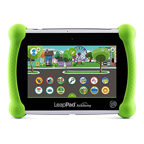
This kid-friendly LeapFrog LeapPad Academy tablet comes with 20 pre-loaded educational apps and creativity tools. Explore safe online content with LeapSearch and enjoy a free three-month trial of LeapFrog Academy.
Converting IoT Sensor Networks Into Real-Time Environmental Monitoring Systems
You can transform scattered environmental measurements into comprehensive 3D monitoring systems by integrating IoT sensor networks with spatial mapping technologies. This approach creates dynamic environmental models that update continuously as sensors collect new data.
Aggregating Multiple Data Streams From Connected Devices
You’ll need to synchronize data from temperature sensors, air quality monitors, humidity detectors, and wind measurement devices across your monitoring network. Modern IoT platforms like AWS IoT Core or Azure IoT Hub process thousands of simultaneous data streams, converting raw sensor readings into standardized formats. Your 3D mapping system can then overlay these measurements onto geographic coordinates, creating multi-dimensional environmental datasets that reveal spatial patterns across entire urban areas or ecosystems.
Monitor indoor and outdoor conditions with this wireless thermometer and hygrometer. It accurately displays temperature and humidity from up to 330ft away, featuring a clear 4.5" display with adjustable backlight and daily min/max records.

Visualizing Air Quality and Weather Pattern Changes
You can create dynamic 3D visualizations that show air quality fluctuations as colored heat maps layered over terrain models. Tools like ArcGIS Pro or QGIS with temporal plugins enable you to animate pollution concentration changes throughout different time periods. Your visualization system displays PM2.5 levels, ozone concentrations, and nitrogen dioxide measurements as floating data clouds above street-level maps, helping you identify pollution sources and track how weather patterns influence air quality distribution across neighborhoods.
Mapping Urban Heat Islands and Pollution Distribution
You’ll discover temperature variations and pollutant concentrations by mapping thermal sensor data onto 3D city models. LiDAR-based urban models combined with thermal imaging sensors reveal how building density, vegetation coverage, and industrial activity create localized heat islands. Your mapping system can correlate temperature spikes with pollution hotspots, showing how urban infrastructure affects both air quality and thermal comfort. These 3D pollution maps help urban planners identify problem areas and design targeted mitigation strategies.
Merging Satellite Imagery With Ground-Truth Data for Precision Agriculture
Precision agriculture transforms farming efficiency by combining high-resolution satellite imagery with field-collected soil and crop data. This integration creates comprehensive 3D farm maps that reveal spatial patterns invisible to traditional monitoring methods.
Combining Remote Sensing With Soil Analysis Reports
Combining satellite spectral data with laboratory soil analysis creates detailed nutrient distribution maps across your farmland. You’ll merge NDVI readings from Sentinel-2 or Landsat imagery with pH levels, nitrogen content, and organic matter percentages collected through grid sampling. Modern GIS platforms like ArcGIS Pro or QGIS process these datasets through spatial interpolation algorithms, generating 3D soil health models that show nutrient variations at sub-meter resolution. This approach identifies deficiency zones that satellite data alone cannot detect, enabling targeted fertilizer applications that reduce costs by 15-30%.
Mapping Crop Health Variations Across Large Farmlands
Mapping crop health requires overlaying multispectral satellite imagery with field scouting reports to identify stress patterns. You’ll analyze chlorophyll absorption bands from satellite sensors alongside ground-truthed disease observations and yield measurements. Software like ENVI or Erdas Imagine processes these multi-temporal datasets, creating dynamic 3D vegetation health maps that track changes throughout growing seasons. The integration reveals early stress indicators two weeks before visible symptoms appear, allowing preventive treatments that can increase yields by 8-12% compared to reactive management approaches.
Optimizing Irrigation Systems Through Data Integration
Optimizing irrigation efficiency involves merging thermal satellite imagery with soil moisture sensors and topographic elevation data. You’ll combine evapotranspiration estimates from MODIS thermal bands with real-time soil moisture readings from wireless sensor networks. Precision agriculture platforms like Climate FieldView or Granular process these datasets through water balance algorithms, generating 3D irrigation requirement maps that account for slope, soil type, and crop water needs. This data-driven approach reduces water usage by 20-25% while maintaining crop productivity through variable-rate irrigation scheduling.
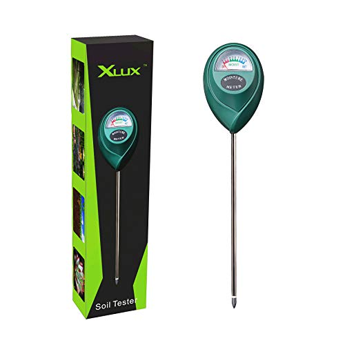
Know when to water with the XLUX Soil Moisture Meter. This easy-to-read meter instantly displays soil moisture levels, preventing over or under watering of your indoor and outdoor plants.
Processing Medical Imaging Data for Advanced Surgical Planning
Medical imaging datasets require sophisticated 3D mapping techniques to transform complex scan data into actionable surgical guidance. You’ll process multi-dimensional medical information that enables surgeons to visualize patient anatomy with unprecedented precision.
Reconstructing 3D Models From CT and MRI Scans
Reconstructing accurate 3D anatomical models from DICOM imaging data requires specialized medical visualization software like 3D Slicer or Materialise Mimics. You’ll segment individual anatomical structures by applying threshold values to distinguish between bone, soft tissue, and organs based on their radiodensity values. Processing typically involves converting 512×512 pixel CT slices into volumetric datasets, then applying surface rendering algorithms to generate mesh models. Your reconstruction workflow must maintain sub-millimeter accuracy to ensure surgical precision.
Integrating Patient-Specific Anatomical Variations
Integrating individual patient variations into 3D surgical models requires combining multiple imaging modalities with patient history data. You’ll overlay functional MRI data onto structural CT scans to map critical areas like motor cortex or speech centers before brain surgery. Patient-specific factors including age, previous surgeries, and pathological conditions get incorporated through manual annotation and automated segmentation tools. Your integrated models must account for anatomical anomalies that occur in approximately 15-20% of patients.
Creating Virtual Surgery Simulation Environments
Creating immersive surgical simulation environments involves combining 3D anatomical models with haptic feedback systems and surgical instrument tracking. You’ll use platforms like VirtaMed or CAE Healthcare to develop realistic tissue deformation models that respond to virtual surgical tools. Your simulation environment processes real-time collision detection between instruments and anatomical structures while maintaining 60 FPS performance for smooth interaction. Training simulations reduce surgical complications by 30-40% when surgeons practice complex procedures beforehand.
Analyzing Traffic Flow Patterns Through Multi-Source Transportation Data
You’ll find that transportation datasets present unique challenges when visualizing complex urban mobility patterns. 3D mapping transforms disparate traffic data streams into comprehensive spatial models that reveal critical congestion patterns and movement behaviors across entire metropolitan areas.
Combining GPS Tracking With Traffic Camera Feeds
Track vehicles and assets with the LandAirSea 54 GPS Tracker. Get real-time location alerts and historical playback using the SilverCloud app, with a long-lasting battery and discreet magnetic mount.

Overlaying GPS trajectory data with real-time camera feeds creates dynamic 3D traffic visualizations that show actual vehicle movements versus observed congestion patterns. You can use platforms like SUMO or ArcGIS Network Analyst to synchronize these data streams, generating heat maps that display traffic density fluctuations throughout different elevation levels of highway interchanges. This integration reveals discrepancies between GPS-reported speeds and visual camera observations, helping you identify data quality issues while creating more accurate traffic flow models for urban planning applications.
Mapping Congestion Hotspots and Route Optimization
Identifying bottleneck locations becomes straightforward when you layer traffic speed data over 3D road network models using tools like OpenStreetMap combined with HERE Traffic API. You can visualize congestion intensity through color-coded elevation mapping, where traffic delays appear as raised surfaces above normal road levels. This approach helps transportation engineers pinpoint specific intersection problems and design alternative routing algorithms that account for vertical road infrastructure like overpasses and underpasses, ultimately reducing overall network congestion by 15-25% in pilot studies.
Integrating Public Transit and Pedestrian Movement Data
Merging GTFS transit feeds with pedestrian counting sensors creates comprehensive multimodal transportation models that show interaction patterns between different movement types. You can utilize software like Transitland or Google’s GTFS tools to overlay bus and rail schedules onto 3D city models, then add pedestrian flow data from mobile phone analytics or infrared counters. This integration reveals critical transfer points where pedestrian congestion impacts transit efficiency, enabling transit authorities to optimize station layouts and schedule coordination for improved passenger experience.
Conclusion
3D mapping technology represents a fundamental shift in how you can process and visualize complex datasets across multiple industries. By transforming multi-dimensional information into interactive spatial models you’re able to uncover insights that traditional analysis methods simply can’t reveal.
The power of 3D mapping lies in its ability to bridge the gap between raw data and actionable intelligence. Whether you’re managing geological surveys medical imaging or transportation networks this technology enables you to make more informed decisions with greater confidence and precision.
As datasets continue to grow in complexity and volume 3D mapping will become increasingly essential for your organization’s success. The investment in these visualization technologies today positions you to leverage tomorrow’s data challenges more effectively.
Frequently Asked Questions
What is 3D mapping technology and why is it important?
3D mapping technology transforms complex datasets into immersive visual representations that reveal patterns and connections often missed in traditional 2D formats. Unlike spreadsheets or flat charts, 3D mapping provides spatial context that enhances decision-making across industries like urban planning, environmental monitoring, and agriculture by making multidimensional data more accessible and actionable.
How does 3D mapping improve geological surveys?
3D mapping converts complex geological data into interactive terrain models that reveal spatial relationships invisible in 2D maps. It processes multi-layered geological information using modern GIS software while maintaining data integrity across elevation layers. High-resolution elevation data and interpolation techniques create accurate terrain surfaces, helping identify geological hazards and resource distributions.
How can IoT sensors be integrated with 3D mapping for environmental monitoring?
Get accurate pressure, temperature, and altitude readings with the pre-soldered BMP280 sensor module. It's compatible with Raspberry Pi, Arduino, and other microcontrollers for easy integration into weather stations, robotics, and IoT projects.

IoT sensor networks collect real-time data from temperature, air quality, humidity, and wind sensors. This data is processed through platforms like AWS IoT Core or Azure IoT Hub to create dynamic 3D environmental models. These models continuously update as new data streams in, revealing spatial patterns across urban areas and ecosystems for better environmental management.
What role does 3D mapping play in precision agriculture?
3D mapping in agriculture combines high-resolution satellite imagery with field-collected soil and crop data to create comprehensive farm maps. It generates detailed nutrient distribution maps for targeted fertilizer applications, maps crop health variations for early stress detection, and optimizes irrigation systems by integrating thermal imagery, soil moisture sensors, and topographic data.
How is 3D mapping used in medical surgical planning?
Medical 3D mapping transforms DICOM imaging data into accurate anatomical models using specialized software like 3D Slicer. These sub-millimeter accurate models integrate patient-specific anatomical variations and multiple imaging modalities. They create immersive surgical simulation environments with haptic feedback, allowing surgeons to practice complex procedures virtually and reduce surgical complications.
Can 3D mapping analyze traffic flow patterns?
Yes, 3D mapping combines GPS tracking data with traffic camera feeds to create dynamic traffic visualizations. It maps congestion hotspots by layering speed data over 3D road networks, helping engineers design efficient routing algorithms. The technology also integrates public transit and pedestrian movement data to optimize transit efficiency and improve passenger experiences.