7 Best Map Design Ideas for Visual Impact
Maps don’t have to be boring. Whether you’re creating a fantasy world for your next D&D campaign or designing infographics for your business, playful map aesthetics can transform mundane geography into captivating visual stories that grab attention and spark imagination.
The right aesthetic choices can make your maps memorable, engaging, and uniquely yours. From whimsical hand-drawn styles to bold color schemes that pop off the page, creative map design opens up endless possibilities for expression and storytelling.
Ready to ditch the standard blue-and-green template? These seven playful approaches will help you create maps that people actually want to look at and explore.
Disclosure: As an Amazon Associate, this site earns from qualifying purchases. Thank you!
P.S. check out Udemy’s GIS, Mapping & Remote Sensing courses on sale here…
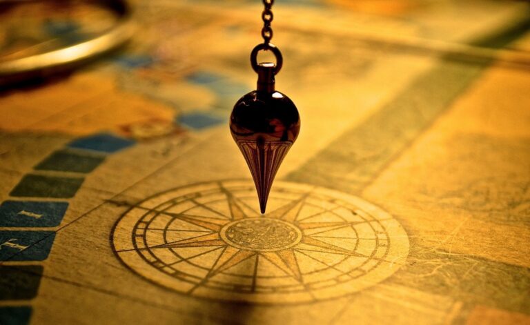
Vintage Treasure Map Style With Aged Paper Effects
Transform your digital maps into authentic-looking historical documents that evoke the golden age of exploration. You’ll create compelling visuals that capture the romance and mystery of ancient cartography.
Creating Authentic Weathering Techniques
Apply realistic aging effects using layered transparency techniques in digital design software. Start with subtle coffee-stain textures and gradually build water damage patterns around map edges. Use burn tools to create random dark spots that simulate decades of handling. Add crease lines diagonally across sections to mimic folding wear. Blend multiple texture layers at 20-30% opacity for natural weathering that doesn’t overwhelm your cartographic details.
Learn to draw and paint on your iPad with this comprehensive guide. Develop your digital art skills with step-by-step instruction.

Adding Compass Roses and Decorative Borders
Design ornate compass roses as focal points that anchor your vintage aesthetic while providing navigational reference. Place them in open ocean areas or unused map corners using traditional 16-point designs with fleur-de-lis markers. Create decorative borders with rope patterns, nautical knots, or Celtic interlacing that frame your map boundaries. Include cartouches with scrollwork for title placement. Use vector graphics to maintain crisp detail when scaling these ornamental elements.
Using Sepia Tones and Burnt Edges
Establish your color palette with warm sepia tones ranging from cream (#F5F5DC) to deep brown (#8B4513) for maximum authenticity. Apply gradient overlays that transition from lighter centers to darker edges, simulating age-related discoloration. Create burnt edge effects using irregular mask shapes with soft feathering. Layer orange and brown tones at map perimeters to suggest fire damage or extreme aging. Maintain sufficient contrast between land masses and water bodies for readability.
Whimsical Hand-Drawn Cartoon Map Design
Hand-drawn cartoon maps offer a delightful departure from traditional cartographic precision. You’ll create charming visuals that prioritize personality over accuracy while maintaining essential navigational elements.
Incorporating Cute Characters and Icons
Character integration transforms your map into a storytelling canvas where tiny inhabitants bring locations to life. You can place miniature dragons guarding mountain passes, cheerful sailors navigating coastal waters, or friendly woodland creatures marking forest boundaries. These characters serve as both decorative elements and subtle wayfinding tools.
Icon design should embrace simplified shapes and expressive features that communicate function instantly. Replace standard map symbols with playful alternatives like smiling houses for residential areas, dancing trees for parks, or quirky vehicles for transportation hubs.
Using Bright Colors and Playful Typography
Color selection drives the whimsical atmosphere through vibrant palettes that break conventional mapping rules. You’ll want to use candy-bright blues for water features, lime greens for vegetation, and sunset oranges for urban areas. This approach creates visual hierarchy through contrast rather than traditional cartographic color schemes.
Enjoy refreshing water with the Avalon Bottom Loading Water Cooler. It offers hot, cold, and room temperature options, a BioGuard anti-microbial coating, and a child safety lock for peace of mind.

Typography choices should complement your hand-drawn aesthetic with fonts that feel organic and approachable. Select typefaces with slight irregularities or hand-lettered qualities, varying text sizes to create visual rhythm while ensuring readability across different map scales and viewing distances.
Adding Fun Landmarks and Easter Eggs
Landmark enhancement involves exaggerating notable features with cartoon proportions and unexpected details. You can transform a simple bridge into an elaborate fairy-tale structure or turn a local coffee shop into a giant steaming mug. These playful interpretations make locations more memorable and engaging.
Easter egg placement rewards careful map exploration with hidden jokes, tiny scenes, or pop culture references tucked into corners and margins. Consider adding a monster in a lake, a UFO hovering over a field, or miniature adventures happening in remote map areas that encourage closer inspection.
Fantasy World Map With Mythical Elements
Get durable, tear-resistant posters made in the USA. Each 18" x 29" poster features high-quality 3 MIL lamination for lasting protection.

Fantasy world maps offer unlimited creative potential for mapmakers seeking to blend storytelling with cartographic artistry. You’ll discover that mythical elements transform ordinary geographical features into extraordinary narrative devices.
Drawing Dragons and Magical Creatures
Dragons serve as both decorative elements and territorial markers on fantasy maps. You’ll want to position them strategically near mountain ranges or ancient ruins to suggest danger zones. Sketch creatures with varying scales – massive wyrms coiling around entire mountain ranges and smaller drakes perched on castle towers. Consider using different creature types like griffins, phoenixes, and sea serpents to represent distinct biomes and magical influences. Each creature should reflect the terrain’s character while maintaining consistent artistic style throughout your map.
Creating Fictional Kingdoms and Realms
Fictional kingdoms require careful boundary design that reflects political relationships and natural barriers. You’ll establish realm borders using rivers, mountain chains, and mystical barriers like enchanted forests or cursed wastelands. Name your kingdoms with linguistic consistency – develop naming conventions that reflect each realm’s cultural identity. Consider political dynamics when positioning capitals and major cities, ensuring trade routes and defensive positions make strategic sense. Add heraldic symbols and coat of arms to distinguish different houses and factions across your fantasy world.
Using Medieval-Style Lettering and Symbols
Medieval lettering adds authentic fantasy atmosphere through carefully chosen typography and symbolic elements. You’ll implement Gothic or Uncial scripts for major location names while using simpler fonts for minor settlements. Incorporate illuminated letters for kingdom names and important landmarks, complete with decorative flourishes and gold leaf effects. Add cartographic symbols like castles, towers, and crossed swords to indicate fortifications and battlefields. Use compass roses featuring mystical designs and runes to maintain the medieval aesthetic while providing navigational reference points.
Add a touch of gold to your art and DIY projects with these 200 imitation gold leaf sheets. Each 5.5" x 5.5" sheet is layered between tissue paper for easy handling in various applications like crafting, decor, and gilding.

Minimalist Geometric Map Interpretation
Geometric minimalism transforms complex cartographic data into clean, simplified representations that prioritize clarity over detailed geographical accuracy. This approach strips away unnecessary visual elements while maintaining essential spatial relationships through strategic use of basic shapes and bold design choices.
Simplifying Shapes and Lines
Reduce your map elements to their most essential geometric forms by converting irregular coastlines into clean polygons and straightening curved roads into angular segments. Replace complex topographical features with simple triangles for mountains, circles for cities, and rectangles for urban areas. This geometric reduction maintains spatial relationships while creating a distinctly modern aesthetic that’s easy to read at any scale.
Using Bold Color Blocking Techniques
Apply solid, high-contrast color blocks to differentiate regions and create visual hierarchy without relying on gradients or textures. Choose a limited palette of three to five colors maximum, using techniques like complementary color schemes or monochromatic variations. Assign specific colors to land masses, water bodies, and political boundaries to establish clear visual coding that viewers can quickly interpret across your entire map composition.
Creating Modern Abstract Representations
Transform traditional cartographic symbols into contemporary abstract icons that communicate function through simplified visual language rather than literal representation. Design custom pictograms for landmarks using basic geometric shapes—squares for buildings, diamonds for points of interest, and hexagons for transportation hubs. This abstraction approach creates cohesive visual systems that work across different map scales while maintaining the minimalist aesthetic throughout your design.
Steampunk-Inspired Victorian Map Aesthetic
Transform your cartographic designs with brass-toned elegance and mechanical precision that captures the industrial romanticism of the Victorian era.
Adding Brass and Copper Color Schemes
Establish your steampunk foundation with warm metallic palettes that evoke Victorian machinery. Use brass (#B8860B) for primary borders and title lettering while incorporating copper (#B87333) for secondary elements like compass roses and decorative flourishes. Apply bronze (#CD7F32) to terrain features and antiqued gold (#CFB53B) to highlight important locations. These warm metallics create depth through subtle gradients while maintaining the period-appropriate industrial aesthetic that defines quality steampunk cartography.
Achieve a flawless, even complexion with e.l.f. Flawless Satin Foundation. This lightweight, vegan formula provides medium coverage and a semi-matte finish for all-day wear, while hydrating your skin with glycerin.

Incorporating Mechanical Elements and Gears
Integrate clockwork components as functional design elements that enhance navigation while maintaining visual authenticity. Position ornate gear assemblies at map corners and along borders using varying sizes to create mechanical rhythm. Add cogwheel compass roses with rotating elements and incorporate steam valve icons for city markers. Design intricate brass pipework connecting different map sections and use mechanical gauge illustrations for scale indicators. These elements transform static cartography into dynamic industrial artwork.
Using Gothic Fonts and Ornate Details
Select Victorian-era typography that balances readability with period authenticity for professional results. Implement blackletter fonts like Old English or Cloister Black for main titles while using serif typefaces such as Trajan Pro for location names. Add ornate Victorian scrollwork around text blocks and incorporate detailed filigree patterns in map borders. Design elaborate cartouches with mechanical embellishments and use decorative initial capitals for major geographic features to achieve authentic Victorian publishing standards.
Watercolor Artistic Map With Soft Textures
Create vibrant watercolor art with this portable set. It includes 40 colors (metallic & fluorescent), a brush pen, watercolor paper, and more, all in a stylish tin box.

Watercolor techniques bring an organic, painterly quality to digital maps that softens harsh geographical boundaries. This artistic approach creates dreamy, flowing visualizations that prioritize atmosphere over strict cartographic precision.
Blending Colors for Dreamy Effects
Gradual color transitions create natural-looking terrain elevation changes and climate zones across your map surface. Use layer blending modes like “Multiply” and “Overlay” in digital software to achieve authentic watercolor bleeding effects. Apply wet-on-wet techniques by working with semi-transparent layers, allowing colors to naturally flow into adjacent areas. Start with lighter base tones and gradually build deeper hues for realistic depth progression.
Creating Organic Flowing Boundaries
Irregular edge treatment replaces sharp political borders with soft, hand-painted boundaries that mimic natural watercolor paper absorption. Utilize brush tools with varying opacity settings to create feathered edges along coastlines and territorial divisions. Apply masking techniques that allow colors to bleed slightly beyond intended boundaries, simulating real paint behavior. Focus on creating asymmetrical, organic shapes that feel naturally formed rather than digitally generated.
Adding Paint Splatter and Brush Stroke Details
Textural elements enhance the handmade authenticity of your watercolor map through strategic placement of paint drips and brush marks. Incorporate custom brush presets that replicate natural bristle patterns and paint flow characteristics. Add subtle splatter effects near water features and mountain ranges using low-opacity layers with varied brush sizes. Include visible brush strokes along major geographical features to emphasize the artistic hand-painted aesthetic while maintaining readable cartographic information.
Retro Video Game Pixel Art Map Style
Transform your cartographic projects into nostalgic gaming masterpieces that capture the charm of classic 8-bit adventures. This pixelated approach creates instantly recognizable maps that evoke memories of exploring digital worlds tile by tile.
Using 8-Bit Graphics and Square Pixels
Construct your map using uniform square pixels to achieve authentic retro gaming aesthetics. Set your canvas resolution to multiples of 8 or 16 pixels for traditional scaling ratios that match classic gaming hardware limitations. Use hard edges without anti-aliasing to maintain the crisp, blocky appearance characteristic of early video game graphics. Convert complex terrain features into simplified geometric shapes using a grid-based system where each pixel represents a specific map unit or terrain type.
Creating Nostalgic Gaming Color Palettes
Limit your color palette to 16-32 colors maximum to replicate the technical constraints of vintage gaming systems. Choose saturated primary colors like bright blues for water, vibrant greens for forests, and bold yellows for deserts that pop against darker backgrounds. Apply dithering patterns to create the illusion of additional colors and smooth transitions between terrain types. Use high contrast combinations that ensure readability on various display types while maintaining the distinctive look of early gaming graphics.
Adding Power-Up Icons and Game Elements
Incorporate recognizable gaming symbols like hearts for settlements, coins for economic centers, and swords for battle locations to enhance navigation while maintaining thematic consistency. Design custom 8×8 or 16×16 pixel icons for specific map features using the same artistic constraints as your base map. Add animated elements like blinking treasure chests or rotating compass roses to create dynamic focal points that guide viewer attention to important locations without overwhelming the overall design aesthetic.
Conclusion
Your maps don’t have to be boring rectangles filled with generic icons and standard fonts. By experimenting with these seven playful aesthetic approaches you’ll transform your cartographic projects into memorable visual experiences that captivate your audience.
Whether you’re crafting a vintage treasure map for your next D&D campaign or designing a minimalist geometric representation for your business presentation each style offers unique ways to enhance storytelling through visual design. The key is choosing an aesthetic that aligns with your project’s purpose and audience expectations.
Remember that great map design balances creativity with functionality. Your artistic choices should enhance rather than hinder navigation and information delivery. Start experimenting with these techniques today and discover how playful aesthetics can elevate your mapping projects from ordinary to extraordinary.
Frequently Asked Questions
What makes creative map design more effective than traditional cartography?
Creative map design transforms ordinary geographical information into engaging visual stories that capture attention and improve memorability. By incorporating playful aesthetics, unique styling approaches, and artistic elements, maps become more than navigation tools—they become immersive experiences that connect with viewers emotionally while maintaining essential functionality.
How do you create authentic vintage treasure map effects?
Apply coffee-stain textures and burn tools to simulate aged paper, add ornate compass roses and decorative borders, and use sepia tones with burnt edges. These weathering techniques create the romantic feel of ancient cartography while maintaining readability and navigational value for your audience.
What elements make cartoon-style maps both fun and functional?
Incorporate cute characters and icons that represent locations, use bright candy-colored palettes with organic typography, and add exaggerated landmarks with hidden Easter eggs. This approach prioritizes personality while retaining essential navigational elements, making maps memorable and engaging for all ages.
How can minimalist geometric design improve map clarity?
Reduce complex cartographic data to essential geometric forms like polygons for coastlines and basic shapes for features. Use bold color blocking with limited palettes to create visual hierarchy and clear coding. This approach transforms cluttered information into clean, easily digestible visual representations.
What defines an authentic steampunk Victorian map aesthetic?
Use brass-toned metallic palettes with copper accents, integrate mechanical elements like gears and clockwork, and employ Gothic fonts with ornate scrollwork. This combination captures industrial romanticism while maintaining professional cartographic standards and period-appropriate visual authenticity.
How do watercolor techniques enhance digital map design?
Blend colors to show natural terrain transitions, create organic flowing boundaries with irregular edges, and add textural elements like paint splatters. These techniques soften harsh geographical boundaries while bringing an artistic, handmade quality that makes maps more visually appealing and approachable.
What makes pixel art maps appealing for modern projects?
Uniform square pixels with limited color palettes evoke nostalgic 8-bit gaming memories while creating recognizable symbols and animated elements. This retro approach transforms cartographic projects into interactive experiences that resonate with gaming culture while maintaining clear navigational functionality.