7 Unique Methods for Visualizing Population Data That Reveal Hidden Patterns
Why it matters: You’re drowning in spreadsheets filled with population numbers but struggling to tell a compelling story that decision-makers will actually understand and act upon.
The big picture: Traditional bar charts and pie graphs don’t capture the complex relationships hidden within demographic data — leaving critical insights buried in rows of statistics.
What’s next: These seven visualization techniques transform raw population numbers into powerful visual narratives that reveal patterns you’ve been missing and help you communicate findings that drive real change.
Disclosure: As an Amazon Associate, this site earns from qualifying purchases. Thank you!
P.S. check out Udemy’s GIS, Mapping & Remote Sensing courses on sale here…
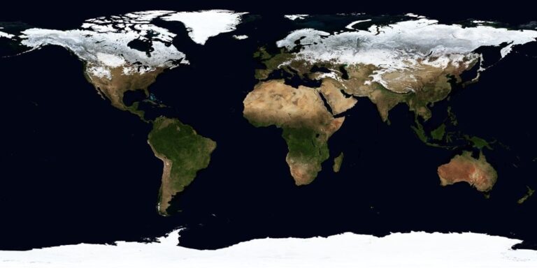
Heat Maps: Revealing Population Density Through Color-Coded Geographic Visualization
Heat maps transform complex population data into intuitive visual stories by applying color gradients to geographic areas. This technique reveals density patterns that would remain hidden in traditional spreadsheets or charts.
Understanding Temperature-Style Color Gradients for Population Distribution
Color gradients in population heat maps follow thermal mapping principles where cooler colors represent lower density areas and warmer colors indicate higher concentrations. Blue tones typically represent sparsely populated regions while red and orange zones highlight densely populated areas. You’ll achieve maximum clarity by selecting color schemes that maintain consistent progression – avoiding jarring transitions that confuse viewers. Consider colorblind accessibility by incorporating color schemes like ColorBrewer’s sequential palettes that remain distinguishable across different vision types.
Creating Interactive Heat Maps Using GIS Software and Online Tools
QGIS provides robust heat mapping capabilities through its Heatmap plugin which generates kernel density surfaces from point data. You can adjust radius parameters and output pixel sizes to control smoothing effects and detail levels. ArcGIS Pro offers similar functionality with its Kernel Density tool plus advanced symbology options for fine-tuning color ramps. Web-based alternatives like Leaflet.js enable interactive heat maps with zoom capabilities while Google Earth Engine handles massive datasets efficiently. Consider data processing requirements when selecting tools – desktop GIS handles complex analysis while web platforms excel at public-facing visualizations.
Dot Density Maps: Representing Individual Population Units as Visual Dots
Dot density maps present a powerful alternative to heat maps by using individual dots to represent specific population quantities. This technique transforms abstract census numbers into tangible visual elements that viewers can count and comprehend intuitively.
Calculating Appropriate Dot Values for Accurate Population Representation
Determining your dot value requires balancing data accuracy with visual comprehension. Start by dividing your total population by your available map space to establish a baseline ratio. For metropolitan areas, use dot values between 100-500 people per dot to maintain readability. Rural regions work better with 50-250 people per dot ratios. Test multiple values using your GIS software’s symbology settings before finalizing your choice.
Balancing Visual Clarity with Statistical Precision in Dot Placement
Strategic dot placement prevents visual clustering while maintaining statistical integrity. Use your GIS software’s random placement algorithms within census boundaries rather than uniform grids. Avoid placing dots in uninhabitable areas like water bodies or industrial zones by creating exclusion masks. Adjust dot spacing to prevent overlap at standard viewing scales, typically maintaining 2-3 pixel separation between adjacent dots for optimal clarity.
3D Population Pyramids: Adding Dimensional Depth to Age and Gender Demographics
3D population pyramids transform traditional flat demographic charts into immersive visualizations that reveal age-gender distributions with unprecedented clarity. You’ll discover how height, width, and depth work together to communicate complex population structures that standard 2D charts simply can’t convey.
Constructing Multi-Layered Pyramids for Complex Population Analysis
Layer different demographic variables by stacking age cohorts with varying transparency levels and color coding. You’ll create depth by positioning male populations on one side and female populations on the opposite side, with bar heights representing population counts. Use software like Plotly or Three.js to build interactive 3D models where users can rotate and zoom into specific age groups. Apply gradient coloring to distinguish socioeconomic factors, education levels, or employment status within each age bracket for comprehensive demographic analysis.
Comparing Multiple Populations Through Side-by-Side 3D Visualizations
Position multiple 3D pyramids in a unified coordinate system to reveal demographic differences between countries, regions, or time periods. You’ll achieve effective comparisons by maintaining consistent scales and color schemes across all pyramids while spacing them strategically to prevent visual overlap. Use animation sequences to show population changes over decades, creating temporal depth that highlights aging trends, migration patterns, and birth rate fluctuations. Tools like D3.js and WebGL enable smooth transitions between different population datasets for dynamic comparative analysis.
Animated Time-Lapse Visualizations: Tracking Population Changes Over Time
Animated time-lapse visualizations transform static population data into dynamic stories that reveal demographic shifts across decades or centuries. You’ll capture migration waves, urban growth patterns, and population booms through motion graphics that make temporal changes immediately apparent to viewers.
Designing Smooth Transitions for Historical Population Data
Frame rates between 15-30 fps create smooth population transitions without overwhelming viewers with rapid changes. You’ll need consistent time intervals—typically 5 or 10-year increments—to maintain visual coherence across your animation sequence.
Calculate interpolation values between census years using linear or cubic spline methods to generate intermediate frames. Tools like D3.js and Adobe After Effects handle temporal smoothing algorithms that prevent jarring population jumps between documented data points.
Incorporating Migration Patterns and Growth Trends in Motion Graphics
Particle systems effectively visualize migration flows by showing individual dots moving between geographic regions over time. You’ll represent population streams using varying particle densities—thicker flows indicate larger migration volumes between origin and destination points.
Color-coded growth indicators help distinguish between natural increase, in-migration, and population decline patterns. WebGL frameworks like Three.js enable real-time rendering of complex migration animations while maintaining smooth playback performance across different devices and browsers.
Treemap Diagrams: Displaying Population Hierarchies Through Nested Rectangles
Treemap diagrams transform hierarchical population data into nested rectangular visualizations where size and color reveal multiple demographic variables simultaneously. This powerful technique displays complex geographic subdivisions and population characteristics through proportional area relationships.
Organizing Population Data by Geographic Regions and Subdivisions
Structure your treemap by creating parent rectangles for major geographic regions like states or provinces. Subdivide these containers into smaller rectangles representing counties, districts, or municipalities based on population size. Arrange the hierarchy logically from national level down to local subdivisions. Size each rectangle proportionally to its population count, ensuring visual accuracy across all administrative levels. Group related geographic units together to maintain spatial context and improve data comprehension.
Using Color and Size Variations to Show Multiple Population Variables
Apply color gradients to represent secondary variables like population density, median age, or growth rates while maintaining size for total population. Select diverging color schemes for variables with positive and negative values, such as population change percentages. Use sequential color palettes for continuous variables like income levels or educational attainment. Implement categorical colors for discrete variables such as predominant ethnic groups or urban versus rural classifications. Balance color intensity to prevent visual conflicts between size and color encoding systems.
Network Graphs: Mapping Population Connections and Migration Flows
Network graphs transform population movement data into visual networks where nodes represent locations and edges show migration flows between them.
Visualizing Movement Patterns Between Cities and Countries
You’ll create directed arrows connecting origin and destination points to show migration flows. Arrow thickness represents flow volume—use weights between 1-10 pixels based on migration intensity. Color-code arrows by flow direction or migration type: blue for incoming flows, red for outgoing streams. Tools like Gephi and Cytoscape excel at handling large migration datasets with thousands of connections while maintaining visual clarity.
Creating Node-Based Representations of Population Centers
You’ll size nodes proportionally to population—typically using square root scaling to prevent largest cities from overwhelming smaller centers. Position nodes using geographic coordinates or force-directed layouts that group related populations. Apply categorical colors for different settlement types: metropolitan areas, regional centers, and rural communities. D3.js and NetworkX provide robust algorithms for calculating optimal node positioning and preventing overlapping elements.
Augmented Reality Population Overlays: Bringing Data into Physical Spaces
Augmented reality transforms population data visualization by overlaying digital information directly onto real-world environments. You’ll experience demographic patterns through your smartphone or AR headset while walking through neighborhoods and cities.
Experience vivid content on the Galaxy A16 5G's 6.7" display and capture stunning photos with its triple-lens camera. Enjoy peace of mind with a durable design, six years of updates, and Super Fast Charging.

Implementing AR Technology for Real-Time Population Visualization
Start with ARCore for Android or ARKit for iOS to build location-based population overlays. Position 3D demographic models using GPS coordinates and compass data for accurate spatial alignment. Configure your AR framework to display population density heat maps that respond to your device’s orientation and movement. Tools like Unity 3D and Unreal Engine provide robust AR development environments for complex population visualizations. Optimize rendering performance by limiting particle counts to 1000-2000 elements per scene while maintaining visual clarity across different device specifications.
Designing User-Friendly Mobile Applications for Population Data Exploration
Design intuitive touch controls that let users toggle between different demographic layers like age groups and income brackets. Implement gesture-based navigation allowing pinch-to-zoom functionality for examining specific population clusters in detail. Create clear visual hierarchies using consistent color schemes that remain readable under various lighting conditions. Include offline data caching to ensure smooth performance in areas with limited connectivity. Add accessibility features like voice commands and high-contrast modes to accommodate users with different abilities and preferences.
Conclusion
You now have seven powerful techniques to transform your population data into compelling visual stories. Each method serves different analytical needs—from heat maps revealing density patterns to AR overlays bringing data into the real world.
The key to successful population visualization lies in matching your technique to your audience’s needs and data complexity. Whether you’re presenting to city planners or engaging the public you’ll find these methods far more effective than traditional charts.
Your demographic data deserves better than boring spreadsheets. By implementing these visualization techniques you’ll uncover hidden insights and communicate population trends with unprecedented clarity and impact.
Frequently Asked Questions
What are the main challenges with traditional demographic data visualization?
Traditional visualizations like bar charts and pie graphs often fail to convey complex relationships within population data. They struggle to reveal hidden patterns and insights that could facilitate better decision-making. Raw population numbers need to be transformed into compelling visual narratives to drive meaningful change through improved data communication.
How do heat maps improve population data visualization?
Heat maps transform complex population data into intuitive visual stories using color gradients applied to geographic areas. They reveal density patterns that remain hidden in spreadsheets, with cooler colors representing lower density areas and warmer colors indicating higher concentrations. This method makes population distribution immediately apparent and accessible.
What makes dot density maps effective for demographic visualization?
Dot density maps use individual dots to represent specific population quantities, transforming abstract census numbers into tangible visual elements. Each dot represents a calculated number of people (typically 100-500 per dot in metropolitan areas), making population distribution concrete and easy to understand at a glance.
How do 3D population pyramids enhance demographic analysis?
3D population pyramids add depth to traditional flat charts, using height, width, and depth to communicate complex age-gender distributions. Multi-layered pyramids with varying transparency levels and color coding allow comprehensive demographic analysis that standard 2D charts cannot convey, revealing population structures with unprecedented clarity.
What are the benefits of animated time-lapse population visualizations?
Animated visualizations transform static data into dynamic stories that reveal demographic shifts over time. They capture migration waves, urban growth patterns, and population changes through motion graphics, using 15-30 fps frame rates and consistent time intervals to maintain visual coherence and show temporal patterns.
How do treemap diagrams organize hierarchical population data?
Treemap diagrams create nested rectangular visualizations where rectangle size represents population and color indicates secondary variables like density or growth rates. They organize data by geographic regions, with parent rectangles for major areas subdivided into smaller rectangles, maintaining visual accuracy and spatial context.
What advantages do network graphs offer for migration data visualization?
Network graphs map population movement into visual networks with nodes representing locations and edges showing migration flows. Arrow thickness indicates flow volume, while color-coding differentiates between incoming and outgoing streams. This approach clearly illustrates complex migration patterns and relationships between geographic areas.
How does augmented reality enhance population data visualization?
AR overlays digital demographic information onto real-world environments, allowing users to visualize population data in actual geographic contexts. Using GPS coordinates and mobile technology, AR enables real-time exploration of different demographic layers through gesture-based navigation, making data more immersive and contextually relevant.