7 Artistic Styles in Cartographic Representations That Create Visual Impact
Maps aren’t just navigation tools—they’re canvases that blend science with art to tell compelling stories about our world. From medieval manuscripts adorned with mythical creatures to modern minimalist designs that strip away everything but essential information, cartographic art has evolved through distinct stylistic movements that reflect both cultural values and technological advances.
Whether you’re a designer seeking inspiration or simply curious about how maps shape our understanding of geography, exploring these seven artistic approaches reveals how cartographers transform raw data into visual narratives that inform, persuade, and captivate audiences across centuries.
Explore and map the wilderness for the Queen in Cartographers! Draw unique terrain shapes and score points based on randomly selected goals each game, but beware of monster ambushes.

Disclosure: As an Amazon Associate, this site earns from qualifying purchases. Thank you!
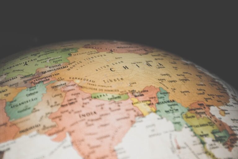
Traditional Hand-Drawn Cartographic Art
Hand-drawn cartographic art represents the foundational approach to mapmaking that dominated the field for centuries before digital tools transformed the industry.
P.S. check out Udemy’s GIS, Mapping & Remote Sensing courses on sale here…
Achieve a flawless, even complexion with e.l.f. Flawless Satin Foundation. This lightweight, vegan formula provides medium coverage and a semi-matte finish for all-day wear, while hydrating your skin with glycerin.

Ornate Border Designs and Decorative Elements
You’ll find that traditional hand-drawn maps feature elaborate border designs that serve both functional and aesthetic purposes. These decorative elements include compass roses with intricate geometric patterns, cartouches containing title information, and ornamental frames featuring flora, fauna, or maritime motifs. Master cartographers like Abraham Ortelius incorporated mythical sea creatures, sailing ships, and indigenous peoples into their border compositions. You can study these elements in 16th-century atlases where borders often consumed 20-30% of the map’s total surface area, creating visual hierarchy while protecting the main cartographic content from edge damage.
Calligraphic Lettering and Typography Techniques
You must master several lettering styles to create authentic hand-drawn cartographic art, including Roman capitals for major cities, italic scripts for water bodies, and sans-serif styles for topographical features. Traditional cartographers employed specific pen nibs ranging from broad-edge tools for large headers to fine-pointed instruments for detailed annotations. Your lettering hierarchy should reflect geographic importance—capital cities receive the largest type size, while small settlements use condensed letterforms. Historical examples show consistent 2:1 ratios between primary and secondary text elements, with careful attention to letter spacing that accommodates the map’s curved coastlines and irregular boundaries.
Watercolor and Ink Illustration Methods
Create vibrant watercolor art with this portable set. It includes 40 colors (metallic & fluorescent), a brush pen, watercolor paper, and more, all in a stylish tin box.

You can achieve professional results using traditional watercolor techniques that emphasize transparent washes for terrain representation and opaque applications for political boundaries. Master cartographers typically applied terre verte (earth green) for lowlands, burnt sienna for mountainous regions, and ultramarine blue for water bodies. Your ink work should begin with precise linework using technical pens ranging from 0.25mm for fine details to 0.7mm for major coastlines. Layer watercolor applications in multiple thin washes rather than single heavy applications—this prevents bleeding and maintains the crisp edge definition essential for readable cartographic features.
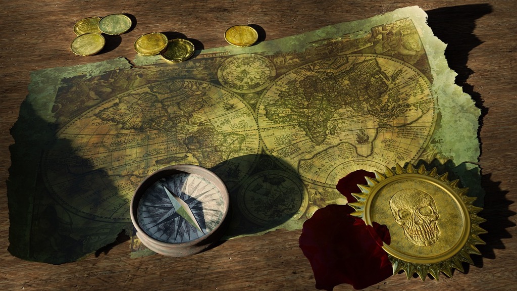
Medieval Illuminated Manuscript Maps
Medieval illuminated manuscript maps represent a fascinating intersection of cartographic precision and devotional artistry. These sacred geographical works transformed functional navigation tools into spiritual documents that guided both physical and metaphysical journeys.
Religious Symbolism and Iconography Integration
Religious symbolism dominates medieval manuscript maps through strategic placement of Christian iconography. You’ll find Jerusalem positioned at the world’s center, reflecting theological rather than geographical accuracy. Sacred sites like Mount Sinai and Bethlehem receive elaborate illustration treatment with golden halos and divine light rays. Biblical events integrate directly into geographical features, creating maps that function as visual scripture. Paradise appears as a walled garden in the east, complete with the Tree of Life and flowing rivers.
Gold Leaf and Precious Metal Accents
Add a touch of gold to your art and DIY projects with these 200 imitation gold leaf sheets. Each 5.5" x 5.5" sheet is layered between tissue paper for easy handling in various applications like crafting, decor, and gilding.

Gold leaf application transforms medieval maps into luminous masterpieces that catch candlelight during monastery readings. You’ll notice precious metals highlighting important cities, sacred locations, and decorative borders with shimmering brilliance. Silver accents emphasize water bodies and celestial elements, creating depth through metallic contrast. Craftsmen applied burnished gold using traditional techniques that required heated tools and careful layering. These metallic elements weren’t merely decorative—they conveyed divine importance and elevated maps to the status of sacred objects.
Mythological Creatures and Fantasy Elements
Mythological creatures populate medieval map margins and unexplored territories, reflecting contemporary beliefs about distant lands. You’ll encounter dragons guarding treasure hoards in Africa, unicorns roaming European forests, and sea monsters threatening ocean voyagers. Headless men, dog-headed people, and giants inhabit the map’s periphery, representing the unknown world’s perceived dangers. These fantastical elements served practical purposes by warning travelers about hazardous regions while filling cartographic gaps with imaginative speculation. Biblical creatures like Leviathan and Behemoth appear alongside classical monsters from Greek and Roman traditions.
Renaissance Perspective and Scientific Precision
Renaissance cartographers revolutionized mapping by introducing mathematical rigor and artistic perspective techniques that transformed medieval maps into scientifically accurate representations. This period marked the transition from symbolic religious mapping to empirical geographic documentation.
Mathematical Grid Systems and Coordinate Frameworks
Renaissance maps introduced precise latitude and longitude grids that established standardized positioning systems for global navigation. You’ll find Mercator projection techniques emerging during this era, creating cylindrical map projections that preserved angular relationships for maritime navigation. Cartographers like Gerard Mercator developed mathematical formulas that translated spherical Earth coordinates onto flat surfaces with unprecedented accuracy. These grid systems enabled explorers to plot courses with mathematical precision rather than relying on landmark-based navigation methods.
Detailed Topographical Relief Representations
Renaissance cartographers pioneered three-dimensional terrain visualization through sophisticated shading and perspective techniques that revealed landscape elevation and geological features. You’ll notice hachure lines and contour methods that depicted mountain ranges, valleys, and coastal formations with remarkable detail and accuracy. Artists employed light-and-shadow principles borrowed from Renaissance painting to create realistic topographical representations that helped travelers understand terrain challenges. These relief techniques combined scientific observation with artistic skill to produce maps that functioned as both navigation tools and landscape portraits.
Classical Architectural Elements in Map Design
Renaissance maps incorporated elaborate architectural frameworks inspired by classical Greek and Roman design principles that elevated cartographic presentation to fine art status. You’ll find ornate cartouches, decorative borders, and title blocks featuring columns, pediments, and sculptural elements that reflected humanist scholarly traditions. Compass roses evolved into intricate geometric designs with radiating lines and classical proportions that demonstrated mathematical precision alongside aesthetic appeal. These architectural elements served practical purposes by organizing map information while showcasing the cartographer’s cultural sophistication and technical expertise.
Art Nouveau Flowing Organic Forms
Art Nouveau brought nature’s elegance to cartographic design through sinuous curves and botanical inspiration. This movement transformed maps from rigid geometric displays into organic artistic expressions that celebrated the natural world.
Botanical Motifs and Natural Pattern Integration
Botanical elements transform your cartographic borders into living gardens of geographic information. You’ll find ivy tendrils weaving through longitude lines, while stylized flowers mark important cities and landmarks. Leaf patterns create natural transitions between different map regions, and vine-like decorations flow along coastlines and river systems. These organic motifs don’t just beautify your maps—they create visual hierarchies that guide readers through complex geographic data while maintaining the movement’s characteristic harmony with nature.
Curved Lines and Asymmetrical Compositions
Curved boundaries replace traditional rectangular frames in Art Nouveau cartographic design, creating dynamic visual movement across your map surface. You’ll notice how sinuous coastlines extend into decorative elements that spiral around compass roses and title cartouches. Asymmetrical layouts break away from centered compositions, allowing geographic features to flow naturally across the page. These flowing lines create visual rhythm that draws the eye through different map sections, while curved text follows the natural contours of rivers and mountain ranges.
Stylized Geographic Feature Representations
Geographic features become artistic interpretations rather than literal representations in Art Nouveau mapping style. You’ll render mountains as flowing, wave-like forms that undulate across the landscape, while rivers transform into serpentine ribbons adorned with water lily motifs. Forest areas appear as stylized tree patterns that create texture without overwhelming detail, and urban areas blend into decorative geometric patterns inspired by architectural elements. These stylized approaches maintain geographic accuracy while infusing your maps with the movement’s characteristic organic aesthetic.
Modernist Minimalist Geometric Approaches
Modernist minimalism transformed dense, decorative cartography into clean, functional design that prioritizes essential geographic information. This movement strips away ornamental elements to create maps that communicate through pure geometry and strategic simplicity.
Abstract Shape Simplification Techniques
Geometric abstraction reduces complex landforms into basic shapes that maintain geographic accuracy while improving visual clarity. You’ll transform irregular coastlines into simplified polygons, represent mountain ranges as triangular forms, and convert river systems into flowing curves that preserve directional flow patterns. This technique eliminates unnecessary detail while preserving critical spatial relationships. Successful abstraction requires careful analysis of which geographic features serve navigation purposes versus decorative elements. Modern GIS software enables precise simplification algorithms that maintain topological integrity while reducing visual complexity.
Bold Color Blocking and High Contrast
High-contrast color schemes create immediate visual hierarchy through strategic use of complementary colors and stark tonal differences. You’ll apply single, saturated colors to define distinct geographic zones—ocean blues contrasting with land masses in warm oranges or deep greens. This approach eliminates gradual color transitions in favor of sharp boundaries that clearly delineate political borders, elevation zones, or land use categories. Color blocking works particularly well for thematic mapping where you need to communicate categorical data quickly. Consider accessibility standards when selecting high-contrast palettes to ensure readability across different viewing conditions.
Typography as Primary Design Element
Typography becomes a structural component rather than mere labeling, with letterforms contributing to the overall geometric composition. You’ll select sans-serif typefaces with clean lines that complement the minimalist aesthetic while ensuring maximum legibility at various scales. Text placement follows grid systems that align with geographic features, creating visual balance between type and cartographic elements. Font weights establish information hierarchy—bold weights for major cities, medium weights for regions, and light weights for secondary features. Strategic use of white space around text prevents visual clutter while maintaining professional appearance standards.
Contemporary Digital Art Fusion
Digital mapping platforms now merge traditional cartographic principles with cutting-edge artistic technologies. You’ll discover how modern cartographers create immersive visual experiences that transform geographic data into compelling artistic narratives.
3D Rendering and Photorealistic Textures
Depth-mapping software transforms flat geographic data into stunning three-dimensional landscapes using advanced rendering engines like Blender and Cinema 4D. You can apply satellite imagery as photorealistic surface textures, creating maps that showcase terrain elevation, urban architecture, and natural features with remarkable visual fidelity. Digital elevation models combined with high-resolution aerial photography produce maps that blur the line between cartographic accuracy and artistic expression, allowing viewers to experience geographic spaces as immersive visual journeys rather than traditional two-dimensional representations.
Interactive Multimedia Map Components
Dynamic layer controls enable you to create maps where users toggle between artistic interpretations and functional data sets through embedded JavaScript frameworks. You’ll integrate video overlays, audio narration, and animated transitions that reveal geographic stories progressively, transforming static cartographic displays into engaging multimedia experiences. Click-responsive elements allow viewers to explore detailed pop-ups containing historical imagery, cultural information, and artistic interpretations of specific locations, creating personalized navigation experiences that adapt to individual interests and exploration patterns.
Augmented Reality and Virtual Mapping Features
AR visualization tools like ARCore and ARKit let you overlay digital cartographic elements onto real-world environments through smartphone cameras and specialized headsets. You can create location-based artistic installations where users discover hidden map layers, historical reconstructions, and artistic interpretations by pointing devices at specific geographic coordinates. Virtual reality mapping platforms transport viewers into immersive cartographic environments where they navigate through stylized geographic spaces, experiencing maps as three-dimensional artistic worlds rather than traditional reference documents.
Experience vivid content on the Galaxy A16 5G's 6.7" display and capture stunning photos with its triple-lens camera. Enjoy peace of mind with a durable design, six years of updates, and Super Fast Charging.

Artistic Infographic Style Visualization
Infographic-style cartography transforms complex geographic data into visually compelling narratives that communicate spatial relationships through artistic design elements. This approach bridges the gap between traditional mapping and contemporary data visualization.
Data-Driven Visual Storytelling Methods
Statistical overlays enhance maps by integrating quantitative data through color-coded heat maps, proportional symbols, and graduated patterns. You’ll achieve maximum impact by combining demographic statistics with geographic boundaries, creating visual narratives that reveal population density, economic indicators, or environmental patterns. Temporal animation sequences allow you to display change over time, transforming static geographic data into dynamic stories. Consider using tools like D3.js or Tableau to create interactive timelines that show urban growth, climate change impacts, or migration patterns across your mapped regions.
Icon-Based Geographic Information Systems
Symbolic representation systems replace traditional map symbols with intuitive icons that communicate function and meaning instantly. You’ll find success using standardized iconography for transportation networks, where airplane symbols indicate airports, anchor icons mark ports, and train symbols identify rail stations. Pictographic data integration transforms numerical information into visual elements, such as using tree icons to represent forest coverage or building silhouettes to show urban density. Modern GIS platforms like ArcGIS Pro and QGIS offer extensive icon libraries, enabling you to create consistent visual languages across multiple map projects.
Stylized Statistical Representation Techniques
Proportional symbol mapping uses varying sizes of geometric shapes or icons to represent quantitative data, where larger circles indicate higher values and smaller ones show lower measurements. You’ll achieve clarity by maintaining consistent scaling ratios and using color gradients to reinforce data hierarchies. Choropleth styling applies color-coding to geographic boundaries, creating immediate visual understanding of statistical distributions across regions. Consider using ColorBrewer palettes to ensure accessibility and maintain professional standards. Isometric projection techniques add dimensional depth to statistical representations, transforming flat data into three-dimensional visualizations that engage viewers while maintaining geographic accuracy.
Conclusion
These seven artistic styles demonstrate how cartography transcends mere functionality to become a powerful form of visual communication. Each approach offers unique ways to transform geographic data into compelling narratives that resonate with different audiences and purposes.
Whether you’re drawn to the ornate beauty of medieval illuminated maps or the clean efficiency of modernist designs you’ll find that each style serves specific communication goals. The choice between traditional hand-drawn techniques and contemporary digital fusion depends on your project’s objectives and target audience.
As cartographic technology continues advancing you have unprecedented opportunities to blend artistic expression with geographic accuracy. The future of mapmaking lies in understanding how these diverse styles can work together to create more engaging and informative visual experiences for modern users.
Frequently Asked Questions
What is the main difference between traditional maps and artistic cartography?
Traditional maps focus primarily on navigation and geographical accuracy, while artistic cartography combines functional mapping with creative visual expression. Artistic maps incorporate decorative elements, stylistic movements, and aesthetic principles to transform raw geographic data into engaging visual narratives that both inform and captivate viewers.
How did medieval illuminated manuscript maps differ from modern mapping techniques?
Medieval illuminated manuscript maps blended cartographic precision with religious devotion, featuring sacred symbolism, gold leaf accents, and mythological creatures. Unlike modern scientific mapping, these maps positioned Jerusalem centrally and included spiritual elements, transforming navigation tools into devotional art pieces that reflected contemporary religious beliefs.
What role did the Renaissance play in transforming cartographic art?
The Renaissance revolutionized cartography by introducing mathematical rigor, precise latitude/longitude grids, and three-dimensional terrain visualization. Cartographers transitioned from symbolic religious mapping to empirical geographic documentation, incorporating classical architectural elements and perspective techniques that elevated maps to fine art status while maintaining navigational accuracy.
How does Art Nouveau influence modern map design?
Art Nouveau introduced flowing organic forms and botanical motifs into cartographic design, replacing rigid geometric displays with natural, curved compositions. This movement integrated nature-inspired elements into map borders and geographic features, creating visual hierarchies that guide readers through complex data while celebrating the organic aesthetic.
What are the key characteristics of minimalist geometric mapping approaches?
Minimalist geometric mapping prioritizes essential geographic information by eliminating ornamental elements. Key features include abstract shape simplification, bold color blocking for visual hierarchy, high contrast geographic zone delineation, and typography as a primary design element that contributes to overall geometric composition while ensuring clarity.
How has digital technology changed artistic cartography?
Digital technology has revolutionized artistic cartography through depth-mapping software, photorealistic textures, and three-dimensional landscapes. Modern cartographers can create interactive multimedia components, augmented reality features, and immersive virtual mapping experiences that blend traditional cartographic principles with advanced artistic technologies for enhanced user engagement.
What is infographic-style cartographic visualization?
Infographic-style cartographic visualization transforms complex geographic data into compelling visual narratives using data-driven storytelling methods, statistical overlays, and temporal animations. This approach bridges traditional mapping with contemporary data visualization through icon-based information systems and stylized statistical representations that maintain geographic accuracy while engaging viewers.