7 Best Map Design Tips
Why it matters: Modern mapmakers face an ongoing challenge between creating visually stunning cartographic art and maintaining geographic precision that users can trust.
The big picture: You’re constantly weighing aesthetic appeal against factual accuracy when designing maps, whether you’re crafting infographics for social media or developing navigation tools for professional use.
What’s next: These seven proven strategies will help you strike the perfect balance between artistic flair and cartographic integrity without sacrificing either element.
Disclosure: As an Amazon Associate, this site earns from qualifying purchases. Thank you!
P.S. check out Udemy’s GIS, Mapping & Remote Sensing courses on sale here…
Understanding the Fundamental Tension Between Artistic Expression and Cartographic Precision
You’ll face an inherent conflict between creating visually stunning maps and maintaining geographic accuracy. This tension shapes every design decision you make as a cartographer.
The Historical Context of Map Making as Both Art and Science
You’re continuing a tradition that spans centuries where maps served dual purposes as navigational tools and artistic expressions. Medieval cartographers like Fra Mauro combined precise geographic knowledge with ornate illustrations and decorative elements. The Mercator projection of 1569 demonstrates how mathematical precision became intertwined with visual presentation needs. Early mapmakers understood that accuracy alone doesn’t guarantee usability – your maps must communicate effectively to their intended audience while preserving spatial relationships and geographic truth.
Explore and map the wilderness for the Queen in Cartographers! Draw unique terrain shapes and score points based on randomly selected goals each game, but beware of monster ambushes.
Modern Expectations for Visual Appeal and Data Accuracy
You’re working in an era where audiences expect both Instagram-worthy aesthetics and GPS-level precision from your maps. Digital platforms demand eye-catching visuals that perform well in social media feeds while maintaining the technical standards required for professional applications. Your clients expect real-time data integration with polished visual design that rivals commercial infographics. Modern GIS software like ArcGIS Pro and QGIS provides sophisticated styling tools, but you must balance these capabilities with cartographic principles that ensure data integrity and spatial accuracy remain uncompromised.
Establishing Clear Priorities for Your Map’s Primary Purpose
Your map’s success depends on understanding its primary function before making any design decisions. This foundation determines every stylistic choice you’ll make throughout the cartographic process.
Achieve a flawless, even complexion with e.l.f. Flawless Satin Foundation. This lightweight, vegan formula provides medium coverage and a semi-matte finish for all-day wear, while hydrating your skin with glycerin.
Identifying Your Target Audience and Their Needs
Define your audience’s technical expertise level before selecting visualization techniques. Tourist maps require simplified iconography and clear landmark references, while professional survey maps demand precise coordinate systems and technical annotations. Emergency response maps prioritize rapid data interpretation over decorative elements, focusing on clear symbology and high-contrast colors that remain visible under stress conditions. Research your audience’s typical viewing environment – mobile screens need larger text and simplified details compared to wall-mounted displays.
Defining Whether Information or Aesthetics Takes Precedence
Establish data accuracy requirements early in your design process to avoid compromising essential information later. Navigation applications must prioritize spatial precision over artistic flourishes, maintaining accurate distances and proper geometric relationships. Marketing materials and infographics allow greater creative freedom with generalized geographic boundaries and stylized representations. Document your accuracy standards using specific tolerances – recreational hiking maps can accept 10-meter positional errors, while utility mapping requires sub-meter precision for infrastructure placement and safety compliance.
Explore the world's most breathtaking landscapes with this guide to 100 unforgettable scenic trails. Discover essential information for planning your next hiking adventure.
Choosing Appropriate Color Schemes That Enhance Rather Than Distract
Strategic color selection transforms your map from a functional document into an engaging communication tool that maintains data integrity.
Using Color Psychology to Guide User Interpretation
Color associations directly influence how users interpret geographic information on your maps. Blue instinctively represents water bodies and elevation depression while green signals vegetation and lowland areas. You’ll find that warm colors like red and orange naturally draw attention to critical features such as hazard zones or points of interest. Sequential color schemes work best for elevation data using light-to-dark progressions while diverging palettes effectively show data deviations from a central value. ColorBrewer 2.0 provides scientifically-tested color combinations that leverage these psychological principles for maximum user comprehension.
Maintaining Accessibility Standards While Creating Visual Interest
Accessibility compliance ensures your maps reach the widest possible audience without sacrificing visual appeal. You should test all color combinations using tools like WebAIM’s contrast checker to meet WCAG 2.1 AA standards with minimum 4.5:1 contrast ratios. Pattern fills and texture overlays provide secondary visual cues that support color-blind users while adding design sophistication. Consider using Sim Daltonism or Coblis simulators to preview how your color choices appear to users with different types of color vision deficiency. High-contrast borders around map elements improve readability while maintaining the aesthetic integrity of your chosen color palette.
Selecting Typography That Balances Readability with Aesthetic Appeal
Typography choices directly impact how users navigate and interpret your map’s information. The right font selections enhance both data comprehension and visual appeal without compromising cartographic clarity.
Pairing Functional Fonts with Decorative Elements
Sans-serif fonts like Helvetica or Arial work best for primary labels because they maintain legibility across different scales and printing conditions. You can introduce decorative elements through title fonts or ornamental borders while keeping data labels functional. Consider using a refined serif font for map titles to add character, then switch to clean sans-serif for street names, elevation markers, and coordinate grids. This approach ensures your map remains professional while incorporating stylistic flair in appropriate locations.
Ensuring Text Hierarchy Supports Map Navigation
Establish clear size relationships between different text elements to guide users through your map’s information layers effectively. Major cities should use larger fonts than neighborhoods, while street names need consistent sizing that doesn’t overpower geographic features. Create a typography scale with at least three distinct sizes: primary labels for major features, secondary labels for important details, and tertiary labels for supplementary information. Test your hierarchy by viewing the map at different zoom levels to ensure critical navigation elements remain visible and proportional.
Incorporating Artistic Elements Without Compromising Spatial Relationships
You’ll find that successful artistic map design requires maintaining geographic integrity while adding visual appeal. Strategic placement of decorative elements preserves the fundamental spatial accuracy that users depend on for navigation and understanding.
Using Illustrations and Icons to Enhance Understanding
Select icons that directly relate to map features to improve user comprehension without cluttering the spatial layout. Use standardized symbols like hiking boot icons for trail markers or camera symbols for scenic viewpoints, ensuring they’re sized proportionally to maintain scale relationships. Position illustrations in margin areas or within large geographic features where they won’t obscure important spatial boundaries or distort distance measurements between key locations.
Maintaining Accurate Scale and Proportions in Decorative Features
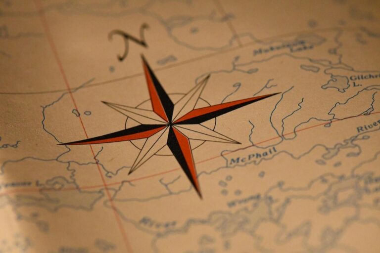
Keep decorative elements sized relative to their real-world significance to preserve spatial relationships across your map. Scale ornamental compass roses and legend boxes to occupy no more than 5-10% of your total map area, preventing them from overwhelming geographic features. Position decorative borders and artistic flourishes outside the main mapping area, ensuring they don’t interfere with coordinate systems or create visual confusion about actual geographic boundaries and distances.
Leveraging Modern Technology to Merge Traditional Cartography with Contemporary Design
Modern mapping software bridges the gap between time-tested cartographic principles and cutting-edge digital aesthetics. You’ll find that today’s technology enables precise geographic accuracy while supporting sophisticated visual design elements.
Digital Tools for Seamless Integration of Style and Accuracy
Advanced GIS platforms like QGIS and ArcGIS Pro offer specialized styling engines that maintain coordinate precision while applying artistic effects. You can use layer blending modes, graduated symbols, and dynamic labeling to create visually stunning maps without compromising spatial relationships. Vector-based design tools such as Adobe Illustrator integrate with geographic data through plugins like MAPublisher, allowing you to refine cartographic elements while preserving geometric accuracy. These workflows enable real-time data updates while maintaining your custom artistic styling.
Learn Adobe Illustrator with the 2025 release of this comprehensive guide. Master essential skills through hands-on lessons.
Balancing Hand-Drawn Elements with Precise Geographic Data
Hybrid workflows combine traditional illustration techniques with digital precision by importing hand-drawn elements as georeferenced overlays. You can sketch decorative borders, custom symbols, or terrain illustrations traditionally, then digitize them using tablets and stylus tools for precise placement. Software like Photoshop supports geographic coordinate systems through plugins, enabling you to blend watercolor textures or pen-and-ink details with accurate base maps. This approach preserves the organic feel of hand-drawn cartography while ensuring your geographic features remain spatially correct and measurable.
Create vibrant watercolor art with this portable set. It includes 40 colors (metallic & fluorescent), a brush pen, watercolor paper, and more, all in a stylish tin box.
Testing and Refining Your Map Through User Feedback and Professional Review
Testing your map design through systematic feedback collection ensures both aesthetic appeal and cartographic accuracy meet professional standards. You’ll need input from multiple perspectives to identify potential issues before finalizing your work.
Gathering Input from Both Design and Geography Experts
Design professionals evaluate visual hierarchy, color harmony, and typography effectiveness in your cartographic work. You should present your map to graphic designers who can assess whether artistic elements support or distract from geographic information. Geography experts focus on spatial accuracy, projection appropriateness, and data representation standards. Submit your work to licensed surveyors, GIS specialists, or academic cartographers who can verify coordinate precision and identify potential misrepresentations. Combining both perspectives creates a comprehensive review that addresses aesthetic appeal and technical accuracy simultaneously.
Iterating Based on Usability and Accuracy Assessments
Usability testing reveals how effectively users interpret your map’s visual elements and navigate its information hierarchy. You can conduct simple wayfinding tests where participants attempt to locate specific features or follow routes using your design. Accuracy assessments involve cross-referencing your mapped features against authoritative datasets like USGS topographic maps or local survey records. Document each identified discrepancy with precise coordinates and prioritize corrections based on the map’s intended use. Create revision cycles that alternate between design refinements and accuracy verification until both elements achieve your established quality standards.
Plan your next adventure with the 2025 National Geographic Road Atlas, covering the United States, Canada, and Mexico. Its durable, folded format (11 x 15 in) makes it ideal for hiking and camping trips.
Conclusion
Balancing artistic style with cartographic accuracy doesn’t have to be an either-or decision. You can create maps that are both visually stunning and geographically precise by leveraging the right tools and techniques.
The key lies in establishing clear priorities from the start and maintaining them throughout your design process. When you understand your audience’s needs and your map’s primary purpose you’ll make better decisions about where to emphasize aesthetics versus accuracy.
Modern technology offers unprecedented opportunities to merge traditional cartographic principles with contemporary design elements. You’re no longer limited by the constraints that forced earlier mapmakers to choose between beauty and precision.
Remember that the best maps serve their users effectively while inspiring them to explore. Your commitment to both artistic excellence and geographic integrity will create maps that truly stand out in today’s crowded visual landscape.
Frequently Asked Questions
What is the main challenge modern mapmakers face?
Modern mapmakers struggle to balance aesthetic appeal with geographic accuracy. They must create visually engaging maps that maintain trust and cartographic integrity, whether for social media infographics or professional navigation tools. This fundamental tension influences every design decision in contemporary cartography.
How do historical maps relate to modern mapmaking challenges?
Historical maps demonstrate that cartography has always balanced art and accuracy. Medieval cartographers combined geographic knowledge with decorative elements, showing that maps have long served as both navigational tools and artistic expressions. This historical precedent validates today’s approach to aesthetic cartography.
What should mapmakers prioritize when starting a new project?
Mapmakers should first establish clear priorities by identifying their target audience and the map’s primary purpose. They must define whether information or aesthetics takes precedence and set data accuracy requirements early in the design process to avoid compromising essential geographic information.
How does modern mapping software help balance art and accuracy?
Advanced GIS platforms like QGIS and ArcGIS Pro feature specialized styling engines that maintain coordinate precision while applying artistic effects. These tools enable sophisticated visual elements without compromising geographic accuracy, bridging traditional cartography with contemporary design capabilities.
What role does user testing play in map design?
User testing is crucial for assessing how effectively people navigate maps and whether aesthetic elements enhance or detract from geographic information. Gathering feedback from both design and geography experts helps ensure maps serve their intended purpose while maintaining visual appeal.
How do accuracy standards vary between different types of maps?
Accuracy requirements differ significantly based on map purpose. Recreational hiking maps may allow for stylistic interpretation, while utility mapping demands precise measurements. Emergency response maps require different detail levels than tourist maps, making purpose-driven accuracy standards essential.
What are hybrid workflows in modern mapmaking?
Hybrid workflows combine traditional illustration techniques with digital precision, allowing mapmakers to incorporate hand-drawn elements as georeferenced overlays. This approach maintains spatial accuracy while adding artistic flair, representing the best of both traditional and modern cartographic methods.


