
7 Best Map Design Choices for Readability
Your audience shapes every map design decision you make – from color choices to data visualization techniques. Whether you’re creating maps for scientific research, public policy, or marketing campaigns, understanding who’ll use your maps determines their effectiveness and impact.
The difference between a successful map and a confusing one often comes down to audience awareness. Different groups process spatial information differently, have varying levels of technical expertise, and bring unique cultural perspectives to map interpretation.
Disclosure: As an Amazon Associate, this site earns from qualifying purchases. Thank you!
Understanding Your Target Demographic Shapes Map Complexity Levels
Your demographic analysis directly determines the appropriate level of visual complexity for your mapping project. Different audience segments process spatial information at varying speeds and comprehension levels.
P.S. check out Udemy’s GIS, Mapping & Remote Sensing courses on sale here…
Age Groups Require Different Visual Processing Approaches
Younger audiences (18-35) typically handle complex layered visualizations with multiple data points and interactive elements. They’re comfortable with dense information displays and modern interface conventions like hover states and zoom controls.
Older demographics (55+) prefer simplified layouts with fewer simultaneous data layers. You’ll achieve better results using larger text, higher contrast ratios, and traditional navigation patterns they recognize from print media.
Educational Background Influences Information Density Preferences
Technical professionals expect detailed metadata, precise coordinate systems, and comprehensive legend explanations. They’ll engage with complex symbology and multi-variable displays that showcase data relationships.
General audiences respond better to intuitive color schemes and simplified classification systems. You should limit simultaneous data categories to 3-5 variables and use familiar icons rather than abstract symbols for point features.
Cultural Context Affects Symbol Recognition and Interpretation
Western audiences typically read maps left-to-right and expect north-oriented layouts with standard color conventions like blue for water and green for vegetation. Red often signals danger or high values in these contexts.
International users may interpret colors differently—red symbolizes prosperity in Chinese culture while white represents mourning in some Asian societies. You’ll need to research regional mapping conventions and adjust your symbology accordingly.
Identifying User Goals Determines Essential Map Elements
Understanding what your users want to accomplish with your map directly shapes which cartographic elements you prioritize. Different user objectives require distinct approaches to data hierarchy, visual emphasis, and interactive functionality.
Navigation-Focused Users Need Clear Route Indicators
Navigation users require prominent road classifications and directional cues above all other map elements. You’ll need to emphasize major highways with bold line weights, use consistent color coding for route types, and ensure street names remain legible at multiple zoom levels. Interactive maps should feature turn-by-turn guidance symbols, while static maps benefit from simplified path highlighting that reduces visual clutter around the primary route corridor.
Research-Oriented Audiences Require Comprehensive Data Layers
Research users demand detailed attribute information and multiple data overlays for spatial analysis. You should include comprehensive legends, metadata panels, and toggleable layers that allow users to compare datasets simultaneously. Scale bars, coordinate grids, and data source citations become essential elements, while interactive features like measurement tools and data export capabilities support analytical workflows that require precision over visual appeal.
Entertainment Seekers Prefer Visually Engaging Design Features
Entertainment-focused users respond to creative visual storytelling and interactive elements that encourage exploration. You can incorporate custom iconography, thematic color palettes, and animated transitions that enhance the user experience. Gamification elements like achievement badges, discovery markers, and social sharing features work well, while maintaining enough geographic accuracy to preserve the map’s educational value without overwhelming casual users.
Analyzing Technical Proficiency Guides Interface Design Decisions
Your audience’s technical comfort level directly determines which interface elements you’ll emphasize in your map design. Advanced users expect sophisticated tools while beginners need streamlined approaches.
Tech-Savvy Users Appreciate Advanced Interactive Features
Tech-savvy users expect sophisticated interface elements including multi-layer toggles, custom symbology controls, and advanced filtering options. You’ll want to include features like GPS coordinate display, measurement tools, and export capabilities in multiple formats. These users appreciate hover-over data tooltips, keyboard shortcuts for navigation, and the ability to manipulate visualization parameters directly. They’re comfortable with complex legends and expect access to metadata, projection information, and data quality indicators within your interface design.
Beginner-Friendly Interfaces Prioritize Simplicity and Clarity
Beginner-friendly interfaces require streamlined controls with clearly labeled buttons and intuitive navigation patterns. You should limit interactive elements to essential functions like zoom and pan while using familiar icons such as magnifying glasses and home buttons. Simple search boxes work better than advanced query builders, and you’ll want to include helpful tooltips explaining each feature’s purpose. Large, high-contrast buttons with descriptive text labels prevent confusion and reduce the learning curve for new users.
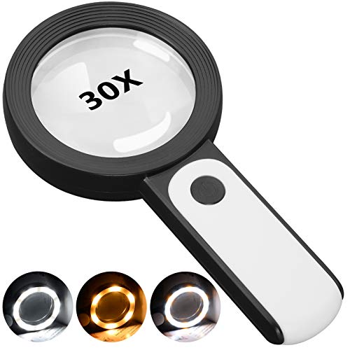
This 30X magnifying glass helps users with low vision easily read small text. Featuring a large 3.15" lens and 18 LEDs with adjustable cool, warm, and mixed light modes, it reduces eye strain and improves reading in any lighting.
Mobile vs Desktop Usage Patterns Shape Layout Choices
Mobile users require thumb-friendly interface elements positioned within easy reach zones on smaller screens. You’ll need to prioritize essential controls in prominent locations while utilizing gestures like pinch-to-zoom and swipe navigation. Desktop users can handle more complex toolbars, multiple panels, and keyboard shortcuts for efficiency. Consider that mobile users typically perform quick reference tasks while desktop users engage in detailed analysis, requiring different information hierarchies and control arrangements for optimal user experience.
Considering Accessibility Needs Influences Color and Font Selections
Accessibility requirements fundamentally reshape your color palettes and typography choices, ensuring your maps serve users with diverse visual, motor, and cognitive abilities.
Visual Impairments Require High Contrast Design Elements
Colorblind users need WCAG-compliant contrast ratios of 4.5:1 for normal text and 3:1 for large text. You’ll achieve this by selecting colors with sufficient luminance differences – dark blues (#003366) against light grays (#F0F0F0) work better than red-green combinations. Pattern fills and texture overlays provide redundant coding for colorblind users who can’t distinguish between similar hues. Test your color schemes using tools like Colour Contrast Analyser to verify accessibility compliance before finalizing your design.
Motor Disabilities Need Larger Interactive Targets
Touch targets must measure at least 44×44 pixels to accommodate users with limited dexterity. You’ll space clickable elements like zoom controls and layer toggles with 8-pixel minimum gaps to prevent accidental activation. Larger buttons reduce frustration for users with tremors or coordination challenges. Consider implementing hover states and click confirmations for critical actions. Mobile map interfaces require even more generous spacing – aim for 48-pixel minimum targets on touchscreen devices to ensure comfortable interaction for all users.
Cognitive Differences Demand Clear Visual Hierarchies
Consistent visual patterns help users with cognitive processing differences navigate your maps effectively. You’ll establish clear information hierarchies using font sizes that increase by at least 2-point increments – 10pt for minor labels, 12pt for standard text, and 14pt+ for headings. Limit your color palette to 5-7 distinct hues to prevent cognitive overload. Group related elements using consistent spacing and alignment. Simple, sans-serif fonts like Arial or Helvetica improve readability for users with dyslexia compared to decorative typefaces.
Evaluating Geographic Familiarity Affects Detail and Context Levels
Your audience’s geographic familiarity directly determines how much contextual information you’ll need to include in your map design. Local users navigate with existing spatial knowledge while distant audiences require comprehensive reference points.
Local Audiences Need Less Background Geographic Information
Local audiences recognize neighborhoods, landmarks, and street patterns without extensive labeling or reference features. You can focus on specific data visualization rather than basic geographic orientation, allowing for cleaner designs with higher information density. Remove redundant geographic markers like major highway labels or well-known district boundaries. Emphasize the unique data elements instead of familiar spatial relationships.
International Users Require Additional Contextual References
International users need comprehensive geographic context including country borders, major cities, and recognizable landmarks for spatial orientation. You’ll want to include multiple scale references, cardinal directions, and familiar geographic features like coastlines or mountain ranges. Add supplementary location identifiers such as latitude/longitude coordinates and distance measurements. Consider including inset maps showing the area’s position within larger geographic contexts.
Tourist-Focused Maps Emphasize Landmarks and Points of Interest
Tourist-focused maps prioritize visual landmarks over precise geographic accuracy, using recognizable buildings, monuments, and attractions as primary navigation anchors. You should enlarge significant tourist destinations beyond their actual scale and include visual symbols that match real-world appearances. Integrate transportation hubs, parking areas, and pedestrian pathways with clear connectivity indicators. Balance artistic representation with functional wayfinding elements.
Assessing Time Constraints Impacts Information Prioritization
Time limitations directly shape how your audience processes spatial information and determines which map elements deserve prominent placement versus secondary positioning.
Quick Reference Users Need Streamlined Essential Information
Quick reference users scan maps in under 30 seconds and require immediate visual hierarchy. You’ll need to eliminate secondary data layers and focus on core navigation elements like major roads and landmarks. Bold typography and high-contrast colors guide rapid decision-making. Mobile commuters exemplify this audience—they need clear route options without cluttering details like property boundaries or elevation contours.
Detailed Analysis Audiences Prefer Comprehensive Data Access
Detailed analysis users spend 10-15 minutes examining maps and expect layered information access. Your design should accommodate toggle controls for multiple data sets including demographics, infrastructure, and environmental factors. Research professionals require complete attribute tables and metadata descriptions. Urban planners represent this audience—they need zoning overlays, utility networks, and historical boundary data for comprehensive spatial analysis.
Emergency Situations Require Immediate Critical Information Display
Emergency situations demand instant information recognition within 5-10 seconds of map loading. You must prioritize life-safety elements using bright warning colors and oversized symbols. Critical infrastructure like hospitals, evacuation routes, and hazard zones need maximum visual prominence. First responders exemplify this audience—they require clear incident locations, access points, and resource positioning without decorative cartographic elements that slow comprehension.
Determining Budget and Resources Influences Final Design Scope
Your budget fundamentally shapes every aspect of your map’s final design scope. Resource allocation decisions determine whether you’ll deliver basic static visualizations or sophisticated interactive mapping platforms.
High-Budget Projects Allow Custom Interactive Features
High-budget mapping projects enable sophisticated interactive elements that transform user engagement with spatial data. You can implement custom geocoding engines, real-time data integration APIs, and advanced filtering systems that respond instantly to user queries. Professional-grade projects support multi-touch gesture controls, animated temporal visualizations, and cloud-based collaborative editing features. These premium implementations require dedicated development teams and specialized hosting infrastructure, but they deliver exceptional user experiences that justify the investment.
Limited Resources Require Strategic Feature Prioritization
Limited budgets demand careful prioritization of essential mapping features over comprehensive functionality. You must focus on core user needs rather than extensive feature sets, selecting open-source tools like Leaflet or QGIS instead of premium ArcGIS licenses. Resource constraints typically eliminate custom development in favor of template-based solutions and static export formats. Smart prioritization means choosing reliable hosting over advanced analytics, ensuring your essential geographic information reaches users effectively within budget parameters.
Maintenance Considerations Affect Long-Term Design Sustainability
Maintenance requirements significantly impact your map’s long-term design sustainability and operational viability. You need sustainable data update workflows, automated quality control processes, and scalable hosting solutions that grow with user demand. Complex interactive features require ongoing technical support and regular security updates, while simpler static designs minimize maintenance overhead. Planning for data refresh cycles, server monitoring, and user support ensures your mapping project remains functional and accurate throughout its intended lifespan.
Conclusion
Understanding your audience transforms map design from guesswork into strategic communication. When you align design choices with user needs technical expertise and cultural context you create maps that actually serve their intended purpose.
Your design decisions should reflect real user behaviors and constraints. Whether you’re designing for time-pressed commuters or detailed analysts each audience segment requires different approaches to information hierarchy and interface complexity.
Remember that effective mapping isn’t about showcasing every available feature—it’s about delivering the right information to the right people in the most accessible way possible. Your audience analysis directly determines whether your map becomes an essential tool or an overlooked resource.
Frequently Asked Questions
How does audience age affect map design decisions?
Younger audiences (18-35) prefer complex visualizations with interactive elements and detailed information layers. Older demographics (55+) respond better to simplified layouts featuring larger text, familiar navigation patterns, and reduced visual complexity. Age-appropriate design ensures better user comprehension and engagement across different generational preferences.
What role does cultural context play in map symbol interpretation?
Cultural background significantly influences how users interpret colors and symbols. Western audiences expect standard layouts and conventional color schemes, while international users may have different interpretations. Understanding regional mapping conventions and conducting cultural research helps designers create universally accessible and culturally appropriate map interfaces.
How should technical proficiency influence map interface design?
Advanced users expect sophisticated tools like multi-layer toggles and custom symbology controls. Beginners need streamlined interfaces with clearly labeled buttons and intuitive navigation. Mobile users require thumb-friendly elements, while desktop users can handle complex toolbars. Matching interface complexity to user technical skills improves usability and satisfaction.
Why is accessibility important in map design?
Accessible design ensures maps work for users with visual, motor, and cognitive disabilities. This includes high contrast color palettes for visually impaired users, larger interactive targets for motor disabilities, and clear visual hierarchies for cognitive differences. Accessibility compliance broadens your audience and improves overall user experience.
How does geographic familiarity affect map detail requirements?
Local audiences need less background information and can navigate using existing spatial knowledge, allowing for cleaner designs with higher information density. International users require comprehensive contextual references, including country borders and major landmarks, to aid spatial orientation and provide necessary geographic context for effective navigation.
What considerations matter for time-constrained map users?
Quick reference users need streamlined essential information with immediate visual hierarchy, focusing on core navigation elements. Detailed analysis audiences expect comprehensive data access with toggle controls for multiple data sets. Emergency situations require prioritized critical information with bright colors and oversized symbols for immediate recognition.
How do budget constraints impact map design scope?
High-budget projects enable sophisticated interactive features like custom geocoding engines and real-time data integration. Limited resources require strategic prioritization of essential features, often using open-source tools and template-based solutions. Budget considerations also affect long-term maintenance capabilities and scalable hosting solutions for sustainability.