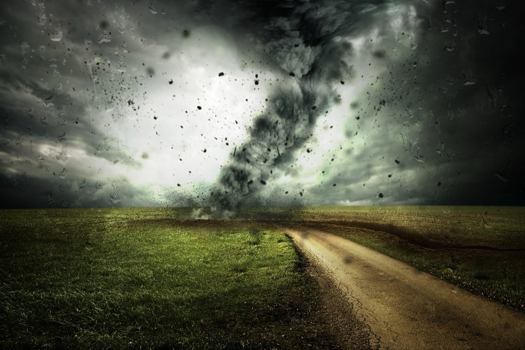
6 Ideas for Visualizing Environmental Data That Transform Climate Action
Environmental data tells powerful stories about our planet’s health but traditional charts and graphs often fail to capture public attention or drive meaningful action. You’re living through one of the most critical periods for environmental awareness yet most people still struggle to connect with complex climate data presented in boring spreadsheets and static visualizations.
The big picture: Innovative data visualization transforms abstract environmental numbers into compelling narratives that resonate with diverse audiences and inspire real change. From interactive heat maps that show rising sea levels in your neighborhood to augmented reality displays revealing air quality in real-time these creative approaches make environmental data impossible to ignore.
Disclosure: As an Amazon Associate, this site earns from qualifying purchases. Thank you!
Interactive Heat Maps Show Climate Change Patterns Over Time
Interactive heat maps transform overwhelming climate datasets into intuitive visual stories that reveal temperature and weather pattern changes across decades. You’ll discover how these dynamic visualizations make complex environmental trends immediately understandable to diverse audiences.
P.S. check out Udemy’s GIS, Mapping & Remote Sensing courses on sale here…
Real-Time Temperature Tracking Across Global Regions
Real-time temperature heat maps display live thermal data from weather stations and satellite sensors across continents, updating every 15-30 minutes. You can layer multiple data sources including NOAA’s Global Temperature Anomaly dataset and NASA’s MODIS satellite imagery to create comprehensive thermal visualizations. These interactive displays allow users to zoom from global overviews down to city-level temperature variations, revealing urban heat islands and regional climate patterns. Popular mapping platforms like Mapbox GL JS and Leaflet provide the responsive frameworks needed for smooth real-time data integration.
Get real-time weather data with the Ambient Weather WS-2902. This WiFi-enabled station measures wind, temperature, humidity, rainfall, UV, and solar radiation, plus it connects to smart home devices and the Ambient Weather Network.

Precipitation Data Visualization Through Color-Coded Mapping
Color-coded precipitation maps use graduated color schemes from blue (heavy rainfall) to red (drought conditions) to instantly communicate water availability patterns. You’ll achieve optimal readability by implementing ColorBrewer’s sequential color palettes, which ensure accessibility for colorblind users while maintaining scientific accuracy. Interactive controls let viewers toggle between daily, monthly, and seasonal precipitation averages from sources like the Global Precipitation Climatology Project. These visualizations become particularly powerful when you integrate historical drought data with current conditions, highlighting areas experiencing unprecedented water stress.
Historical Climate Comparison Using Layered Heat Map Overlays
Layered heat map overlays enable side-by-side comparisons of climate data spanning multiple decades, revealing long-term environmental changes through interactive timelines. You can create compelling before-and-after visualizations by overlaying temperature data from the 1980s with current readings, using opacity controls to blend historical and contemporary datasets. Time-slider functionality allows users to animate climate progression year by year, making gradual changes dramatically visible. Tools like D3.js combined with climate datasets from Berkeley Earth provide the technical foundation for creating these multi-temporal visualizations that clearly demonstrate warming trends across specific geographic regions.
Achieve a flawless, even complexion with e.l.f. Flawless Satin Foundation. This lightweight, vegan formula provides medium coverage and a semi-matte finish for all-day wear, while hydrating your skin with glycerin.

Augmented Reality Displays Bring Pollution Data Into Physical Spaces
AR technology transforms environmental awareness by overlaying invisible pollution data directly onto the physical world you experience daily. This immersive approach makes abstract environmental concepts tangible and immediately relevant to your location.
AR Mobile Apps for Visualizing Air Quality in Real-Time
Real-time air quality apps like AirVisual AR and Breezometer integrate particulate matter sensors with smartphone cameras to display pollution levels as floating data points over your immediate environment. You’ll see PM2.5 concentrations, ozone levels, and nitrogen dioxide measurements appear as color-coded indicators hovering above streets, buildings, and parks. These apps pull data from government monitoring stations and IoT sensor networks, updating every 15-30 minutes to reflect current conditions in your exact location.
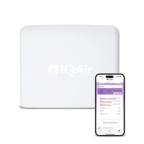
Monitor your outdoor air quality in real-time with professional-grade sensors that track pollutants, temperature, and more. Connect via Wi-Fi or Ethernet and easily install this weatherproof device on a wall, roof, or pole to contribute data to the global IQAir network.
Virtual Pollution Clouds Overlaid on City Landscapes
Pollution visualization overlays render invisible contaminants as semi-transparent 3D clouds floating above urban landscapes through your device’s camera view. You can observe how smog accumulates in valleys, track industrial emissions spreading from factories, and witness traffic pollution concentrating along highways. Advanced AR platforms like Unity’s AR Foundation enable developers to map EPA air quality data onto geographic coordinates, creating realistic pollution clouds that shift and disperse based on real wind patterns and atmospheric conditions.
Interactive AR Experiences for Environmental Education
Educational AR platforms let you manipulate virtual environmental scenarios to understand cause-and-effect relationships in pollution dynamics. You can increase industrial output and watch corresponding air quality changes, adjust traffic patterns to see emission reductions, or simulate different weather conditions affecting pollutant dispersion. Museums and science centers use AR experiences that overlay historical pollution data onto current cityscapes, showing how environmental conditions have changed over decades through interactive before-and-after comparisons.
3D Data Sculptures Transform Abstract Numbers Into Tangible Art
3D data sculptures bridge the gap between complex environmental datasets and public understanding by transforming statistical information into physical artworks. These tangible installations make invisible environmental changes visible through sculptural forms that viewers can touch, walk around, and experience viscerally.
Physical Models Representing Ocean Acidification Levels
Ocean acidification models use layered acrylic sheets and color-changing materials to display pH level variations across different marine regions. Artists like Nathalie Miebach create sculptural installations using woven materials where basket height corresponds to specific pH measurements from NOAA’s ocean monitoring stations. These three-dimensional representations show acidification’s impact on coral reef ecosystems through sculptural forms that visitors can examine from multiple angles, making the invisible chemistry of ocean degradation physically comprehensible.
Create stunning projects with these durable, clear acrylic sheets. Each 1/8" thick panel is easy to cut and offers excellent scratch and UV resistance for versatile indoor/outdoor use.

Sculptural Installations Showing Deforestation Rates
Deforestation sculptures translate forest loss data into powerful physical installations using materials like charred wood, metal fragments, and living plants. Environmental artist Maya Lin’s “Ghost Forest” installation recreates Atlantic white cedar trees killed by rising sea levels, with each sculptural element representing specific acreage lost annually. These installations often incorporate real-time data feeds that adjust lighting or mechanical components based on current deforestation rates from satellite imagery, creating dynamic artworks that evolve with ongoing environmental destruction.
Interactive 3D Prints of Biodiversity Loss Data
Biodiversity sculptures use 3D printing technology to create tactile representations of species population decline across different ecosystems. Each printed element’s size, texture, and position corresponds to specific species data from the Living Planet Index database. Interactive installations allow visitors to manipulate sculptural components while digital displays show corresponding biodiversity statistics, creating hands-on experiences that reveal connections between human activity and wildlife population changes through physical manipulation of data-driven art objects.
Create 3D art with the SCRIB3D P1 3D Pen! This easy-to-use pen features adjustable speed control and includes PLA filament, a stencil book, and project guide to get you started.

Immersive Virtual Reality Environments Simulate Future Climate Scenarios
Virtual reality technology transforms environmental data into visceral experiences that make future climate impacts tangible and immediate. You’ll discover how VR applications create powerful connections between abstract climate models and human understanding.
Virtual Worlds Showing Sea Level Rise Projections
VR platforms like Climate Interactive and Stanford’s Virtual Human Interaction Lab transport you to coastal cities experiencing projected sea level increases. You’ll walk through flooded streets of Miami or Venice as water levels rise according to IPCC climate models. These simulations display specific elevation data showing which neighborhoods face submersion by 2050 or 2100. Interactive elements let you adjust emission scenarios and witness corresponding changes in flood boundaries in real-time.
VR Experiences of Extreme Weather Events
Immersive weather simulations place you inside hurricanes wildfires and heat domes using meteorological data from NASA and NOAA. You’ll experience Category 5 hurricane winds while viewing pressure readings and wind speed measurements overlaid in your field of vision. Fire simulation VR recreates wildfire behavior using fuel moisture content temperature data and topographical information. These experiences translate complex atmospheric models into visceral encounters that communicate the intensity of extreme weather events.
Interactive Climate Modeling Through Virtual Ecosystems
Virtual ecosystems demonstrate how temperature precipitation and CO2 levels affect biodiversity through interactive 3D environments. You’ll manipulate climate variables in rainforest coral reef or arctic tundra simulations and observe species population changes in real-time. These VR platforms integrate ecological data from field research stations and satellite monitoring to show ecosystem responses to different climate scenarios. Interactive elements allow you to test conservation strategies and witness their long-term environmental impacts through accelerated time sequences.
Real-Time Data Dashboards Combine Multiple Environmental Metrics
Real-time environmental dashboards revolutionize how you monitor and respond to ecological changes by consolidating multiple data streams into unified visualization platforms. These comprehensive systems provide instant insights across interconnected environmental systems.
Integrated Pollution Monitoring Across Air, Water, and Soil
Integrated monitoring systems combine data from particulate matter sensors, water quality probes, and soil contamination detectors into single dashboard interfaces. You’ll access real-time measurements of PM2.5 levels, dissolved oxygen concentrations, and heavy metal contamination simultaneously. Platforms like EPA’s AirNow and USGS Water Quality Portal aggregate pollution data from thousands of monitoring stations. These dashboards display correlation patterns between air quality index readings, groundwater contamination levels, and soil pH measurements, enabling you to identify pollution sources affecting multiple environmental compartments.
Live Wildlife Migration Tracking Systems
Live migration tracking dashboards integrate GPS collar data, satellite imagery, and citizen science observations to visualize animal movement patterns in real-time. You’ll monitor migratory routes for species like caribou, monarch butterflies, and gray whales through interactive maps showing current positions and historical pathways. Systems like Movebank and eBird combine tracking data with environmental conditions including temperature, precipitation, and habitat changes. These platforms display migration timing shifts, population density changes, and habitat corridor usage, helping you understand how climate change affects wildlife movement patterns.
Comprehensive Carbon Footprint Visualization Tools
Carbon footprint dashboards consolidate emissions data from transportation, energy consumption, and industrial processes into comprehensive tracking systems. You’ll visualize CO2 emissions from vehicle fleets, building energy usage, and manufacturing operations through integrated metrics displays. Tools like CarbonTracker and Global Carbon Project combine atmospheric monitoring data with economic activity indicators to show real-time carbon flux patterns. These dashboards present emissions intensity per capita, sectoral contribution breakdowns, and progress toward reduction targets, enabling you to identify high-impact areas for climate action.
Storytelling Through Animated Infographics Makes Data Accessible
Animated infographics transform static environmental data into compelling narratives that capture attention and drive understanding. These dynamic visualizations guide viewers through complex ecological processes step-by-step, making abstract concepts tangible and memorable.
Motion Graphics Explaining Complex Environmental Processes
Motion graphics break down intricate environmental systems into digestible visual sequences. You’ll see carbon cycle animations that trace molecules from atmosphere to ocean, showing photosynthesis and respiration in real-time motion. Water cycle visualizations animate evaporation, condensation, and precipitation patterns across seasons, while ecosystem food web graphics demonstrate energy transfer between species through flowing arrows and particle effects. These animations help viewers grasp interconnected environmental relationships that static charts can’t convey.
Animated Timeline Visualizations of Environmental Changes
Timeline animations reveal environmental transformations that occur over decades or centuries. You can watch Arctic ice coverage shrink year-by-year through satellite imagery sequences, or observe urban sprawl consuming natural habitats through time-lapse mapping. Deforestation timelines show forest loss acceleration in the Amazon, while temperature anomaly animations display global warming patterns spreading across continents. These temporal visualizations make gradual environmental changes visible and urgent, demonstrating trends that might otherwise remain hidden in spreadsheets.
Interactive Story Maps Connecting Data to Human Impact
Understand the structure of a one-hour TV drama pilot. This book provides a guide to story mapping for television.

Interactive story maps weave environmental data into human narratives through location-based storytelling. You’ll explore platforms like ArcGIS StoryMaps that combine satellite imagery, demographic data, and personal testimonies to show how climate change affects specific communities. These maps let you click through flood zones to hear residents’ stories, or scroll through drought-affected regions while viewing crop yield data. Story maps transform abstract environmental statistics into personal experiences, connecting global climate patterns to local human consequences through immersive geographic narratives.
Conclusion
These innovative visualization approaches represent a fundamental shift in how you can communicate environmental data to diverse audiences. By moving beyond traditional charts and embracing immersive technologies you’re creating opportunities for deeper engagement with critical climate issues.
The future of environmental communication lies in your ability to make data visceral and actionable. Whether you’re implementing AR pollution overlays or designing interactive dashboards your goal should be transforming abstract statistics into experiences that resonate emotionally with viewers.
Success in environmental data visualization requires balancing technical accuracy with storytelling power. When you combine cutting-edge technology with compelling narratives you create the foundation for informed decision-making and meaningful environmental action in your community.
Frequently Asked Questions
What are the main challenges with traditional environmental data presentation?
Traditional charts and graphs often fail to capture public attention or inspire meaningful action. They present complex climate data in formats that are difficult to understand and don’t create emotional connections with viewers. This leads to decreased engagement and limited public awareness about critical environmental issues.
How do interactive heat maps improve climate data understanding?
Interactive heat maps transform complex climate patterns into visually compelling, easily understandable formats. They allow users to explore temperature variations, precipitation patterns, and climate changes over time at different scales. These visualizations make abstract data tangible and help users grasp long-term environmental trends more effectively.
What are the benefits of using augmented reality for environmental awareness?
AR technology overlays invisible pollution data onto the physical world, making environmental threats visible in real-time. Apps like AirVisual AR display pollution levels as floating data points, showing PM2.5 concentrations and ozone levels in users’ immediate environments, creating immediate awareness of air quality conditions.
How do 3D data sculptures enhance public environmental understanding?
3D data sculptures transform statistical environmental information into physical artworks that people can touch and experience. These installations make invisible changes like ocean acidification and deforestation tangible through sculptural forms, creating visceral connections to environmental issues and enhancing public engagement with climate data.
What advantages do VR environments offer for climate education?
VR environments simulate future climate scenarios, making abstract climate models immediate and tangible. Users can walk through projected sea level rises, experience extreme weather events, and manipulate climate variables to observe real-time effects on ecosystems, creating powerful educational experiences about climate change impacts.
How do real-time environmental dashboards improve climate monitoring?
Real-time dashboards consolidate multiple environmental data streams into unified platforms, revolutionizing ecological monitoring. They integrate air, water, and soil pollution data, track wildlife migration patterns, and visualize carbon footprints, enabling comprehensive environmental awareness and more informed decision-making for climate action.
Why are animated infographics effective for environmental communication?
Animated infographics transform static environmental data into compelling narratives that guide viewers through complex ecological processes. Motion graphics break down intricate systems like carbon cycles into digestible sequences, while interactive story maps connect data to human impact, making abstract statistics relatable and urgent.