7 Best Map Lettering Styles
Your map’s typography can make or break its visual impact and user experience. While standard fonts work fine for basic cartography you’re missing out on the opportunity to create truly memorable and distinctive maps that stand out from the crowd.
Custom lettering styles transform ordinary maps into compelling visual narratives that capture attention and enhance readability. The right typography choices can guide your viewers’ eyes establish hierarchy and reinforce your map’s overall theme and purpose.
From elegant serif scripts to bold modern sans-serif designs these seven lettering approaches will elevate your cartographic projects and help you create maps that people actually want to explore and share.
Disclosure: As an Amazon Associate, this site earns from qualifying purchases. Thank you!
P.S. check out Udemy’s GIS, Mapping & Remote Sensing courses on sale here…
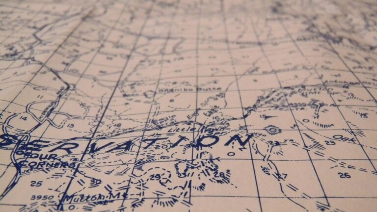
Hand-Drawn Script Lettering for Vintage Map Aesthetics
Hand-drawn script lettering transforms modern maps into timeless cartographic treasures. This organic approach captures the authenticity of historical cartography while maintaining contemporary readability standards.
Creating Flowing Letterforms with Brush Techniques
Brush lettering creates natural variation that mimics traditional cartographic methods. You’ll achieve optimal results using pressure-sensitive styluses with vector software like Adobe Illustrator or Procreate. Start with consistent baseline angles around 15-20 degrees for geographic labels, then vary stroke width naturally. Practice connecting letters smoothly – rivers, mountain ranges, and regional names benefit from this flowing continuity that guides the reader’s eye across your map’s terrain.
Learn Adobe Illustrator with the 2025 release of this comprehensive guide. Master essential skills through hands-on lessons.

Incorporating Decorative Flourishes and Swashes
Strategic flourishes enhance visual hierarchy without overwhelming map functionality. Place decorative elements on important place names like capital cities or major landmarks, using swashes that extend into open map areas. Keep flourishes directional – they should point toward related geographic features or complement your map’s overall flow. Limit ornamental details to 2-3 per map section to maintain professional cartographic standards while preserving the vintage aesthetic you’re targeting.
Balancing Readability with Artistic Expression
Legibility remains paramount in functional map design regardless of stylistic choices. Test your script lettering at various zoom levels and printing sizes – aim for readable text at 200% and 50% of your intended display size. Use higher contrast between text and background colors than you’d typically require for standard fonts. Consider reserving elaborate script styles for secondary labels while keeping primary navigation text more restrained yet still hand-drawn in character.
Modern Sans-Serif Typography for Clean Contemporary Maps
Modern sans-serif typography delivers exceptional clarity for digital cartographic applications where information density and screen readability are paramount. These typefaces eliminate decorative elements that can interfere with map functionality at various zoom levels.
Utilizing Geometric Letter Structures
Geometric sans-serif fonts like Futura and Proxima Nova provide consistent visual weight across your map labels. You’ll achieve better spatial harmony by selecting typefaces with circular O’s and uniform character widths. These structured letterforms maintain their clarity when rendered at small sizes on mobile devices, making them ideal for street names and neighborhood labels.
Maintaining Consistent Stroke Weights
Uniform stroke thickness prevents visual competition between typography and map elements like roads or boundaries. You should avoid fonts with dramatic thick-to-thin variations that create visual noise at standard map viewing distances. Consistent weights ensure your labels integrate seamlessly with vector map elements, particularly when overlaying text on colored polygons or satellite imagery backgrounds.
Optimizing Spacing for Digital Map Applications
Letter spacing adjustments become critical when displaying geographic names across different zoom levels and screen densities. You’ll need to increase tracking by 0.05-0.1em for labels appearing over busy background patterns. Proper line spacing prevents text overlap when displaying multi-line place names, while adequate word spacing ensures readability when labels follow curved geographic features like rivers or coastlines.
Calligraphic Serif Styles for Traditional Cartographic Elegance
Calligraphic serif lettering brings timeless sophistication to cartographic projects, drawing from centuries of established typographic traditions. You’ll achieve the most compelling results when these classical letterforms complement your map’s historical context or formal presentation requirements.
Mastering Classical Letter Proportions
Classical proportions establish the foundation for elegant cartographic typography through carefully balanced letter spacing and consistent stroke relationships. You’ll achieve optimal results by maintaining a 3:2 ratio between ascender height and x-height, ensuring your geographic labels maintain visual harmony across different scales. Practice consistent counter spacing between letters like ‘o’ and ‘n’ to create even texture throughout your map labels. Test your proportions at multiple zoom levels to verify readability remains intact when users navigate between overview and detail views.
Achieve a flawless, even complexion with e.l.f. Flawless Satin Foundation. This lightweight, vegan formula provides medium coverage and a semi-matte finish for all-day wear, while hydrating your skin with glycerin.

Adding Sophisticated Serif Details
Serif details enhance readability while adding visual refinement to your cartographic lettering through carefully crafted terminals and brackets. You’ll want to design subtle serif extensions that guide the eye along label baselines without creating visual clutter on complex geographic features. Consider using bracketed serifs for larger place names and hairline serifs for smaller settlements to maintain appropriate visual hierarchy. Limit serif complexity when working with dense topographic information to prevent interference with contour lines and elevation data.
Integrating Historical Typography References
Historical typography references connect your modern cartographic work to established mapping traditions through authentic letterform choices and period-appropriate styling. You’ll find inspiration in 18th-century atlases like those produced by Abraham Ortelius, which demonstrate elegant integration of decorative capitals with functional body text. Research typographic styles from your map’s historical period to ensure authentic visual consistency. Document your reference sources to maintain stylistic coherence across multi-sheet mapping projects and establish clear design guidelines for collaborative cartographic work.
Stencil Lettering for Industrial and Urban Map Themes
Stencil lettering transforms industrial and urban maps by creating bold, utilitarian typography that reinforces geographic context. This technique works particularly well for city maps, infrastructure plans, and industrial zone documentation.
Creating Bold, Cut-Out Letter Designs
Design stencil letters with thick strokes and generous spacing to ensure proper cut-out functionality. Your letter forms need sufficient material between gaps to maintain structural integrity when applied as physical stencils. Focus on geometric shapes like rectangles and circles rather than complex curves. Military stencil fonts like OCR-A provide excellent starting points for customization. Consider using 18-point minimum sizes for small map features and 24-point for major labels. Test your designs by printing them on cardstock and cutting out the negative spaces to verify readability.
Create professional documents with Neenah 90 lb white index cardstock. This 8.5" x 11" pack of 300 sheets delivers high-resolution images and jam-free printing on both inkjet and laser printers.

Ensuring Structural Integrity in Letter Forms
Maintain connecting bridges between letter segments to prevent pieces from falling out during stencil application. Your bridges should appear at consistent locations across the alphabet – typically at letter centers or natural breaking points. Standard bridge widths range from 2-4 points depending on overall letter size. Avoid placing bridges at visual focal points like letter terminals or stroke intersections. Uppercase letters work better than lowercase for stencil applications due to their uniform height and stronger structural elements. Review each letterform individually to identify potential weak points before finalizing your design.
Adapting Stencil Styles to Different Map Scales
Adjust bridge thickness and letter spacing proportionally as map scales change to maintain visual consistency. At 1:50,000 scales, use 3-point bridges with 150% standard letter spacing for optimal readability. Smaller scales like 1:250,000 require 2-point bridges and 125% spacing to prevent visual clutter. Large-scale maps (1:5,000) can accommodate 4-point bridges with 175% spacing for maximum impact. Consider creating three distinct stencil weights – light, medium, and bold – to handle different hierarchical levels within your map’s labeling system. Test legibility at your target print size before committing to final letterforms.
Organic Nature-Inspired Lettering for Environmental Maps
Nature-inspired lettering transforms environmental maps by connecting typography directly to landscape characteristics. This approach creates visual harmony between text and terrain while reinforcing ecological themes.
Incorporating Natural Textures and Forms
Create lettering that mimics bark, stone, or water patterns by applying texture overlays to your typography. Use rough brush strokes for mountainous regions or flowing curves for coastal areas. Software like Adobe Illustrator‘s texture brushes or Procreate’s organic brushes help achieve authentic natural effects. Test texture visibility at different map scales to ensure readability while maintaining organic character across zoom levels.
Create unique art with this set of 4 textured paint brushes! Jumbo handles provide a comfortable grip for little hands, while the different tips create exciting patterns and effects.

Using Earth-Tone Color Palettes
Select colors that mirror your map’s environmental zones – forest greens for woodland areas, desert browns for arid regions, and ocean blues for coastal features. Apply subtle color gradients within letterforms to create depth while maintaining contrast ratios above 4.5:1 for accessibility. Consider seasonal variations by adjusting saturation levels to reflect summer vibrancy or autumn transitions in your geographic context.
Reflecting Landscape Elements in Letter Shapes
Design letterforms that echo topographical features by incorporating mountain peaks into “A” shapes or wave patterns into flowing letters like “S” and “C.” Modify serif details to resemble tree branches or rock formations specific to your mapped region. Maintain consistent character spacing while allowing organic variations in letter weight to simulate natural growth patterns without compromising legibility standards.
Decorative Display Fonts for Themed Adventure Maps
Adventure maps demand typography that captures imagination while maintaining cartographic functionality. Decorative display fonts transform ordinary geographic labels into immersive storytelling elements.
Designing Eye-Catching Headline Typography
Create impactful titles using oversized decorative fonts that establish your map’s adventure theme immediately. Choose display fonts like Blackletter for medieval fantasy maps or weathered Western styles for exploration themes. Scale your headlines 3-4 times larger than body text, ensuring they anchor visual hierarchy without overwhelming geographic details. Test headline legibility at your intended print or screen size before finalizing design choices.
Adding Thematic Elements to Letter Designs
Incorporate adventure motifs directly into your letterforms using decorative flourishes, textural effects, and contextual embellishments. Add rope textures to nautical adventure maps, stone carving effects for archaeological themes, or weathered metal finishes for steampunk expeditions. Balance decorative elements with readability by limiting embellishments to 20-30% of each letter’s surface area. Maintain consistent styling across all thematic elements to preserve visual cohesion.
Creating Memorable Brand Identity Through Lettering
Establish distinctive map branding through custom lettering that differentiates your cartographic work from standard geographic products. Develop signature letterforms that reflect your adventure mapping specialty, whether treasure hunting, hiking expeditions, or fantasy world-building. Create a style guide documenting your custom lettering specifications, including stroke weights, decorative patterns, and color applications. Apply your branded typography consistently across map series to build recognition and professional credibility.
Technical Blueprint Lettering for Architectural and Engineering Maps
Technical blueprint lettering transforms architectural and engineering maps into precise communication tools that meet professional documentation standards. This systematic approach ensures your cartographic work aligns with industry requirements while maintaining exceptional clarity.
Implementing Precise Line Work and Measurements
Precise line work forms the foundation of professional technical lettering for architectural maps. You’ll achieve optimal results by maintaining consistent stroke weights between 0.5mm and 0.7mm for standard drawing scales, ensuring your lettering remains legible when printed at various sizes. Digital tools like AutoCAD and ArcGIS Pro offer precise vector control for creating uniform letter thickness throughout your map labels. Consider using technical pens or specialized CAD fonts like ROMANS.SHX that automatically maintain proper proportions. Your line weights should correspond directly to your map’s drawing scale – use thicker strokes for larger scales and finer lines for detailed site plans.
Using Grid-Based Letter Construction
Grid-based construction ensures consistent letter spacing and proportional accuracy across your entire mapping project. You’ll establish a baseline grid system using 4mm or 6mm modules that align with your map’s coordinate system and scale requirements. Professional CAD software allows you to snap letter elements to grid intersections, maintaining perfect vertical alignment for street names and building labels. Create standardized character heights using a 7:5 ratio between uppercase and lowercase letters, following established drafting conventions. Your grid system should accommodate both horizontal and angled text placement while preserving readability at standard viewing distances of 24 to 36 inches.
Maintaining Professional Standards and Clarity
Professional standards require adherence to established lettering conventions that ensure your maps meet industry documentation requirements. You’ll implement ANSI Y14.2M guidelines for technical drawing lettering, using single-stroke Gothic fonts that provide maximum legibility under various lighting conditions. Maintain minimum character heights of 3mm for critical labels and 2.5mm for secondary information to meet accessibility standards. Your letter spacing should equal 1/6 of the character height, while word spacing maintains 2/3 of the character height for optimal readability. Consider using contrasting text colors – typically black on white backgrounds – that provide sufficient contrast ratios for professional reproduction and regulatory compliance.
Conclusion
Your typography choices will make or break your map’s impact. Each lettering style serves a specific purpose and connects with different audiences in unique ways.
The seven approaches we’ve explored give you a comprehensive toolkit for any cartographic project. Whether you’re designing heritage tours with calligraphic serifs or creating urban navigation with clean sans-serif fonts your lettering decisions shape how people experience your maps.
Remember that great map typography isn’t just about looking goodâit’s about guiding your viewers through information efficiently. Test your lettering choices at different scales and always prioritize readability alongside visual appeal to create maps that truly serve their intended purpose.
Frequently Asked Questions
What is the importance of typography in map design?
Typography in map design goes beyond basic functionality – it creates memorable and distinctive visuals that enhance readability and guide viewers’ attention. Custom lettering styles can reinforce a map’s theme, making it more compelling and shareable. While standard fonts work for basic maps, thoughtful typography transforms maps into engaging communication tools that connect with audiences on both functional and aesthetic levels.
When should I use hand-drawn script lettering on maps?
Hand-drawn script lettering works best for maps requiring a vintage or artisanal aesthetic while maintaining modern readability standards. It’s ideal for historical maps, tourism materials, or projects where you want to create an intimate, personal connection. Test script lettering at various zoom levels and ensure high contrast for legibility, especially when layering over complex geographic backgrounds.
What are the benefits of sans-serif typography for digital maps?
Sans-serif typography offers exceptional clarity for digital maps, particularly when information density and screen readability are crucial. Geometric fonts like Futura and Proxima Nova provide consistent visual weight and maintain clarity at small sizes. They prevent visual competition between typography and map elements while remaining readable across different zoom levels and screen densities.
How do calligraphic serif styles enhance map design?
Calligraphic serif styles bring timeless sophistication to cartographic projects, especially those with historical contexts. They enhance readability through refined serif details while maintaining visual elegance. Classical letter proportions (3:2 ratio between ascender height and x-height) create visual harmony, and historical typography references help connect modern maps with established mapping traditions.
When is stencil lettering appropriate for maps?
Stencil lettering is perfect for industrial and urban maps where you want to create bold, utilitarian typography that reinforces geographic context. It works well for infrastructure maps, military applications, or urban planning documents. Design with thick strokes and generous spacing, maintaining connecting bridges between letter segments for structural integrity at various scales.
What is organic nature-inspired lettering best used for?
Organic nature-inspired lettering excels in environmental maps where typography should connect to landscape characteristics. It creates visual harmony while reinforcing ecological themes through natural textures and forms. Use earth-tone color palettes that reflect environmental zones and design letterforms that echo topographical features, allowing for organic weight variations while maintaining legibility.
How do decorative display fonts work for adventure maps?
Decorative display fonts transform adventure maps into immersive storytelling experiences by turning geographic labels into thematic elements. Use oversized decorative fonts for headlines to establish the adventure theme, incorporate thematic textures and embellishments directly into letter designs, and develop signature letterforms that create memorable brand identity across map series.
What are the requirements for technical blueprint lettering?
Technical blueprint lettering must meet professional documentation standards with precise line work and grid-based letter construction. Follow specific guidelines for stroke weights, character heights, and spacing to ensure industry compliance and legibility. This style transforms architectural and engineering maps into precise communication tools that meet professional documentation requirements.