7 Ideas for Blending Art and Geography in Maps That Create Visual Impact
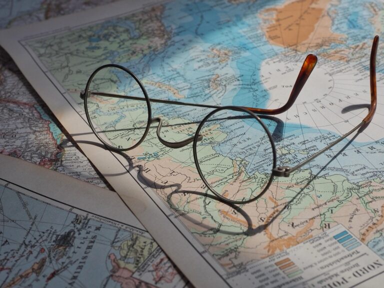
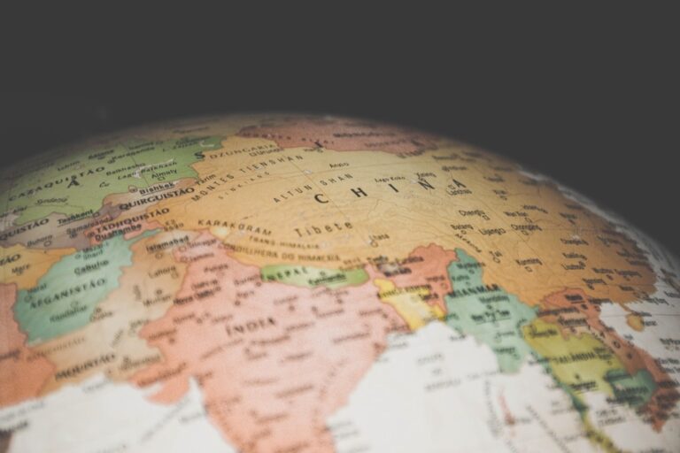
Why it matters: Maps aren’t just functional tools anymore—they’re becoming powerful canvases that merge artistic expression with geographical precision.
The big picture: From hand-drawn vintage aesthetics to digital data visualizations you can transform ordinary maps into stunning works of art that tell compelling stories about places and cultures.
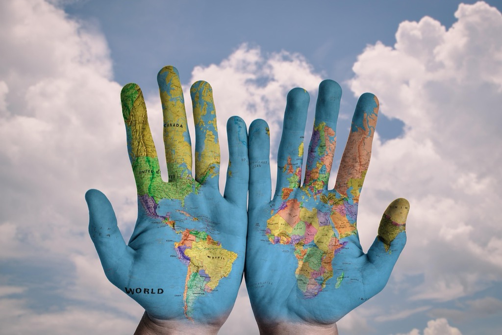
What’s next: These creative approaches will help you reimagine how geography and art intersect whether you’re designing for your home decorating a classroom or building professional presentations.
Disclosure: As an Amazon Associate, this site earns from qualifying purchases. Thank you!
P.S. check out Udemy’s GIS, Mapping & Remote Sensing courses on sale here…
Create Hand-Drawn Artistic Maps With Watercolor Techniques
Create vibrant watercolor art with this portable set. It includes 40 colors (metallic & fluorescent), a brush pen, watercolor paper, and more, all in a stylish tin box.

Hand-drawn watercolor maps represent the perfect fusion of cartographic precision and artistic expression. This traditional technique allows you to create unique geographical interpretations that capture both the scientific accuracy of topographical data and the emotional resonance of artistic vision.
Choose Your Geographic Focus Area
Select a specific region that offers diverse topographical elements like coastlines, mountain ranges, or river systems. Urban areas with distinct neighborhoods work exceptionally well for watercolor mapping because they provide clear boundaries and recognizable landmarks. Consider choosing locations with personal significance or strong visual appeal—familiar places allow you to add authentic details while working from memory. Start with smaller geographic areas like city districts or national parks before attempting larger regional maps to develop your technique effectively.
Select Appropriate Watercolor Materials
Use high-quality watercolor paper with at least 300gsm weight to prevent warping when applying multiple water layers. Professional watercolor paints in earth tones—burnt sienna, raw umber, and sap green—create realistic geographical representations. Fine-tip waterproof ink pens work best for initial sketching and labeling because they won’t bleed when paint is applied. Round brushes in sizes 4, 8, and 12 provide versatility for both detailed work and broad washes across terrain features.
Create vibrant artwork with this 9"x12" watercolor pad. The 140lb/300gsm cold-pressed paper is ideal for watercolor, mixed media, and various art techniques.

Blend Topographical Features With Artistic Flair
Apply transparent color washes to represent elevation changes, using darker values for higher altitudes and lighter tones for lower areas. Layer complementary colors to show different land uses—green for forests, blue for water bodies, and warm oranges for urban development. Create texture through dry brush techniques for mountain ridges and stippling effects for forested areas. Balance artistic interpretation with geographical accuracy by maintaining proper spatial relationships between features while allowing creative color choices that enhance visual appeal.
Design Minimalist Maps Using Typography As Art
Typography transforms maps from basic navigation tools into sophisticated visual statements that highlight geographical relationships through deliberate font choices and spatial arrangement.
Incorporate Creative Font Choices
Select typefaces that reflect your map’s geographic character and intended audience. Sans-serif fonts like Helvetica or Futura work best for modern urban areas, while serif fonts such as Times or Garamond suit historical regions. You’ll want to limit yourself to 2-3 font families maximum to maintain visual coherence. Consider geometric fonts for contemporary cityscapes and handwritten styles for rustic or artistic interpretations of natural landscapes.
Use Text Size to Show Geographic Hierarchy
Establish clear visual hierarchy by scaling text sizes according to geographic importance and administrative levels. Major cities should use 14-16pt fonts, while smaller towns work well at 10-12pt. State or province names typically require 18-20pt sizing to command appropriate attention. Rivers and mountain ranges benefit from 8-10pt italicized text that follows their natural curves, creating organic flow across your mapped terrain.
Balance White Space With Geographic Information
Strategically position text elements to create breathing room while maintaining geographic accuracy and readability. Leave adequate margins around dense urban areas and avoid overcrowding coastlines with overlapping labels. You’ll achieve better balance by clustering related geographic features and using consistent spacing between text elements. Consider negative space as an active design element that guides the viewer’s eye through your cartographic composition naturally.
Craft 3D Relief Maps With Sculptural Elements
Explore the United States with this 3D raised relief map. Feel the terrain and understand topography through its tactile, vacuum-formed design.

Building on the artistic foundations of watercolor and typography, three-dimensional relief mapping transforms flat geographic information into tactile sculptural art. This approach combines traditional cartographic accuracy with hands-on craftsmanship to create compelling visual narratives.
Achieve a flawless, even complexion with e.l.f. Flawless Satin Foundation. This lightweight, vegan formula provides medium coverage and a semi-matte finish for all-day wear, while hydrating your skin with glycerin.

Build Elevation Using Clay or Paper Mache
Create professional-looking paper mache projects quickly and easily with ACTIVA CelluClay. Just add water to this sustainably sourced, non-toxic material for a remarkably hard finish that can be sanded, cut, and painted.

Start with polymer clay or paper mache to construct your base topography. Layer materials gradually to match actual elevation data from USGS contour maps or digital elevation models. Polymer clay offers precision for detailed mountain ranges and valley systems while paper mache provides cost-effective coverage for larger geographic areas. Shape major landforms first, then add secondary features like ridgelines and river valleys. Allow each layer to cure completely before adding the next elevation tier to prevent structural collapse.
Create anything with Sculpey Original Polymer Clay! This oven-bake clay stays soft until you bake it, and it's easy to shape, paint, and finish for all your projects. Non-toxic and made in the USA.

Add Textural Details for Geographic Features
Apply varied textures to differentiate geographic elements using specialized tools and materials. Use fine sandpaper for desert regions, cotton batting for cloud formations, and small pebbles for rocky coastlines. Create forest canopies with textured paint or moss for realistic vegetation representation. Carve river channels with sculpting tools and apply glossy medium for water surfaces. Build urban areas using small geometric shapes or modeling paste to represent building density. Each texture should correspond to actual land use data for geographic authenticity.
Incorporate Lighting for Dramatic Effect
Position LED strip lights or spotlights to enhance topographical features and create shadow depth. Install warm white LEDs beneath translucent areas to simulate city lights or volcanic activity. Use directional lighting from the northwest to mimic natural sun angles and emphasize mountain relief. Add color-changing LEDs for dynamic presentations showing seasonal changes or climate data visualization. Conceal wiring within the base structure and use dimmer switches to control intensity levels for different viewing scenarios.
Develop Abstract Geographic Representations Through Color Theory
Color theory transforms traditional cartographic elements into expressive visual narratives that reveal geographic patterns beyond conventional mapping approaches. You’ll discover how strategic color application creates compelling abstract representations while maintaining geographic integrity.
Use Color Gradients to Show Data Patterns
Apply sequential color schemes to visualize continuous geographic data like elevation, population density, or temperature variations across your mapped region. Choose single-hue progressions from light to dark tones to represent low-to-high data values effectively. Tools like ColorBrewer 2.0 provide scientifically-tested gradient palettes that ensure accessibility and visual clarity. Position your darkest gradient values at data peaks to create immediate visual hierarchy, guiding viewers naturally toward significant geographic concentrations or anomalies.
Apply Complementary Colors for Regional Distinctions
Select opposing colors on the color wheel to create maximum visual contrast between different geographic regions, political boundaries, or thematic categories. Pair warm oranges with cool blues, or deep purples with bright yellows to establish clear regional separations. This technique works particularly well when mapping categorical data like land use types, climate zones, or administrative divisions. Maintain consistent saturation levels across complementary pairs to prevent visual competition while ensuring each region maintains distinct identity within your overall composition.
Create Visual Harmony Through Strategic Color Placement
Balance your color palette distribution across the entire map canvas to achieve cohesive visual flow that guides viewer attention naturally. Distribute similar color families throughout different map sections rather than clustering them in single areas. Apply the 60-30-10 color rule: use your dominant color for 60% of the map area, secondary colors for 30%, and accent colors for 10% of visual elements. Test your color harmony using digital tools like Adobe Color or Coolors.co to verify that your palette maintains both aesthetic appeal and functional clarity.
Integrate Historical Art Styles Into Modern Cartography
Drawing from centuries of artistic tradition transforms contemporary maps into sophisticated visual narratives that honor both geographic accuracy and aesthetic heritage.
Adapt Medieval Illuminated Manuscript Techniques
Medieval illuminated manuscripts offer rich decorative frameworks you can adapt for modern cartographic design. Incorporate gilded borders using metallic digital brushes or actual gold leaf for physical maps to frame your geographic content with historical elegance. Apply ornate initial capitals to mark major cities or regions, mimicking the elaborate letterforms found in medieval texts. Create decorative corner flourishes and margin illustrations that complement your map’s geographic theme while maintaining the manuscript’s characteristic attention to detail and symbolic imagery.
Incorporate Art Nouveau Decorative Elements
Art Nouveau’s flowing organic forms and botanical motifs enhance cartographic design through nature-inspired decorative elements. Integrate sinuous vine patterns along coastlines or mountain ranges, using the movement’s characteristic curved lines to trace geographic boundaries naturally. Apply stylized floral borders that reflect regional vegetation, creating visual connections between artistic decoration and geographic reality. Use Art Nouveau’s distinctive typography with elongated letterforms for place names, and incorporate the style’s signature color palette of muted greens, browns, and golds to evoke the movement’s earthy aesthetic.
Blend Renaissance Perspective With Geographic Accuracy
Renaissance perspective techniques add dimensional depth to flat cartographic representations while maintaining geographic precision. Apply atmospheric perspective by gradually lightening distant mountain ranges and geographic features, creating natural depth hierarchy across your map’s landscape. Incorporate the Renaissance tradition of detailed architectural illustrations for major cities, showing buildings in three-quarter view to suggest urban density and character. Use chiaroscuro lighting effects to model topographic relief, casting shadows that enhance elevation changes while respecting actual geographic data and maintaining cartographic accuracy throughout your design process.
Combine Digital Art Tools With Geographic Information Systems
Modern GIS platforms integrate seamlessly with digital art software, creating powerful workflows that transform geographic data into compelling visual narratives. You’ll discover how vector graphics, satellite imagery, and interactive elements work together to produce maps that balance artistic expression with spatial accuracy.
Utilize Vector Graphics for Clean Line Work
Vector graphics provide precise control over cartographic elements while maintaining scalability across different output formats. Adobe Illustrator and Inkscape integrate directly with GIS exports, allowing you to refine coastlines, borders, and topographic features with Bezier curves that preserve geographic accuracy. You’ll achieve crisp linework at any resolution while maintaining the ability to adjust stroke weights, fill patterns, and symbolic representations without pixelation concerns.
Layer Artistic Elements Over Satellite Imagery
Satellite imagery serves as a foundation for artistic interpretation through strategic layering in programs like Photoshop or GIMP. You can apply artistic filters to Landsat or Sentinel-2 data while preserving geographic reference points, creating painterly effects that maintain spatial relationships. Blend modes like multiply and overlay allow you to incorporate hand-drawn elements, watercolor textures, or digital brushwork that enhance the imagery’s visual appeal without compromising its informational value.
Create Interactive Art Maps With Dynamic Features
Web-based mapping libraries like Leaflet and D3.js enable you to combine artistic styling with interactive functionality for engaging user experiences. You’ll incorporate custom SVG icons, animated transitions, and responsive design elements that adapt to user interactions while maintaining geographic precision. JavaScript frameworks allow you to create hover effects, zoom-dependent styling changes, and data-driven visualizations that transform static artistic maps into dynamic storytelling tools.
Transform Maps Into Mixed Media Collages
Mixed media collages transform traditional cartographic elements into tactile artistic experiences that engage viewers through multiple sensory layers. This approach combines photographic documentation with textural elements to create compelling geographic narratives.
Incorporate Photographs From Geographic Locations
Photographs anchor your mixed media map with authentic visual references that connect viewers directly to specific places. Layer aerial shots of coastlines over hand-drawn topographic elements, creating depth between photographic reality and artistic interpretation. Include street-level photography of architectural landmarks, natural formations, or cultural sites to establish geographic context. Position these images strategically across your map base, allowing photographic elements to emerge from underlying cartographic structures while maintaining spatial accuracy and visual hierarchy.
Add Fabric Textures Representing Regional Characteristics
Fabric textures communicate regional characteristics through tactile elements that reflect local materials and cultural traditions. Apply rough burlap or canvas to represent agricultural regions, while smooth silk pieces can indicate urban commercial districts. Use denim or corduroy for industrial areas, and incorporate natural fibers like wool or linen for pastoral landscapes. Layer these materials directly onto your map base, cutting them to follow geographic boundaries. Consider local textile traditions when selecting fabrics—incorporating tartan patterns for Scottish highlands or batik designs for Indonesian archipelagos.
Include Found Objects Related to Geographic Features
Found objects create three-dimensional geographic storytelling that transforms flat maps into sculptural experiences. Attach small shells, sand, or driftwood to coastal areas, while incorporating twigs, leaves, or bark for forested regions. Use metal fragments or industrial materials for urban zones, and consider agricultural elements like seeds or dried grasses for farming areas. Secure these objects with archival adhesives, ensuring they complement rather than overwhelm the underlying cartographic information. Position found objects to follow natural geographic patterns while maintaining the map’s functional readability.
Conclusion
Maps aren’t just navigation tools anymore—they’re your gateway to creative expression. Whether you’re sketching watercolor landscapes or building three-dimensional relief sculptures these techniques transform geography into compelling visual stories.
Your artistic journey with maps can take countless directions. From minimalist typography to historical art integration each approach offers unique ways to connect viewers with geographic narratives while maintaining cartographic accuracy.
The beauty lies in experimentation. Start small with a single technique that resonates with your style then gradually incorporate mixed media elements or digital tools. Your maps will evolve from functional references into meaningful artistic statements that capture both place and imagination.
Frequently Asked Questions
What makes a map artistic rather than just functional?
Artistic maps blend geographical accuracy with creative expression through elements like hand-drawn designs, unique color schemes, typography, and mixed media. They transform traditional cartographic tools into visual narratives that tell stories about places and cultures while maintaining spatial relationships and geographic integrity.
How do I start creating hand-drawn watercolor maps?
Begin by selecting a smaller geographic area with diverse topographical features. Use high-quality watercolor materials and focus on balancing cartographic precision with artistic flair. Start with basic shapes and gradually add details, blending topographical elements with creative interpretation while maintaining geographical accuracy.
What role does typography play in minimalist map design?
Typography transforms maps into sophisticated visual statements by highlighting geographical relationships through strategic font choices and spatial arrangement. Select typefaces that reflect the map’s character, establish visual hierarchy with varying text sizes, and balance white space with geographic information for enhanced readability.
How can I create three-dimensional relief maps?
Use materials like polymer clay or paper mache to build elevation layers that match actual topographic data. Add textural details to differentiate geographic features and incorporate strategic lighting for dramatic effects. This hands-on approach combines traditional cartographic accuracy with sculptural craftsmanship.
What is the 60-30-10 color rule for map design?
The 60-30-10 rule ensures effective color distribution across maps: 60% dominant color for the base, 30% secondary color for major features, and 10% accent color for highlights. This creates visual harmony while maintaining functional clarity and aesthetic appeal in geographic representations.
How can historical art styles enhance modern maps?
Historical styles like medieval illuminated manuscripts, Art Nouveau decorative elements, and Renaissance perspective techniques can frame geographic content with elegance. Use gilded borders, organic botanical motifs, and atmospheric perspective to add dimensional depth while maintaining geographic accuracy and creating unique visual narratives.
What are the benefits of combining digital tools with GIS for map creation?
Digital art tools with GIS provide precise control over cartographic elements while maintaining scalability. Vector graphics allow refined coastlines and topographic features, satellite imagery serves as an artistic foundation, and web-based mapping libraries create interactive experiences that blend artistic styling with geographic precision.
How do mixed media collages enhance map storytelling?
Mixed media collages transform maps into tactile experiences by incorporating photographs from geographic locations, layering textures representing regional characteristics, and adding found objects related to geographic features. This approach creates three-dimensional storytelling that enhances sensory engagement and deepens viewer connection to geographic narratives.